Saturday, August 30, 2014

Best results from recent contests

Today I'm finally caught up with summarizing my recent contest entries. Yesterday I rounded up a couple of designs that performed pretty well (at least by my standards), so we're wrapping up with the ones that have performed the very best.

The most recently finished contest was for something to do with beetles.  Of course I immediately thought of doing something punny with Volkswagons or The Beatles (or both at once), but decided instead on Egyptian scarabs. One of the other synergy designers is working on a set of colors matching those used by ancient Egyptians, of which I selected a subset. It was fun doodling a whole variety of variations on standard scarab carvings.

Scarabs

This got 133 votes and came in 55th out of 288. My favorite was this one (which won).

Further back in time, the theme was surfing, and we had to use these colors (plus white):

Spoonflower_Surfing
Color by COLOURlovers

I went with a pretty straightforward combination of surfboards and hibiscus.

Hibiscus Surfboards

This got 104 votes and came in 31st place out of 169. My favorite entry also featured hibiscus.

Finally, we got a theme of tennis. Not a topic I find particularly interesting. Thinking back on tennis historically, it reminded me of going to Hearst Castle, where one of the stories the tour guides like to tell you is how Hearst always wanted his guests to be active - illustrated with old film of his glamorous guests heading off to the tennis court. So, how about some twenties-style tennis clothes? I used the same colors as my art deco and library cards designs.

Dashing duds for twenties tennis

This got 136 votes and came in 23rd! That's my highest placement in quite a while. My favorite was this graphic repeat of tennis balls.

Friday, August 29, 2014

Pretty good results

Continuing up the ladder from middling contest results, we can now enjoy reflecting on some that did a little better.

We had the first coordinates contest we've had for awhile, with a theme of sewing notions. I decided right off to expand on my existing stitching design, using the colors I originally tried out on the feather design. For the other coordinating designs, I immediately wanted to include hooks and eyes, since I've always found those very aesthetically appealing. And the pink in the color scheme reminded me of the pink sewing box Gramma Liz gave me for Christmas one year, soon after I really got into sewing as a kid, filled with all colors of thread and interesting notions. If I had more time, I would have drawn a bunch of different sewing accouterments flying out of it, but instead focused on the box itself. For the last pattern, I just wanted to do some kind of silhouette that I could fill in with different textures, so I went with ironing boards.

Potential of the sewing box - coordinates

This got 95 votes and came in the top third of entries. I'm particularly happy with how the hooks-and-eyes design turned out. The entries this week were honestly quite repetitive (so many spools of thread!) but my favorites were these two.

Then a bit of a strange theme - beards and mustaches.  I included all the animals I could find that have something resembling facial hair. For the colors, I reused the set I've used a couple times for different animal patterns.

Magnificent Beards of Nature

This got 78 votes, and alllllmost made it into the top quarter of entries. My favorite was this psychedelic assortment.

Sunday, August 24, 2014

Now we're getting somewhere

Yesterday I went over some contest entries that couldn't make it into the top 50% - now I'm going to show you some that did!

One of the recent themes was one of those oddly-specific ones that seemed to have been inspired by randomly picked words, or something. Monsters, but done by hand-drawing with crayons. Well, I didn't feel like digging up some crayons and scanning something in, so I just used a crayon-esque brush in GIMP.  One of the synergy themes I hadn't used yet was "mad", so I made my monsters angry and used that color scheme.

Peeved Purple Peculiarities

It garnered 66 votes and came in 75th out of 167. The design I liked best was this one.

Next, the theme was "herb garden." I went for all herbs that are all native to California, using mostly this page as reference. Also, the colors are all from the state flag! Well, except for the yellow, and that's from the "California Welcome Center" sign I've referenced before.

California Native Herb Garden

The plants featured here are Tule mint, wood strawberry, miner's lettuce, yerba buena, Western yarrow, alum root, wild ginger, and California sagebrush. I'm pretty happy with how this came out - when I have the time I think I'll put each plant by itself in a repeat. This got 83 votes, but essentially the same relative placement as the crayon monsters due to there being many more entries in this contest. My favorite entries were these two.

Then, the contest was for Rhinoceroses. I used the same set of colors as my jazz design. Thinking that the most signifying feature of a rhino is the horn, I used just heads to try to make a pattern that looks abstract, almost like a houndstooth, from afar, and then resolves into rhinos when you look more closely.

Friendly Rhino faces

This got 76 votes and placed a little higher, at 88 out of 251. I liked this very cute Mary-Blair-esque damask and these more sophisticated home-dec style rhinos.

Saturday, August 23, 2014

Still below average

Continuing from yesterday's roundup of poorly-performing contest entries, we now move on to the ones that came in closer to the middle.

For the hiking theme, there was a restricted palette with these six colors:

Spoonflower_Trail
Color by COLOURlovers
Spoonflower_HikingColor by COLOURlovers


Plus white.  I did an overhead trail map, though I think my trails are a little too dense.

Through shady groves and sunny meadows


This got 47 votes and edged into the top two-thirds. My favorite was the graphic compasses (though I'd like it better at a smaller scale).

For the backpacks contest, I re-used the colors from my school papers and the cute cats from the Olympic events and created Kitten School:

Just after the bell rings at kitten school

This got 61 votes and crept a little closer to the median line. My favorite entries were these about camping and travel.

Next theme: farming. I was inspired by terrace farming.

terraced fields reflecting the sky

This only got 45 votes, but since this contest had many more entries than the previous two here, it placed a little higher, relatively speaking. (Generally, the more entries in a contest, the fewer votes any individual design gets.) On the understated side, I liked the sketchy textured fields, and for the more kid-centric, exuberant type of farm, I liked this one. And I liked the chickens and lemons.

Friday, August 22, 2014

The stinkers

There are a ton of contests that have finished up since the last time I blogged, so I'm going to start trying to catch up on them. First off, let's get the ones that did the worst out of the way.

We had the yearly Fabric8 contest, this time with the theme "cosmic voyage." Since the prize is bigger than other contests (a contract to make mass-produced fabric for a "real" company!) there are a boatload of entries. As a result they do a three-tier selection process: the staff winnows it down to 100 entries, then the community votes, then the top eight vote getters get some time to make three additional coordinating designs, then we all vote again on these four-design collections. So THIS time, for the first time, I made it into the top 100! Hooray!

The bad news is, of those 100, I then came in dead last in votes. Sad trumpet noise. It did at least get 50 votes, though. My take on the theme was an imaginary space voyage in a pretend rocket ship (i.e. cardboard box).

Cardboard Rockets

I got the colors from this palette (which I found just by searching through things tagged "cosmic"):
Cosmic_Daylight
Color by COLOURlovers

My favorite entry in the initial round was this assortment of watercolor planets (which actually did make it into the final round as well). In the final round, though, I voted for this collection, on the strength of the coordinating bouquet and hexagon designs. Neither of those ultimately won - the winner was constellation-themed.

With fewer votes (18), but better relative placement (173/201), was my entry in the utensils contest. I chose some lesser-used implements (grapefruit spoons and honey dippers), some textures I already had on hand, and violá.

Grapefruit spoons and honeydippers

I used colors from these two palettes:

milk_toast_honey
Color by COLOURlovers
Grapefruit
Color by COLOURlovers


My favorite entry was this very folksy kitchen assortment.

Next increment up, with 31 votes, and just barely missing getting out of the bottom 20% of entries, was my take on fishing lures.

Specific lures for specific fish

My husband helped me come up with this one - catfish being lured by mice, dogfish being lured by bones, zebrafish being lured by grass, parrotfish by berries, and goldfish by little pickaxes. Like the "cosmic voyage" one, I browsed around for colors first:
One_Fish_Two_Fish
Color by COLOURlovers

And then made the design. I don't think I made very good use of these colors - they look a lot nicer in the palette than they do in my repeat.

My favorite entry was this very stylized geometric border print.


Thursday, August 21, 2014

Oh dear...

Hello blog! Long time no see! It's been all I can do lately to keep with my day job, my son, and just squeak in a Spoonflower contest entry every week. Now it's time to see if I can slip back in a little blog posting here and there.

Good news - I actually managed to do a little sewing for fun. I made "treat bags" for my son, nephew, and niece, to hold a few toys for the drive for a trip my family took all together. When I was a kid, we used to go camping up in the redwoods every year, and now that all the grandkids are old enough (4, 3, and 2) my parents decided to reinstate this tradition.

My grandmother, for these (and other) long car drives, used to make each of us these bags. My brother reminded me of that a few weeks before the trip, so I started to mull the idea of making my own version of them. I have quite a few fat quarters lying around from all my Spoonflower samples, so there's plenty of material to work with. I even looked up a pattern on how to make a little drawstring bag out of a fat quarter. But I was so busy trying to get ahead at work before the trip, I didn't think I was going to have the time.

One evening, after my son was asleep and I was just about to log back in to work, our power went out. Well, gosh, I guess since I can't work or use wifi on my iPhone I could sew instead! And thus I was able to get a toehold on the sewing, and made all three bags in time for the trip.


The patterns used here are the campground map, soil formation stripes, and ballet-dancing t-rexes. The bias tape on the B-for-Bruce bag is leftovers from Cord's quilt, on the I-for-Isabel bag is leftovers from Maren's quilt, and on the E-for-Emmett bag is some I had gotten as an alternate for Maren's quilt but didn't use.

Thursday, May 15, 2014

A busy month!

Since I last posted, we have moved to Sonora! Very lovely forested location, deer and turkeys wandering by all the time, but still close to grocery stores and the like. Despite the move I've still managed to keep entering the weekly contests, so I have a few to catch up on.

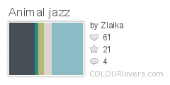
First, the theme was lilies. I combined actual lilies and fleur-de-lis. The colors I got from the list of prize winning varieties of lilies from Wikipedia, collected on a board 
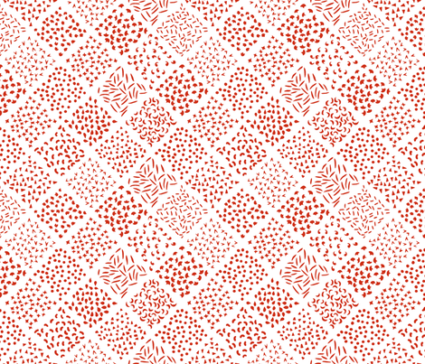
here. The background is the same pattern as I used for the bark on my bonsai trees, and the leafy pattern on the fleur-de-lis is the "kelp" pattern I've used for a few things.

Lily and fleur de lis color study

I got 32 votes for this and finished right at the top of the bottom third. There were several entries in this one I really, really liked: a riotous combination of lily-named flowers with other vegetation, one in the style of William Morris, and a bright, stylized take.

Then there was another contest to make a floral design, but in a black-and-white line-art style, such that it could be used like a coloring book page. The idea being, you could use it as colorable wallpaper. I pondered trying to do something inspired by ikebana (Japanese flower arranging) but beyond making a board with some of the stuff I liked best I couldn't get that idea to gel. I just combined my eight favorite flowers: honeysuckle, jasmine, orange blossoms, fuchsia, lavender, California poppies, borage, and snapdragons (Side note: since some people tag bonsai as ikebana, I discovered that you can make some of these into bonsai, which made me hyperventilate a little to be honest)

My favorite blooms

This entry got 47 votes and came in right in the middle. The design I could most see myself using as coloring book wallpaper was this one, and the design I liked most on its own was this more graphic one.

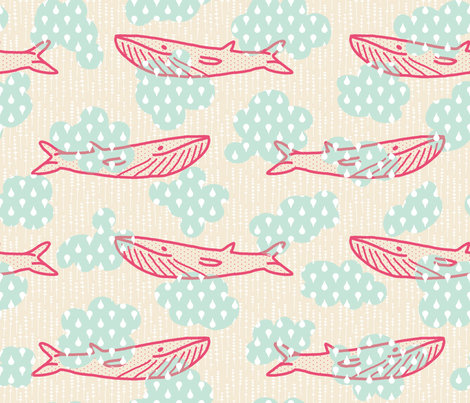
Continuing the plant theme, there was also a contest for terrariums. This was one of those themes I found intimidating, as it's easy to imagine all kinds of amazing, lush illustrations on the topic, but hard to execute them. So I took a very graphic, subdued take. I had fun looking up neat terrariums on Pinterest, though. I based the colors and proportions on this very tiny spice jar terrarium. The textures I used here were the isometric dots and lines I originally made for my school papers and the lattice (all of which can also be seen here), plus the knit I've used quite often.

Moss Terrariums

This entry did not catch on, got 12 votes, and finished in the bottom 10. My favorite was this one.

For the contest closest to Earth Day, the challenge was to make a 1-yard pattern for a reusable tote bag. The bag itself didn't necessarily need to be Earth Day-themed, but I decided to use a couple of my existing designs that are nature themed, and combined them together with this tote pattern that I liked. This uses the "kelp" mentioned above in two color combinations, the "star" pattern in two more, the meerkats I drew for my son, and the map pattern, which is one of my most popular. (I pulled the other fabric colors from the map design.)

Meerkat Tote Kit

My tote did pretty well, getting 132 votes and just squeaking into the top quartile. My favorites were this bright one in modern colors and this more serene, mid-century-ish take.

There was actually another holiday-related cut-and-sew challenge. Another tea towel, but this one with one of "Mom's" recipes on it, in honor of Mother's day. I knew immediately that I would adapt my mother's banana bread recipe (which she got from my paternal grandmother). And for fun I drew it as a diagram instead of writing out the recipe (plus this is really how I think of the recipe in my head). The colors are the same as the last time I combined family lore with a towel. The blue/green background patterns are, yet again, my "kelp" and the "knit" both mentioned previously. The brown texture in the border was one I put together for the "anti-Valentine's" faux-cross-stitch.

Banana Bread Diagram Recipe Towel

I got my hopes up pretty high for this one, as it gained a lot of "likes" through the week - enough to make it my second-most-liked design ever (behind Baby's Book of Computer Science, of course). But even so it ended up with 84 votes, and just above the median. The entry I could most likely see using as an actual kitchen towel was this one, which combined an actual old hand-written recipe card with some textures from hand-me-down cookbooks.

Sunday, April 13, 2014

Things that get wet: small and large

The latest contests were for galoshes and whales. For the whales contest, we had to use these colors:

Spoonflower_Whales
Color by COLOURlovers

Which annoyed many people on the forums as being very un-whale-like (and not having a lot of contrast). I discovered that these colors were actually a subset of the twelfth-most-popular color combination ever on all of ColourLovers:

LoversInJapan
Color by COLOURlovers

So it seems that they simply picked a well-loved combo without thinking how challenging it would be for a fabric contest. OR, as the forum conspiracy theorists would have it, they deliberately picked a challenging combo to reduce the number of contest entries! (Mainly because voting can be a very tiresome activity when the number of entries creeps up much past 150 - I would love to see a chart showing number of entries vs. number of people who voted to see if there is a noticeable effect)

In any case, I did my best to work with (rather than against) the colors and did dreamy whales floating in clouds.

Candy Whales in Minty Skies

The first time I put it all together, I had placed the clouds randomly, hidden them, and then drawn the whales. By sheer chance nearly every whale had a cloud right over its face and it made my nose itch to look at. So I had to shift things around but I'm happy with it now. (The background pattern is the lavender again, by the way)

This came just into the top half of the entries, with 58 votes. My favorite entry was this, which I want to make into a Hawaiian-style shirt (or maybe a sundress).

For the galoshes contest, I used these colors, and then arranged stomping galoshes inside giant rain drops. (I actually shrank down that same rain drop pattern and used it inside the whale design above for the clouds)

Splish Splosh Galosh Galosh

The background uses the basic linework from the interwoven knot design I made for Maren's collection. I'm pleased with how it came out but it did not make a "splash" (har-de-har) in the contest - I got 17 votes. My favorite was this ultra-cute design with bunnies.

Saturday, March 29, 2014

Get some sleep, it's a school night

After the last roundup of mediocre-performing contest entries, now I have two to summarize that did a little better. First, the theme was "bedtime," with these colors:
Spoonflower_Bedtime
Color by COLOURlovers

I was inspired by a "lovely rooms' tumblr, and made an orderly jumble of inviting turned-down beds. The lines are colored with a gradient of the two shades of blue. The background pattern is a smaller version of the lavender I made for Maren's collection. - thinking about being tucked into bed makes me think of my mother's lavender-scented lotion. The sheets and bedspreads are also filled in with existing patterns created for previous designs: shells, grass tufts, dots, knit, lattice, and bricks.

Time to get tucked in

This came in 48 out of 254, with 109 votes - the highest percentile placement I've had since my blue jeans entry! My favorite entry had a similar dormitory feel, but a much cuter style. I was also not the only person to think of lavender.

Next, a design for "science fair." Two of my own science fair experiments I remember the most involved growing radish sprouts in different colors of light and with different watering liquids. So I thought of framing radish sprouts with rays of light or streams of liquid, and abstracted it from there. I re-used all the patterns mentioned above, plus others in the paper patchwork, my omnipresent eucalyptus, speckles, and stars.

Radish sprouts with different treatments

This came in 67 out of 157, with 98 votes. I also uploaded a version with just the background diamonds, and no sprouts, in case anyone wants it. This contest didn't produce many designs that had standalone appeal, to my eye, but my favorites were the lunar cycle and glassware.

Saturday, March 15, 2014

History, both recent and not-so-recent

Time to give an update on how my latest contest entries have done. But one other point of news: my "Baby's Book of Computer Science" has just exceeded 100 "favorites"! (In fact, 105 at the time I'm writing this.) Nothing else is even close - 22 for the painters' eggs, 21 for the ghosts, and a bunch in the teens. On to the more recent ones!

First, the theme was "history of Jazz." I'm not a big fan of the genre, but took a stab at it anyway. According to Wikipedia, the principle characteristics of jazz are polyrhythms, swung notes, syncopation, blue notes, and improvisation. Also, much of it carries on from African musical traditions, many from the Congo River region, so I wanted to tie in a little of that for the "history" part of the theme. I looked at textile designs from the cultures in that part of the world, and found this one, from Kuba culture, that called to me. I took the inner checked sections and adapted them into ovals.

I used the inner grids to represent notes, which are offset in different ways to represent they polyrhythms, swung notes, and syncopation. And of course some colored blue for the blue notes. The improvisation is represented by the links between the ovals, letting you take varying paths all around the design.

I had no idea what colors to use, so I looked around for jazz-inspired schemes until I found this one I liked:
Animal_jazz
Color by COLOURlovers

And it all came together like so:

Jazz Principles Kuba Cloth

This came in the bottom fifth, with 24 votes. My favorite was the one inspired by kente cloth.

Next the inspiration was "gemstones and geodes." This was another one like Great Barrier Reef that I found intimidating. I realized I had a design already that contained some gemstones - rubies and pearls in my literal computer languages. So I took just those elements and made them a coordinating design.

Rubies and Pearls

This came in juuuust above the bottom third, with 33 votes. My favorite entries were the pebbles, turquoise, and retro graphic jewels.

And finally, in honor of International Women's Day, we had to do a design inspired by inspirational women - leaders, scientists, etc. BUT, it had to be a toile. Hmm. For subject matter, I picked up something from my own family history. During WWII, my grandmother was one of many students who worked as a "civilian computer" for the US Army. (Big thanks to my dad for supplying more information about this!) She had to analyze pictures that had been taken of blinking lights on bombs dropped out of planes, extracting data that would eventually allow bombing tables to be calculated. Nowadays, this kind of thing would of course be done in a fraction of the time on an (electronic) computer.

However, these civilian computer projects were in fact a key step towards the development of modern computers, and some of the women who worked there went on to be the first programmers of ENIAC. (Among them: Adele Goldstine, who wrote the world's first computer manual, and Betty Holberton, who was responsible for the classic beige color of all our computer cases for so many years) It was nice to learn that women had key roles in so many milestones like this. As a computer programmer today, it sometimes feels a little odd to be one of the few women in the engineering department. Finding out things like this remind me - I'm not an anomaly!

So for the toile, I honored those young wartime computers who set the foundation for all that.

WW2 Civilian Computer Toile

I collected a board of 40's daywear to try to get a feel for the clothes (and hair!), including pictures of women working as computers or operating ENIAC. The lettering is inspired by the look of contemporary typewriters, such as used for the ENIAC manual. The colors are also supposed to be forties-ish - forest green on pink.

This came in, again, in the bottom fifth, with 37 votes. My favorite, for having both good subject matter, visual appeal, and fits in the "rules" of being a toile, was probably the blue one with many different female scientists.

Thursday, February 13, 2014

Happy Valentine's Day!

Yes, I know it's not until tomorrow, but not only did my husband and I already exchanged our presents, the Valentine's-associated contest at Spoonflower ended today. Actually, the theme of the contest was Anti-Valentine's Day, and in addition had to be faux cross stitch.

I spotted some early entries, before I started mine, which were pretty impressive: one that fully embraced the cross stitch format, and one that brought candy hearts into the mix - and both exhibiting exhilarating levels of unromantic snark. So I decided to take a different strategy. Rather than say something negative about the usual sentiments of the holiday, I wanted to say something positive about something that was the opposite any those sentiments. I looked around for quotes about being by yourself, and at various vintage samplers (you should be able to pick out my reference material from here). And for the colors, I decided that the Synergy "serenity" colors, which I had previously used for my newborn dinos, would be a good fit both for the material on its own, and as a further contrast from traditional Valentine's pinks. So assembled into a panel and put in a simple repeat, it came together like this:

Companionable Solitude Motto

But then I started thinking about how you might actually use this fabric, and decided to make a format where you could actually use (almost) everything in a standard fat quarter. That size actually makes a good fit for a 16" square (as we learned with the Spring Cheater contest), so I decided to go for something that you could make into a front for a 16" throw pillow.

Companionable Solitude FQ Panel

I'm very happy with how this came out. I even took the time to turn some of the elements into their own repeats - and I could happily add more, given time. I got a respectable 117 votes, and just squeaked in to the top third in the rankings.

Thursday, February 6, 2014

Papercut

This week's contest was one of those that requires a format, instead of themed content. In honor of the Chinese new year, we were asked to make red and white designs that looked like Chinese paper cutting. I decided to take a sly approach to it and made an arrangement of shapes that looked like the leftover snippets.

Papercut Leavings

I got quite a few nice comments appreciative of the humor, but it obviously has more of a niche appeal when there were so many ACTUAL nice paper cut-style designs.. It got 56 votes and came in 133 out of 218, so just a hair better than last week. My favorite entries were the garden birdsstylized zodiac animals, patterned hexagons, and teapots. I also really liked the guitar-shaped dragon panel. And for a more usable general fabric, the simple clouds are a nice idea.

Sunday, February 2, 2014

Little houses, all in a row

The theme this week was the "Great Barrier Reef." I found it rather intimidating, since I could picture right off all these amazing, hyper-colorful underwater seascape prints, brimming with dozens of different life forms. I decided to focus on just the coral part of things - and doing it in a cutesey, anthropomorphic style. My take was to draw a little village of coral polyps, each in its own little "house" of calcified excretions. I looked around for color inspiration and found this:

Coral_in_the_sea
Color by COLOURlovers

I originally wanted it to be a little more organic - not so geometric of a layout, and each house is slightly different - but that was giving me fits so I stuck with one "style" of house in a regular hex layout. It's hard to see at this scale, but each little roof has a thatch texture and the walls have a brick texture.

Happy Calcareous Village of Coral Polyps

This came in 148 out of 228, with 49 votes. There actually weren't any fabrics that went as all-out as I had imagined (how much easier it is to imagine those kinds of illustrations than bring them to life!), but this one in graphic style one probably got the closest. I also liked this one in an indigo/gold color scheme, and this assortment of corals and sea plants. For more subtle entries, I liked the brain coral texture, tonal sea plants, and super-simplified fish.

Monday, January 27, 2014

Ahead and behind

First, the "behind" - I have two contest entries to blog about.

First, we had to do a cheater print (previous cheater contests have been themed with zig-zag and robots), this time including something floral and being seasonally apt for Spring. And also using these nine colors (plus white):

Cheater_Spring_Warm
Color by COLOURlovers

Cheater_Spring_Cool
Color by COLOURlovers

I searched around for florally-suggestive traditional quilt blocks and liked "Thistle Bloom." That design requires five different fabrics. As a twist, though, this is a square block and the contest entries get shown on a 21" by 18" fat quarter, so I tried to come up with a way to have it work as a full FQ or if you just wanted a square block. My solution was to make the block a fairly standard 16", then add a 1" seam allowance all around, then add 1.5" sashing to each side to fill it out. So with a different design for the allowance, that brought it to six sub-designs.

I considered drawing six new floral repeats, but got a little light-headed at the thought, so instead I just took some of my existing designs that have gotten the most amount of positive attention and recolored them. I even managed to upload them all as their own repeats, so you can see them all here.

The easiest, just involving swapping the colors, were the seadragons, the basic stitching, and the baby praying mantises. I also took the "wailing spirits" and redrew their faces so they were happy and laughing instead. I had previously turned the campground patten into an abstract texture, so I used that one again as well. And finally, I took just the Rothko egg from the painters' eggs and put that in a small repeat.

So the end result:

Spring Thistle

I ended up using only the cool colors, plus the light yellow and pink from the warm. I thought it would give a more serene look, but I think it was a mistake as it simply looked washed out compared to all the other designs that featured the red, in particular. It came in a bit below the 50th percentile, with 60 votes. My favorite entries were the ones based on millefiore and Baltimore-style applique. For plainer types of patchwork cheaters, I really liked the 3" squares, hexagons, and cathedral windows.

As to the "ahead" part of the post title - I had managed to get ahead of the contests by the time I was working on this cheater, so I even made a few more coordinating designs. I put just the 16" patch in a repeat without the extra filler:

Spring Thistle Yardage

And I also made some plain quarter-inch checks using various combinations of the same colors I used in the other fabrics, and combined them all to make a nine-patch cheater print:

Spring Ninepatch Cheater


Part of this burst of coordination was also procrastination, because I was lacking inspiration for the next challenge, which was "magic" (as in Houdini, not Harry Potter). I had an idea of a scatter print of white-gloved hands in poses suggesting sleight-of-hand, but hands are some of the most challenging things to draw, so I kept putting it off. But, finally, I loaded up a video of Penn and Teller demonstrating their principles of magic and did my best on a representative sequence. It was at that point I decided to just put the hands in orderly rows, so that you could "read" them in order like a little illustration of the technique.

I decided to use the Synergy "movie" palette, which is a bit of a stretch theme-wise - still entertainment, I guess? I plan on also doing a version with hands clapping, so perhaps that can bridge the gap. I entered this version in the contest:

Sleight of Hand

And I also did a version with a gray background. My entry came in 34 out of 119, with 105 - a pretty good showing! My favorite entry was the playing cards.

Sunday, January 12, 2014

Resolutions at 150 DPI

Since it's still right at the beginning of the year, the contest that finished last week was to make something that portrayed a new year's resolution - which had to contain at least some hand-written text. Since "saving money" is one of the most popular resolutions that people make each year, I went in that direction. My husband gave me the idea of having coins marching into piggybanks. Thinking of piggybanks reminded me of this previous pig-based design, which since it has pink tones, plus silver and gold for the coins, seemed to hit the mark perfectly. (I have used these same colors for a few other designs as well).

Galloping Piggybanks! Dancing Coins! Saving Money!

This came in 63 out of 109, with 54 votes. Lots of people did assortments of resolutions, rather than focusing on one. My two favorites were like one - one more graphic, based on tags, and the other very painterly, based on flowers and leaves.