Showing posts with label fabric. Show all posts

Saturday, March 12, 2016

Love/air/etc

For contest coinciding with the week of Valentine's day, we had to do something regarding romance plus weather - e.g. "Love is in the air." I decided to do something representing the atmosphere as a whole. So, I went with representations of N2 and O2 molecules, which make up 78% and 21% of the atmosphere respectively. The black outlines here are for nitrogen, and the gray is for oxygen (I approximated the ratio in my design).

Un

The outer shapes of the molecules can also be read as infinity signs. The white hearts represent the electrons - you can see O2's double bond and N2's triple bond.

I titled the design "Un'aura amorosa" as this is the title of one of my favorite Mozart arias, which means "A Loving Breath," and seemed thematically appropriate. (Perhaps though I should have done the ratio of gasses in an exhalation and added CO2 as well...)

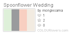
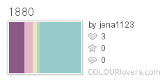
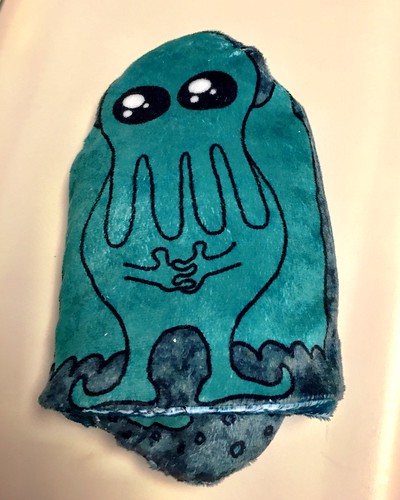
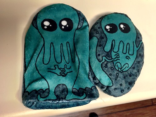
There were a lot of good entries in this one. These rainbows and these flowers are two prints that I want to make into clothes and send back in time to my six-year-old self. My favorite overall was this more geometric take. Mine wasn't popular and came in quite near the bottom.


Saturday, February 20, 2016

Wedding Pastels

This week's contest required a restricted palette:

Spoonflower_Wedding
Color by COLOURlovers

Also including black and white if we wished. And we could make it wedding themed if we liked. I went very slightly wedding-themed by using ampersands. (Y'know, joining two things together...)

Wedding ampersands

I was thinking of doing a bunch of different ampersands, but eventually decided it looked nicer with just the one over and over. I arranged the colors to make a semi-plaid. This entry maintained the pattern I've been in - twenty-something likes, several dozen votes, ending in the bottom half. My favorites were the roses, the fruit, and the gems.


Sunday, February 14, 2016

Animal pals

For the theme "interspecies friendship," I had about an hour to pull something together. Originally, I was going to do a representation of the Norse myth that there's a squirrel that runs up and down the world tree, bringing gossip back and forth between the dragon at the bottom and the eagle at the top. When I was looking up the names of these animals, I found out that in the legend, the eagle actually has a hawk on top of his head! This struck me as funny so I went with just that pair.

Hawk and eagle at the top of the world

My favorite was the super-cutesy sheep + bird. My design made no impact in the competition and remained in the bottom third. I'm pretty happy with how it came out, though.

Thursday, February 11, 2016

Eighties Hair

For the theme "eighties hair," I went for the classic decade avoidance strategy and changed centuries. Yes, I did 1880's hair instead of 1980's.

Hairstyles of the 1880s

As is usual, this came in about in the middle - but for the first time this year, it actually squeaked just into the top half! There were very few designs in this one I liked at all, but I thought the most appealing were the hair bows.

Edited to add: I gathered up this board of hairstyle inspiration, and used (some of) these colors:
1880
Color by COLOURlovers

Wednesday, February 10, 2016

Year of the Monkey

Recently, the contest theme was monkeys, since this is the year of the monkey in the Chinese zodiac. I went with just the Chinese symbol for monkey, using the colors, white, gold, and blue, which are supposedly auspicious for the year of the monkey.

Monkey ideogram - blue/white on gold

The colors are actually the same as the ones from the state fair ribbons. I looked up several different versions of the character to try to come up with a rendering somewhat like what would be used in a chop,

I had so much fun with this, I tried making versions for all twelve animal ideograms of the zodiac, continuing to use the recommended zodiacal colors as documented on wikipedia. You can see them all here.

My entry came in right smack dab in the middle of results. My favorite was this landscape of frolicking monkeys.

Tuesday, February 9, 2016

Spin spin whoosh smack

For the theme "pinata," I went with some traditional star-shaped pinatas, arranged into a pattern based on this tiling. The colors are the synergy "mad" set, previously used here.

candy madness

This actually seemed like it was going to perform better than I expected - twenty-six likes! However, it got barely more votes than that, and came in about two-thirds down the result list. My favorite entry was the crepe paper fringe repeat.

Sunday, January 17, 2016

Rock and Roll

For the theme of rock and roll music, I wanted to avoid referencing any specific artist, so I depicted the drum notation for a "back beat," one of the key rhythms that distinguishes rock music. (Inspired by the Wikipedia definition of hard rock).

Back beat

The background texture is based on the kuba cloth ish design I did for the jazz contest, and the colors are from the Sgt Pepper album (i.e. the shiny psychedelic band outfits of the four Beatles - ok, so I did end up referencing a specific artist).

My favorites were the 45 rpm inserts (there were several designs of those, but those gold ones were the best) and the palm frond guitar picks.

Saturday, January 16, 2016

Windows

For the theme of "windows," I adapted two common quilt piecing designs with window names - cathedral windows and attic windows. I used the "bedtime" colors previously seen here. I combined all that together like so:

cathedral windows in attic windows

I think this would make a pretty good cheater print. Funnily enough, this got exactly the same number of votes (49) and favorites (14) as last week's Auld Lang Syne design. This contest had almost twice as many entries, but I retained essentially the same relative placement (in the bottom half). My favorite entry was this one.

Saturday, January 2, 2016

Design for the new year

This week's theme was "New Year's traditions" - either what you do during the celebration or immediately at the beginning of the year. I decided to do a typographical design using the lyrics of "Auld Lang Syne."

I picked these colors, so the design came out like this:

singing in the new year

This was another challenge were I felt like very few of the entries were visually appealing. This one I liked the look of most. Mine didn't quite make it into the top half of entries.

Sunday, December 20, 2015

The zen of knitting

In my sleep-deprived state (due to the 11-week-old baby), some of my thought processes are a little off. When I came up with the idea for the "knitting" design contest and started it, I swear it made sense. On reflection, perhaps not so much.

In any case, I started off with a list of knitting abbreviations, and was going to do a typographical design with those. Somehow I thought of making each abbreviation a rock in a zen garden, so I used colors from this print to try to capture a little more Japanese flavor. It all came together like so:

Zen of knitting

I'm mostly happy with how it came out, but it is, as my mother said, "rather obscure." The main problem with it is that, from a distance, it looks kind of...scabby. Hmm. It made no impact in the contest.

Faux-fairisle/Christmas sweater knits were a recurring theme, of which this was my favorite. Also popular were repeats of balls of yarn, of which I liked this the most.

Monday, December 14, 2015

Gift bag

This week, the design challenge was to make a at quarter cut-and-sew kit for a reusable gift bag. I based mine on this pattern, and reused my snow angel design. The light-colored fabric for the lining is the basketweave seen previously.

Snowflake snowangel giftbag kit

I got enough votes to just make it into the top half.

Most of the entries were pretty disappointing. A significant proportion of people ignored the whole cut-and-sew kit thing and just did the usual seamless repeats. The number of entries that were actually visibly appealing was quite low as well. Two that I did like were the ornament bag and the one that looks like a gingerbread house.

Friday, December 4, 2015

Family portrait

For the "family portrait" theme, my photographer husband gave me the great idea of doing kid's faces, making all the expressions besides smiling when pictures are being taken - eyes closed, fake smiles, etc. I had a lot of fun drawing a bunch of different exasperating children.

Hold still and smile, darn it!

This was a tough contest to try to do something actually usable as a surface design, and not just a repeating illustration. (I don't consider myself to have succeeded in this regard either!) My entry just made it into the top quartile - not too shabby. The entry I liked best was this very cartoony one, which I could see being used for kid's pajamas or the like.

Thursday, December 3, 2015

Constructing Cthulhu

I was finally able to sew together the Cthulhu pillow I designed - I gave it to my niece for her birthday. Fortunately, my design worked the way I was hoping so I don't need to tweak the fabric.

I got it printed out on the "minky" fabric, which looked like this:
Sewing together Cthulhu pillow

Then cut out all the pieces.
Sewing together Cthulhu pillow

First, I sewed together the inner pillow, right sides together, leaving a gap for reversing and stuffing.
Sewing together Cthulhu pillow

Sewing together Cthulhu pillow

Then I filled it with rice. (And sewed the gap shut - by hand - after taking this picture)
Sewing together Cthulhu pillow

Next, I sewed the two sides of the slipcase together separately - just along the curve, leaving the bottom open.
Sewing together Cthulhu pillow

Then, I turned one half of the slipcase right side out and put it inside the other.
Sewing together Cthulhu pillow

I sewed the two halves together, again leaving a gap.
Sewing together Cthulhu pillow

Here's what it looks like turned right side out.
Sewing together Cthulhu pillow

And then turned so that the lining is inside the outer case, gap sewn shut.
Sewing together Cthulhu pillow

And voila, now the rice-filled pillow can be heated or cooled, and placed inside the slipcover!
Sewing together Cthulhu pillow

Sewing together Cthulhu pillow

Also you can reverse the slipcover to show the pattern on the other side.
Sewing together Cthulhu pillow

Saturday, November 28, 2015

The moon, the sun, and so forth

For the theme "lunar cycles," I made a representation of how the lunar cycle matches up with the sun. Specifically, I realized I wasn't clear on what cycle determined whether you could see the moon during the day or night. So, I looked it up! The answer being: at the full moon, it rises at sunset, and rises later each day, until at the new moon it's rising at sunrise. So I tried to capture this:

lunar cycle over time

The gray half-circles indicate when the moon is up, and the yellow/orange represent when the sun is up. The small light blue half-circles are for the high tides. I tried to balance being representational with being abstract enough to be a usable stripe/dot. It came in the bottom half of entries.

I knew there would be a lot of designs that had all the phases laid out in a row like I did, but I stuck with it anyway. My favorite in that vein was this one, plus this one that put them in a circle. Others I liked were the ones that looked like a quilt, sort of Scandinavian, or retro and sketchy.

Monday, November 16, 2015

Fitness and health

For the theme of "fitness," I was still thinking about the various glyphs and symbols I worked with last week, and wanted to do some basic icons related to fitness. I have a very young baby (almost 7 weeks!) so I'm not able to think much beyond the essential functions for life. So I came up with some very straightforward advice on health: get enough sleep, get some exercise, eat a balanced diet, and drink plenty of water. I made little "icons" for each of these.

basic advice for health

For the colors, I used the "Doctor" colors from the synergy project, which I hadn't used yet. This entry came in very near the bottom of the contest. My favorite was this nice usage of running shoe treads.

Monday, November 9, 2015

The yearly calendar

Every year Spoonflower does a contest to put next year's calendar in a fat quarter-sized design, such that it can be used as a tea towel - you can see my previous entries here. This year, I was initially going to go with something generic that people like to have in their kitchens. Uhh, lavender flowers! And let's add fleur-de-lis and go for a French theme. But when I started trying to make the basic layout of all the numbers, it seemed kind of dumb and pointless. Back to the drawing board.

I had been laying it out in a diagonal checkerboard pattern, so I stuck with that. Then I had the thought to fill the background of each of the diamonds I was going to put a month in with just a large initial for the month. But, starting with "J", that seemed like it left too much empty space, so then I did the three-letter abbreviations instead, trying to stack them together like Mayan glyphs.

The Mayan connection reminded me of the ancient Egyptian colors I used before, so I used those. I made a polka dot background - instead of just circles, it's X's, stars, hexagons, and bursts, which you can see better here. I'm actually really happy with how that came out - it's one of the few designs I've made that came out exactly like I envisioned it.

In any case, the calendar came together like so:

Glyph Calendar 2016

It didn't go anywhere in the contest, but two people bought it. My favorite was this one.

Monday, November 2, 2015

After the apocalypse

This week's contest was another one for a toile, but with a "post-apocalyptic" theme. I went right for the "only the cockroaches will be left" approach, and drew some giant, irradiated cockroaches wandering around in overgrown ruins. I tried somewhat to emulate the style of Tom Gauld as a guide to conveying atmosphere without a ton of detail.

giant roaches among the ruins

For the colors, I used a subset of the ones from my sandcastle entry, since I thought it had a bit of an eerie feeling. This came in near the bottom of the results. My favorite entries were this cartoony one that depicts life after an alien takeover and this sketchy, nearly-abandoned cityscape..

Friday, October 23, 2015

A tasty bacteria

For the "micro-organisms" theme, I went with depicting the bacteria that makes yogurt possible: lactobacillus. In photo micrographs, it has a pretty basic cylindrical shape with rounded ends - like a pill capsule. I went for that look, and used the colors from the "spring" set.

lactobacillus makes yogurt

I think this is pretty fun, and could even be mistaken for sprinkles. This came right smack dab in the middle of the results. My favorites were this very geometric one and this one with some interesting textures.

Thursday, October 22, 2015

Cephalopods

For the cephalopod theme, I drew some squid egg casings, which are weird and interesting but simultaneously cute. Here are some of the reference images I used: 123.

I used these colors:

squid_and_the_moon
Color by COLOURlovers

And here's the result:

squid egg cases

The background texture is my good ol' kelp again, and the texture on the branches the cases are attached to is a basketweave. My favorites were the tentacle stripe, this very cutesy design, and this more grown-up take.

Wednesday, October 21, 2015

Pop art cookies

We had yet another "pop art" theme, this time for cookies instead of chickens. I stuck with Murakami as my inspiration again but went with his flowers this time.

I used these colors:

Pop_Art_Kiss
Color by COLOURlovers

So it came together like this:

superflat cookies

The gray background is supposed to make it look like they're still on a cookie tray. I think I have improved my technique a little and they look more like iced sugar cookies than my previous attempt.

I was surprised at how many macaroon entries there were. That actually included my favorite (which was the ultimate winner).