Spoonflower had a contest for a mermaid design - and this was another partner contest. The winner has a chance at getting their design made into girl's pajamas! So they had some (somewhat confusing) guidelines about not making the design motifs too big or too small, and not using more than eight colors. I didn't fuss too much about it, because I had my own purpose in mind for a mermaid design.
I was getting ready to make another set of three bags for our upcoming family Redwoods trip, and unlike
last year where I used fabric I had on hand, I wanted to make specific fabric designs for each kid for their bags. So for my niece, I wanted to make robot mermaids, using the same colors as her
robot quilt.

And here's how it turned out as a bag:
The
fabric for my son features some of his favorite things: dalmations, a convertible Mustang (just like Dad drives- well, except in yellow instead of gray), giraffes, and penguins. The penguins are facing each other because the last time he went to the zoo, he got to see two penguins pecking at each other and thought it was the most hilarious and interesting thing ever. "They were playing penguin BEAK FIGHTING!" he would say, with accompanying hand gestures. This uses the same set of colors as my
animal tax accountant design.
 Color by COLOURlovers
For my nephew, I found an interesting palette with his name:
 Color by COLOURlovers
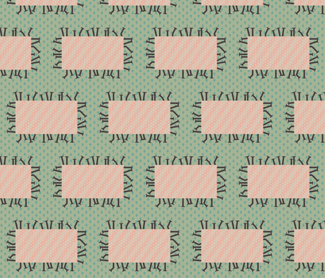
And for
the design, I combined some of his favorite animals: cheetahs, dragons (a two-legged wyvern style) and penguins.
So for my family it worked out well but made no impact in the mermaid competition. My favorite entry was this
night-themed one.


