Well, I messed up last week's contest. Plus, the contest ended on Thanksgiving, so I couldn't write about it until now. The goal was design an advent calendar - it didn't necessarily have to count down 25 days until Christmas, but the idea was some kind of counting calendar with things hidden in pockets or behind doors. I originally wanted to do a full advent calendar like the ones my mom made when I was a kid. She made two, which were these wonderful Victorian-style houses made of paper, with pictures behind the doors and windows. Since we celebrated both Hanukkah and Christmas, she would always put pictures for the days of Hanukkah that fell in December. For instance, in one calendar it was simply menorahs with the right number of candles lit, and in the other the pictures told the story of Hanukkah, with little stick figure Maccabees liberating the temple and finding the miraculous oil that lasted eight days. She also put in a picture for the Winter Solstice, which falls on the 21st or 22nd. Since those days change every year, she had to move around all the pictures. The remainder were filled in with more traditional holiday stuff. The first calendar had drawings of different ornaments on each day, with the 25th showing a tree with all of them hung up. The second one showed a snowman with more and more features each day. She said that a hard lesson she learned after making the first calendar was that having all the windows & doors at different sizes each year made it really hard to switch it around! She sometimes had to redraw the pictures if they ended up in a really different window. But then, some years later when she made the second one, she forgot about that in the rush of inspiration - and made all the windows & doors different sizes again. Oops!
So anyway, I do eventually want to make something like that of my own, with pictures for Christmas, Hanukkah, and the Solstice that move around every year, but since I had been spending my limited crafting time finishing
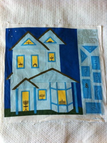
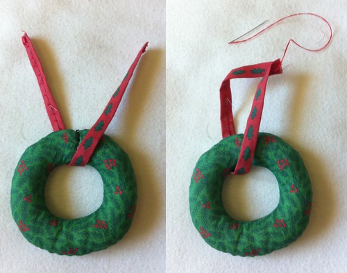
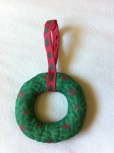
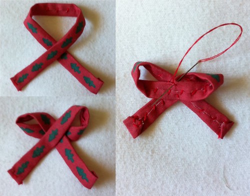
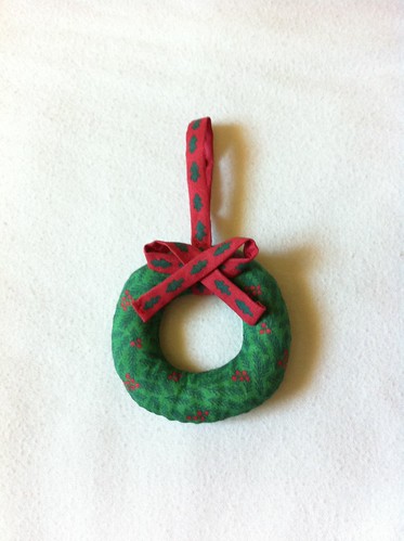
this quilt, I had only a few days to work on the advent calendar for the contest, so I quickly decided to be less ambitious. I still stuck with the Victorian-style house though. I realized I could do just Hannukah, and have only eight openings to deal with! So I drew the house, with a menorah in each window, and then coverings for each window & door. It was fun to come up with eight different menorah designs! As I was making it, I was thinking to myself, wow, it's pretty cramped to fit this on a fat quarter with only eight! The openings/pockets for a regular 25-day calendar must have to be pretty tiny! Ah, foreshadowing.
Anyway, I finally managed to wrap it up in the early evening the last day for contest entries. I would have loved to have gotten more detail on the house, but I'm still happy with how it came out. I uploaded the design to Spoonflower, and entered it into the contest. However, I noticed that on the page where they show you how it will look when people are voting, it looked strange - instead of filling the whole rectangle, my design floated in the middle with a huge blank margin all around. So I took a look at the contest page again....and oops, it turns out the idea was to create the calendar on a WHOLE YARD, not a fat quarter! Eeeeeuuurghhhhhhhhh.
I wrestled briefly with the idea of trying to hurriedly adapt it to fit on a yard. Perhaps I could make a version where you could buy either a fat quarter and get just what I'd done so far, or buy a whole yard and get extra decorative bits, like backing, strips to hang it with, etc. Then I decided to just go with what I had. I'm just doing this for fun, after all, no need to stress! I still left it as a contest entry - no reason not to.
After all that,
my design came in
28th out of 41, with 111 votes. I'm sure I would have done better if I had done it correctly and filled up a whole yard, but I was the only one to do a Hanukkah calendar, so at least I stood out in a good way in that aspect!