Friday, March 27, 2015

Beagles

I managed to catch up with the last few months' worth of contests, so I only have this week's to cover now. The theme was "beagles." (Since the most recent winner of the big dog show was a beagle.)

I was inspired by this diagram (for which I can't find the original source) showing all the different possible colorations for beagles. I'm pretty happy with how the doggy facial expression came out.

Beagle Buffalo Check

As usual, this came in right in the middle of the competition. My favorites were the trotting beagles, tessellated beagles, and batik-style paw prints.

Sunday, March 22, 2015

Best recent contests

Bringing the catchup to a close, here are some contest entries that have done quite well (by my standards).

For the theme "calligraphy," which also had to be in black and white, I focused on ligatures - joined-together letters. I thought it would be fun to put them in circles, to focus on the shapes rather than making it look like something you should be reading.

ligature medallions

This got 149 votes and came in 26th out of 205! My favorites were the textured assortment of pens and ink (which won), the friendly speech bubbles, and the bold sampler.

For the yearly tea towel calendar, I did an assortment of ephemera - menus, tickets, etc, each of which had one month's worth of numbers on it.

Calendar of all kinds of paper

The background is the "kitchen table" I created previously. This got 186 votes, almost made it into the top 20% of entries, and I even sold a few. The ones I liked best were the tall ship and the trees.

Finally, near the end of October, there was a contest to do something related to Calaveras, a.k.a. sugar skulls. I pondered what kind of shape or creature to apply that decoration style to, and since there are so many oak trees around here, settled on acorns. Also, the Synergy project has a "haunted" color group, so I used that to tie it into Halloween more specifically.

Spooky Sweet acorns

I had a lot of fun with this one and I'm quite happy with how it came out. It got 42 "likes" (second only to Baby's Book of Computer Science), 198 votes, and came in 29th out of 250. My favorite (other than my own!) was this one.

The most recent contest was a good one for me as well. The theme was "spoons," this being Spoonflower and all. I tried to think of something other than "cutesy layout of spoons in nice colors," since that would be what most people would do. I tried to think of some other theme to apply to spoons - Disney princesses as spoons? The seven deadly sins as spoons? Eventually I settled on putting a piece of advice on each spoon, and calling it "spoon-fed wisdom."

Spoon-fed wisdom

The colors are from this menswear palette. The advice is:

  • Don't drown in a cup of water
  • The single biggest problem in communication is the illusion it has taken place (George Bernard Shaw)
  • Not my circus, not my monkeys
  • It's ok to have an unexpressed thought
  • If you can't explain it to a six year old, you don't understand it yourself (Albert Einstein)
  • Worrying won't stop bad stuff from happening, it just stops you from enjoying the good

This came in 25th, ending up in the 91st percentile - the best relative finish I've had so far! Can't complain about that. My favorite was probably this one, which included a bunch of other kitchen implements.

Saturday, March 21, 2015

Passing grades


Often Spoonflower will do contests with a required set of colors, but usually there will be some kind of theme as well. For this one, we had to use coral, mint, black and white - these shades specifically:
Spoonflower_BWMC
Color by COLOURlovers

But there were no other parameters. So there were nearly 700 entries, the largest set ever. It made for quite a long voting process! I figured most people would use white as a background, so I immediately decided to use black instead. I was in the mood to make a floral, so I thought of making it like a calico. I used some of my favorite flowers: jasmine, honeysuckle, orange blossoms, and fuchsia.

Sweet-smelling calico

This did moderately well - almost into the top third. There were a number of other florals/botanicals that I liked, as well as this cute little map.

Another contest was "rockets." Obviously the main focus was supposed to be on the space ship type of rocket, but I wanted to branch out from that. The word "rocket" can also refer to fireworks or arugula, so I combined those two things (the colors are from my previous space ship related design):

Arugula (rocket) fireworks (rockets)

This made it well into the top third. My favorites were the control panel repeat and the abstract take on Apollo rockets.

One very specific theme was "Kittens in Mittens." I focused mostly on the mitten part, and did little paw-tread mittens in this color scheme I'm still trying to get a good use out of.

Mittens for Kittens

This got 155 votes and actually made it into the top quartile! My favorite entry was this one.

Friday, March 20, 2015

Continuing the roundup

A recent contest theme was "libraries." I used some of the colors I had before for library-related designs. I did a play on houndstooth (a fabric maybe an old-fashioned librarian would wear?), and made it look like hands holding a book.

librarian

This got 84 votes and came in the middle of the pack. I liked these expressive books and this assortment of library accessories.

Another theme was ditsy sheep. (Ditsy meaning a small-scale scattered print that can work facing any direction.) Previous ditsy contests have been for crickets, sea creatures, and early on, just ditsy in general with no other theme.  I wanted to go ultra-cute, so I went with lambs specifically. That made me think of the old song that goes "Mares eat oats, and does eat oats, and little lambs eat ivy," so lambs and ivy it is. Since the song is from the 40's, I picked a retro palette:
Japanese_Book_1944
Color by COLOURlovers

liddle lamzy divey

This came just shy of the top half of entries. Some of my favorites were the sheep with flowers (maybe a liiiiitle large scale to be ditsy though...) and the pastel farm scene.

Leading up to the holidays, there was of course a Christmas-related contest. This year it was for ornaments. I went with clove oranges, and used the same colors as a previous Christmas-y design.

Clove Oranges

This one also came in right in the middle. I liked the black and gold, filigree paper, retro graphic, and stamped paper ornaments.

Another contest around that time of year was for (yet another) toile, with a "winter" theme. I made mugs of hot chocolate (with marshmallows of course), in icy blue and chocolate brown.

Winter Symbols on Cocoa Mugs

Each mug is decorated with a different wintry icon. In the contest, it just crept into the top half! I liked this frontier town entry, which reminded me a little of the illustrations for the Little House on the Prairie books.

Thursday, March 19, 2015

Stuck in the middle with hues

Let's continue the contest catchup, with some entries that came in around the cutoff point for the bottom third of entries.

For the theme "umbrellas," I went with those little cocktail umbrellas. I used the same color as my galoshes, and the hibiscus again as the decoration on the umbrellas.

cocktail umbrellas

My favorite were these happy little umbrellas.

The very next week, the prompt was "clocks." I went for a combination of analog and digital clocks. Also, the Synergy project has a "time travel" theme, so I used those colors.

Progression of Time

My favorites were these endless hourglasses and these cuckoo clocks.

Continuing the kind of home decor feeling, another contest was for "tables and chairs." Rather than showing an entire piece of furniture, I tried to show the top of an old, weathered kitchen table. The shades of brown are taken from the seahorse towel design, as a kind of in-joke with myself on the theme of family history.

The Old Kitchen Table

I liked this cute assortment of furniture on postage stamps.

Finally, there was a theme of Australian cities. My thought on that theme was "?????" for awhile, and I finally went with something simply showing the existence of Australian cities: nighttime lights visible from space.

Cities revealed by night

I really liked this modern representation of high-rise windows and these rolling hills.

Wednesday, March 18, 2015

Well, *I* liked them

Continuing my ridiculous amount of catchup, here are some contest entries which I liked, but made little impression on my fellow voters.

For the theme "penguins," I did a little assortment of penguins hanging out on various levels of an icy landscape. The colors are some of the some from the fishing lures entry - and I'm much happier with how the color usage turned out this time.

Penguins on an Iceberg

This barely made it out of the bottom fifth. My favorite was this graphic Antarctic layout.

Moving on to another animal theme, there was another cat-related contest. This time, however, we had to try to do a "cubist" style. Hmm. I gathered up a few pieces of at least semi-cubist art here, to try to get away from the "The Dream"/"Nude Descending a Staircase" axis of cubism. I tried to convey the nonstop movement of kittens by having extra legs and tails.

skittering kittens

The colors came from this set, which someone made in honor of their own cat:

Martin_the_Cat
Color by COLOURlovers

This placed about the same as the penguins. My favorite entry was this one - I felt it referenced the cubist style but still was pattern you could see being used somewhere.

Finally, there was a contest to make a cut-and-sew pattern for a plushie version of some mythological creature. I went with a changeling, as there's a longstanding family joke that I'm actually a fairy changeling, and the real Amanda is off somewhere with the fairies and elves. I had a lot of fun coming up with a whole playset, rather than a single stuffed animal.

Fairy Changeling Playset

Not only are there two babies (one human, one...maybe not), each with their own little bassinet and blanket to allow you to stage a little swap, there are a few things related to changeling folklore. There's a pair of iron scissors - if you leave them open sitting near the crib, it stops the fairies from coming and changing out the babies. Then there's a bowl of eggshells. If you suspect your baby of being a changeling already, you can leave the bowl next to the fire (as if cooking with it). This will eventually confuse the changeling enough that it's forced to ask what you're doing, thus blowing its cover.

I can't wait to get this and sew it together!

Anyhow, fond as I am of this, it didn't get all that many votes, and just squeaked out of the bottom quartile. My favorites were the Grim Reaper, Puss-in-Boots, jackalope, and cyclops.

Tuesday, March 17, 2015

Did better than I thought they would

Sometimes, the voting body of Spoonflower followers mystifies me. I very often have contest entries that don't measure up to how I pictured them in my mind, and much less often than that, they get a good number of votes anyway.

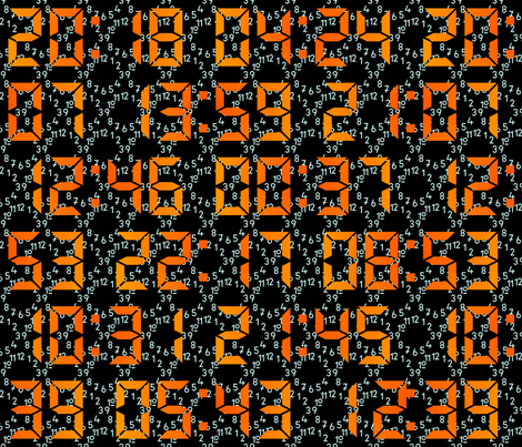
One week, the contest was to do a design in black and white which had something to do with "your neighborhood." I immediately decided to do something with white lines on a black background, since most people would certainly be doing the opposite. Which of course led me to think of nighttime, which made me think of all the nocturnal creatures we can hear rustling around after sunset, up here in the hills.

I'm sure you'll be super surprised to hear this: I had very little time to get this one done. So I did a very loose, simplified sketchy style. Little houses with lit windows, trees, and eyes glowing in the night.

Neighboorhood at night

Not all that pleased with how this came out. I seriously considered not bothering entering it in the contest. But, this actually got 97 votes (and 13 "likes"!) and almost made it into the top quartile. What?? Like I said, sometimes I'm mystified, but I shouldn't complain!

This entry was actually quite similar to what I wanted to shoot for, had I enough time. I also really liked this "European old town" and delightful assortment of medieval architectural details. My overall favorite was this Escher/cliff dwelling/infinite staircase landscape.

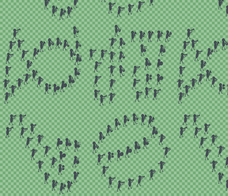
For the "Nutcracker" (as in the ballet, not just the toy) contest, I also ended up doing a black-and-white entry even though it wasn't required. Again, short on time. I referenced the mouse army (interspersed with candy), and once again fell back on a simple, cartoony style.

mouse army

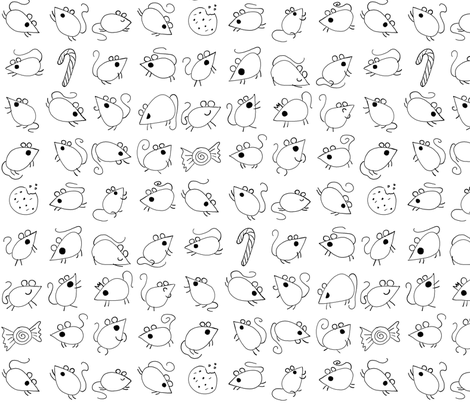
I'm happier with this one than the neighborhood design, but still expected it to rank very low. But, it actually got 92 votes and very nearly made it into the top third! I want to do at least a colored-in version of this at some point. My favorite entry was this one.

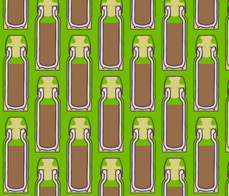
Another propt was "groundhogs." That's a hard topic to come up with an idea which a million other entries won't be using as well. I decided to do groundhogs in their little underground tunnels. As I often do, I used existing patterns for texture: hibiscus for the dirt, and geometric stars for the tunnels.

subterranean groundhogs grumbling

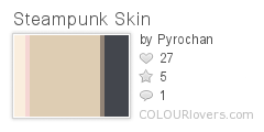
I didn't know what to do with colors, so I just picked the number-one most popular palette on ColourLovers - though I did add a maroon to have a darker detail color.
Giant_Goldfish
Color by COLOURlovers

Astoundingly, this got 139 votes and came in 26th place. Don't get me wrong, I'm much happier with how this one came out than the one above, but that's still way higher than I thought it would place. My favorite was the ultimate winner.


Monday, March 16, 2015

Inspired by the deadline

Having spent a lot of my recent months in a bit of a time crunch, I've had several contest entries that I had to whip out at the last minute. And for the most part, it really shows!

One of the toughest themes to deal with was "marching band" - not one that resonates with me. Also it's hard to come up with something that conveys the idea but can still be quickly executed. My husband came up with the idea of having the band marching in formations that are themselves musical instruments used by the band. I also tried to go for a bit of an Ed Emberley look. Not super pleased with how it came out, but it's the beginning of an idea at least. The individual marchers are cute, but the layout is not very attractive.

Marching band in musical formations

This came in the bottom fifth of entries. My favorites were the ones inspired by the traditional uniform braids and the "self-marching band."

The very next week, I also had very little time. The challenge was to make a cat-themed damask. I went with a damask that could have been made BY a cat:

Damask painted by a kitten

I made a brush in Gimp shaped like a paw print, and used that to outline a traditional damask. Since there's so much symmetry, I only had to draw a portion of it, then mirrored it, so it came together pretty quickly. This version, which came in the bottom quarter of the contest, is ginger cat colored, and I also made a grey tabby colorway. I was inspired by these cat-colored yarns, but got all my colors from this set:
calico_cat
Color by COLOURlovers

My favorite was this ultra-cute one.

But it's not all bottom-of-the heap. This year's Valentine's Day contest also had to have a steampunk theme. I had maybe two hours to make it from start-to-finish, so I used a clipart heart and a gear to get the shapes right, the colors below, and my pre-existing knit and isometric lines patterns.

Steampunk_Skin
Color by COLOURlovers

minimalist steampunk valentine

I got 147 votes for this, and almost made it into the top quartile. I want to make an alternate version that has the hearts rotated in all four directions so it's more usable, but haven't had the chance yet. My favorite entry was this one.

Sunday, March 15, 2015

Another gap

Well, I fell off the face of the earth again (as far as the blog is concerned). The holidays are (well) over now! I have an honest-to-gosh sewing machine now, though I haven't been able to use it much so far. I did manage to make a few presents for Christmas, which I'll talk more about once I dig up pictures to post.

So the main thing to catch up on, as ever, are some Spoonflower contests.

The sad news, my streak ended - there was one contest in which I did not manage to enter. I did get an entry done, but due to poor decision making I uploaded it too late to enter the contest.  The theme was "ballet" and I decided to revisit my "ballerina plumber" idea (without being hampered by a watercolor format).

Ballerina Plumbers with wrenches


I used these colors as a starting point, but added some lighter and darker values:
classical_ballet
Color by COLOURlovers

I'm pleased with how it came out. It's always possible there could be a future contest that I could use this in - "Tomboys" or "What I want to be when I grow up" or something like that.  I also did a coordinating print of just the background pipes. My favorite entries were the slipper damask and these ultra-cute little dancers.

Now for some designs that I did enter into contests - but might as well not have, as they came in the bottom 10%. The themes were "math" and "thermoses."

This is based on Euler's Identity (a big favorite of both myself and my husband) and uses colors from "Baby's Book of Computer Science."

Euler

My favorite math entries were these assorted hexagons, polygons, and polyhedrons.

For thermoses, I just based my design on a cross-section of a thermos. It uses some of the same colors as my radish sprouts.

Vacuum Flask Cross-section

The entry I liked best was the one that expanded it into a general camping/Paul Bunyan theme.