Friday, October 28, 2011

Scrum Artwork

Yesterday was my first day back at work after six months of maternity leave. In honor of that, I thought I'd post some artwork I created for work awhile back. But, it needs a little bit of an introduction.

I work as a software engineer, and at the time I created these my department was deep into converting to a "Scrum" style of development. I'm not going to get into all of what that means (google it!) but one of the main tenets of scrum is that the people involved in an effort can be divided into "pigs" and "chickens." Consider this story: a pig and a chicken are starting a breakfast restaurant. The chicken provides the eggs, and the pig provides the bacon. This causes the pig to remark to the chicken, "you're involved in this restaurant, but I'm committed!" Back to the world of software, the idea is that if you are not actually committed to a project, i.e. are merely a chicken, then you should, for the most part, be seen and not heard, particularly at daily status meetings. The analogy allows for a lighthearted way of enforcing the rule - you can remind people butting in unasked for that they are chickens, cluck at them, etc. I halted a rather senior person in full "take charge" swing by exclaiming "aren't you a chicken?!?" and wow, it was quite satisfying.

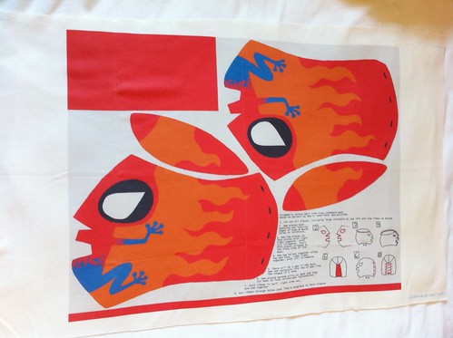
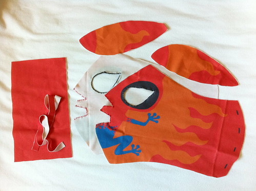
I forget the exact circumstances, but the project managers at work asked people to create drawings of pigs pretending to be chickens and vice-versa, to serve as metaphors of what not to do. I don't think anyone but me ended up creating any, though. In any case, eventually these got put on the cover of an internal Scrum guide the project managers printed up and put in all of the conference rooms. So I'm a famous artist, at least in my own department!

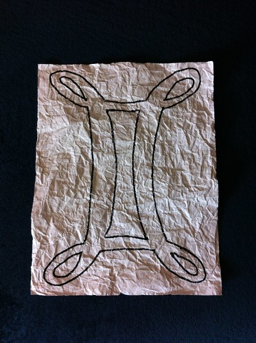
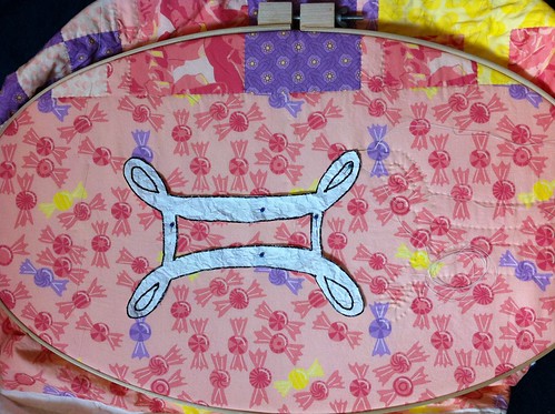
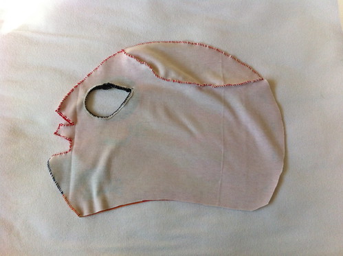
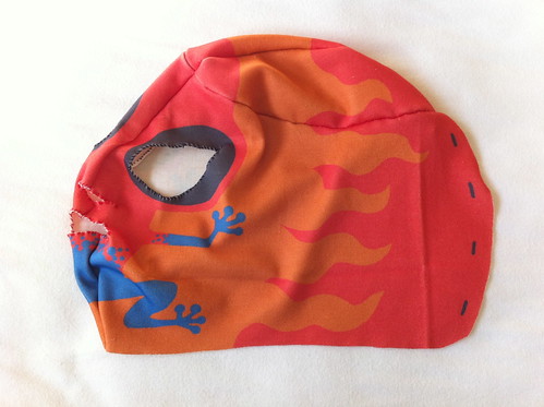
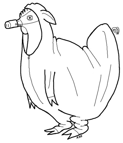
First off, the chicken pretending to be a pig. This is the most problematic from a Scrum perspective, because it means someone is butting in and trying to control things where they really don't have anything to contribute. To me the best part is the limp little pig front legs flapping empty in front of the chicken.
Chicken dressed as a pig

The pig pretending to be a chicken doesn't actually make as much sense from a scrum perspective (someone trying to slough off responsibility?), but I had to draw it anyway for symmetry.
Pig dressed as a chicken

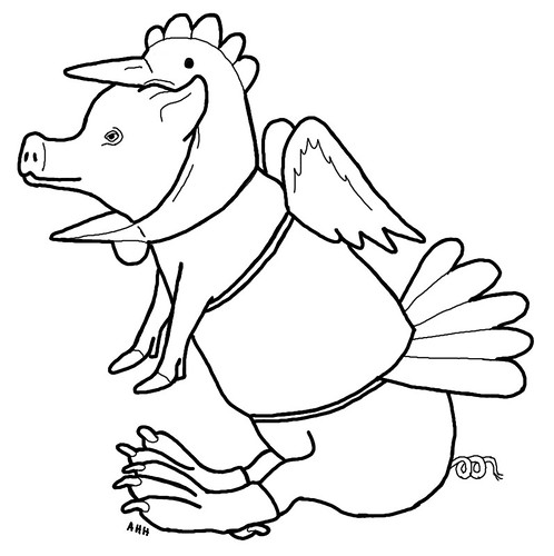
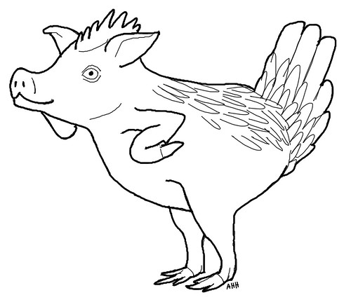
Most horrifying of all, the mutant pig/chicken combination. Piggen? Chig? Whatever you call it, it looks like it would be pretty tasty! From the scrum point of view, this would be someone with an unclear role, not fully committed yet still necessary for a project.
Pig/Chicken Combination

Thursday, October 27, 2011

Results of ornament contest

This week's Spoonflower design contest was for a Christmas ornament. I've already shown the design I made in a previous post where I showed how I sewed it together. I actually made this design before the previous week's lucha libre mask, and in fact this was the first design I ever made specifically for one of these contests. It came in 69 out of 124 with 112 votes. There were a lot of really cute designs so I'm pretty pleased.

One interesting trend I noticed among the designs was the idea of having more ornaments if you bought more fabric. The design for the contest had to fit on the 8" by 8" swatch size, normally just used for samples. But some designers actually made a design that filled a fat quarter, so that the swatch got you one ornament design, but there was a whole set of designs in the fat quarter. I realized that this was a good commercial strategy, because although designers get a 10% commission if anyone buys your designs, this doesn't apply to swatches. (They even acknowledge this in the blog post.) Very smart if you really want to make money!

And speaking of that, I saw today that one person has bought my Christmas ornament swatch! That's pretty exciting! It's the first time anyone has bought any of my designs (except for myself, of course).

Tuesday, October 25, 2011

Spoonflower colors

One of the most fraught parts of creating fabric designs for Spoonflower is dealing with color. Of course printed colors never look quite the same as they do on computer screens, but additionally their printer doesn't support the entire RGB spectrum, so "out of gamut" colors will get shifted and can sometimes look quite different. For instance, once a color that appeared light purple on the screen printed nearly magenta. So for designs that are really important to me, i.e. the ones I'm creating for baby quilts, etc, rather than just for the contests, I prefer to proof the colors.

At first, I didn't have a printed copy of the Spoonflower color map, so I just worked with the colors on the computer and hoped for the best. But now that I have the map, I can at least avoid major mishaps. First, I decide on the appearance of the colors I want (sometimes using a formal palette, as I did for the wrestling mask), then examine the map and find the printed colors that, in my opinion, best resemble what I'm shooting for. The swatches are tiny, but I can still fold it up to see how colors look next to each other. This is especially important when using several shades of the same hue, because frequently one shade in the sequence will get shifted a bit and throw the whole combination off.
Color map
Up to this point I've always done this before I have the final design finished (or even started, mostly), so in order to get a preview I create a separate "swatch" image using the colors I want.
Color swatches
I actually created the first color swatch for the waterpolo puppies some time back (er, when Cord was still a little baby and not a toddler as he is now!), before I had the map printed out. So I printed out a few different combinations of yellows, browns, & blues, to see what would look best. I'm not sure where it is now, but I did use it to chose the colors. When I finished the design, I had added some additional colors (the yellow & maroon in the balls) so I wanted to check the colors one last time before printing out the whole top. So I just printed out a little square of what ended up being the final design, and that's pictured here. However, in addition, I ended up using that color swatch as scrap fabric to create a mockup of the Christmas ornament! I started too late before the contest deadline to print out the final fabric and make sure the pattern was doable, so I created this mockup, which also helped immensely in writing the directions on the pattern itself.
Back to the swatches - for Maren's design, I made the small mistake of adding several colors in a gradient without checking the map. If you look at the purples you might be able to tell that they don't exactly go in a smooth sequence. However, I didn't end up using them all in a row on any design, so I think all the individual designs that use the purples turned out fine.

One side effect of this process is that I end up with the opposite problem of the fabric not looking like I want - the design on the screen is actually misleading! In particular, I've found that many blues and reds look much lighter and brighter than how they will print out. The most chilling incident so far was again with the wrestling mask. When printed on fabric, it looks like the red I want. However, on the screen, it looks unfortunately pinkish. Since I created that one with an even shorter time before the deadline than the ornament, I didn't even have time to create a fabric mockup. So I shrank it and printed it out on paper:
Mask paper mockup
As it turns out, our laser printer is running out of red toner, so the red looked even pinker on paper! When my husband saw this model, he looked at it with great suspicion and said, incredulously, "is that...PINK?" However, considering that the top five winning designs included butterflies, flowers, and lace, perhaps I shouldn't have been worried about some feminine subversion!

Monday, October 24, 2011

Continuing quilting

So, I've decided how I'm going to do the rest of the quilting for Maren's quilt. She's a Gemini, so I'm going to quilt a large Gemini symbol on either side of each of the five flags. Here's the first one:
One repeat quilted
I don't believe in any of that astrology malarkey, but it's a rich vein of symbolism and personalization! I found this script-like version of the symbol, which has a pleasing appearance. So I blew it up to ten inches tall (the same size as the flags) and printed it out. To make it more pliable and fabric-like, I thoroughly crumpled up the paper. I learned that trick in art class in elementary school!
Quilting template
To use it for quilting, I just pin it in place.
Template in use
With a design this curvy and continuous, there's really no way to avoid having to turn the quilt every which way to maintain the right-to-left sewing direction. But in order to minimize stopping & starting threads, I have a strategy to sew each symbol using just one length.

I start a long thread at one corner, with half on each side of the starting point (that's the stage the photo above is at). With the first half, I sew around one "edge" of the design - going around the outside of the outer loops, and the inside of the rectangular section. For the parts in the interior of the design, I skip under the quilt top.

With the second half, I do the other "edge" - the insides of the outer loops, and the outsides of the rectangular section. Notice I haven't cut out the holes for the insides of the outer loops. I just eyeball those when I sew them, since they're pretty small and easy to line up once the first half is already quilted.

The hardest part of this process is getting the template pinned to the right place, so that it's lined up vertically with the flag and horizontally with the existing quilted symbols.

Friday, October 21, 2011

Quilting progess on baby blankets

So the two baby blankets I'm working on are both well into the process of quilting. For Maren's quilt, I started by doing (faux) stitch-in-the-ditch to outline all the pieced-looking segments. This was probably the easiest quilting I've ever done! The lines were of course very easy to follow, and since it was a cheater print there were no thick seam allowances on the underside to navigate. I've finished all of that, and am still contemplating exactly what I'll do to fill in the spaces on either side of the column of flags.
Maren flags quilt partially quilted

For Cord's quilt, I couldn't decide right away what to do. I didn't want to sew over the puppies, and I wanted to do something in the blue segments to suggest splashing/rippling water, without being too time-consuming. I thought about doing stipple quilting, but that definitely failed the "time-consuming" test, as well as being denser than I wanted. I finally settled on doing wavy lines. I focused on just keeping them ad-hoc, and not stressing over getting them perfectly parallel or concentric. That was kind of hard for me! I had to keep stopping myself from picking out segments and redoing them just a few millimeters away. I kept reminding myself that even if I see all kinds of minute imperfections, the likelihood of other people noticing (if I don't point them out) is practically nil. And there's the old crafter's saw, "finished is better than perfect." I do want to give it as a gift as soon as I can!
Waterpolo puppies quilt partially quilted
All the quilting I have left on this one is the outline of the pool and the pool deck.

Thursday, October 20, 2011

Results of Mask contest

So I posted my design yesterday for the Spoonflower wrestling mask design contest.
Wrestling mask fabric
Apparently I'm not alone in thinking this was a difficult inspiration, since they only had 27 entries; as far as I know, that's the fewest they've had for one of these contests. Mine came in 15th with 172 votes. The top two designs, like mine, were also semi-abstract representations of animals - a butterfly & a chicken respectively. The folks at Spoonflower themselves sewed up both of those designs to illustrate their blog post about the competition. The people wearing them are posed mock-strangling each other - having made up my own mask, I suspect part of the reason for that is to actually hold the masks in place! I think that's pretty clever, since it makes the masks look more polished, and the photo more dynamic and humorous.

Wednesday, October 19, 2011

Wrestling mask for Spoonflower

So I mentioned creating a Christmas ornament pattern for a Spoonflower contest, which was the first design I created specifically for a challenge. However, that contest is actually next week - this week the goal is to create a fat quarter pattern for a lucha libre mask! I wasn't sure if I'd participate in this one, because I couldn't come up with an idea. But then, one night as I was waiting for my baby to fall back into deeper sleep after nursing so I could go to bed, I considered one of the iPhone games I frequently play at such times - Pocket Frogs. The point is to create frogs with all different sorts of designs and color combinations. So that made me think about poison dart frogs, which I thought might be a fun inspiration for a mask.

I found this palette as a starting point:
Poison_Dart_Frog
Color by COLOURlovers

Then I used the Spoonflower color guide I have printed out to find the RGB value for colors that look like those when printed, rather than on the computer screen. In particular the red color looks much pinker on the screen than it does in the fabric. Then I googled for a basic mask pattern, and found this, which from looking at some of the other contest entries, I'm guessing other folks used as their base as well! The design I came up with is here.

For fun, I actually got the mask printed out and sewed it together! I got it on knit instead of the usual quilting-weight woven cotton, which definitely added to the challenge. Knit fabric, curved seams, 3D shape - it's like a hit list of sewing difficulties. Here's what that process looked like.

First, here are all the pieces cut out:
Wrestling mask construction example part 1
At this first stage, I also whip-stitched around the eye and mouth holes, to try to strengthen them. This was only partially successful - they still warped a bit.

Next, I stitched the two "melon" pieces to the tops of the main mask pieces. Again I used whipstitching to try to allow for more stretching than a hemstitch. With this pattern it doesn't matter so much if the seam allowances exactly reach 1/4".
Wrestling mask construction example part

That resulted in two large pieces, which I then sewed together. They needed to be sewn just along the top & front, leaving the back (and bottom, of course) open.
Wrestling mask construction example part 2

Here's how that looks completed, with the mask still inside out.
Wrestling mask construction example part 3
I actually ran out of red thread partway through, so I used blue and orange thread on the blue & orange parts where the face meets.

Here it is right side out now:
Wrestling mask construction example part 4
Rather pleasingly mask-like, if I say so myself!

Next, I sewed the extra flap of red fabric into the back to form a "tongue" for under the laces. I ended up sewing it onto the existing seams at the top back so the stitches wouldn't show on the outside. Note that the flap is longer than it needs to be, so I left the extra just hanging around on the inside for now.
Wrestling mask construction example part 5

Then I sewed four (rather rough) button holes (lace holes?) onto each side of the back.
Wrestling mask construction example part 7

I also had the "lace" as part of the pattern. Unfortunately though, when printed out on knit, the long way of the lace was perpendicular to the rib, so it was quite a bit stretchier and weaker than I would have liked. Oh well, you learn something every day! I just whipstitched it down the whole length.
Wrestling mask construction example part 8

Then it was just a matter of running the lace through the holes!
Wrestling mask construction example part 9

One other thing I would have changed about the print on knit was the orientation of the main mask pieces - as it was, the rib was vertical on the face, meaning it was stretchiest parallel to the seam down the middle. This also contributed a bit to fragility & warping. Also, since the print is only on the top of the knit, any stretched areas look faded due to the unprinted parts between the rib peeking out. But again, just a project for fun, so not a big deal! I'm definitely glad I did this. Finding out those gotchas about how the print alignment plays with the rib alignment could be valuable information for the future.

Tuesday, October 18, 2011

Second quilt with custom fabric

I mentioned in yesterday's post that I was using Spoonflower to create custom fabric for two baby quilts in progress, but only showed the one for my niece. Here's the one in progress for my nephew:
Waterpolo puppies quilt laid out for basting

It's golden lab puppies playing water polo! The inspiration for this is that my brother-in-law is a water polo coach (and my sister-in-law played in high school), and they have a golden lab. So I put those elements together into what I think is a quite adorable scene.

This picture was taken when I had it laid out for basting. I'm still trying to decide exactly how I will quilt it. That's why I've started on the quilting for Maren's first, even though she's younger - I already know exactly how I'm starting that.

Monday, October 17, 2011

Projects using custom fabrics

So the two Spoonflower designs I entered in contests so far (ditsy sugar cubes & ginger roots) were created with a specific project in mind. I'm trying to catch up on making baby blankets for all my nephews and nieces (and my son of course!). So far I've only made the ones for my oldest nephew and oldest niece. The one for my nephew is here, and I actually don't have any photos of the one I made for my oldest niece! Hopefully I can correct that over the coming holiday season. You can see the design itself on Spoonflower, at least.

So next up are the ones for my next oldest nephew and niece. Once I finish those I'll create the one for my son, and once that's done we should have found out whether the next one on my brother's side will be a boy or a girl.

So, back to those two fabric patterns I linked already. My idea for my niece was to spell out her name - "Maren," by the way - using international maritime signal flags. But the twist is that I would change them to more "girly" colors, and represent each color as its own print. Then, I could put the flags together on the quilt in a "cheater" style, to make it appear as though I pieced the images together. I decided to translate the white and red segments into light & dark pink prints, the blue segments into a purple print, and keep the yellow segments in a yellow print. Then I would create a medium pink print with yellow and purple accents to use as the background to tie it all together.

So once I decided on that color scheme, I needed to decide on what the prints would actually be. I decided to do a take on the old cliche "sugar and spice and everything nice." Sugar is represented by sugar cubes and candies on the light and medium pink prints respectively. Spice is represented by ginger on the yellow print. Everything nice could probably not be any more vague, so I just used things that I think are pleasing: roses for the dark pink print and square knots for the purple print. I also added hints of yellow to the dark pink and purple prints to add more balance to the overall design, since the yellow print was only going to get used in the "R" in Maren.

So here are all the prints together:
Sweets & Flowers Fabric Collection

You can also see them all on Spoonflower.

But wait a minute - there are two purple prints in that photo, not just one! Well, some of the signal flags also use black - though not any of the ones in "Maren" - so I decided to create a darker purple print to stand in for black in case I wanted to create other letters in the future. This print shows sprigs of lavender as a counterpoint to the roses.

But back to the original thread, here is the printed crib-sized quilt top that uses these prints to spell out "Maren":
Maren flags quilt laid out for basting
This picture shows the top laid out over the backing and batting - after this was taken, I basted it together and started quilting. Hopefully I'll be able to post another progress photo soon!

Friday, October 14, 2011

Christmas Ornament

One of the upcoming Spoonflower contests is for a cut & print pattern for a Christmas ornament that can fit on an 8" by 8" swatch. I created a pattern for a cute miniature wreath. I ordered a copy of it printed out...
Mini Wreath Ornament Fabric
...and today I sewed it together. As you can see, there are some instructions on the pattern itself, but I thought it might be nice to expand on them.

First, I cut out the two main pieces, pinned them together, and sewed the inner and outer circles. I clipped the seams to make it easier to make it easier to turn inside out.
Mini Wreath Ornament construction example part 1

Turning it inside out was a little difficult due to the small size. I used a skewer to push it through.
Mini Wreath Ornament construction example part 2

Then, I used the skewer to stuff it. I didn't have any stuffing on hand, so I cut up some leftover quilt batting and used that instead! Once it was filled up, I blind stitched it shut.
Mini Wreath Ornament construction example part 3

I finger-pressed and tacked down the two "ribbon" pieces. If I were making this from scratch, I'd probably just use actual ribbon instead to avoid dealing with the raw edges this way, but I thought it would be more fun to make it part of the pattern for the contest.
Mini Wreath Ornament construction example part 4

I looped one of the ribbons through the hole in the wreath. I messed it up a few times by not getting the trees upright on the side I wanted to be the top! But once it's looped in the right way, it's just a matter of sewing the ends together.
Mini Wreath Ornament construction example part 5

Just a few stitches were needed to close it at the top of the wreath to form the loop for hanging. I made sure that the seam in the ribbon sat at the bottom of the inside of the wreath so as to be least visible.
Mini Wreath Ornament construction example part 6

Then I folded the second ribbon into a faux bow and put in a few stitches to hold the shape.
Mini Wreath Ornament construction example part 7

Then it was just a few more stitches to put it on the wreath, and viola!
Mini Wreath Ornament finished

Thursday, October 13, 2011

Second Spoonflower contest

I entered a second Spoonflower contest, this one themed "root vegetables." My design is of ginger roots. Like the last time, this was a design I had already created for my own purposes, that just happened to more-or-less fit the contest. I know ginger is not a "vegetable", but heck, another entry was themed on root beer, so there's some leeway!

It came in 88 out of 181 with 141 votes, so better than last time. I'm surprised, since it's not really a very strong design on its own - I created it to be a tone-on-tone element in a larger design. Of course, that's how the last one was as well, but they had a record number of entries in the last contest, and actually had to reject some entries for the first time ever. So I probably fared better simply due to there being fewer to look through. (The way these contests work is that you can vote for as many designs as you like, so the more you have to look at, the more fatigue sets in.) In any case, it's fun to have other people take a look at my designs.

Thursday, October 6, 2011

First Spoonflower Contest Entry

I finally entered a Spoonflower design contest! They have a new inspiration every week, and this week was ditsy prints. I came in 218th place out of 247, with 45 votes! The design I entered is here.

I've started creating more designs. So far all the designs were created with specific projects in mind (just as I hoped to do), so I hope to post about those soon!