So next up are the ones for my next oldest nephew and niece. Once I finish those I'll create the one for my son, and once that's done we should have found out whether the next one on my brother's side will be a boy or a girl.
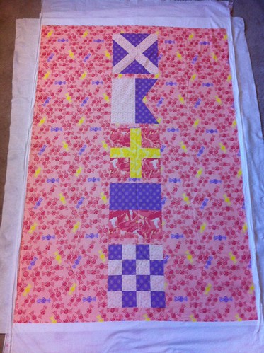
So, back to those two fabric patterns I linked already. My idea for my niece was to spell out her name - "Maren," by the way - using international maritime signal flags. But the twist is that I would change them to more "girly" colors, and represent each color as its own print. Then, I could put the flags together on the quilt in a "cheater" style, to make it appear as though I pieced the images together. I decided to translate the white and red segments into light & dark pink prints, the blue segments into a purple print, and keep the yellow segments in a yellow print. Then I would create a medium pink print with yellow and purple accents to use as the background to tie it all together.
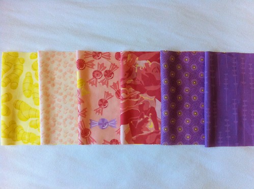
So once I decided on that color scheme, I needed to decide on what the prints would actually be. I decided to do a take on the old cliche "sugar and spice and everything nice." Sugar is represented by sugar cubes and candies on the light and medium pink prints respectively. Spice is represented by ginger on the yellow print. Everything nice could probably not be any more vague, so I just used things that I think are pleasing: roses for the dark pink print and square knots for the purple print. I also added hints of yellow to the dark pink and purple prints to add more balance to the overall design, since the yellow print was only going to get used in the "R" in Maren.
So here are all the prints together:

You can also see them all on Spoonflower.
But wait a minute - there are two purple prints in that photo, not just one! Well, some of the signal flags also use black - though not any of the ones in "Maren" - so I decided to create a darker purple print to stand in for black in case I wanted to create other letters in the future. This print shows sprigs of lavender as a counterpoint to the roses.
But back to the original thread, here is the printed crib-sized quilt top that uses these prints to spell out "Maren":

This picture shows the top laid out over the backing and batting - after this was taken, I basted it together and started quilting. Hopefully I'll be able to post another progress photo soon!
No comments:
Post a Comment