As this week's episode kicks off, Alexander is still feeling thrown off by the blowout with Ken last time, and Kate is sick of being in second place. This time it's the HP challenge, meaning they get to design a fabric. There's an extra twist this time, in that they will each be paired with a young innovator, who will serve as muses for their looks. Both the winning designer AND the paired innovator will get an HP technology suite as the prize.
Helen gets to pick first, and pairs up with the paint/print artist. Kate chooses the 17-year-old computer scientist, who is working on way to encourage more women to enter the field. Justin will be inspired by the charity-involved Miss USA 2012. Bradon picks the BMX rider, Alexander the pastry chef, and Alexandria the magazine editor. That leaves Dom with the president of Kiva, the microfinance organization.
Then they all get to actually meet their innovator muses and discuss their work. Helen really hits it off with the artist, as he seems to remind her of her fine-artist parents. They work together on a piece, based on a photo of her, that she gets to keep. Alexander actually has to decorate the cake with the pastry chef - and then take it back to the workroom with him! He's not feeling very inspired by the process.
Since it takes time to print up the fabric, the producers always have to come up with some way of filling the gap. This time, they've simply set it up so that their innovator interviews take up the first part of the day, then they design the fabric, so it gets printed up overnight and they sew the next day.
Kate designs a white-on-blue print composed of flowers and lines. She keeps saying that the print is like "binary code" but based on the design she seems to be confused with "bar code." Alexander takes the chocolate strands on his cake as inspiration and makes squares full of rayed chocolate streaks. Dom is drawn to the indigenous prints created by some of the women who received Kiva loans, plus the global interconnectedness of the whole thing, and makes giant black and pink chevrons. Bradon evokes the BMX activity through NYC with an abstract black and electric blue plaid. Alexandria continues the "abstract menswear" trend with a pale, scribbly windowpane. Justin is inspired by Miss USA's love of her work to make a ghostly, smoky print with hidden sign language "love" signs. Helen does a print of stars on white.
At this point I noticed that Kate had gotten a lot of screen time already in the episode. Not a good sign at this point in the season.
The next morning, they get to work on garments. Helen is struggling mightly and annoying everyone with constant requests for help. Dom urges her to just get something done so that Tim can give her guidance instead.
Tim's visit is, as usual, intercut with clips of the designers making comments of their own in the interview booth. We learn that Dom doesn't understand Bradon's, Bradon doesn't understand Kate's, Helen doesn't understand Alexander's, and Justin doesn't understand Alexandria's. Tim professes himself perplexed by Bradon's, who then decides to ditch the long skirt he was planning. Alexander has put a giant white cross on the front of his dress, which Tim pegs as clerical - but Alexander (last name Pope) won't be dissuaded. Bradon comments that "[his] last name is McDonald, and you don't see me making dresses out of french fries."
Helen is still struggling mightly. She's afraid to even cut into her custom fabric. Dom is doing her best to pep her up. Alexander and Alexandria kvetch in the break room about how Helen's process always seems to involve peppering everyone else with constant requests for help, reassurance, hand-holding, etc. Alexandria describes as Helen's "usual fit." Once she actually makes something, and gets it on her model, she starts feeling much better about it. Meanwhile, Kate is having fit issues, of a different kind, getting her dress on her model. But finally everybody gets a look out the door.
Bradon makes a bomber-style jacket from his semi-plaid, over a stretchy tube dress. Justin makes a fairly blah, gothy-even-though-it's-white, gown. Kate makes a busy, flippy dress, in which the print is entirely shrouded by a transparent white layer. Alexander's can only be described as a chocolate nun, or perhaps when you see the revealing back as something that Willy Wonka's arm candy (hah!) would wear to a red-carpet event. Dom's graphic dress is really cool looking. Alexandria's outfit is strange and messy, with a weirdly hanging wrap skirt and raw-edged leather vest. Helen's minimal look is composed of a short top and a very high-waisted skirt.
Since we're down to seven contestants, only one person will be in the safe middle - and that's Alexandria. Then the judges tease that one OR MORE of the rest will be out. I suppose we do have Tim's save to make up for...
The judges adore Dom's dress. Since Dom is known for working with print, they feel this was her challenge, and she lived up the expectations. Even the styling was good. The details of the print placement are great, and it's global without being too costumey. Zac Posen says he would wear it if he were a woman - of course, not that he couldn't wear it as a man, but I guess he's no Marc Jacobs.
Bradon's gets lots of love too. It's cool, the dress is very sexy yet versatile, it's an updated classic. Zac thinks it's his best work all season. Helen is also in the top. her decision to make it two pieces was a good one, and the combo of the figured print on white with ivory solid fabric gives it an interesting vintage versus modern feel. The shoulder is interesting, and it could be "1930's pinup" or "star-spangled hipster."
That leaves Justin, Alexander, and Kate in the bottom. Justin's is good from the waist up, but the bottom is drab, depressed, and not modern. Alexander's is neither sweet nor sexy, and is serious when it should have been light. Heidi thinks the white lines look like masking tape left on by accident. Kate tries to talk up the whole "digital dots of information" of her design but the judges are just giving her looks like (-_-). The shrouding layer makes it look like she fell into a kleenex box, and the look is just not about the print any more.
Backstage during deliberations, Kate is already freaking out because she's sure she will be eliminated - especially since they said they might "auf" more than one.
Dom is named the winner! So Kiva will get the additional technology suite. Bradon and Helen are safe. Alexander is out, Justin is in, and poor Kate has to be in suspense the longest. Alas, she is indeed out as well. Many tears are shed, and she says it hurts even more the second time. So close and yet so far!
Next week, it's the final elimination challenge that will decide who gets to show at fashion week.
Friday, September 27, 2013
Thursday, September 26, 2013
This fabric is made for walking
This week's design challenge was in concert with a shoe company called Milk + Honey, to make a small-scale geometric print that could be used on shoes. Milk + Honey are picking from among the top ten vote-getters to actually put on shoes they'll produce.
For the geometric layout, I really like sashiko designs, and was originally going to go with the classic interlocking circles pattern you see everywhere, but then I noticed that even the example shoe in the contest announcement used it. I used a variation instead, where the circles are replaced by octagons, and it looks like this.
Since the middle segments look like stars, I decided to try using the Synergy group "star" palette, which are not normally colors I'd gravitate towards, but figured it would be a fun exercise if nothing else. I tried to make it look a little bit crystalline, like the prismatic effect you get through cut glass.

This came in 279 out of a whopping 495 entries, with 70 votes. Boy howdy did it take a long time to get through the voting! There were indeed several entries that used the interlocking circles - my favorites were the poppy-colored and aqua gradient versions. Gems were also a big theme: in bubbly circles of all sizes (came in fifth), serene graphics, exuberant wireframes, and emerald dots. Many people tried to work in as many colors as possible, in circle segments (came in sixth), lozenges (came in ninth) and pixels. Other designs I really liked were this wiggly zig-zag, folksy patchwork, linen-textured motifs, Death-Star-like windows, and blackwork. The entry I'd probably most like on a pair of shoes were the buckyballs, or possibly the sequins.
For the geometric layout, I really like sashiko designs, and was originally going to go with the classic interlocking circles pattern you see everywhere, but then I noticed that even the example shoe in the contest announcement used it. I used a variation instead, where the circles are replaced by octagons, and it looks like this.
Since the middle segments look like stars, I decided to try using the Synergy group "star" palette, which are not normally colors I'd gravitate towards, but figured it would be a fun exercise if nothing else. I tried to make it look a little bit crystalline, like the prismatic effect you get through cut glass.
This came in 279 out of a whopping 495 entries, with 70 votes. Boy howdy did it take a long time to get through the voting! There were indeed several entries that used the interlocking circles - my favorites were the poppy-colored and aqua gradient versions. Gems were also a big theme: in bubbly circles of all sizes (came in fifth), serene graphics, exuberant wireframes, and emerald dots. Many people tried to work in as many colors as possible, in circle segments (came in sixth), lozenges (came in ninth) and pixels. Other designs I really liked were this wiggly zig-zag, folksy patchwork, linen-textured motifs, Death-Star-like windows, and blackwork. The entry I'd probably most like on a pair of shoes were the buckyballs, or possibly the sequins.
Wednesday, September 25, 2013
Project Runway Season 12 Episode 10
This week's challenge is the dreaded "real woman" (i.e. not the figure of a professional clothes-hanger) episode. The eight possibly naive souls this time are in fact "Project Runway Superfans" who get to come, tour the set, and get complete makeovers. They are so incredibly happy that I start to seriously dread whatever bad treatment they may get at the hands of the over-stressed designers. But my fears turned out to be unfounded - the designers reserve the bad treatment solely for each other.
Since they're down to just four men, Alexander and Bradon have to troop over and move in with Ken and Justin. When they arrive (at eleven at night, exhausted from the day's work), Ken is camped out right inside the door, ironing a pair of denim shorts (??? isn't the point of jeans that you DON'T NEED TO IRON THEM???) wearing some kind of skin-treatment domino mask, and stone-facedly ignores Alexander's attempts to get in the door. For Alexander's part, he tries to be jokey about it at first, but then he loses his patience and simply pushes his way in, deliberately knocking the iron on the ground. So of course it turns into Ken screaming in rage, with Megan, the poor "talent coordinator," trying to get him to take deep breaths and calm down, and him having none of it. In the morning everybody has to sit in the lounge together and talk it out, led by Tim Gunn, and they eventually agree to put it behind themselves, though Alexander, Bradon, and Justin remain quite rattled. Ken will also remain in a room of his own, with the other three rooming together.
On to the challenge. They get two days for this one, instead of the usual one, which is a very smart move - hopefully this ratchets down the stress level a little, making the designers more pleasant to be around for the superfans, plus the added time gives them the best possible chance of sending everyone out on the runway with a finished garment.
The designers are assigned to the superfans randomly. Helen feels like everyone is jealous of who she got - the tall, thin, Jamie, who has the most dated style and very unflattering hair. Jackpot! This lady is ripe for the classic movie makeover montage - take off the glasses, smooth out the hair and bam!
At the other end of the spectrum is Jennifer, a very pretty and put-together blond assigned to Bradon. She doesn't need a makeover, per se, but wants a look with more edge.
The superfans actually get to go to Mood with the designers. The curly-haired Susie, accompanying Ken, falls in love with a nubbly chartreuse fabric, which he loathes but feels he has no choice but to use. Once they all get back and the designers get to work, the superfans go off for the massive L'Oreal product placement segment, I mean hair makeovers.
At Tim's workroom checkin, he tells Justin to watch the length of his dress, Alexander to watch the bust of his suit, Ken to watch the fit, and Dom to watch the print. As the time ticks away, Alexander has the most alterations to complete. We get to see the superfans lined up backstage right before the runway, getting their final "walk and pose" instructions. Jennifer is so excited she is in tears and has to repair her running mascara. Susie wants vodka.
Kate, for the most mature superfan Altagracia, makes a fluttery tunic top and leggings. Dom, working with red-haired Jane-Sarah, makes a pretty safe print dress and an interesting A-line jacket. They are both safe, and relieved to be so. Both are happy to have made looks that their clients liked.
Alexander, Ken, and Alexandria end up in the bottom. Alexander didn't have enough time to finish the suit he made for Andrea (who has just switched careers blue collar to white collar) and it shows. But even if it were finished, Zac Posen doesn't like the colorblocking or the cut, and says the shape is like an Oompa-Loompa. He also has unkind words for the interview outfit Alexandria made for Art student Stephanie. For her part, Stephanie likes the jacket, but not the rest. Zac thinks the jacket is sad, and that the wide waistband on the skirt makes it "maternity librarian." Susie actually completely loves the green sheath dress that Ken made, but the judges dislike it. The placing of the leather piecework is unflattering to the figure and it doesn't have any "fashion".
Justin nails the challenge with a lovely black dress for the tall Tristan. He also places her signature down the front as lovely abstract-seeming white embroidery, a beautiful touch that goes over well with the judges. Helen follows through on Jamie's perfect makeover potential with a navy red-carpet-ready gown. Bradon's black dress and vest with beaded and patent leather trims definitely delivers the edge requested by Jennifer, but the judges are a bit more divided - the vest can take it from workwear to evening, but the shiny leather looks cheap.
Helen wins! I though Justin made the most personal garment, but I can see how it would be hard to vote against the overall effect of Jamie's huge makeover. Even though Alexander is sure it's the end for him, it is in fact Ken who is eliminated. So, I guess the producers don't have to keep paying for an extra room for him after all. Ken is at peace with his exit at this point, and feels like it was actually a boost of confidence for him and his barely-budding career to have made it to this point.
Next week - it's the digital textile design challenge!
Thursday, September 19, 2013
Time to come inside, it's getting dark
This week's challenge was in coordination with Adobe, who have just come out with their own color palette website, called Kuler. We had to create a color combo there and then use it to make our fabric design. The colors I chose are here. Personally I still far prefer Colourlovers, which is much more full-featured.
In any case, then I had to decide what to draw, and riffed on the "adobe" name. I thought of a village of little adobe dwellings, and the colors made me think of light shining through windows at night.

This came in 87 out of 122 with 79 votes. My favorite entries were the fish, the succulents, and this airy floral.
In any case, then I had to decide what to draw, and riffed on the "adobe" name. I thought of a village of little adobe dwellings, and the colors made me think of light shining through windows at night.
This came in 87 out of 122 with 79 votes. My favorite entries were the fish, the succulents, and this airy floral.
Tuesday, September 17, 2013
Let's just create an account on every website
So, I created a tumblr for myself but haven't totally resolved what kinds of things I want to be posting on it, so I haven't been posting anything lately. There are certain categories of posts (cool artwork, interesting scenic photos) that I had been posting as a way of being able to go back and look through them for inspiration later. So that started sounding more and more like Pinterest instead. So, what the hey, I started one of those too.
It's also really great for saving Spoonflower designs. You can "Favorite" designs on the website, but Pinterest allows you to scroll through everything you've saved on one page. So I have some boards there where I'm listing out all the ones I would most like to buy to make into things. I already have more pinned than I could every possibly use in my lifetime, so that's pretty great.
It's also really great for saving Spoonflower designs. You can "Favorite" designs on the website, but Pinterest allows you to scroll through everything you've saved on one page. So I have some boards there where I'm listing out all the ones I would most like to buy to make into things. I already have more pinned than I could every possibly use in my lifetime, so that's pretty great.
Monday, September 16, 2013
A little side project
So I've continued to make a small trickle of sales of my designs (mostly Baby's Book of Computer Science). On the Spoonflower account pages, they show you a chronological list of all your sales. I was curious how some of the other designs stacked up, and started brainstorming how I could scrape all the data off the page and into, say, a spreadsheet. Then it occurred to me that, since I've been doing more front-end Javascript development in my day job, perhaps I could write it as a browser plugin and just add whatever statistics I wanted directly to the page itself! And the added bonus of doing it that was is that I could share it with other people.
So I took a couple of hours and did just that. I managed to get it working in Chrome and Firefox. (For reference, plugin development is MUCH easier and more clearly documented for Chrome.) Here's a screenshot of what it looks like in place:
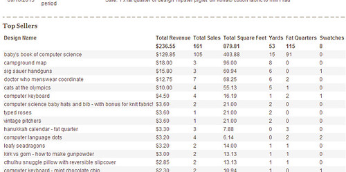
The plugin (and installation instructions) are here. I was very nervous about having others try it out, since I could only test it with my own data, and there could easily be other types of sales that would break my code. I offered it to the Synergy group though, and so far a couple of people have tried it out and said it works. Exciting!
So I took a couple of hours and did just that. I managed to get it working in Chrome and Firefox. (For reference, plugin development is MUCH easier and more clearly documented for Chrome.) Here's a screenshot of what it looks like in place:
The plugin (and installation instructions) are here. I was very nervous about having others try it out, since I could only test it with my own data, and there could easily be other types of sales that would break my code. I offered it to the Synergy group though, and so far a couple of people have tried it out and said it works. Exciting!
Saturday, September 14, 2013
Project Runway Season 12 Episode 9
Jeremy starts us off this week by doing his own recap of the previous day's events - Karen is out because "she f***ed up the challenge." Ken says that he's being very careful what he says to who at this point in the competition, and that his guard is up. He's not the only one - the designers are told that they will get to have a nice brunch out, and everyone is immediately suspicious, wondering what the catch will be.
They do indeed get to have a fancy brunch, out at a restaurant patio reserved just for them, punctuated by a little gloating from Helen over her New Balance win and a little secretive eye-rolling in response. Everyone is tense, waiting for the other shoe to drop. So when Tim Gunn finally appears it's a relief. But fortunately the twist isn't too brutal - the brunch is simply to put them in the right frame of mind for the challenge, which is to make an outfit (day or evening) for a modern Southern woman. This is because it's the challenge for Belk, which is supplying the accessory wall this season, and who's slogan is "Modern. Southern. Style." Also, the winning look will actually get produced by Belk.
Ken and Dom are immediately perceived have an advantage, both having family backgrounds in the South. They, in fact, know exactly what modern Southern women are wearing at this very moment. At Mood, everyone goes for very colorful fabrics, and then in a repeat of the Miranda/Alexander plaid pants collision, Bradon and Alexander both get very similar large-scale plaids, not seeing the coincidence until too late. Alexandria also ends up with plaid. Really? Plaid? Somehow plaid doesn't say "Southern" to me at all but I must be missing something. Dom and Ken also seem to agree that plaid is definitely not a "thing" in the South, leading to a running joke throughout the episode that whenever on of the plaids is mentioned, we get a quick shot of one of them looking skeptical, irritated, or bemused. They did one of those "live polls" during the show, and in fact the majority of viewers agreed that they did not see plaid as something a modern Southern woman would wear.
At Tim's visit, we find out that Bradon's plaid is a very close match for Tim's tie. Tim also warns Justin that combining dark colors with his lovely coral fabric just push it into cheap orange Halloween territory. And then he just straight out tells Alexandria that hers is hideous. She ditches some complicated patchwork she had started for the skirt and starts over using the plaid alone.
We get a little interlude with Ken. He's feeling "not quite homesick," but misses his family. He has a conversation with his mother where it becomes apparent that they're both aware he has an anger issue. "Has that other side come out yet?" she asks. "A little." And in one of those moments where the editors enjoy themselves far too much, we get a montage of the times Ken has yelled at, sworn at, or attempted to silence the others.
Heading into the runway, everyone is really happy with their looks except Alexandria. So we know already at least two folks are in for a rude shock.
Ken's dress looks like a long version of Marilyn Monroe's iconic gown, but in purple, and somehow the proportions around the torso look awkward. Helen's lace-over-yellow gown looks very nicely made but doesn't seem modern to me. Justin's flippy coral dress with interesting draped elements is probably my favorite. Alexander's plaid dress strikes me as a tamer take on Vivienne Westwood. Alexandria's plaid dress has a weird shape and has some kind of odd structure around the hips. Bradon has pieced his plaid in a way that is interesting for the textile, but I think makes the dress too unevenly flexible - it drapes nicely in some parts and is too stuff in others. Dom's evening gown is long and colorblocked, and looks pretty nice but slightly too twee. Jeremy's print dress is alright, but the red jacket makes it look far too old. On the other end of the spectrum, I think Kate's exuberant confection reads too young.
Helen, Justin, and Alexandria are safe. Helen is peeved, as she feels that she was bumped out of the top just because hers would be too expensive to mass-produce.
Now, I have to say, at no point in this episode did I get any real understanding of what was meant by "modern Southern woman." The judges seemed to have gravitated towards "modern country woman" in my opinion. They were definitely not sold on Ken's and Dom's, who both made what they claimed were the kinds of things that the actual modern Southern women, which they know in real life, would really wear. So those two were in the bottom, as was Jeremy.
Jeremy's is not modern or sexy. Zac hates the jacket, Nina hates the print, and guest judge Stacey Keibler hates the length of the skirt. As for Dom's, Heidi says it's not fashion forward, Nina thinks the colors are reminiscent of hospital scrubs, and it's too safe and pageanty. Heidi also calls Ken's safe, as well as unflattering, and she doesn't understand where anyone would wear it. Zac finds it uninteresting and calls it a purple nightgown. Ken is visibly fuming more and more, and finally Heidi remarks that he looks like he wants to roll his eyes into his head. Ken, probably recognizing that if he says anything he's going to completely lose it again, chooses to remain silent and we get some awkward moments of staring.
Praise for Bradon's and Alexander's plaid dresses are universal. We gets lots of shots of Ken and Dom giving hairy eyeballs, since they can't imagine the modern Southern women of their acquaintance wearing plaid (Dom even compares Bradon's to a tablecloth). As for Kate's, the judges all like it except for Heidi who thinks the high-waisted poofy skirt looks too much like a baby bump.
Bradon is named the winner! And then we get the twist. Based on how the judges are acting, Helen thinks they might just eliminate all of the bottom three, but it's more interesting than that. The judges feel none of them "got" the challenge, so they each get one more hour, one other designer as an assistant, and any remaining fabric in the workroom to produce another garment.
Dom chooses Helen, and makes a completely new dress out of the black and white print she was initially going to use for her long skirt but then passed on.
Jeremy chooses Alexander, and they also start completely over, making a tank dress out of two different light-colored fabrics.
Ken chooses Kate, and they rework his purple dress. They chop off the skirt and make it nearly a mini, then drape the extra fabric around the neck and down one arm.
The judges adore Dom's new effort. Heidi wants to buy it right then, Zac loves the print, and the guest judge from Belk admires how it has interest both from the front and the back. They agree that Ken's is a 100% improvement, and is sexier and cooler. However, Heidi thinks it's now TOO short, and the top looks forced. They're even more lukewarm on Jeremy's - it's pretty and more fun, they like the prints, but it's the least interesting of the three.
Nina takes a stab at keeping Jeremy around instead of Ken, since he has a better attitude, but nothing can save him - he's out. Ken stays for another day. Dom not only stays, but her design will ALSO be produced by Belk!
Next time - looks like it's the "real woman" challenge, this time with Project Runway "superfans." Judging from how those usually go, I really hope they all have thick skin and a willingness to look ridiculous. And speaking of thick skin, or a lack thereof, it also appears there will be some kind of blow up between Ken and Alexander in their apartment.
Thursday, September 12, 2013
Sleepy, wiggly creatures
This week's contest was dinosaurs! I have been thinking about trying to make a design for a lovey blanket for my son, so making some uber-cute dinos seemed like a good possibility. Then, looking through the Synergy palettes, the "Serenity" group seemed to fit both "calm and sleepy" and "dinosaurs."
Then it was just a matter of drawing a bunch of sleeping dinosaurs - I decided to go for non-species-specific heads and anthropomorphic bodies. It was fun to think back to all the funny little poses my son would make when he was a tiny baby. Then, I filled in all the little onesies with all the "small" patterns I have on hand from other designs.

I really want to make a cheater print as well, using all the little sub-patterns in use here. I'm pretty pleased with how this one came out - it's very close to the vision I had in mind. It did quite poorly in the contest though - a mere 19 votes. Insert sad trumpet noise here. No matter, this will be another one like the adder, where all I can say is, well, I liked it!
Novelty prints for kids certainly dominated the entries. Indeed, it's hard to think of any other kind of fabric you could make based on the dinosaur theme. My favorites were this damask that went more towards the girly side (and came in second), and these colorful dinos all standing atop one another that would be considered more of a boys' fabric. Moving into less cartoony territory, I thought this mix of doodles and bright pixelated textures was a really fresh combination. Then there were two plesiosaur designs that I really liked - this almost Edward Gorey one with lacy textures, and a more graphic take with a plaid underlay that was my favorite entry.
Then it was just a matter of drawing a bunch of sleeping dinosaurs - I decided to go for non-species-specific heads and anthropomorphic bodies. It was fun to think back to all the funny little poses my son would make when he was a tiny baby. Then, I filled in all the little onesies with all the "small" patterns I have on hand from other designs.
I really want to make a cheater print as well, using all the little sub-patterns in use here. I'm pretty pleased with how this one came out - it's very close to the vision I had in mind. It did quite poorly in the contest though - a mere 19 votes. Insert sad trumpet noise here. No matter, this will be another one like the adder, where all I can say is, well, I liked it!
Novelty prints for kids certainly dominated the entries. Indeed, it's hard to think of any other kind of fabric you could make based on the dinosaur theme. My favorites were this damask that went more towards the girly side (and came in second), and these colorful dinos all standing atop one another that would be considered more of a boys' fabric. Moving into less cartoony territory, I thought this mix of doodles and bright pixelated textures was a really fresh combination. Then there were two plesiosaur designs that I really liked - this almost Edward Gorey one with lacy textures, and a more graphic take with a plaid underlay that was my favorite entry.
Saturday, September 7, 2013
Project Runway Season 12 Episode 8
This week's episode opens with Tim, dressed as a ref, waking everybody up at oh-dark-thirty by blowing a whistle in their rooms and tossing them a duffel bag of athletic wear. Ah, of course, the t-shirts all say "HK for NB" - this must be the challenge where they have to make a look for Heidi Klum's activewear collection for New Balance. Both workout ready and fashionable, fits in with the existing collection, the winner's design will actually get produced as part of the line, etc etc.
But first, a little humiliation, I mean fun, for the designers. They get paired up to run an obstacle course: three-legged race, then a tire run (before which they have to untie their legs), wheelbarrow race, and then a search for a flag in a pile of random cloths. The winning pair will get to pick from the available fabric first, and get an extra hour of working time for the challenge.
Bradon and Helen had an early lead, but they forgot the wheelbarrow portion and just ran to the flag pile, so they had to go back and redo it. That gave Dom and Justin enough time to take the lead and win! Strangely they still made everyone else finish the course and root through to find the flag, even though there was nothing to be gained from any further places. Alexander and Jeremy were the very last, and still had to keep sheepishly tossing the fabric around until they found the last flag.
Then, each designer gets to pick a total of ten yards of fabric from the varieties available from Heidi's collection. There was never a mention of the quantities being limited, or anyone not getting the ones they wanted, so I'm not clear on what the advantage of being able to pick first was. Back in the workroom, they are each given an outfit from the existing collection so they can see how the style looks (though they are not allowed to cut them up and use them in their garments).
The big dustup of the episode occurs when Helen goes out in the hallway to ask Tim whether they can use the existing garments to help them make patterns - so that nobody else can hear. He says yes and she returns to the workroom, and smugly declines to tell anyone what she asked. Which seems a little silly since wouldn't anyone glancing over easily be able to see her doing so once she gets started? The other designers are annoyed, since they say she always comes around and asks for advice. But instead of calmly calling her out on this hypocrisy, they fume in mostly silence, until Ken finally "tsks" enough that Helen rolls her eyes and says "well fine, if you're going to be CHILDISH about it, what I asked was..." But OH NO Ken can't possibly bear such a CRUSHING insult and starts yelling at her, which escalates until he's just shouting "shut the f*** up" at her over and over. When he finally makes a vague threat of "going over there" Helen again ducks out and tells Tim what's going on and that she feels unsafe now. In general I would consider that the right move, but she did it in a very self-conscious way that grated at me. She seemed like she was relishing her role as the "victim" here far more than she should have, had she actually felt afraid that Ken was going to escalate further to physical attacks.
Fortunately, Ken takes a break at this point, talks to some people back home on the phone, and calms down a little. Tim also talks him down a little further, until he can go and calmly apologize to Helen. Helen doesn't do any better accepting this apology than she did with Sandro's, but at least that's the end of it. Yet more examples of how sleep deprivation and intense pressure to perform can make people into the worst versions of themselves.
Heidi joins Tim for his workroom visit. They urge Helen to make sure her as-yet unstarted jacket is a wow piece, and Alexander to make his trim narrower. Justin is adorably nervous and blushing around Heidi, who makes fun of Jeremy for having gotten sunburned at the obstacle course. Tim is concerned about Alexandria making drop-crotch pants (again) but Heidi likes them, unlike Karen's outfit, which Heidi loathes - it is impossible, crazy, Martian, nobody would want it. So Karen has to completely start over. Ken also starts over after Heidi compares his to a scuba suit.
The funniest moment of the episode comes at the model fitting, when the seam at the crotch of Helen's pants pops open on the model, who quips, "I don't think this was the kind of wow piece Heidi wanted!" Karen's model is second guessing her second attempt as fast as she can - should it be this baggy? sure you don't want to make shorts? and grimacing mightily all during the fitting. Karen convinces herself that there are other outfits worse than hers.
On the runway, it was hard to believe that this was filmed in the summer, as everyone except Justin made full- or capri-length leggings. Nearly everyone used the same vernacular for workout gear - black and grey for the most part, with angled accents in neon colors. So I'll just list the differentiating factors.
Helen is named the winner, and Karen is out. Next week, the teaser makes it look like they all do so badly on the challenge that they're all given a re-do. Looking forward to that one!
But first, a little humiliation, I mean fun, for the designers. They get paired up to run an obstacle course: three-legged race, then a tire run (before which they have to untie their legs), wheelbarrow race, and then a search for a flag in a pile of random cloths. The winning pair will get to pick from the available fabric first, and get an extra hour of working time for the challenge.
Bradon and Helen had an early lead, but they forgot the wheelbarrow portion and just ran to the flag pile, so they had to go back and redo it. That gave Dom and Justin enough time to take the lead and win! Strangely they still made everyone else finish the course and root through to find the flag, even though there was nothing to be gained from any further places. Alexander and Jeremy were the very last, and still had to keep sheepishly tossing the fabric around until they found the last flag.
Then, each designer gets to pick a total of ten yards of fabric from the varieties available from Heidi's collection. There was never a mention of the quantities being limited, or anyone not getting the ones they wanted, so I'm not clear on what the advantage of being able to pick first was. Back in the workroom, they are each given an outfit from the existing collection so they can see how the style looks (though they are not allowed to cut them up and use them in their garments).
The big dustup of the episode occurs when Helen goes out in the hallway to ask Tim whether they can use the existing garments to help them make patterns - so that nobody else can hear. He says yes and she returns to the workroom, and smugly declines to tell anyone what she asked. Which seems a little silly since wouldn't anyone glancing over easily be able to see her doing so once she gets started? The other designers are annoyed, since they say she always comes around and asks for advice. But instead of calmly calling her out on this hypocrisy, they fume in mostly silence, until Ken finally "tsks" enough that Helen rolls her eyes and says "well fine, if you're going to be CHILDISH about it, what I asked was..." But OH NO Ken can't possibly bear such a CRUSHING insult and starts yelling at her, which escalates until he's just shouting "shut the f*** up" at her over and over. When he finally makes a vague threat of "going over there" Helen again ducks out and tells Tim what's going on and that she feels unsafe now. In general I would consider that the right move, but she did it in a very self-conscious way that grated at me. She seemed like she was relishing her role as the "victim" here far more than she should have, had she actually felt afraid that Ken was going to escalate further to physical attacks.
Fortunately, Ken takes a break at this point, talks to some people back home on the phone, and calms down a little. Tim also talks him down a little further, until he can go and calmly apologize to Helen. Helen doesn't do any better accepting this apology than she did with Sandro's, but at least that's the end of it. Yet more examples of how sleep deprivation and intense pressure to perform can make people into the worst versions of themselves.
Heidi joins Tim for his workroom visit. They urge Helen to make sure her as-yet unstarted jacket is a wow piece, and Alexander to make his trim narrower. Justin is adorably nervous and blushing around Heidi, who makes fun of Jeremy for having gotten sunburned at the obstacle course. Tim is concerned about Alexandria making drop-crotch pants (again) but Heidi likes them, unlike Karen's outfit, which Heidi loathes - it is impossible, crazy, Martian, nobody would want it. So Karen has to completely start over. Ken also starts over after Heidi compares his to a scuba suit.
The funniest moment of the episode comes at the model fitting, when the seam at the crotch of Helen's pants pops open on the model, who quips, "I don't think this was the kind of wow piece Heidi wanted!" Karen's model is second guessing her second attempt as fast as she can - should it be this baggy? sure you don't want to make shorts? and grimacing mightily all during the fitting. Karen convinces herself that there are other outfits worse than hers.
On the runway, it was hard to believe that this was filmed in the summer, as everyone except Justin made full- or capri-length leggings. Nearly everyone used the same vernacular for workout gear - black and grey for the most part, with angled accents in neon colors. So I'll just list the differentiating factors.
- Kate: A-line sweater with a zipper in the back that can make it more form-fitting
- Bradon: got the most flattering lines down the legs
- Alexandria: drop-crotch pants, slashed detail on shirt
- Helen: black mesh jacket with drawstring waist
- Dom: Tron-like red accents and matching hat
- Justin: shorts!!! Looked like something on the cover of Women's Health, though the bra top was too busy
- Ken: too-long purple tank, model looked like she wanted to kill someone
- Jeremy: mixed purple and green accents
- Karen: the loosest fit - banded capris and awkward sweatshirt
- Alexander: made his leggings with no seams on the outsides of the legs!
Bradon, Dom, Justin, and Jeremy are in the middle. Dom is irritated to not get any feedback, and Jeremy is relieved, as is Bradon who think that Michael Kors, back for this challenge, looks ready to spew his trademark one-liners.
The judges aren't completely unanimous on which are best. Heidi doesn't like Kate's back zipper, but the others do, and they like it even more up close. Heidi and Zac like Alexander's, but Nina and Kors don't - Nina says the piecing make the model's butt look too big, and Kors finds it unmemorable. Up close they like it less, as the mismatches in the graphic piecing are more apparent. Zac calls out Alexandria for using drop-crotch pants again, which Heidi defends because she likes them. Nina hates them and considers them impossible to be active in. Kors hates the, uh, "suggestive" placement of the pockets on the front and deems it creepy. They all like at least parts of Helen's look, and they all love the jacket, especially Nina. She's about ready to run up on the runway and steal it for herself that second.
Ken tries to play up the functional elements in his (long top to avoid cameltoe, black around collar & armholes to camoflauge sweat) but the judges like it less the more they look. It doesn't have enough fashion, the top is so long it just looks like Tina Turner's dress rode up, and the complicated straps in back just make it look like the model is wearing seven bras. Karen's is also disliked by all, including the model wearing it. It's not athletic and it is badly sewn.
Helen is named the winner, and Karen is out. Next week, the teaser makes it look like they all do so badly on the challenge that they're all given a re-do. Looking forward to that one!
Thursday, September 5, 2013
Potstickers
This week's theme was Dim Sum, and additionally had a required palette:

Color by COLOURlovers
I immediately thought of potstickers, since those were always required in my family when we got Chinese food. Their curved shape made me think of the classic ogee, so here's how it all came together:

This came in 81 out of 144 with 89 votes. There was another entry that did almost the same layout, but with the more spherical style of dumplings. Bowls were a popular theme, and I really liked these plain graphic ones (which came in fifth) and these pretty patterned ones (which won) - and, very smartly, that designer is also offering those patterns as their own separate designs. There were also many scattered prints of varieties of dim sum, such as these very cute ones and these teeny-tiny beauties. Tablescapes were also well represented, my favorite of which were these smiling steam baskets. A subset of those were the straight overhead layouts, from which I liked this streamlined graphic version and this more detailed, textured pattern. Some less literal takes I liked were the dumpling-clutching dragon and Chinese menu text. Edging out further from the realm of the representational, I also admired the sesame seeds (a great blender print!) and the highly textured circles and swirls.
Color by COLOURlovers
I immediately thought of potstickers, since those were always required in my family when we got Chinese food. Their curved shape made me think of the classic ogee, so here's how it all came together:
This came in 81 out of 144 with 89 votes. There was another entry that did almost the same layout, but with the more spherical style of dumplings. Bowls were a popular theme, and I really liked these plain graphic ones (which came in fifth) and these pretty patterned ones (which won) - and, very smartly, that designer is also offering those patterns as their own separate designs. There were also many scattered prints of varieties of dim sum, such as these very cute ones and these teeny-tiny beauties. Tablescapes were also well represented, my favorite of which were these smiling steam baskets. A subset of those were the straight overhead layouts, from which I liked this streamlined graphic version and this more detailed, textured pattern. Some less literal takes I liked were the dumpling-clutching dragon and Chinese menu text. Edging out further from the realm of the representational, I also admired the sesame seeds (a great blender print!) and the highly textured circles and swirls.
Subscribe to:
Posts (Atom)