Monday, December 28, 2015

This year's wrapping paper

This year, I printed out two different designs of mine to use as wrapping paper for Christmas presents.


These two stacks of presents used up the two rolls completely. On the left, I used the cocoa mug design, which I altered slightly so that the mugs are pointing in all directions, plus I tweaked the colors to match those used by the "Christmas Colors" group palette. On the right, my calico,  also using colors from that set.

Last year I used the scarabs, which I guess I didn't get a photo of. The year before that was the mint-ens, which I did take a photo of, but I don't think I posted here before.


Sunday, December 20, 2015

The zen of knitting

In my sleep-deprived state (due to the 11-week-old baby), some of my thought processes are a little off. When I came up with the idea for the "knitting" design contest and started it, I swear it made sense. On reflection, perhaps not so much.

In any case, I started off with a list of knitting abbreviations, and was going to do a typographical design with those. Somehow I thought of making each abbreviation a rock in a zen garden, so I used colors from this print to try to capture a little more Japanese flavor. It all came together like so:

Zen of knitting

I'm mostly happy with how it came out, but it is, as my mother said, "rather obscure." The main problem with it is that, from a distance, it looks kind of...scabby. Hmm. It made no impact in the contest.

Faux-fairisle/Christmas sweater knits were a recurring theme, of which this was my favorite. Also popular were repeats of balls of yarn, of which I liked this the most.

Monday, December 14, 2015

Gift bag

This week, the design challenge was to make a at quarter cut-and-sew kit for a reusable gift bag. I based mine on this pattern, and reused my snow angel design. The light-colored fabric for the lining is the basketweave seen previously.

Snowflake snowangel giftbag kit

I got enough votes to just make it into the top half.

Most of the entries were pretty disappointing. A significant proportion of people ignored the whole cut-and-sew kit thing and just did the usual seamless repeats. The number of entries that were actually visibly appealing was quite low as well. Two that I did like were the ornament bag and the one that looks like a gingerbread house.

Friday, December 4, 2015

Family portrait

For the "family portrait" theme, my photographer husband gave me the great idea of doing kid's faces, making all the expressions besides smiling when pictures are being taken - eyes closed, fake smiles, etc. I had a lot of fun drawing a bunch of different exasperating children.

Hold still and smile, darn it!

This was a tough contest to try to do something actually usable as a surface design, and not just a repeating illustration. (I don't consider myself to have succeeded in this regard either!) My entry just made it into the top quartile - not too shabby. The entry I liked best was this very cartoony one, which I could see being used for kid's pajamas or the like.

Thursday, December 3, 2015

Constructing Cthulhu

I was finally able to sew together the Cthulhu pillow I designed - I gave it to my niece for her birthday. Fortunately, my design worked the way I was hoping so I don't need to tweak the fabric.

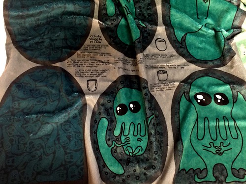
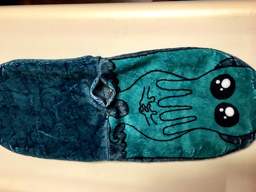
I got it printed out on the "minky" fabric, which looked like this:
Sewing together Cthulhu pillow

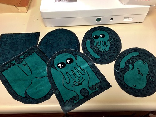
Then cut out all the pieces.
Sewing together Cthulhu pillow

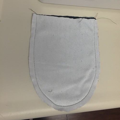
First, I sewed together the inner pillow, right sides together, leaving a gap for reversing and stuffing.
Sewing together Cthulhu pillow

Sewing together Cthulhu pillow

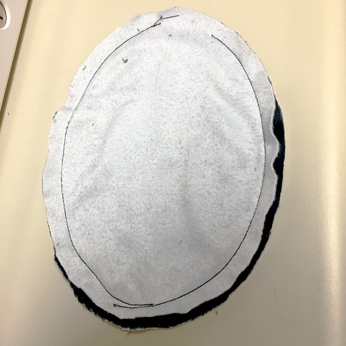
Then I filled it with rice. (And sewed the gap shut - by hand - after taking this picture)
Sewing together Cthulhu pillow

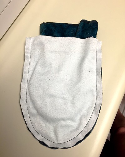
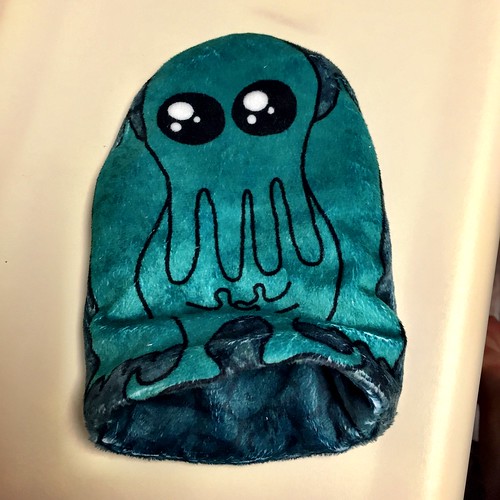
Next, I sewed the two sides of the slipcase together separately - just along the curve, leaving the bottom open.
Sewing together Cthulhu pillow

Then, I turned one half of the slipcase right side out and put it inside the other.
Sewing together Cthulhu pillow

I sewed the two halves together, again leaving a gap.
Sewing together Cthulhu pillow

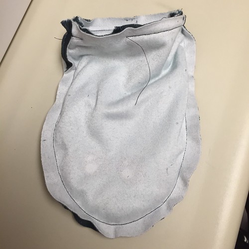
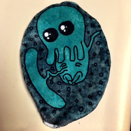
Here's what it looks like turned right side out.
Sewing together Cthulhu pillow

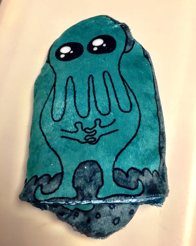
And then turned so that the lining is inside the outer case, gap sewn shut.
Sewing together Cthulhu pillow

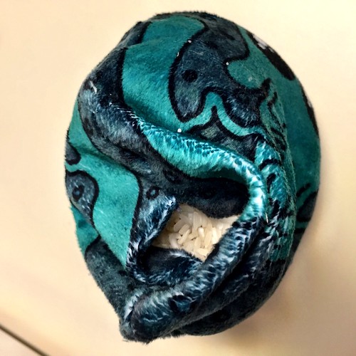
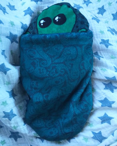
And voila, now the rice-filled pillow can be heated or cooled, and placed inside the slipcover!
Sewing together Cthulhu pillow

Sewing together Cthulhu pillow

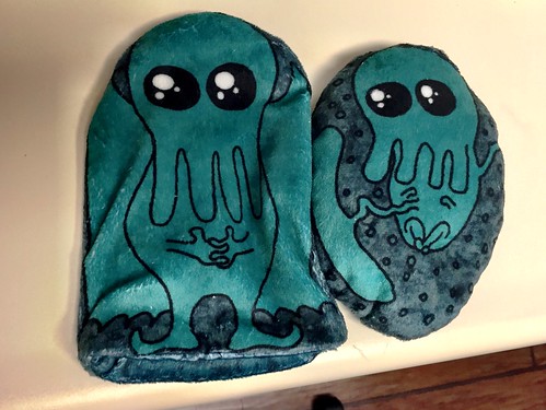
Also you can reverse the slipcover to show the pattern on the other side.
Sewing together Cthulhu pillow

Saturday, November 28, 2015

The moon, the sun, and so forth

For the theme "lunar cycles," I made a representation of how the lunar cycle matches up with the sun. Specifically, I realized I wasn't clear on what cycle determined whether you could see the moon during the day or night. So, I looked it up! The answer being: at the full moon, it rises at sunset, and rises later each day, until at the new moon it's rising at sunrise. So I tried to capture this:

lunar cycle over time

The gray half-circles indicate when the moon is up, and the yellow/orange represent when the sun is up. The small light blue half-circles are for the high tides. I tried to balance being representational with being abstract enough to be a usable stripe/dot. It came in the bottom half of entries.

I knew there would be a lot of designs that had all the phases laid out in a row like I did, but I stuck with it anyway. My favorite in that vein was this one, plus this one that put them in a circle. Others I liked were the ones that looked like a quilt, sort of Scandinavian, or retro and sketchy.

Monday, November 16, 2015

Fitness and health

For the theme of "fitness," I was still thinking about the various glyphs and symbols I worked with last week, and wanted to do some basic icons related to fitness. I have a very young baby (almost 7 weeks!) so I'm not able to think much beyond the essential functions for life. So I came up with some very straightforward advice on health: get enough sleep, get some exercise, eat a balanced diet, and drink plenty of water. I made little "icons" for each of these.

basic advice for health

For the colors, I used the "Doctor" colors from the synergy project, which I hadn't used yet. This entry came in very near the bottom of the contest. My favorite was this nice usage of running shoe treads.

Monday, November 9, 2015

The yearly calendar

Every year Spoonflower does a contest to put next year's calendar in a fat quarter-sized design, such that it can be used as a tea towel - you can see my previous entries here. This year, I was initially going to go with something generic that people like to have in their kitchens. Uhh, lavender flowers! And let's add fleur-de-lis and go for a French theme. But when I started trying to make the basic layout of all the numbers, it seemed kind of dumb and pointless. Back to the drawing board.

I had been laying it out in a diagonal checkerboard pattern, so I stuck with that. Then I had the thought to fill the background of each of the diamonds I was going to put a month in with just a large initial for the month. But, starting with "J", that seemed like it left too much empty space, so then I did the three-letter abbreviations instead, trying to stack them together like Mayan glyphs.

The Mayan connection reminded me of the ancient Egyptian colors I used before, so I used those. I made a polka dot background - instead of just circles, it's X's, stars, hexagons, and bursts, which you can see better here. I'm actually really happy with how that came out - it's one of the few designs I've made that came out exactly like I envisioned it.

In any case, the calendar came together like so:

Glyph Calendar 2016

It didn't go anywhere in the contest, but two people bought it. My favorite was this one.

Monday, November 2, 2015

After the apocalypse

This week's contest was another one for a toile, but with a "post-apocalyptic" theme. I went right for the "only the cockroaches will be left" approach, and drew some giant, irradiated cockroaches wandering around in overgrown ruins. I tried somewhat to emulate the style of Tom Gauld as a guide to conveying atmosphere without a ton of detail.

giant roaches among the ruins

For the colors, I used a subset of the ones from my sandcastle entry, since I thought it had a bit of an eerie feeling. This came in near the bottom of the results. My favorite entries were this cartoony one that depicts life after an alien takeover and this sketchy, nearly-abandoned cityscape..

Friday, October 23, 2015

A tasty bacteria

For the "micro-organisms" theme, I went with depicting the bacteria that makes yogurt possible: lactobacillus. In photo micrographs, it has a pretty basic cylindrical shape with rounded ends - like a pill capsule. I went for that look, and used the colors from the "spring" set.

lactobacillus makes yogurt

I think this is pretty fun, and could even be mistaken for sprinkles. This came right smack dab in the middle of the results. My favorites were this very geometric one and this one with some interesting textures.

Thursday, October 22, 2015

Cephalopods

For the cephalopod theme, I drew some squid egg casings, which are weird and interesting but simultaneously cute. Here are some of the reference images I used: 123.

I used these colors:

squid_and_the_moon
Color by COLOURlovers

And here's the result:

squid egg cases

The background texture is my good ol' kelp again, and the texture on the branches the cases are attached to is a basketweave. My favorites were the tentacle stripe, this very cutesy design, and this more grown-up take.

Wednesday, October 21, 2015

Pop art cookies

We had yet another "pop art" theme, this time for cookies instead of chickens. I stuck with Murakami as my inspiration again but went with his flowers this time.

I used these colors:

Pop_Art_Kiss
Color by COLOURlovers

So it came together like this:

superflat cookies

The gray background is supposed to make it look like they're still on a cookie tray. I think I have improved my technique a little and they look more like iced sugar cookies than my previous attempt.

I was surprised at how many macaroon entries there were. That actually included my favorite (which was the ultimate winner).

Tuesday, October 20, 2015

State Fair

For the "State Fair" theme, I just did some simple blue ribbons backed by small polka dots. The gold and blue colors are from the official California State Fair website.

first place ribbons

This came in just barely out of the bottom quarter of entries. I was certainly not the only one to focus on the ribbons, and my favorite in that vein was this one. I also liked this sampler quilt and the one that won.

Monday, October 19, 2015

Ditsy Lizards

Time for another ditsy contest, this time for lizards. I wanted to stretch myself a little and use some more difficult colors to work with, so I used some from the Murakami-inspired design I did, and drew a bunch of little lizards just hatching from their eggs.

Hatching lizards

This only got 12 votes and came in 6th from the bottom. Oh well! My favorite entry was the baby chameleons.


Sunday, October 18, 2015

Can't touch this

For this contest, the theme was "Nineties Nostalgia." What am I nostalgic for from the 90's? Not much. Plus, this is one of those themes that's hard to tackle without infringing on some intellectual property. Most pop culture references would be to some product or movie/TV show.

After discussing some options with my husband, I decided to do an homage to hammer pants, via the "U Can't Touch This" video. I went through the dance moves on the video and captured some illustrative poses in silhouette. I had previously used a video for reference for my sleight-of-hand design, and was able to go frame-by-frame to get the exact reference I wanted. However, I discovered that YouTube has since discontinued this feature! You can only go in 10-second bumps forward and backwards. Or, let it play and hit spacebar to stop it and hope you get lucky. So that made it much more difficult. But, I was still able to get the poses I wanted EVENTUALLY.

Hammer pants

For the background, I used these colors:

Nineteen_Ninety_Five
Color by COLOURlovers

So this was fun to make but I have no idea what you could ever use this design for. It actually did pretty well and came in the top quarter of entries. My favorite was the cute tamagotchis.

Saturday, October 17, 2015

Botanical sketches

The time came again for another Fabric8 contest. This time the theme was "botanical sketchbook." I made some drawings of acorns and maple seeds and put those together - kind of a "tree babies" theme.

Maple and oak babies - aqua

The background texture is the ivy vines I've used a few times before. As usual, I didn't make the cut for the final 100 so I don't know how many votes I got. Most people just went for "botanical" and didn't try to make it look like anything from a sketchbook. My favorite entries were this smaller-scale assortment, this lush arrangement with birds, these delicate roses, and the wildflowers and mushrooms.

Friday, October 16, 2015

Book bindings

For the theme of books, I focused on just the various ways of binding them, in a simple isometric view.

Book Bindings

For the first time, my design actually made it into the "roundup" image for the vote opening announcement blog post! I don't think it made any difference to the voting, but cool anyway.

This did pretty well in the contest, making it into the top quarter of entries. My favorite was this one.

Thursday, October 15, 2015

Butterfly coordinates

We had another coordinates contest, this one for butterfly-related designs.

Deconstructed butterflies

Clockwise from top-left, the designs represent: the butterfly heads with proboscis curled up, cocoons, the "warning spots" that appear on butterfly wings and on the bodies of caterpillars, and the "cellular" look of wing patterns (like those of monarch butterflies). The cocoons and wing cells are my favorites out of the four. The background of the heads uses the water droplets pattern and the background of the cocoons uses the hex graph paper pattern. (can't see it in this view but you can on the specific fabric page)

I used these colors:

One_Year_Abroad
Color by COLOURlovers

I managed to get all four designs done from start to finish in about a five-hour stretch at the last minute, and I'm pretty satisfied with how they turned out. This was my best contest result since my spoons entry back in March. It got 150 votes and made it into the top 20%. And, it got enough likes to become my second-most-liked design ever (behind only Baby's Book of Computer Science).

My favorites were this sketchy one and this Scandinavian one.

Wednesday, October 14, 2015

After school snacks

For the contest about "after school snacks," I went with the classic cracker trio - you know, that assortment that has a butterfly shape, a bowtie shape, and a rectangle. I put the crackers on top of some classic handwriting practice paper (a design I recreated so I could make this one).

After School Cracker Trio

This one REALLY bombed - it only got four votes and came in DEAD LAST. Wow! This was a little surprising considering that seven people "liked" it during the voting - and every other time I've seen, a lot more people vote for a design than "like" it. Just one of life's mysteries, I suppose.

My favorites were the very stylized fruit and nuts and strawberry fruit snacks.

Tuesday, October 13, 2015

Goats

For the "goats" theme, Spoonflower gave us the colors to use:

Spoonflower_Goats
Color by COLOURlovers

(Plus white.)

I definitely wanted to feature the eyes of the goats, as that's one of the most distinctive things about that type of animal. So I went with a straightforward arrangement of simplified goat heads.

gooooaaaats

This didn't quite make it into the top half of entries. My favorite was this one, which used crosshatching to expand the apparent range of colors, for a lovely glowy look.

Monday, October 12, 2015

National Parks

For the "National Parks" contest, I focused on the national parks in California. I was originally going to make some kind of ornate badge or patch for each park, but decided I didn't have enough time for that. Instead I focused on a typographical approach. I started off using just the colors in the National Park Service logo, but that turned out too dull so I added more greens, blues, and grays, until each of the eight hexes had a distinct color.

National Parks of California

The texture is the ivy vine from this design. This actually did decently and made it into the top third of designs. My favorite was the entry that had unique bottlecaps for all FIFTY-NINE national parks!


Sunday, October 11, 2015

Baseball

For the theme of baseball, I ask my husband (who watched a lot more baseball growing up than I did), what some of his favorite memories or aspects of baseball were. One of the things he mentioned was filling out scorecards during games. I've never done that, but I loved filling out forms as a kid, so I bet I would have enjoyed it. So, I thought I would do a design that mimicked all the little lines and boxes on a scorecard.

I started out with these colors, but ended up modifying the blue and buff and using just those:

baseball.
Color by COLOURlovers

I thought it was a little more interesting rotated into diamonds:

baseball scorecards on the bias

I also did a straight up-and-down version in black and white. This barely cracked into the top half of entries. Interestingly, someone immediately bought a full yard of it! Pretty exciting.

My favorite entry was the winner, which featured highly textured bats.

Saturday, October 10, 2015

What's in your bag

The theme for this contest entry was "what's in your bag?" I have a recurring anxiety dream around not having a bag (or having an insufficient bag) so I used that as a jumping-off point for "bags within bags." I used the same color set as the candle design I did a while back.

I keep bags in my bags

The anxiety dream is always in a different place with different things, but the common thread is that I have some awkward set of objects I have to carry, and I'm stuck out in public walking around for awhile. For instance, I'm on a school field trip to a museum with a big heavy backpack full of papers and books, and someone gives me a kitten I also have to keep track of. Or, I've just checked out of a hotel and need to walk across town to somewhere else, and need to carry a stack of magazines and a ceramic snowman. So because of the fear of having some sudden responsibility to carry something around, I always carry a small collapsible bag around in my purse (and my suitcase when travelling).

This did a little better than my entries have been, and came right smack dab in the middle of the contest. My favorite was the one that focused on keys.

Friday, October 9, 2015

Llamas

For the theme "llamas," I went for free-association (semi-) rhyming, adding in "origami" and "pajamas." For the origami part, I used patterns you might see on origami paper, and for pajamas I used the "bedtime" color scheme from a previous contest.

origami llamas

The pattern in the llamas are those stars again, and the background are the water droplets. I'm fairly satisfied with how this came out, but I feel like the way the llama heads are arranged makes your eyes zip across the pattern too quickly, undercutting the calmer vibe I was going for.

As per usual, this came in the bottom quarter of designs. My favorite entry was this cheery folk-art stripe.

Thursday, October 8, 2015

Lemonade -> Lemon-aid

Lemonade was the theme for this contest. Since most designs would obviously be mostly yellow, I wanted to come up with a way of using darker colors. I used this as a starting point for what other colors look good with yellows.  And I decided to go for a pun rather than literal lemonade. Hence, lemon-aids:

lemon-aid

The background uses the kelp design I'm fond of as a texture. I really like how this turned out - very similar to the pickle herringbone, I like the colors, and the fact that it can be seen as an abstract pattern. But, it didn't even make it out of the bottom ten percent of the contest. My favorites were these sort of mid-century modern lemons (like something out of an old cookbook!) and these very airy graphic lemons.

Wednesday, October 7, 2015

Hedgehogs at the last minute

For the hedgehog contest, I had literally ten minutes to make a design before we left on a trip. So I made a little ASCII hedgehog. I made it a little too small though - it would have had to be bigger to be easily readable in the contest format. But I discovered that too late to redo it.

Ascii Hedgehog

But in any case, this is the scale that I prefer it at, so no big deal. It got 23 votes in the contest. And unfortunately I didn't even get a chance to vote in this contest so I don't have any other entries to call out specifically, but these are the top ten.

Tuesday, October 6, 2015

Sandcastles

For the theme "sandcastles," I went for the simplest type possible: digging holes in the sand and then mounding it up by hand. I looked for a sandcastle-themed set of colors and went with this one:

Frozen_sandcastles
Color by COLOURlovers


dig, mound, repeat

I'm not all that happy with how this turned out, and it didn't do very well in the contest. But here's the funny thing - even though I think some of my other recent entries are CLEARLY far superior to this one (pickles and power tools), this got a handful MORE votes than either one of those. I can only shrug!

My favorite entries were these two.

Monday, October 5, 2015

Watercolor power tools

Here's a weird theme: power tools, but done in a watercolor style. This is the kind of contest that just makes me think they're trying to keep the number of entries down to make voting easier. In any case, instead of focusing on the tools themselves, I did just the chargers. They have such interesting shapes and I wonder what kind of thinking goes into their design.

Powertool charging stations

This was pretty fun to draw. I used some free watercolor textures I found online.  However, it only got 12 votes and came in 81st out of 84. Ha, ouch!  My favorite was the drill bits.

Sunday, October 4, 2015

Mermaids and other things for children

Spoonflower had a contest for a mermaid design - and this was another partner contest. The winner has a chance at getting their design made into girl's pajamas! So they had some (somewhat confusing) guidelines about not making the design motifs too big or too small, and not using more than eight colors. I didn't fuss too much about it, because I had my own purpose in mind for a mermaid design.

I was getting ready to make another set of three bags for our upcoming family Redwoods trip, and unlike last year where I used fabric I had on hand, I wanted to make specific fabric designs for each kid for their bags. So for my niece, I wanted to make robot mermaids, using the same colors as her robot quilt.

Robot Mermaids

And here's how it turned out as a bag:


The fabric for my son features some of his favorite things: dalmations, a convertible Mustang (just like Dad drives- well, except in yellow instead of gray), giraffes, and penguins. The penguins are facing each other because the last time he went to the zoo, he got to see two penguins pecking at each other and thought it was the most hilarious and interesting thing ever. "They were playing penguin BEAK FIGHTING!" he would say, with accompanying hand gestures. This uses the same set of colors as my animal tax accountant design.

Time_for_Taxes
Color by COLOURlovers

For my nephew, I found an interesting palette with his name:
Emmett
Color by COLOURlovers

And for the design, I combined some of his favorite animals: cheetahs, dragons (a two-legged wyvern style) and penguins.

So for my family it worked out well but made no impact in the mermaid competition. My favorite entry was this night-themed one.