Spoonflower has ended the weekly design challenges and will be doing them monthly instead. For March, the format is quite strange: the first fifteen days of the month, we get a daily prompt (the "Daily Spoonchallenge"), for which we can create a full-fledged design, or a sketch, or whatever. Then, on the 16th, they'll pick one of those prompts to become the actual contest theme - and entries are due on the 18th. So, not very friendly to those of us who have limited time to work on designs!
I did my best to keep up with the prompts. Here are the designs I came up with:
I went with the simplest thing I could think of I use a pencil for (though I used Sketchbook Pro to digitally replicate the look of pencil): writing the alphabet.

Thinking that these themes are all going to be mediums rather than subject matter, I figured I'll stick with the theme I started: typography. I messed around in Sketchbook Pro to find the brush that most resembled water color and drew a couple different symbols. I decided I liked the "@" the best and applied a
watercolor texture.

Once again, I faked the look of the prompt format on my computer. Having done "@", I figured I'd do the darling of the typographical world: the ampersand. For colors, I looked for "trendy palettes" and decided to use
this one.

I have terrible handwriting and am no kind of calligrapher. So I didn't want to continue using lettering, exactly, so I thought of other things to draw that are still kind of writing. Maritime flags! (
Which I have used before) But what should I spell out? Just drawing each flag in the alphabet is a little boring. I looked at
pangrams and chose to spell "Glib jocks quiz nymph to vex dwarf".

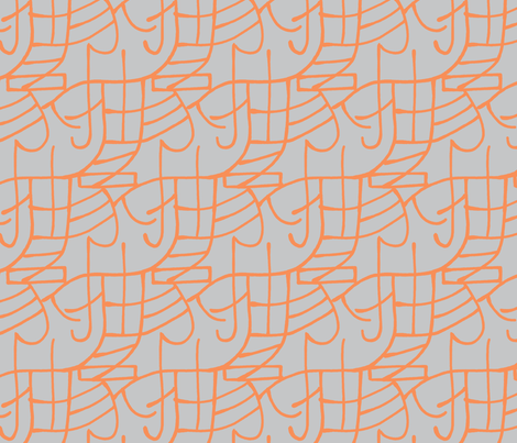
Some type elements are very geometric - like the plus sign! Scattered plus signs are actually pretty trendy, as are chevrons, so I combined them. Plus I used one of the "
trendy palettes" used by one of the design groups. So this resulted in a kind of Frankenstein's monster of trendiness.

I was unexcited at trying out a vector-drawing program just for the sake of the challenge, so I ended up combining this with Day 12 below, by using only the basic vector tools: rectangle and circle selectors, with flood fills.
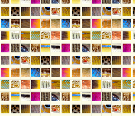
Flickr has a collection of copyright-free photographs from various institutions, so I browsed around that until I found
this gallery of fish from the Smithsonian. My husband had the idea of framing stuff in rectangles to look like polaroids. I took crops of the most interestingly-patterned parts of the fishes and put them together. (No typographical association with this one!)
Well, I use GIMP to draw almost everything anyway, so I didn't bother doing anything specific for this.
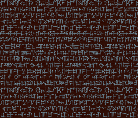
I wanted to do something with
cuneiform, so I drew some using
antique square nails instead of the usual wedge shapes in clay. I feel like it's still in the same spirit as "steampunk," but outside of the same old gears that usually means.
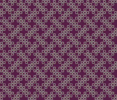
Really? A theme of "hand-dying" for a single day? I'm not sure who can just go come up with the time and materials to try dying something in one day with no notice - not people with a full-time job, a toddler, and an infant, I guess! So, as with the other themes involving a specific medium, I just mimicked it digitally. Thinking about various forms of writing, I was considering Braille, which reminded me of the way some shibori-style dying makes
motifs out of
lots of little squares. Instead of Braille I ended up arranging such squares into a cross-stitch type design (taken from
this book, which I've
used before). I used the colors from
this example.
So of course, after having adopted typography as an unofficial theme, it comes up as one of the official ones! I was browsing interesting typographical examples and liked
this one. So I tried to think of what text I could compose in a circle...how about just the word "circle?" Might as well do square and triangle at the same time! I used the other of the
trendy palettes from what I used in Day 7.

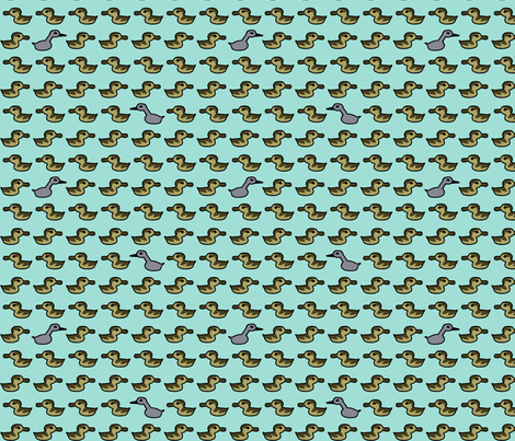
I considered a bunch of different things to render "kawaii," but at this point I was five designs behind so it couldn't be that elaborate. (I spent way too much time drawing all that cuneiform!) I saw a picture of a heron in my Feedly feed, which made me think of what bird would be interesting - but not too hard to make cute. So I went with the obvious and illustrated "The Ugly Duckling."
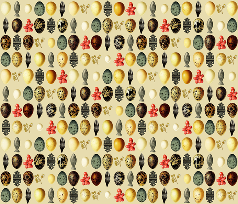
I went back to the copyright-free commons I used for the fish photos and browsed around until I had a
variety of interesting images saved. Then I combined them into a simple grid. I think this would make a pretty cool wrapping paper.
- Day 15: Designer's Choice
On the final day, they just suggested that we pick one of the previous themes and use it again. So I didn't do anything for this one either.