First, the "behind" - I have two contest entries to blog about.
First, we had to do a cheater print (previous cheater contests have been themed with
zig-zag and
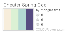
robots), this time including something floral and being seasonally apt for Spring. And also using these nine colors (plus white):
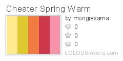 Color by COLOURlovers
 Color by COLOURlovers
I searched around for florally-suggestive traditional quilt blocks and liked "
Thistle Bloom." That design requires five different fabrics. As a twist, though, this is a square block and the contest entries get shown on a 21" by 18" fat quarter, so I tried to come up with a way to have it work as a full FQ or if you just wanted a square block. My solution was to make the block a fairly standard 16", then add a 1" seam allowance all around, then add 1.5" sashing to each side to fill it out. So with a different design for the allowance, that brought it to six sub-designs.
I considered drawing six new floral repeats, but got a little light-headed at the thought, so instead I just took some of my existing designs that have gotten the most amount of positive attention and recolored them. I even managed to upload them all as their own repeats, so you can see them all
here.
The easiest, just involving swapping the colors, were the
seadragons, the
basic stitching, and the
baby praying mantises. I also took the "
wailing spirits" and redrew their faces so they were happy and laughing instead. I had previously turned the
campground patten into an
abstract texture, so I used that one again as well. And finally, I took just the Rothko egg from the
painters' eggs and put that in a small repeat.
So the end result:

I ended up using only the cool colors, plus the light yellow and pink from the warm. I thought it would give a more serene look, but I think it was a mistake as it simply looked washed out compared to all the other designs that featured the red, in particular. It came in a bit below the 50th percentile, with 60 votes. My favorite entries were the ones based on
millefiore and
Baltimore-style applique. For plainer types of patchwork cheaters, I really liked the
3" squares,
hexagons, and
cathedral windows.
As to the "ahead" part of the post title - I had managed to get ahead of the contests by the time I was working on this cheater, so I even made a few more coordinating designs. I put just the 16" patch in a repeat without the extra filler:

And I also made some plain quarter-inch checks using various combinations of the same colors I used in the other fabrics, and combined them all to make a nine-patch cheater print:

Part of this burst of coordination was also procrastination, because I was lacking inspiration for the next challenge, which was "magic" (as in Houdini, not Harry Potter). I had an idea of a scatter print of white-gloved hands in poses suggesting sleight-of-hand, but hands are some of the most challenging things to draw, so I kept putting it off. But, finally, I loaded up a
video of Penn and Teller demonstrating their principles of magic and did my best on a representative sequence. It was at that point I decided to just put the hands in orderly rows, so that you could "read" them in order like a little illustration of the technique.
I decided to use the
Synergy "movie" palette, which is a bit of a stretch theme-wise - still entertainment, I guess? I plan on also doing a version with hands clapping, so perhaps that can bridge the gap. I entered this version in the contest:

And I also did a version with a
gray background. My entry came in 34 out of 119, with 105 - a pretty good showing! My favorite entry was the
playing cards.