Thursday, January 31, 2013

Crane your neck to see the brolga

This week - Australian animals! I decided first I wanted to do something inspired by petroglyphs. I browsed Australian petroglyphs on Wikipedia until I found this one that appealed to me - I like the super-exaggerated long legs:


It's described as a brolga. Hadn't heard of that before! It's a kind of crane with a patch of red on its head. So I drew my own take on the stylized cranes. I see now, however, that I didn't get all the legs as dramatic as I could have - I think each individual crane I drew became less exaggerated, in fact.

Brolga Crane Petroglyphs

I made the crane bodies a blue-gray to be a compromise between the color of the real cranes and the color of rock. Plus the touches of red on the heads for fun. The designs in the background are supposed to be suggestive of grass but I couldn't quite satisfactorily resolve the color. I'm not sure what would work better, but it seems not quite right.

This came in 43 out of 175 with 209 votes. My favorite entry was this gentle Kookaburra stripe. The cutest one was the Aboriginal-art-inspired animal assortment that came in seventh.

Saturday, January 26, 2013

Project Runway Season 11 Episode 1

The big news for this season is that the entire season will be a team challenge. This has been a much-reviled move on the internet, since it serves to transparently increase the interpersonal drama. Tim Gunn has been bravely pushing the company line, which is that by tying together the fates of the designers in teams, they should be more willing to help each other out and offer constructive criticism instead of just being catty in the interview room. They way it'll work is that most of the challenges will still be individually judged (not like they have to make coordinating team collections every week), but the team with the overall higher score will have one of its members named the winner and the team with the overall lower score will have one of its members eliminated. So an individual who does poorly can still be safe from elimination if the rest of her team is good enough to cancel her out. So it could lead to more cooperation - I guess we'll find out!

We start off with the usual first-episode blur of trying to introduce sixteen people. James manages to distinguish himself with a truly gross joke about peeing on the set to mark his territory (complete with a raised leg). Then it gets down to brass tacks, and the designers are clued in to the fact they'll be on teams. (Sound of a record scratching, tinkle of broken glass) Yeah, not a popular idea with those folks.

The teams are formed according to...nothing apparent. Heidi just names names and they sit on one side of the room or the other. The first challenge arrives: each team will have a scenic field trip (either to the top of the Atlas apartment building or on a boat) to see inspiring views of NYC, and then they will each make a garment drawn by that, which, as always, should show "who they are as a designer." But also they should listen to feedback from their team members during the process.

Stanley, Kate, Richard, Patricia, Amanda, Layana, Joseph, and Daniel are on the boat. They call themselves "Team Keeping It Real." Matthew, Samantha, Tu, James, Emily, Benjamin, Cindy, and Michelle are on the rooftop and call themselves "the Dream Team." Thus continues the streak of PR teams giving themselves horribly cheesy, cliched names. Well, I guess they are clothing designers, and not branding experts. James continues his stream of not looking good on TV by yammering nonstop.

Each team gets $1200 for fabric, which I assume ends up getting split up evenly to $150 for each designer as we don't see that part. By the time they are well into sewing, I notice that 24-year-old Emily has gotten a LOT of screen time - plus she's said many very confident things and pooh-pooh'd many of the other designers. So in other words the editors are telling us now that she's doomed.

The teams have to all listen to Tim's critiques together. Since there are so many to get through, some are reduced to literally one syllable (Benjamin's: "Good!") and some designers are edited out entirely. But that's actually a good sign since that means they'll probably be around for at least a few more episodes. By this point Emily is very intimidated and know's she's bitten off more than she can chew. (Or cut off more than she can sew, more accurately) Her team tries to tell her to take on less (two pieces instead of three), and she initially agrees, but then continues on with her elaborate jacket anyway. James is pouty when his team isn't wowed and suggests some changes.

As the time comes to a close, Emily's pride is further broken down, when Cindy, whom she previously disdained (mostly for being an older lady who chose to be a designer only later in life), comes to her rescue and helps her sew, so that she at least has something to go down the runway. Says Emily, "I'll never judge again." We are then treated to the usual array of smug comments from the designers belittling other outfits.

For team "Keeping It Real" (I can't believe I'm going to have to call them that all season), Stanley sends out a shiny jumpsuit, Kate a pieced boucle dress that seems to have construction issues, and Richard a colorblocked dress. Patricia hand-painted her own print, which she made into a boxy short dress with odd blue crescents at the armpits. Layana made an LBD with lacing in the back, and Daniel a nice black suit with capri pants a giant poofy peplum. Amanda's outfit is a drapey blue shirt and sci-fi pants, and Joseph's dress looks like towels hanging on a clothesline.

The "Dream Team" starts out with Matthew's white collared shirt & poofy skirt accented with a string tie. Samantha shows a nice navy dress with an organza overlay, and Tu has an odd midriff-baring white outfit. James has grudgingly produced a white shirt with messy ruching and a black skirt with a beige segment. Emily manages to send out a belly shirt, a black mini skirt, and a randomly-sewn organza shape that looks more like an out-of-control collar than a jacket. Benjamin's is a mullety assortment of flowy beige panels, Cindy's long dress has an interesting print but a weird red checkerboard pieced Empire waist, and Michelle closes it out with an survivalist waxed denim dress.

My favorites are Richard and Samantha's dresses. I might be biased in Richard's favor, though, since he's from my hometown of Sacramento.

Team KIR are the winners! David, Richard, and Patricia are the top three. David's looks chic and expensive, and Richard's is flattering and the asymmetry works well. Patricia starts talking about hers and the editors let us know she actually talks for a loooooong time by cutting to a variety of bored-looking faces. The bottom three are James, Cindy, and of course Emily. James tries to blame his bad outfit on the unwelcome suggestions made by his team but the judges have none of it. They say Cindy's has "no designer quality." Nina claims that Emily's "jacket" is the least finished garment she's ever seen on the show, but I disagree - that would have to be the pathetic "shirt" that Carmen made for Tiki Barber in season 4 (scroll to the bottom - it's the blue swatch of fabric tucked underneath the jacket like a full-torso fichu)!

Daniel is named the winner, for his very designer-y suit. (Where can you wear something like that? How do you sit down with a cloud of fabric around your hips?) And then, surprising no one, the utterly crushed Emily is out. Emily was initially sure she would win, because she works a day job and sews at night, so that must mean she could take the pressure of PR, right? Well, we can extract from this that working long hours by choice actually has no bearing on whether you're good at time management. (and in this specific case, it seems to be a negative correlation!)

Project Runway Season 10 Episodes 13 and 14

Well, the next season of Project Runway just started - so I'd better wrap up my thoughts on the last season ASAP. (And that's ignoring the fact that a whole season of "all stars" has also aired in the interim - oops!)

The last four designers were given $9000 and five weeks to make their finale collections. As is usual, four weeks in they each get paid a visit by Tim Gunn. We learn that Fabio, Dmitry, and Mellisa have each been loaned apartments to use a studio space. Chris, however, is simply in his parents' basement.

Chris is basing his collection around a sepia-toned print of an x-ray taken of his mother after an accident - showing screws and plates in her bones. Fabio's is a pastel drapey "cosmic tribaldom" collection, which Tim loves until he sees the clunky pants & shoes Fabio plans on putting under each outfit and then he is "mystified." Dmitry keeps repeating that his black and white and chartreuse garments are "organic architecture" and Mellisa's is very, uh, I can't actually read what I wrote for my initial impression. Damn you, terrible handwriting!!

In any case, in the penultimate episode, the contestants have to choose three outfits to show to the judges, and based on these mini-collections one of them will get eliminated before the finale. However, they don't actually end up eliminating anyone so it's a no-op. I guess it's just a chance for everybody to address (if they want) any criticism at this point. Mostly the judges have issues with the styling - Fabio's doesn't look sophisticated, Dmitry's is too old, and Mellisa put her girls in ugly wigs. Chris didn't have enough garments done in time so he had to just show the few things he had that would actually fit on the models he got, so the judges called him out for having no "wow" factor, and, well, "very little clothes."

Coming into the finale, everybody gets $300 more to spend at on fabric to finish off their collections. Mellisa has the most notable addition by picking up red leather, which she makes into a dress. Mellisa and Chris are both still frantically sewing when Tim comes to take everyone to the runway. Chris then rips off the bottom tier of one of his dresses that's trailing lower than he wanted.

Totally random cameo - Stephanie Meyer (as in, author of Twilight) at the runway show. Huh?

Chris, Mellisa, and Dmitry's collections are all black with a few other neutrals. Fabio stands out with all his hand-dyed pastels. Chris and Dmitry's read as more formal, whereas Mellisa and Fabio's are more towards daywear. I liked Dmitry's the best - it had interesting geometric details.

In the judging, Chris is out of the running pretty much immediately. They say he's "still finding his voice." That leaves it between Dmitry's more tailored dresses versus Mellisa & Fabio's slouchier, hipster-y clothes. Dmitry wins!


Thursday, January 24, 2013

For whom the bell toiles

This week the contest was for a toile (again). This time, it was supposed to have a "murder mystery" theme. The most obvious way of making a murder mystery appealing? How about Clue! I drew a stereotypical dead body scene and surrounded it with garlands containing the six Clue weapons.

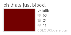
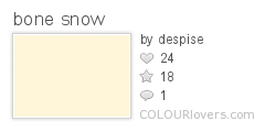
The colors I chose are supposed to be reminiscent of blood and bone. Specifically:

oh_thats_just_blood.
Color by COLOURlovers
 
bone_snow
Color by COLOURlovers

Then it was just a matter of getting that design into a repeat. Last time I felt like I had too much empty space - I'm pretty happy with the balance of drawing-to-background with this one.

Murder Mystery Board Game Toile

This came in 45 out of 75 with 91 votes. Given that this was a much more specific, and difficult, contest, there were fewer entries this week than usual. My favorite entry was the ludicrously cute thumbprint bird tableau that came in fourth. I also really liked the chess design and this mashup of Poe and a china pattern that came in eighth.

I was obviously not the only person to think of Clue. My favorite other Clue entry was this one.

Friday, January 18, 2013

Look to the skies

This week, we were directed by our masters at Spoonflower to create a zodiac-related design. An idea occurred to me pretty quickly - I'd do a pattern of all the zodiac symbols that looked like it was part of a wizard's robe. That quickly further refined itself into a border print, rather than an allover repeat. I thought, hey, I could make it the hem of a wizard's robe.

Also, I decided for more variety, I would include all the symbols for the planets as well. I found this page that had all I was looking for, and more! There are all kinds of symbols for things in space.

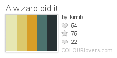
For the colors, I just searched for palettes using the word "wizard" that appealed to me. Bingo!

A_wizard_did_it.
Color by COLOURlovers

I had been debating on how exactly to depict the symbols - should I try to make them look like faux embroidery or faux applique by drawing faux stitches? And how about the background - what should I put behind the symbols so it's not so flat? Once I got these colors, it really began to come together.

I continued my experiments with gradients from last week and gave the symbols a golden shine. I think it gives a good impression of gold embroidery without being too overdone. For the background, I wanted to suggest a velvety texture. I actually ended up using just the trees and boulders from my campground pattern, shrunk, as the "nap." (And speaking of that design, somebody recently bought four yards of it on canvas! The mind reels!)

Wizard Robe Hem - Gold-Embroidered Border

It came in 33 out of 93 with 178 votes. I liked this Pottery Barn-bedding-feeling take (which won), this ultra-sweet baby-appropriate design, and this straightforward geometric version. Taking advantage of digital printing, I also liked these star photos shaped like stars which came in seventh.

Thursday, January 10, 2013

Why did it have to be...

This week's contest was for something to do with snakes, in honor of the imminent start of the Year of the Snake. I kept up my theme of hexagon-based layouts from my last two entries, and arranged snake faces in a pretty simple repeat. For the colors, I wanted to put a variety of gradients to suggest iridescence.

Iridescent Snakes

I'm pretty pleased with how this came out - it's very close to how I pictured it originally.  It came in 21 out of 130 with 261 votes, which is quite a bit better than I thought it would do. It got a pretty good number of page views, but hardly any comments. I guess people voted but didn't have much to say!

I really liked the snakey floral that won. I also liked this simplified snakeskin and these cute snakes that remind me of the old screensaver that draws pipes on the screen.

Sunday, January 6, 2013

Various crystalline forms

Happy new year! It's time to catch up on the contests that have closed since last we met.

First: a small print having to do with sweets. I decided to make things easy on myself and adapt the hard candy print I made for Maren's quilt. I shrunk it to small size and redrew the highlights so they're on all sides. In the original, they're all on the top left, making it essentially a directional print when I wanted it to be more of a scatter. So this version is more successful in that regard.

Tiny Shiny Toothsome Sweets

My entry came in 169 out of 207 with 22 votes. My favorite entry was the candy necklace that came in fifth. For more tonal designs, I liked the candied spiders, this typographical take on hard wrapped sweets, and the graphic licorice squares. Also good were the assorted chocolates and this design that makes up for lack of candy with extreme cuteness.

Then - snowflakes! Like the candy design, the layout is based on a honeycomb type of repeat. For this one, I wanted to try to do something that looked like could be used on kids' pajamas. (My son has all kinds of fleecy footie jammies with absurdly cute prints) My husband had the suggestion of beaming little baby faces peeking out from the centers of snowflakes (as a take on describing kids as "precious snowflakes"), and I ended up more-or-less reversing that.

Snowflake Snow Angels

This came in 74 out of 320 with 146 votes. I liked all of the top ten this week. My favorite entry was this glistening floral. I also really liked the blueprint and purple snowflakes.