Friday, August 31, 2018

Sixties

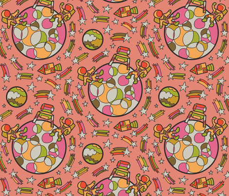
So after Fifties last week, we have Sixties this week. I went with another scientific milestone - this time, the moon landing! And I tried to do it in a somewhat "psychedelic" style - like Peter Max or Pucci. I had quite a bit of fun and I'm pretty happy with how it turned out!

Psychedelic Moon Landing

This came in my usual spot of right in the middle. My favorite design overall was the peacocks, but I thought the one that was the best combination of good AND Sixties was this one.

Saturday, August 25, 2018

Fifties

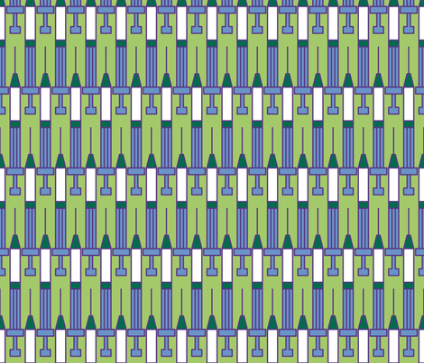
Coming right after twenties, this week's theme was the fifties. I looked at the scientific breakthroughs of the decade (which I had also done for the twenties but didn't find anything that leant itself to an illustration) and decided to go with the rollout of the Polio vaccine in 1954. So, a nice little repeat of syringes.

1954 - Polio Vaccine

 This ended up right in the middle of the pack as usual. My favorite was this scatter of mod-style elements.

Sunday, August 19, 2018

Twenties

This week's theme was the 1920s. (Yes, even though we just had an Art Deco contest.) I have previously done a 20's fashion design for the tennis contest. I started with some famous slang terms from the twenties: "the bee's knees" and "the cat's pajamas." Hence, bees, and pajama-clad cats, doing the Charleston:

Cat

I had a lot of fun drawing fancy twenties-style pajamas. This came in right in the middle of the pack, as usual. My favorite was the colorful high-rises.


Saturday, August 11, 2018

Two food contests

There were two contests in a row with food-related themes. First, a contest with a LOT of modifiers:
  • It was for a company that does iPad coloring books, so it was to be in black and white linework only
  • Plus the top designs could be featured in the coloring app, which does NOT do repeating designs, so our entries were supposed to be (or easily formatted to) 2200 by 3300. (as you can imagine, most people ignored that in order to make something more appealing as a repeat, since there's probably a bigger potential return on investment for yardage/wrapping paper)
  • And the actual theme was "food frenzy."
My inspiration was actually really simple. When I noted down the contest themes, I summarized it as "Food Coloring." So hey, how about those cute little bottles of literally food coloring?

Coloring food? Food coloring!

I even took a few reference photos of food coloring in our kitchen (without spilling it everywhere!), like a responsible artist. I'm really happy with how this came out. It almost made it into the top third of the contest! My favorite entry was the doodled fruits.

The next one was simply "tacos and burritos." I did polka dots (using the colors of traditional Mexical folk embroidery) with empty taco shells.

Imagine the tasty tacos

This ended up right in the middle of the pack. My favorite was the one that ultimately won.