Here's the designs I've made lately!
For the "April Showers" theme, I made a design in the style of a "tilted square" patchwork, with clouds and giant drops.
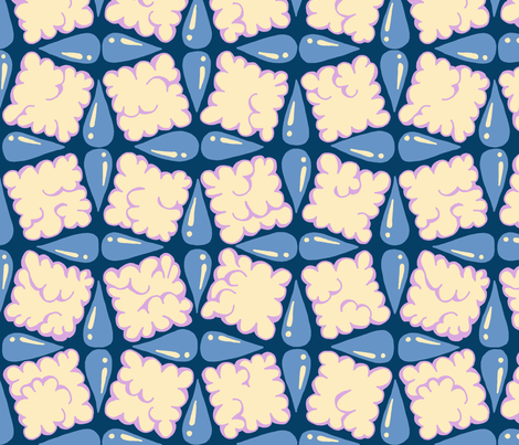
My favorite was the
rainbow raindrops.
for "eucalyptus," I was just going to use the
eucalyptus design I made already, but as it turns out it was pretty small so I ended up having to redraw it. So I also added some pods to it.

I'm really happy with this one - maybe one of my favorites I've created for a contest. (Still didn't do any better than usual, ha ha!) My favorite was this one that combined
different types of eucalyptus.
Speaking of trying to predict what people will vote for, there were also contests for "shibori" and "abstract minimalism." Here are my respective entries:


In my opinion, the shibori one is way more pretty AND useful. But the abstract rectangle one did way better in the contest! The first ended up very near the bottom, and the second did quite well (almost in the top 100). Insert shrug emoji here!
I think the common perception of shibori is that it's always indigo dye. (Probably 97% of the entries were blue.) I specifically chose something to look like a traditional mulburry dye instead so as to not be one of the zillions of blue entries. I'm sure that ended up hurting me! You can see an example of the kind of elaborate shibori dye I had in mind on
this page (the red kimono). Also I had made this base
shibori pattern for an earlier challenge.
The abstract rectangle one is an homage to
this artwork specifically.
My favorites for these themes were the
simple shibori squares and the
triangles.
Then, there was a contest to make a playmat, to fit on a yard of fabric. I made a solar system playmat. With more time I would love to add more details - like Voyager, the Mars rovers, etc.

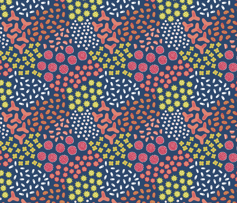
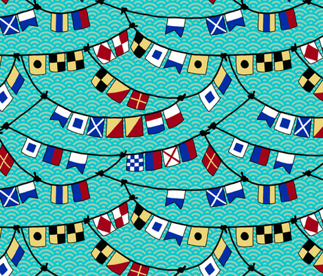
My favorites were the
circuit components and the
nest.
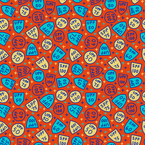
For small-scale Summer-themed prints, I made one based on the shield-like badges you often see on bottles of suncreen.
My favorite was the
fruits.


