Saturday, January 28, 2012

Two entries, one palette, fifty-one votes

I have two Spoonflower contests to catch up on. First up, the theme was to create a cityscape. I decided to go with the city where I live, Goleta. This area cracks me up sometimes. We could get into the politics of why unused or underused plots are left as-is, but the end result is that you get a strange mix when you drive down Hollister, which is the main drag: strip mall, empty weedy lot, business park, airport, gym, apartments, another strip mall, "old town", expensive condos, car dealership, nursery, school, lemon orchard, hospital! I wanted to do a cartoony overhead map just focusing on Hollister. Plus I wanted to have it be pretty small and dense. Once again though I didn't have enough time to really get it quite the way I envisioned. I kept having to stop myself from making it too accurate - adding all the right kinds of trees, shrubs, etc.

Hollister Avenue in Goleta, CA

If I'd had more time, I would have gone further down Hollister (I was only able to get from Winchester Canyon to Fairview, and I wanted get to Patterson), and spent more time on the repeat so it looks a bit more evenly spread. Definitely one on the "possibly remake someday" pile. I keep going back & forth on this one - at first I thought it was ok, then I saw some of the other entries and decided it's terrible, and now I'm starting to think it's marginally alright again. This came in 174 out of 180, with 15 votes, so I know where the Spoonflower voting public stands. Ha! You need to look at the top ten for this one, some of them are really amazing.

The following contest was for "outdated technology." I was obviously quite tempted to do something with computers - old floppy disks and so forth. But eventually I decided to go with something from my favorite book: the Count of Monte Cristo. There's a scene where the titular count interferes with messages sent through what is translated as a "telegraph," but it's also described as being a series of relay towers with "beetle-like arms." Of course I had to know more. As it happens, they are also called semaphore towers, and they have an apparatus with three jointed bars that the operator can rotate into different positions, each of which represents a character. So for my design I drew semaphore towers out in the countryside, each on their own hill. For more variety I added some oxen in there too. I decided I kind of liked the set of colors I used in the previous design, and they worked for this one too, so I just used them again! I have five different towers, which are displaying the letters B-R-U-C-E, which is, of course, the name of my son.

French Semaphore Towers with Oxen

This came in 181 out of 203, with 36 votes. So I doubled my votes from last week, ha ha! I didn't get either of these to quite gel, which was frustrating - but I'm much happier with a couple that are in upcoming contests, so stay tuned.

Tuesday, January 17, 2012

Adventures in Mundanity

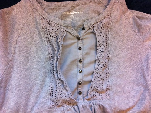
I've had this shirt for awhile, and the eyelet fabric on the placket is permanently crumpled.
Permanently wrinkled shirt
What's that you say? I could iron it? HA! My level of caring about this issue is way below the threshold that would cause me to commit to ironing repeatedly. You know, if they made irons that cooled down immediately when you were done, I might iron more. I hate having a cooling iron sitting around, waiting to singe an unwary passerby.

A few months ago, I bought another shirt that has a similar placket (same company - Eddie Bauer, actually) and noticed that an improvement had been made - the lace part was sewn down to the fabric underneath. So I thought, hmmm, I could probably do that with the one I have already! I finally got around to putting those thoughts into action.
Mended shirt

There we go! I just sewed through the wavy outside edge. Pretty easy. (And yes, I did iron it before I sewed it - hopefully for the last time ever.)

Speaking of fixing things, here's another task I accomplished. I've done the most cliched thing possible for the beginning of the year and decided to try to work out more regularly. I pulled out my Polar heart rate monitor for the first time in awhile, and discovered the batteries were dead. We had watch batteries in the cupboard - hooray! Oh darn, they're the wrong kind - the battery type is written on the back of the watch. Ok, let's get the other kind on Amazon. Pause for two days. The batteries arrived! I crack open the watch. Huh. There's kind of a weird little tab over the battery on one side - maybe that's keeping the battery down? I try to pry it up, and it snaps off and disappears! GASP OF HORROR. FRIGGING CUPCAKES, I BROKE IT! SELF, HOW HARD CAN IT BE TO CHANGE A STUPID BATTERY?? I THINK MY FRUSTRATION HAS MADE MY HEART RATE GO UP - GEE, I WISH I HAD A WAY TO TELL FOR SURE >:(

Just to twist the knife, I guess, I decided THEN to look up the manual online. It says, first off, that they don't recommend you change the battery yourself. You should take it to a "licensed Polar technician." Huh. But they do give directions, and say basically to pry it out with a tiny screwdriver, but be careful not to break the "sound tab." ARRRRGGGGGG.

I didn't know where any of our tiny screwdrivers are, so I closed the watch back up, and put it back in the drawer, and put the new batteries in the cupboard. Let's pretend that didn't happen.

I thought back to a watch I had when I was a kid, which when it died I got my parents to take it to the mall and get a "licensed technician" of some kind, and when I got it back it worked but didn't beep any more. Hmm. By process of 80% educated guessing and 20% wishful thinking, I decide that if I go ahead and change the battery, the exact same thing will happen to my heart rate monitor.

So after my husband gets home and is informed how is wife is a CLUMSY OAF who can't CHANGE A BATTERY, he pulls out our tiny screwdrivers and I make a second attempt. SUCCESS! My theory is proved correct. I'm actually really happy with this, because I don't care if it beeps anyway. And extra bonus victory - it saved my data! So all I had to do was reset the time & date.

Monday, January 16, 2012

Coordinate contest

The latest Spoonflower contest was to create a design that fit four different designs on a yard of fabric, with at least one stripe and one polka dot, that all harmonize together. I've been knocking around an idea involving the various Dr Who costumes through the years, so I wanted to use this as a kind of proof of concept. The one thing I wanted to include for sure was the stripes of the fourth doctor's scarf. I refreshed my memory of how the rest of the doctors dressed, and decided I also wanted to do something tartan-like, and something tweedy.

However, the Tuesday evening deadline loomed ever closer around and I still hadn't even finished the first design. Tuesday itself was a pretty tiring day - my son fought all of his naps and work was frustrating. So I decided to put a backup plan in place. I had created five different fabric designs for the quilt I made for Maren, plus a sixth that matched but didn't make it into the quilt, and only two of them had been in contests before (the ginger and the sugarcubes). They ask that you not enter any designs into more than one contest, so I still had the other four I could use, that were already done and coordinating! So it was just a matter of pasting them all in a yard-sized rectangle and calling it a day. I decided to do that really quickly, just so I'd have an entry, and finish my Dr Who design later in the evening if I had time.

But then, of course, I initially messed up and made it a fat quarter instead of a yard (yes, AGAIN), which I didn't discover until I uploaded it. So it took way longer than it should have.

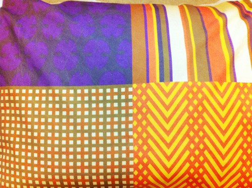
Sweets & Flowers Coordinate

I knew that to have any hope of finishing my other design, it would have to be mostly NOT drawing things. I had already figured out the seven colors for the scarf stripe, fortunately, so I decided that the other three designs would just use subsets of those colors. I created the tartan and the tweed-ish stripes just with various tricks involving flood fills of geometric areas, layer masks, and tiled patterns. I still hadn't decided what the last pattern (something polka-dot-ish) would be. So I browsed the internet for Dr Who costumes and was reminded of the epic Time Lord collars. Ah ha! So I drew the silhouette of one of those and put it in a repeat. Then I just had to put it in the same quartered-yard setup and call it a night.

Doctor Who Menswear Coordinate

The gestalt is actually kind of Halloweeny, with the collar dots looking mostly purple and the red/yellow tweed-ish looking orange, so perhaps I might have swapped the yellow and the purple or something like that. And if I had spent more time I would definitely have refined the tweed pattern to look a bit more obviously like a tweed weave. But besides those flaws, I'm pretty happy with how this turned out!

Dr-Who Inspired Coordinates

My entry came in 141 out of 200, with 95 votes.

Saturday, January 14, 2012

Project Runway All Stars - Episodes 1 and 2

The first two episodes of "Project Runway All Stars" have aired now. The biggest change with this season is, of course, the fact that the judges and (gasp!) Tim Gunn have been replaced. Plus, the format has been changed back to an hour instead of 90 minutes. I think that's a huge mistake - there wasn't even enough time to show all the designs on the runway in the first episode, much less even brief snippets of each designer's workroom critique! At least the time crunch will matter less as the season progresses and contestants get eliminated. The replacement cast, however, will continue to be in effect.

Instead of Heidi Klum, we get Angela Lindvall, who intones the same host lines that Heidi did, but with the urgent friendliness and careful enunciation as if she were endlessly narrating a cosmetic commercial. Isaac Mizrahi and Georgina Chapman have yet to make much of an impression on me. They have excellent fashion industry credentials, and probably have quite a bit of media experience, especially Mizrahi. However, from what I know that experience is all in "spokesperson" type roles - and mostly for their own brands. So whereas Kors and Garcia, after nine seasons, had no problem delivery absolutely blistering critiques, our new panel is still getting into the spirit of things and perhaps not willing to appear THAT negative yet. In contrast, since the designers have all been on Project Runway before, they are potentially more reality-show experienced than the judges.

And of course the most lamented change is the replacement of Tim Gunn with Joanna Coles. I can't get past the fact that she has a huge conflict of interest, since she is the Editor-in-chief of Marie Claire, and part of the prize is to be a guest editor there. Though she is not a judge, she does have the ability to influence the designers as they're working. So if there are any designers she decides she does NOT want to work with, she could well be tempted (even subconciously!) to withdraw from mentoring them, and withhold suggestions that would help them come judging time. Tim Gunn was always very concerned about not having any such conflict of interest, which is why he refused to be a judge even though such a move would be really popular with viewers. I think that if Joanna would prefer to have a role in determining who wins the prize and works with her, then she should just be a judge! Then someone with no other stake in the proceedings can be the mentor. Surely there can't be a shortage of people in the fashion world who want to be on TV giving their expert opinions...

How are the designers doing? Austin has grown a mustache, which fits oddly on his face with the blush, lip gloss, eyeliner, and careful blonde bouffant, but his nose is leonine enough that it works. The very young April has similarly augmented her extreme amount of makeup by dying her hair...gray. Huh. Michael is still overly fond of making exaggerated, moony surprised faces at every opportunity. I don't know much about Jerell or Kenley (having missed season 5 due to a bum DVR), but Jerell seems to communicate solely though standard reality show sass ("they better watch out for me!") and Kenley, who I think was the villain of her season, has a distinctly nasal voice, as if she were talking with her head tilted back as far as possible. She has taken it upon herself these first couple of episodes to play shepherd by occasionally calling out out time remaining ("one hour left, guys!") and get everybody out of the room when it's time for the runway. I'm sure most people will declaim this as bossy and irritating, but I couldn't help but think - if I were there, that's exactly what I would do! Everyone else seems exactly they were before. This makes sense - these are the people who have agreed to go another round, after all, meaning they haven't moved on to bigger things yet.

In the first episode, there were two runway shows. First, the designers each got to present something they made before the show which represented who they are. Then, they had to buy materials at a dollar store, and make a look that was inspired by the first one. In the second episode, they were given one day (and a trip to a real fabric store, i.e. Mood, of course) to make a ball gown fit to go to the opera.

At the dollar store, Micheal and April both get black & white mop heads. There is a whispered kerfuffle in the workroom as they each try to convince themselves (April much more successfully) that it isn't going to be a problem that they're both using them as the main material. Are they going to turn on each other during the judging if they get called out for the similarity? Actually, this ends up being a non-starter since both are deemed safe and get no comments. But, the reason behind the decision to spend precious minutes on this issue becomes clear in the second episode, when they both go for red fabric. This time, however, Michael has a slight freakout, complete with jazz hands, and loses this round of chicken. He gets black fabric instead. Then, in the workroom, April dyes her red fabric black. Yes really! In the end, though, the black is just an ombre effect on the bottom of her dress, which is still mostly red. The ridiculous coda to this thread is when she is told by the two guest judges that they don't like red and black together. To which I say, ok, me neither really, but do you have any kind of actual critique from a fashion point of view or is that just personal preference?

But I'm getting ahead of myself. Back to the dollar store challenge, Austin accidentally burns a hole in his blue plastic dress with a glue gun, but is able to fix it in time. Anthony, Sweet P, and Jerell all create nearly the same silhouette (high halter neck, narrow skirt) just in different materials. Gordana creates a dress that looks like a pinata, but kind of in a good way, and though it looks stiff on the mannequin it looks pretty good moving - and then she ruins it by putting too much random stuff on the shoulders and neckline. Kara uses mop heads, but unlike Michael & April's, hers are red. Both her design and Kenley's are unremarkable.

Elisa's is clearly the worst. It looks like a model from Victoria's Secret Pink line accidentally wandered into the runway show for Victoria's Secret Angels and tried to make the best of it.

My favorite was Mila's - a futuristic striped tunic and leggings. Mondo's is also pretty great - a frilly, gothic dress that looks like something Abby Sciuto would wear, albeit she would use much less twee accessories. Rami's plaid confection with a giant collar is my third favorite.

Rami wins, and Elisa is out. Photos of all the looks are here.

The producers kept trying to convince us that the second challenge was to create a couture dress, but as the designers kept saying, couture really means hours and hours of hand sewing and all kinds of fancy and expensive technique, so any dress created in a single day can't really qualify. So I'll stick to thinking of it simply as an opera ballgown challenge. However you call them, I thought most of the resulting dresses actually turned out pretty well. Austin's gold-and-black is very pleasing, though it has that same high-necked silhouette that was so popular in the last challenge. Micheal's black-and-silver also has a similar shape, and like Austin's looks like it could go on a real red carpet. I can't imagine sitting through a whole opera with all those feathers tickling my neck, though. Kenley's pink-and-black polka dots are very cute.

Anthony creates a creditable Angelina Jolie red-carpet gown in white, helped greatly by his styling. Also styling wins are Gordana, with a 30's-style pastel dress, and Kara, whose dress had an 80's floral of the type which I think are trendy again but I personally don't like. Sweet P's is similar, but with a constrasting bodice. Mila, Mondo, and Rami all create gowns which are pretty nice but not terribly distinctive.

April's red-and-black creation is really messy on top. I wish it had turned out more like her sketch. Even worse was Jerell's, with a scratchy-looking, overly poofy Regency-style bodice, and is by far my least favorite.

Micheal wins, and Sweet P is out. Photos of all the looks are here.

Next week, they have to make dresses for Miss Piggy. Yes, a muppet. And apparently she shows up in person and participates in the judging.

Thursday, January 12, 2012

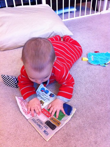
The book in action

Here is my son, eight-and-a-half months old, playing with his copy of the Baby's Book of Computer Science!

Bruce learning computer science

I finally had a chance to sew his together. Hooray! He enjoys playing with washclothes, just by rolling around with one in his hands, admiring it, so he has a similar kind of interaction here. I'm hoping all those colorful flaps will be fun for him to practice his pincer grip on in the coming months.

Wednesday, January 11, 2012

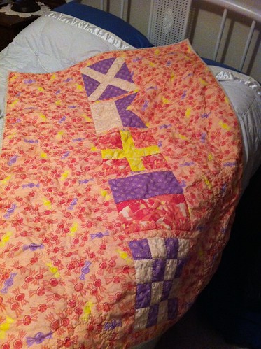
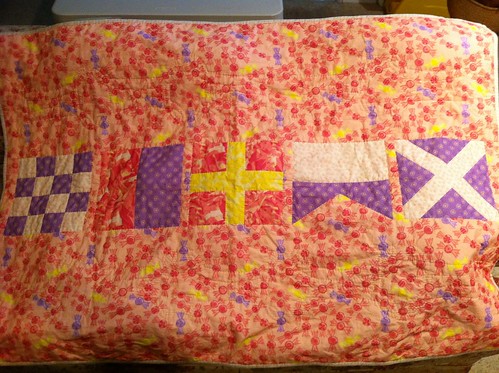
Maren's quilt, finally finished

Maren's Flag Quilt Completed

Maren's Flag Quilt Completed

So, last we saw the quilt for my niece, I was still doing the quilting. I really wanted to finish it time to give it when we were visiting family during the holidays, since the one for her older brother was done as well. But then of course I added to the last-minute present-making by deciding to sew the baby computer science books, leaving even less time for the quilt. I just can't get these things done with time to spare - that would be too easy. And since I already printed up the quilt labels for the back that said 2011, well, I couldn't make myself a liar by waiting and giving them at some point in 2012!

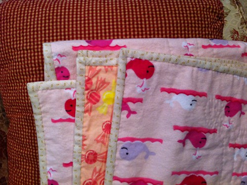
The last few days before we left town, I did manage to get all of the quilting done, leaving just the binding to go. I had again used purchased binding (from this seller on Etsy), so I didn't have to make that too. The last night before departure, I got the binding pinned on, then packed it up along with my sewing kit. I felt a little bad about the extra luggage, since we have to take so much stuff to travel with the baby. So much for trying to travel as light as possible on my own account! The binding is a nice yellow/cream floral with delicate stripes.
Maren's Flag Quilt Completed

From there it was a certain amount of déjà vu of the quilt for my older niece - I sewed in the car during the times when the baby didn't need direct entertainment (or his toys retrieved from the other side of his car seat where he kept throwing them...). I think in the end I only lost one pin under my seat that I haven't been able to find again. I still had some more to go when we got to my mother-in-law's house, but I was still able to carve out some time during naps and in the evening to wrap it up, and I finished sewing on Christmas Eve morning! I even had enough time that I was able to wash it before wrapping it up. Fortunately I'm a faster sewer than I used to be.

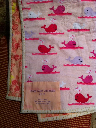
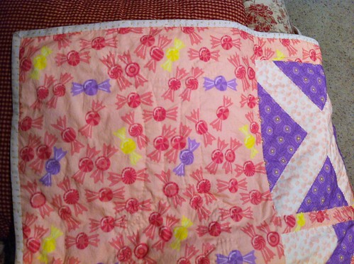
Here's how the quilting looks from the front and the back:
Maren's Flag Quilt Completed

Maren's Flag Quilt Completed
The backing is flannel, which I was able to get on Amazon. I know the pinks don't exactly go with the pinks I chose for the front, but it was just too cute and perfectly on-theme to skip.

You can kind of see all the quilting in this shot - there's a stylized Gemini symbol on either side of each flag.
Maren's Flag Quilt Completed

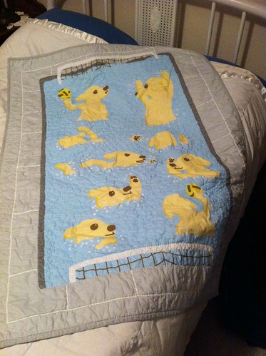
Maren is only seven months old, so it'll be a little bit before she can form an opinion of it herself, but her mother (my sister-in-law) really liked it. Cord also really took to his - as soon as it was unwrapped, he just wanted to hold on to it, and didn't even want to let his father hold it up so everyone could see. Cord's quilt looked even cozier than it did before after its washing - I'm quite pleased with how the quilting turned out:
Waterpolo puppies quilt completed

Definitely worth the time to make these! Every stage was really fun - designing the tops, deciding on backing & binding and how to quilt them, sewing them together, and of course giving them to my nephew and niece.

Thursday, January 5, 2012

Recipe for fabric

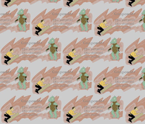
This week's contest was for a design containing a recipe. When I mentioned this to my husband, he had the brilliant suggestion of basing it on the recipe for gunpowder instead of something edible. Yes! The first thing that came to mind when thinking about that, obviously, could be nothing else but the episode of Star Trek where Kirk creates gunpowder from scratch. Since this contest closed on December 27th, and I didn't have a chance to work on it early due to the previous entries and last-minute present making, I had to work on it when we were on the road visiting family at Christmas time. But fortunately, since I had a pretty clear vision of what I wanted it to look like it actually came together pretty quickly, and I was able to scrape together a few spare moments with my laptop and various family wifi networks to make this.

Kirk vs Gorn - How to make gunpowder

I'm much happier with this than I am with the previous two designs I made. I'm not entirely happy with the repeat, though, and wish it flowed together a little more smoothly. Also the text is a little stiff - I should have made it tilt and wiggle with the rock formations a bit.

It's interesting how some of the "nerdy" subjects pan out on Spoonflower. There are only a dozen Star Trek fabrics, and about twenty for Star Wars. But there are about 90 Doctor Who fabrics!

My design came in 60 out of 75, with 56 votes. A few other people went with punny non-food recipes like I did - there was a recipe for disaster and instructions on the creation of the universe (which came in 14th!).

Wednesday, January 4, 2012

More contest catchup

Last week's contest's theme was "evergreens," with the added twist that the design should only use four colors. I had a hard time coming up with an idea. Being the holiday season, the most obvious thing that came to mind was Christmas trees. One of my favorite images of a Christmas tree is from a Berenstain Bears book - there was a story about them going out to chop down a tree for themselves, but the tree they found had little folks (bugs? mice? I can't recall) living in it, with their own little tree inside. I remember a wonderful page where they're looking into the tiny little house in the tree trunk, windows all aglow. So I wanted to do something along those lines. However, since that contest closed just before we were headed out for holiday travel, I had very little time to put my design together, so I needed to do something with a small repeat to have any chance of getting something in. I eventually thought of doing lines of marching ants, holding little pine branches.

Ants collecting pine needles

I figured many of the designs would be predominately green, so I wanted to avoid that. I also wanted to avoid a white background, since even though that's an obvious choice from a graphic design point of view, it makes the fabric hard to use. Hopefully the light blue with little white footprints is suggestive of snow.

Like the previous contest, I'm not super happy with this one either. I just didn't have enough time to refine it any further. I almost didn't enter it, but what the hey. It came in 119 out of 149, with 37 votes.

Tuesday, January 3, 2012

Bells within Bells

Time to start catching up on the Spoonflower contests that closed over the holiday season.

The one from two weeks ago was for a design involving bells, with a small repeat that could be seen on an eight-by-eight inch swatch. I decided to focus on round "jingle" bells, rather than big church-style bells. This was influenced by a recent episode of "Food Network Challenge" that my husband and I watched, where the contestants had to create cakes that were holiday-related in some way. (I forget the exact details now.) One of the teams had big cake bells on theirs, but they used the church bells when they clearly should have done the round jingly kind. The former is definitely what sprang to mind first off from the word "bell", so I decided to go with the latter.

When I described what I was doing to my husband, he remembered the same TV show too! "Jingle bells, right?"

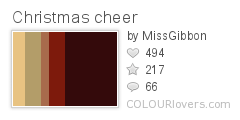
I looked up "Christmas" palettes on ColourLovers to find one that suggested the holiday without being just green & red. I decided I liked this one:
Christmas_cheer
Color by COLOURlovers

In the end, I used both kinds of bells. The main design is of jingle bells on straps, like they're sometimes shown festooned on sleighs. Then, I decided that the negative space between the straps would occasionally be in the shape of church bells. To add a little more depth beyond that, I put a semi-abstract knit-like pattern in the background as well.

Cozy Jingle Bells

It's not entirely successful. I think there is not enough contrast between the color of the bells and the background. Also the shapes of the straps are too forced and awkward. It's a neat idea, but I couldn't execute on it the way I wanted - I may revisit it at some point.

In the end, both kinds of bells were well represented in the contest entries. My design came in 99 out of 148, with 44 votes.