Time to give an update on how my latest contest entries have done. But one other point of news: my "
Baby's Book of Computer Science" has just exceeded 100 "favorites"! (In fact,
105 at the time I'm writing this.) Nothing else is even close - 22 for the
painters' eggs, 21 for the
ghosts, and a bunch in the teens. On to the more recent ones!
First, the theme was "history of Jazz." I'm not a big fan of the genre, but took a stab at it anyway. According to
Wikipedia, the principle characteristics of jazz are polyrhythms, swung notes, syncopation, blue notes, and improvisation. Also, much of it carries on from African musical traditions, many from the Congo River region, so I wanted to tie in a little of that for the "history" part of the theme. I looked at textile designs from the cultures in that part of the world, and found
this one, from Kuba culture, that called to me. I took the inner checked sections and adapted them into ovals.
I used the inner grids to represent notes, which are offset in different ways to represent they polyrhythms, swung notes, and syncopation. And of course some colored blue for the blue notes. The improvisation is represented by the links between the ovals, letting you take varying paths all around the design.
I had no idea what colors to use, so I looked around for jazz-inspired schemes until I found this one I liked:
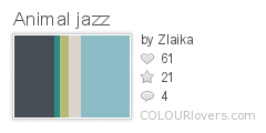 Color by COLOURlovers
And it all came together like so:

This came in the bottom fifth, with 24 votes. My favorite was the one
inspired by kente cloth.
Next the inspiration was "gemstones and geodes." This was another one like
Great Barrier Reef that I found intimidating. I realized I had a design already that contained some gemstones - rubies and pearls in my
literal computer languages. So I took just those elements and made them a coordinating design.

This came in juuuust above the bottom third, with 33 votes. My favorite entries were the
pebbles,
turquoise, and
retro graphic jewels.
And finally, in honor of International Women's Day, we had to do a design inspired by inspirational women - leaders, scientists, etc. BUT, it had to be a
toile. Hmm. For subject matter, I picked up something from my own family history. During WWII, my grandmother was one of many students who worked as a "civilian computer" for the US Army. (Big thanks to my dad for supplying more information about this!) She had to analyze pictures that had been taken of blinking lights on bombs dropped out of planes, extracting data that would eventually allow bombing tables to be calculated. Nowadays, this kind of thing would of course be done in a fraction of the time on an (electronic) computer.
However, these civilian computer projects were in fact
a key step towards the development of modern computers, and some of the women who worked there went on to be the first programmers of
ENIAC. (Among them:
Adele Goldstine, who wrote the world's first computer manual, and
Betty Holberton, who was responsible for the classic beige color of all our computer cases for so many years) It was nice to learn that women had key roles in so many milestones like this. As a computer programmer today, it sometimes feels a little odd to be one of the few women in the engineering department. Finding out things like this remind me - I'm not an anomaly!
So for the toile, I honored those
young wartime computers who set the foundation for all that.

I collected a
board of 40's daywear to try to get a feel for the clothes (and hair!), including pictures of women
working as
computers or
operating ENIAC. The lettering is inspired by the look of contemporary typewriters, such as used for the
ENIAC manual. The colors are also supposed to be
forties-ish - forest green on pink.
This came in, again, in the bottom fifth, with 37 votes. My favorite, for having both good subject matter, visual appeal, and fits in the "rules" of being a toile, was probably the
blue one with many different female scientists.


