Wednesday, December 19, 2012

Tags

Last week's contest was to create a pattern you could cut apart and use as gift tags. Incidentally, Spoonflower has branched out - along with fabric, you can also get anything printed out on wallpaper or on vinyl wall decal material (that has a re-adhesive back). So I decided to make a pattern you could cut out of the decal stuff and use as stickers on packages (as Spoonflower themselves suggested in the contest description) - in other words, no seam or hem allowances. However, I still wanted it to look reasonably good on fabric. So the extra challenge I imagined for myself was to have no partial or cut-off labels no matter what size of fabric or sticker I got. So the rectangles I had to operate in were five and fifteen inch squares for the decals, and the eight inch square and 18" by 21" fat quarter for the fabric. (The larger sizes - 30" decal square and full yardage - are naturally covered by the smaller sizes.)

After I divvied it up into reasonably label-sized sub-rectangles within those contraints, I filled in each with a pastel version of the knit pattern I've used a couple times before. Then I used the Dr Who/menswear patterns as if they were cloth-covered buttons on each tag.

Cut & Stick Gift Tags - sweater patches with cloth-covered buttons

My entry came in 122 out of 152 with 36 votes. Out of the more cutesy entries, I liked these (which came in eighth), these animals (which came in first!), and these little houses. For more elegant ones, I liked these and these (which came in ninth).

I even got mine printed out in time to use them for wrapping Christmas presents!

Gift tag applied to present

Wednesday, December 12, 2012

That eucalyptus pattern gets around

Back when I created a "family crest" pattern, I created two sub-patterns for it. One was a simple line drawing of eucalyptus leaves. I used it again to create a little more depth in the pomegranate cookie design. I recently had a chance to take it for a spin again.

First, some backstory. When I was a kid, every year at Thanksgiving we'd gather with the extended family on my mom's side at an old house on an orange orchard that the family owned but nobody occupied year-round. The bathroom at the back of the house had these strange old (probably decades old) paper hand towels that just hung there yellowing and never got used. They had pictures of sobbing seahorses,with the text "Have you ever seen a seahorse cry? You should, he has no hands to dry!" So very odd.

Once the house finally got sold and its contents were packed up and divided among certain family members (a saga too long to even touch on now), nobody was able to put those aside. Perhaps some are still in a box somewhere; perhaps none exist. I had been wishing for years that I could get my hands on one to scan it and turn it into a real towel. Well, fast-forward to this year, when my brother was gearing up to host Thanksgiving at his house again, and he suggested that I should just draw my own version and make those the new Thanksgiving towels. Challenge accepted!

For the text, I found a couple of retro fonts I liked: Roadbrush and Simplesnails. I searched for seventies-inspired colors and decided on these:
oshkosh
Color by COLOURlovers

Next I had fun drawing some distraught seahorses. I framed the whole thing using the rounded lattice previously seen here. Then I thought it still looked a bit plain so I put that trusty eucalyptus pattern very lightly in the background (though rotated 20 degrees, since putting it next to text made the horizontal repeat wayyyyy too obvious).

I decided to make the overall size six inches by nine inches, so that it would be nicely visible when appliqued onto a hand towel but not take up the whole front. Plus that size meant I could fit exactly nine on a fat quarter of cotton-linen (which Spoonflower has wider than the plain standard cotton) like so:

Have you ever seen a seahorse cry? You should; he has no hands to dry!

Then, since I had a streak to maintain, I got the printed fabric on literally the day before we headed out of town for Thanksgiving, and started sewing the towels in the car. The towels themselves are from here.

Seahorse towel

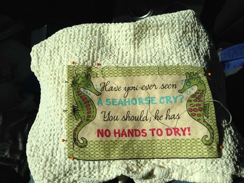
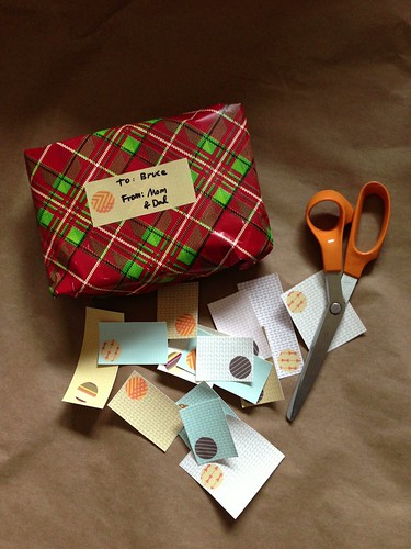
Each patch is just blind-stitched on to the towel. I managed to finish all nine in time, on the drive up and during naptimes at my mother-in-law's house. (The above picture shows me sewing in the car - you can imagine my toddler son directly to the right of this, asleep in his carseat.)  I gave eight to my brother and kept one for myself. I had prewashed the towels and the fabric before we left, so they were ready to put into service as soon as we arrived!

Seahorse towel

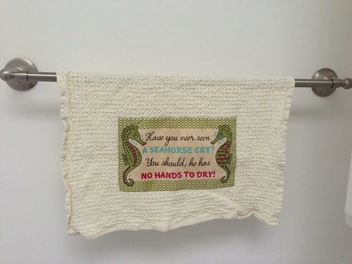
It'll be fun to get to use these every year now. They seemed to be a hit with my extended family. I still cherish the idea of someday miraculously finding the original.

Oh yeah, the other pattern in that family crest? That would be the little repeat of handguns. I just got a notice that somebody ordered FIVE YARDS of it...on SILK. As my husband said, that's a heck of a set of pajamas!

Saturday, December 8, 2012

A tee for the sea

This week's contest was to take an existing blank pattern for a t-shirt, which fits on a yard of fabric, and fill it in with an "under the sea" themed design. I somehow missed the fact that it's a shirt for a little girl, not an adult, so I had a much more subdued take than most of the rest of the entries. I based the basic layout on one of my favorite shirts, which has a sort of harness-like colorblocking. For the two areas of color, I used two prints I had already - the seaweed-like background of the jellicle jellyfish, and the rounded lattice I used as part of the zig-zag cheater quilt (which was itself a simplification of this pattern). However, I changed this colors of those patterns slightly. I looked for a set of kelp-inspired colors and liked these:
kelp_forest
Color by COLOURlovers

So that resulted in these two patterns:

Netting lattice


 Lacy Kelp

And thus, it all came together like so:


 Kelp and Netting T-shirt
The original pattern blank was in a PDF. So I imported it, selected out all the whitespace so that I had just the lines, masked out the shapes for my different areas, filled it in, and submitted it. But for some reason the whole rectangle was showing up too small - it wasn't taking up the whole yard. Huh? Then I figured out - I had imported the PDF at 100 DPI instead of 150. ARRRRRRGGG. So I had to redo it entirely! Fortunately I had learned from the first time around so it didn't take all that long.

This came in 78 out of 182 with 107 votes. My favorite entries were this cute sailor-inspired one with a faux placket, one with a graphic jellyfish, and this one with lobsters.

Friday, December 7, 2012

A kernel of truth

Like the previous contest, this one also had an assigned palette:
 Spoonflower_Matisse
Color by COLOURlovers

The additional requirement was to make it look like something that could be in a Matisse painting. That didn't capture my imagination so much, so I read through Matisse's wikipedia page to see if anything grabbed me. One thing that stuck with me, for whatever reason, was that his father was a grain merchant. Additionally, I've seen a type of grouped floral print in a couple of different places I wanted to try to make a version of - like this or this. So I decided to use different grains instead of differently colored flowers. I also made this my first attempt at a true half-drop repeat instead of a straight repeat.

Tribute to Matisse

So the colors formed up into an unintentional diagonal stripe, but that's ok. For the grains themselves, I looked up eight different grains that are actually major crops in France. I also tried to be less literal with the colors than I usually am (or else I would have just made all the grains yellow with red shadows or something like that). The large white grains are wheat, the small white grains are rye, the pointy blue ones are oats, the large pink ones are barley, and the round red ones are sorghum. The pink squarish ones are corn, the little red ones are sunflower seeds, and the tiny blue ones are sesame seeds.

My entry came in 31 out of 303 with 147 votes. That makes it just the second time I've come in the top ten percent (after the Spider Castle)! I really liked these patterned plusses, these berries, and the cherries that came in tenth. For designs more directly inspired by specific Matisse motifs, I liked these graphic shapes, and the horizontal and vertical stripes of abstract elements. For more conventional florals, these two were my favorites.

Blown Away

Alas, I have neglected to post a few contests now - time to start catching up. First up, this contest had two aspects. One, you had to use these colors:
Spoonflower_Flight
Color by COLOURlovers

And two, it had to have something to do with birds or flight. I made a first pass at an abstracted, geometric repeat of dandelion puffs.

 Geometric Dandelion Puffs

Then I made the terrible mistake of looking at the Spoonflower site and I accidentally saw some of the designs that had already been entered - such as this amazing dandelion design. As Cathy would say, ACK! So at that point I lost my nerve and gave up trying to improve my poor little effort.

My entry came in 264 out of 323 with 24 votes. That intimidating design ended up, very deservedly, winning. I also liked these bees, birds with foliage, and geometric owls.