Color by COLOURlovers
The additional requirement was to make it look like something that could be in a Matisse painting. That didn't capture my imagination so much, so I read through Matisse's wikipedia page to see if anything grabbed me. One thing that stuck with me, for whatever reason, was that his father was a grain merchant. Additionally, I've seen a type of grouped floral print in a couple of different places I wanted to try to make a version of - like this or this. So I decided to use different grains instead of differently colored flowers. I also made this my first attempt at a true half-drop repeat instead of a straight repeat.

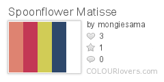
So the colors formed up into an unintentional diagonal stripe, but that's ok. For the grains themselves, I looked up eight different grains that are actually major crops in France. I also tried to be less literal with the colors than I usually am (or else I would have just made all the grains yellow with red shadows or something like that). The large white grains are wheat, the small white grains are rye, the pointy blue ones are oats, the large pink ones are barley, and the round red ones are sorghum. The pink squarish ones are corn, the little red ones are sunflower seeds, and the tiny blue ones are sesame seeds.
My entry came in 31 out of 303 with 147 votes. That makes it just the second time I've come in the top ten percent (after the Spider Castle)! I really liked these patterned plusses, these berries, and the cherries that came in tenth. For designs more directly inspired by specific Matisse motifs, I liked these graphic shapes, and the horizontal and vertical stripes of abstract elements. For more conventional florals, these two were my favorites.
No comments:
Post a Comment