Showing posts sorted by relevance for query toile. Sort by date Show all posts

Friday, March 23, 2012

Catching up with contests

I'm behind in posting about the most recent Spoonflower contests! First, the theme was toile - you know, that old-fashioned, elaborately detailed type of pattern featuring shepherds picknicking and what not. An upholstery/wallpaper sort of thing. Plus, it was supposed to be inspired by the towns where we live, with a little explanation of how it related to the town's history in the fabric description. Toile is not really my favorite, so this really felt like a homework assignment. I grappled with some way of making a "history of Goleta" (or even "history of Sacramento" since that's where I grew up) toile, and finally decided to discard the theme. If I could make a toile-type design based on anything I want, what would it be?

The first thing I hit upon was legos - what if I did all the traditional bucolic toile scenarios, but rendered with lego figures & lego greenery and so forth? I had to give that up as being way too much work, but that's something I still want to try at some point. Next I thought, well, I may have spent the most amount of my physical existence in Sacramento and Goleta, but where have I spent my mental existence? For many years, that would be doodling. So I pretended I was in a lecture again and arranged some of the types of things I doodled constantly in school in a toile-ish layout.

Toile of the Land of Doodling

The main thing I would want to change about this is to move it closer together - there's too much blank space between the repeats. But overall I'm pretty satisfied, given that I'm not the hugest fan of toiles anyway. It came in 60 out of 81 with 45 votes.

Next up, the contest was to create a cheater print involving robots. Ah ha! That was easy, given that I created a robot print for a whole cloth quilt for my niece already. So not exaaaaaactly a cheater print but pretty close. So I decided to take the same colors and robots and rearrange them. I wanted to make it look more like a fake pieced design (as cheaters usually are) so I also made several coordinating prints. The overall design came together like so:

Isabel

It came in 116 out of 132 with 40 votes. I will admit to hoping it would do a little better, especially since there were very few other girl-specific designs entered. My favorite entry was this one.

You can see all the coordinating designs here. The darker blue print is "Isabel" in Morse code, and the lighter blue print is postage stamps, in honor of her grandfather (my father) being a philatelist. The pink print is logic gates (AND, OR, and NOT), and the purple print is LEDs!

The last contest, that ended yesterday, was actually only open to Spoonflower staff. They had to make larger projects involving printed fabric. My favorite entries were the hankies and the black & white quilt that formed a QR code of the Spoonflower URL.

Saturday, March 15, 2014

History, both recent and not-so-recent

Time to give an update on how my latest contest entries have done. But one other point of news: my "Baby's Book of Computer Science" has just exceeded 100 "favorites"! (In fact, 105 at the time I'm writing this.) Nothing else is even close - 22 for the painters' eggs, 21 for the ghosts, and a bunch in the teens. On to the more recent ones!

First, the theme was "history of Jazz." I'm not a big fan of the genre, but took a stab at it anyway. According to Wikipedia, the principle characteristics of jazz are polyrhythms, swung notes, syncopation, blue notes, and improvisation. Also, much of it carries on from African musical traditions, many from the Congo River region, so I wanted to tie in a little of that for the "history" part of the theme. I looked at textile designs from the cultures in that part of the world, and found this one, from Kuba culture, that called to me. I took the inner checked sections and adapted them into ovals.

I used the inner grids to represent notes, which are offset in different ways to represent they polyrhythms, swung notes, and syncopation. And of course some colored blue for the blue notes. The improvisation is represented by the links between the ovals, letting you take varying paths all around the design.

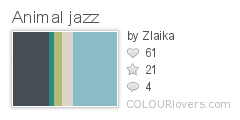
I had no idea what colors to use, so I looked around for jazz-inspired schemes until I found this one I liked:
Animal_jazz
Color by COLOURlovers

And it all came together like so:

Jazz Principles Kuba Cloth

This came in the bottom fifth, with 24 votes. My favorite was the one inspired by kente cloth.

Next the inspiration was "gemstones and geodes." This was another one like Great Barrier Reef that I found intimidating. I realized I had a design already that contained some gemstones - rubies and pearls in my literal computer languages. So I took just those elements and made them a coordinating design.

Rubies and Pearls

This came in juuuust above the bottom third, with 33 votes. My favorite entries were the pebbles, turquoise, and retro graphic jewels.

And finally, in honor of International Women's Day, we had to do a design inspired by inspirational women - leaders, scientists, etc. BUT, it had to be a toile. Hmm. For subject matter, I picked up something from my own family history. During WWII, my grandmother was one of many students who worked as a "civilian computer" for the US Army. (Big thanks to my dad for supplying more information about this!) She had to analyze pictures that had been taken of blinking lights on bombs dropped out of planes, extracting data that would eventually allow bombing tables to be calculated. Nowadays, this kind of thing would of course be done in a fraction of the time on an (electronic) computer.

However, these civilian computer projects were in fact a key step towards the development of modern computers, and some of the women who worked there went on to be the first programmers of ENIAC. (Among them: Adele Goldstine, who wrote the world's first computer manual, and Betty Holberton, who was responsible for the classic beige color of all our computer cases for so many years) It was nice to learn that women had key roles in so many milestones like this. As a computer programmer today, it sometimes feels a little odd to be one of the few women in the engineering department. Finding out things like this remind me - I'm not an anomaly!

So for the toile, I honored those young wartime computers who set the foundation for all that.

WW2 Civilian Computer Toile

I collected a board of 40's daywear to try to get a feel for the clothes (and hair!), including pictures of women working as computers or operating ENIAC. The lettering is inspired by the look of contemporary typewriters, such as used for the ENIAC manual. The colors are also supposed to be forties-ish - forest green on pink.

This came in, again, in the bottom fifth, with 37 votes. My favorite, for having both good subject matter, visual appeal, and fits in the "rules" of being a toile, was probably the blue one with many different female scientists.

Thursday, January 24, 2013

For whom the bell toiles

This week the contest was for a toile (again). This time, it was supposed to have a "murder mystery" theme. The most obvious way of making a murder mystery appealing? How about Clue! I drew a stereotypical dead body scene and surrounded it with garlands containing the six Clue weapons.

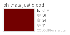
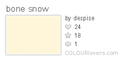
The colors I chose are supposed to be reminiscent of blood and bone. Specifically:

oh_thats_just_blood.
Color by COLOURlovers
 
bone_snow
Color by COLOURlovers

Then it was just a matter of getting that design into a repeat. Last time I felt like I had too much empty space - I'm pretty happy with the balance of drawing-to-background with this one.

Murder Mystery Board Game Toile

This came in 45 out of 75 with 91 votes. Given that this was a much more specific, and difficult, contest, there were fewer entries this week than usual. My favorite entry was the ludicrously cute thumbprint bird tableau that came in fourth. I also really liked the chess design and this mashup of Poe and a china pattern that came in eighth.

I was obviously not the only person to think of Clue. My favorite other Clue entry was this one.

Friday, March 20, 2015

Continuing the roundup

A recent contest theme was "libraries." I used some of the colors I had before for library-related designs. I did a play on houndstooth (a fabric maybe an old-fashioned librarian would wear?), and made it look like hands holding a book.

librarian

This got 84 votes and came in the middle of the pack. I liked these expressive books and this assortment of library accessories.

Another theme was ditsy sheep. (Ditsy meaning a small-scale scattered print that can work facing any direction.) Previous ditsy contests have been for crickets, sea creatures, and early on, just ditsy in general with no other theme.  I wanted to go ultra-cute, so I went with lambs specifically. That made me think of the old song that goes "Mares eat oats, and does eat oats, and little lambs eat ivy," so lambs and ivy it is. Since the song is from the 40's, I picked a retro palette:
Japanese_Book_1944
Color by COLOURlovers

liddle lamzy divey

This came just shy of the top half of entries. Some of my favorites were the sheep with flowers (maybe a liiiiitle large scale to be ditsy though...) and the pastel farm scene.

Leading up to the holidays, there was of course a Christmas-related contest. This year it was for ornaments. I went with clove oranges, and used the same colors as a previous Christmas-y design.

Clove Oranges

This one also came in right in the middle. I liked the black and gold, filigree paper, retro graphic, and stamped paper ornaments.

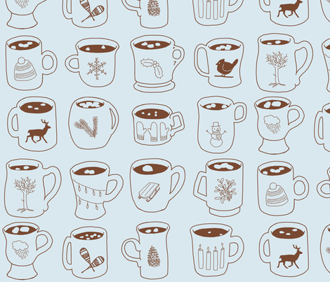
Another contest around that time of year was for (yet another) toile, with a "winter" theme. I made mugs of hot chocolate (with marshmallows of course), in icy blue and chocolate brown.

Winter Symbols on Cocoa Mugs

Each mug is decorated with a different wintry icon. In the contest, it just crept into the top half! I liked this frontier town entry, which reminded me a little of the illustrations for the Little House on the Prairie books.

Monday, November 2, 2015

After the apocalypse

This week's contest was another one for a toile, but with a "post-apocalyptic" theme. I went right for the "only the cockroaches will be left" approach, and drew some giant, irradiated cockroaches wandering around in overgrown ruins. I tried somewhat to emulate the style of Tom Gauld as a guide to conveying atmosphere without a ton of detail.

giant roaches among the ruins

For the colors, I used a subset of the ones from my sandcastle entry, since I thought it had a bit of an eerie feeling. This came in near the bottom of the results. My favorite entries were this cartoony one that depicts life after an alien takeover and this sketchy, nearly-abandoned cityscape..

Sunday, July 14, 2013

Three summer designs

Welp, got another few designs to catch up on! Happy July!

Furthest back, the theme was something based on the Shakespeare play "A Midsummer Night's Dream," which additionally had to use only these colors:

Midspoon_Dreamflower
Color by COLOURlovers

I unfortunately got sick on the days leading up to the deadline, so I had to keep my entry simple. I focused on a few key motifs: the flower that cast the spell causing people to fall in love with the first being they saw, Bottom's donkey head, and fairies. (I didn't realize until I read the Wikipedia article on the play that the flower - called "love-in-idleness" is actually explicitly a pansy!) Then it was just a matter of putting those in the classic "scattered grid" layout. The background is actually polka dots, of the yellow shade on the gray background.

Love-in-idleness, fairies, and donkey heads

This came in 95 out of 160 with 92 votes. Pansies, fairies, and donkey heads, unsurprisingly, all turned up in many other entries. My favorite fairy-centric design was the repeat of wings followed by the dancers; for pansies this one (which came in second), though this airier one (that came in eighth) is my next favorite. There were also a few general floral entries that were less literally specific to the play but (obviously) used the color scheme, including this one which was my favorite entry overall (and came in ninth), this doodley one, the midcentury style flowers, and the leaves. There were also some more ambitious designs that showed toile-like vignettes from the play, like this very lush illustration (that came in third), these two more modern takes (which came in first and fifth), and this one that looks like it should be the endpapers for a deluxe printed edition.

In other news, when browsing around for inspiration, I found this handdrawn logo that I really like - except the name of the play is misspelled! Oh well.

Next up - citrus! One of my favorite beverages is Earl Grey tea, which is flavored using the essence of Bergamot oranges. So I went with that. Fun fact - the tea glasses I drew in this design are the ones once used by Captain Picard to drink that very beverage. (Which I myself am drinking as a type this - yes, I drink hot tea even in the summer heat, why do you ask?)

Earl Grey

This came in 302 out of 403 with 34 votes. I liked the crumpled paper design, the one that looked like it was made with potato stamps, and one that reminded me of a vintage orange label. This one with cartoony oranges also stood out since it had a more subdued palette. Plus I liked this Escher-like lime rind.

The last one to catch up on was the picnic theme. I had a hard time coming up with an interesting idea for this one. I didn't want to do any kind of overhead picnic landscape, since I've noticed that the majority of my designs feature green - so no grass or trees this time! Finally I thought of the reverse - a sky above a picnic, with clouds in suggestive shapes.

Picnic in the sky

This came in 199 out of 260 with 33 votes. I really want to redo this one day using 3D renderings and more subtle lighting/shading to really make it look like photo-realistic clouds. Gingham was a popular theme, and my two favorites were the dishes/flatware and the strawberries. I liked the design featuring clover. As for those overhead/landscape type designs of picnic scenes, my favorites were the dancing fruit and the bear and deer eating together.