Also, I decided for more variety, I would include all the symbols for the planets as well. I found this page that had all I was looking for, and more! There are all kinds of symbols for things in space.
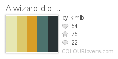
For the colors, I just searched for palettes using the word "wizard" that appealed to me. Bingo!

Color by COLOURlovers
I had been debating on how exactly to depict the symbols - should I try to make them look like faux embroidery or faux applique by drawing faux stitches? And how about the background - what should I put behind the symbols so it's not so flat? Once I got these colors, it really began to come together.
I continued my experiments with gradients from last week and gave the symbols a golden shine. I think it gives a good impression of gold embroidery without being too overdone. For the background, I wanted to suggest a velvety texture. I actually ended up using just the trees and boulders from my campground pattern, shrunk, as the "nap." (And speaking of that design, somebody recently bought four yards of it on canvas! The mind reels!)

It came in 33 out of 93 with 178 votes. I liked this Pottery Barn-bedding-feeling take (which won), this ultra-sweet baby-appropriate design, and this straightforward geometric version. Taking advantage of digital printing, I also liked these star photos shaped like stars which came in seventh.
No comments:
Post a Comment