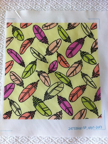
First, I decided to work with this one:
Color by COLOURlovers
When I sketched the flower design initially, I used black outlines and quick ovals of color to decide which feathers would be which colors. I kind of liked the way that looked, so I kept the black outlines in the final design. Once it was done, though, I liked it less - looks a little too 80's. I was tempted to keep tweaking it but in the end just left it as is. I think this color combo might be used better by making the proportions less even - emphasizing some colors and leaving some as just small accents.
Next, I tried this one:

Color by COLOURlovers
I used the brown for the outlines instead, resulting in this design. I like this better, so this is the one I entered in the contest. I think my design is a bit leaden, though. Not one of my best efforts, since I couldn't think of any twist or inspiration like I usually try to.
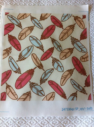
There were many, many designs which were a lot like mine - scattered, tossed, and otherwise evenly distributed feathers. It was the first thing that came to mind for me, and evidentally for many others as well! Another big theme was peacock feathers, which I didn't surprise me in the least. My design came in 116 out of 224, with 63 votes.
No comments:
Post a Comment