Two contests to catch up on! First, the challenge was chickens, but using a Pop Art style in some manner. Obviously the first thing that comes to mind is Andy Warhol and Roy Lichtenstein, but I knew there'd be a ton of those references, so I thought some more. I tried to think of something in pop culture that had lots of appeal - and then I remembered the famous collaboration where Takashi Murakami made a super-colorful (and apparently astonishingly expensive) version of the Louis Vuitton handbag. So I decided to remake that print with chickens and chicken-related stuff.

I'm a little disappointed how this came out. It uses the same colors, but is much more leaden and garish than the original. I think a big part of the problem is that Murakami's uses much more negative space within the repeating icons. I could go on about the shortcomings, but it doesn't do to be TOO self-deprecating on my own blog. Oh well, another for the "redo someday" file!
This came in 63 out of 199 with 111 votes, so it actually did pretty well. My favorite entries were these two graphic, outlined, collage-style montages (the first of which came in fifth). I also really like these understated chicken feather dots. The funniest was this take on the chicken crossing the road. As expected, some of the most common themes were takes on Roy Lichtenstein's comic book panels and Andy Warhol's Marilyn Monroes. My favorites of each of those were this and this, respectively.
Then, this week's contest was one of those where we're given a set of colors to use:
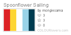
Color by COLOURlovers
Plus, the theme was "sailing." Originally I wanted to try doing a bunch of different knots, but I started with the figure-eight knot and liked it so much I stuck to just that one.

This came in 41 out of 247 with 198 votes - definitely one of my better showings! There were some other knot entries as well - my favorite was this large print (that came in eighth), though I liked the little ditsy one too. There were also a few appearances of nautical code flags, of which I liked this one the most. I also really liked these textured seagulls, the flotsam and jetsam print, the ships in bottles (that came in fifth), and this cutesy illustration reminiscent of old tattoos.
The most common type of design was of course scattered prints of boats on a water-like background, with various other evocative icons. My favorite was this one that used crosshatching to cleverly give the appearance of more colors - and indeed, that was the overall winner this week. Tied for second in my mind are this in a modern, flat style, and this very cute one with excellent typographic elements. I also really liked the treasure map and this one with stylized schools of fish. And these two had a great sense of movement (the former of which came in fourth). As usual, the limited palette contests always seem to draw out a ton of really great entries!
No comments:
Post a Comment