Showing posts sorted by relevance for query ditsy. Sort by date Show all posts

Friday, March 20, 2015

Continuing the roundup

A recent contest theme was "libraries." I used some of the colors I had before for library-related designs. I did a play on houndstooth (a fabric maybe an old-fashioned librarian would wear?), and made it look like hands holding a book.

librarian

This got 84 votes and came in the middle of the pack. I liked these expressive books and this assortment of library accessories.

Another theme was ditsy sheep. (Ditsy meaning a small-scale scattered print that can work facing any direction.) Previous ditsy contests have been for crickets, sea creatures, and early on, just ditsy in general with no other theme.  I wanted to go ultra-cute, so I went with lambs specifically. That made me think of the old song that goes "Mares eat oats, and does eat oats, and little lambs eat ivy," so lambs and ivy it is. Since the song is from the 40's, I picked a retro palette:

Japanese_Book_1944
Color by COLOURlovers

liddle lamzy divey

This came just shy of the top half of entries. Some of my favorites were the sheep with flowers (maybe a liiiiitle large scale to be ditsy though...) and the pastel farm scene.

Leading up to the holidays, there was of course a Christmas-related contest. This year it was for ornaments. I went with clove oranges, and used the same colors as a previous Christmas-y design.

Clove Oranges

This one also came in right in the middle. I liked the black and gold, filigree paper, retro graphic, and stamped paper ornaments.

Another contest around that time of year was for (yet another) toile, with a "winter" theme. I made mugs of hot chocolate (with marshmallows of course), in icy blue and chocolate brown.
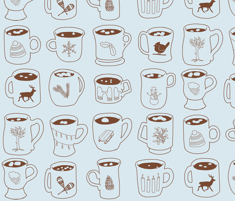
Winter Symbols on Cocoa Mugs

Each mug is decorated with a different wintry icon. In the contest, it just crept into the top half! I liked this frontier town entry, which reminded me a little of the illustrations for the Little House on the Prairie books.

Thursday, July 25, 2013

*crickets*

Crickets is the theme for the week. Jiminy! I browsed through my color inspiration saved links and found this 300-year-old court gown. This then reminded me of the faux embroidery I drew for the wizard's robe, so I decided to take a similar tack and make this design look a little like elaborate embroidery.

A guideline from the culinary world is to pair meat with side dishes made from the food that the animal would have eaten. So in the same vein I wanted to include other motifs based on the diet of crickets. I saw that among other things they eat fungus, so bingo - crickets and mushrooms.

And finally, I pondered, what exactly is the difference between crickets and grasshoppers, in physical appearance? To me, the most noticeable was that crickets have much longer antennae. So I made sure to keep them nice and long in my drawings.

It was fun to do a much more free style of doodling for the fill patterns. I haven't done that for a long time. When I was done with the drawing, I remembered that the contest guidelines also stated that this was for a ditsy - so it needed to look good at a smaller scale. Once I shrunk it down, I decided adding in the highlights and lowlights on the "embroidery" as I did for the wizard's zodiac signs would be too busy, so I kept it to a very simple two colors.

Crickets and Mushrooms

This came in 37 out of 172 with 138 votes. My very favorite entry were these extremely cute cartoony crickets (which came in sixth). This was a close second in the cute category - not quite as cute, but more closely following the spirit of a true ditsy, rather than just being a general small-scale print. (Not that mine is really a ditsy either - everything is oriented vertically and all the mushrooms are the same way up.) Another favorite of mine was this soothing grouping with jasmine and ginkgo. On the more graphic side, a floral that activated my sticker-brain, and this scientific and slightly creepy scatter of parts.

Post script: I did some searching online to remind myself of traditional embroidery fill patterns. While doing so, I found this post showing examples of built-in stitches from a machine. It does little trees! And little turtles!! It's a good thing I don't own it or I'd probably have some crazy stitched border around the hem of every shirt I own.

Monday, October 19, 2015

Ditsy Lizards

Time for another ditsy contest, this time for lizards. I wanted to stretch myself a little and use some more difficult colors to work with, so I used some from the Murakami-inspired design I did, and drew a bunch of little lizards just hatching from their eggs.

Hatching lizards

This only got 12 votes and came in 6th from the bottom. Oh well! My favorite entry was the baby chameleons.


Sunday, January 29, 2023

Like Persephone returning from the underworld, I have returned after three years (also pomegranates are involved)

Let's see who still has this blog plugged into a feed reader somewhere and forgot all about it! 

I took a looooong break from Spoonflower contests but decided to hop back in. For the contest for food-related ditsy patterns, I went with pomegranates. This was a bit of a tactical error, because red shades suffer the most from compression algorithms, so the design looks fuzzy on most renderings on the website.


I'm reasonably happy with how this turned out. I would prefer it to be scaled smaller than this, in fact, but then it looks even fuzzier and it's harder to decode online. I'll have to see how it looks printed.

My favorite entry was this blackberry bramble.


Monday, October 17, 2011

Projects using custom fabrics

So the two Spoonflower designs I entered in contests so far (ditsy sugar cubes & ginger roots) were created with a specific project in mind. I'm trying to catch up on making baby blankets for all my nephews and nieces (and my son of course!). So far I've only made the ones for my oldest nephew and oldest niece. The one for my nephew is here, and I actually don't have any photos of the one I made for my oldest niece! Hopefully I can correct that over the coming holiday season. You can see the design itself on Spoonflower, at least.

So next up are the ones for my next oldest nephew and niece. Once I finish those I'll create the one for my son, and once that's done we should have found out whether the next one on my brother's side will be a boy or a girl.

So, back to those two fabric patterns I linked already. My idea for my niece was to spell out her name - "Maren," by the way - using international maritime signal flags. But the twist is that I would change them to more "girly" colors, and represent each color as its own print. Then, I could put the flags together on the quilt in a "cheater" style, to make it appear as though I pieced the images together. I decided to translate the white and red segments into light & dark pink prints, the blue segments into a purple print, and keep the yellow segments in a yellow print. Then I would create a medium pink print with yellow and purple accents to use as the background to tie it all together.

So once I decided on that color scheme, I needed to decide on what the prints would actually be. I decided to do a take on the old cliche "sugar and spice and everything nice." Sugar is represented by sugar cubes and candies on the light and medium pink prints respectively. Spice is represented by ginger on the yellow print. Everything nice could probably not be any more vague, so I just used things that I think are pleasing: roses for the dark pink print and square knots for the purple print. I also added hints of yellow to the dark pink and purple prints to add more balance to the overall design, since the yellow print was only going to get used in the "R" in Maren.

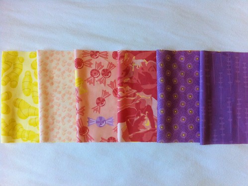
So here are all the prints together:
Sweets & Flowers Fabric Collection

You can also see them all on Spoonflower.

But wait a minute - there are two purple prints in that photo, not just one! Well, some of the signal flags also use black - though not any of the ones in "Maren" - so I decided to create a darker purple print to stand in for black in case I wanted to create other letters in the future. This print shows sprigs of lavender as a counterpoint to the roses.

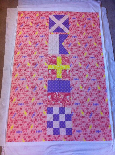
But back to the original thread, here is the printed crib-sized quilt top that uses these prints to spell out "Maren":
Maren flags quilt laid out for basting
This picture shows the top laid out over the backing and batting - after this was taken, I basted it together and started quilting. Hopefully I'll be able to post another progress photo soon!

Sunday, February 19, 2012

Seadragons

The contest this week was for a ditsy print, involving some form of sea creature. My parents were in town visiting when I started working on it, so I asked my mom for suggestions on what her favorite creatures were (minus jellyfish, since they had already announced that next week's design should involve jellyfish!). She threw out a few suggestions and I decided to go with leafy seadragons - those really ornate seahorses with lots of appendages to help them blend with kelp.

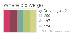
For the colors, I browsed around on ColourLovers and found this palette I liked:
Where_did_we_go
Color by COLOURlovers

Here's the design I made:

Leafy Seadragons

I'm pretty happy with the repeat - there's a fairly good variety of orientations and so not too many long lines for the eye to try to follow. There were actually two other entries using seadragons - this one and this one. Mine came in 102 out of 214 with 120 votes. The winning fabric has a really neat use of color to suggest iridescence! My favorite entry was this one, which suggests a coral reef.

Thursday, October 6, 2011

First Spoonflower Contest Entry

I finally entered a Spoonflower design contest! They have a new inspiration every week, and this week was ditsy prints. I came in 218th place out of 247, with 45 votes! The design I entered is here.

I've started creating more designs. So far all the designs were created with specific projects in mind (just as I hoped to do), so I hope to post about those soon!

Thursday, May 2, 2013

Chickens of the sea

Two contests to catch up on! First, the challenge was chickens, but using a Pop Art style in some manner. Obviously the first thing that comes to mind is Andy Warhol and Roy Lichtenstein, but I knew there'd be a ton of those references, so I thought some more. I tried to think of something in pop culture that had lots of appeal - and then I remembered the famous collaboration where Takashi Murakami made a super-colorful (and apparently astonishingly expensive) version of the Louis Vuitton handbag. So I decided to remake that print with chickens and chicken-related stuff.

Chickens after Murakami

I'm a little disappointed how this came out. It uses the same colors, but is much more leaden and garish than the original. I think a big part of the problem is that Murakami's uses much more negative space within the repeating icons. I could go on about the shortcomings, but it doesn't do to be TOO self-deprecating on my own blog. Oh well, another for the "redo someday" file!

This came in 63 out of 199 with 111 votes, so it actually did pretty well. My favorite entries were these two graphic, outlined, collage-style montages (the first of which came in fifth). I also really like these understated chicken feather dots. The funniest was this take on the chicken crossing the road. As expected, some of the most common themes were takes on Roy Lichtenstein's comic book panels and Andy Warhol's Marilyn Monroes. My favorites of each of those were this and this, respectively.

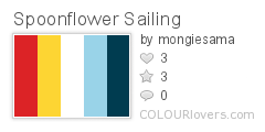
Then, this week's contest was one of those where we're given a set of colors to use:

Spoonflower_Sailing
Color by COLOURlovers

Plus, the theme was "sailing." Originally I wanted to try doing a bunch of different knots, but I started with the figure-eight knot and liked it so much I stuck to just that one.

Figure-Eight Knots

This came in 41 out of 247 with 198 votes - definitely one of my better showings! There were some other knot entries as well - my favorite was this large print (that came in eighth), though I liked the little ditsy one too. There were also a few appearances of nautical code flags, of which I liked this one the most. I also really liked these textured seagulls, the flotsam and jetsam print, the ships in bottles (that came in fifth), and this cutesy illustration reminiscent of old tattoos.

The most common type of design was of course scattered prints of boats on a water-like background, with various other evocative icons. My favorite was this one that used crosshatching to cleverly give the appearance of more colors - and indeed, that was the overall winner this week. Tied for second in my mind are this in a modern, flat style, and this very cute one with excellent typographic elements.  I also really liked the treasure map and this one with stylized schools of fish. And these two had a great sense of movement (the former of which came in fourth). As usual, the limited palette contests always seem to draw out a ton of really great entries!