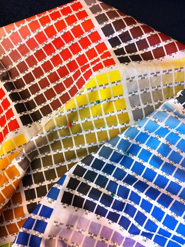
At first, I didn't have a printed copy of the Spoonflower color map, so I just worked with the colors on the computer and hoped for the best. But now that I have the map, I can at least avoid major mishaps. First, I decide on the appearance of the colors I want (sometimes using a formal palette, as I did for the wrestling mask), then examine the map and find the printed colors that, in my opinion, best resemble what I'm shooting for. The swatches are tiny, but I can still fold it up to see how colors look next to each other. This is especially important when using several shades of the same hue, because frequently one shade in the sequence will get shifted a bit and throw the whole combination off.
Up to this point I've always done this before I have the final design finished (or even started, mostly), so in order to get a preview I create a separate "swatch" image using the colors I want.
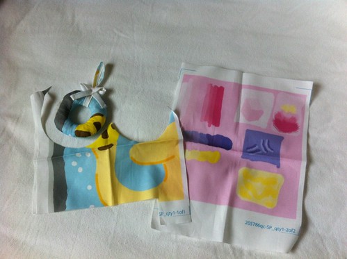
I actually created the first color swatch for the waterpolo puppies some time back (er, when Cord was still a little baby and not a toddler as he is now!), before I had the map printed out. So I printed out a few different combinations of yellows, browns, & blues, to see what would look best. I'm not sure where it is now, but I did use it to chose the colors. When I finished the design, I had added some additional colors (the yellow & maroon in the balls) so I wanted to check the colors one last time before printing out the whole top. So I just printed out a little square of what ended up being the final design, and that's pictured here. However, in addition, I ended up using that color swatch as scrap fabric to create a mockup of the Christmas ornament! I started too late before the contest deadline to print out the final fabric and make sure the pattern was doable, so I created this mockup, which also helped immensely in writing the directions on the pattern itself.
Back to the swatches - for Maren's design, I made the small mistake of adding several colors in a gradient without checking the map. If you look at the purples you might be able to tell that they don't exactly go in a smooth sequence. However, I didn't end up using them all in a row on any design, so I think all the individual designs that use the purples turned out fine.
One side effect of this process is that I end up with the opposite problem of the fabric not looking like I want - the design on the screen is actually misleading! In particular, I've found that many blues and reds look much lighter and brighter than how they will print out. The most chilling incident so far was again with the wrestling mask. When printed on fabric, it looks like the red I want. However, on the screen, it looks unfortunately pinkish. Since I created that one with an even shorter time before the deadline than the ornament, I didn't even have time to create a fabric mockup. So I shrank it and printed it out on paper:
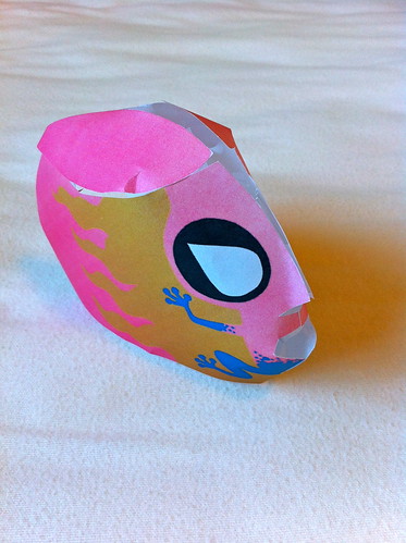
As it turns out, our laser printer is running out of red toner, so the red looked even pinker on paper! When my husband saw this model, he looked at it with great suspicion and said, incredulously, "is that...PINK?" However, considering that the top five winning designs included butterflies, flowers, and lace, perhaps I shouldn't have been worried about some feminine subversion!
No comments:
Post a Comment