Showing posts sorted by relevance for query tea towel. Sort by date Show all posts

Friday, November 8, 2013

The annual tea towel contest

It's that time of year again - when Spoonflower does a design contest for a tea towel with the upcoming year's calendar. I updated my 2012 pie calendar for 2014, but didn't bother for my lackluster produce entry for 2013, though I do intend to rework that at some point.

This year I debated a couple more elaborate ideas, but finally decided to do something fairly straightforward - stylized moons, with the full moons marked. The background image is a smaller version of my constellations design, and the calendar text itself is simply copied from the pie calendar.

Also, people who buy these and actually intend to use them as tea towels prefer to get them on the cotton-linen canvas, which is wider than the basic cotton by a full foot. Usually the contests are always for the regular fat quarter size (18" by 21") but this year they set it to the cotton-lined size (18" by 27") so that we could make designs that took up the full space (without having them cut off from the contest view). Some of us still opted to make the main design fit in the conventional fat quarter area so that someone could still buy just that. I turned my extra six inches into bookmarks!

2014 Full Moon Tea Towel Calendar - with bonus bookmarks

This came in 178 out of 195 with only 20 votes, though I did get one message from somebody saying they want to buy it. Tons of great entries this time! I would have an enormous stack of towels if I bought all the ones I love. I wasn't the only person to focus on the cycles of the moon. There are always a few that emphasize the changing seasons. For less common motifs, I liked the LA cityscape and the string instruments. For cutesy, I loved the kawaii icons, the fairytale mushroom cottage, and the graphic sea creatures. Some animal-themed entries at the top of my list were the songbirds and the cats. And for plant-based designs, I liked the preserved apples and the colorful modern floral, and my favorite overall was composed of pressed flowers.

Thursday, October 4, 2018

A Month of Tea Towels

Whoops, got behind on posting contest results again. This is the time of year that Spoonflower does tea towels. So we need to design for a 18 by 27 inch rectangle (the size of the cotton/linen fat quarter). This year they actually have it set up to display in the contest on a fully-rendered towel, which is nice - since it's a 90 degree rotation from how the fabric normally displays, making it an awkward choice.

First, there's always a calendar challenge. I put each month into a single column and added color-coding for the seasons, also noting the equinoxes, solstices, and phases of the moon.

2019 At a Glance

Here it is in the towel preview - you can see how much hem allowance you have to leave around the edge of the design.


My favorite calendar was the one with the envelopes.

For the "retro bar cart" towel, I went with a plain repeating design rather than tailoring something for the towel shape.

Carbonation/Intoxication

I don't drink, am not into drinking culture at all, and am even not particularly into the fifties/sixties type of retro they mean for this contest. So it was a bit tricky to get a toehold! I made this board and found some few elements that called to me. (You can probably spot my color inspiration there too!) I was trying to give the sensation of a carbonated liquid fizzing.

My favorite was this one that takes advantage of how the towel could be folded in half to hang it up.

Next, the theme was to do a visual pun. I used one my son told me off of a Gogurt: what kind of shoe do ninjas wear? Sneakers! I had very little time to work on this one, so I went with big and cartoony:


My favorite was the thematically appropriate Wetness Protection Program.

Next, the theme was just Animals. I had even less time for this one, so I reused the elements I made for a whale/bat design.  This is a life-size Blue Whale eye and the entire body of a Bumblebee Bat - the largest and smallest mammals.


My favorites were these swans and the bee/bear.


And finally! The recipe tea towel. I put eight of my favorites (including old family favorites from my mom and grandma) in a grid, leaving a space in the middle for someone to add their OWN recipe.


My favorite was the diagrammatic representation of a jam recipe.


Friday, November 18, 2011

Tea towel calendar

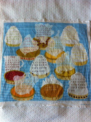
So "tea towels" are thin, mostly decorative cloths that are meant mostly to be hung up in kitchens, as I understand it. Around this time each year, Spoonflower has one of its contests to design a tea towel (to fit on a fat quarter) that has a whole year's calendar on it. I tried to think of what would be an interesting representation of each month of the year. Then I remembered...PIES. My mom makes the most wonderful pies. She always makes a cherry pie, a lemon meringue pie, and a chocolate (custard) pie every year at Christmas, and another cherry pie for my dad's birthday. One time, my dad was suggesting other pies that would go with other special occasions, and then had a sudden flash of inspiration - "What about a pie every month?" Being a kid, I took this joke and treated it as a serious suggestion to be enthusiastically endorsed. Mom, of course, quickly and laughingly shut us down. But the dream remained - the pie of the month club!

I decided to make my calendar design of twelve delicious pies laid out on a table. It was surprisingly hard to come up with twelve distinct pies! Then I had to come up with ways to create lighter backgrounds to put the actual calendar numbers over. Most pies I just heaped up with whipped cream or meringue, or topped with a cloud of steam as if they were fresh from the oven.

Anyway, the pie flavors are:
  • January: Key Lime
  • February: Boysenberry
  • March: Banana Cream
  • April: Strawberry Rhubarb
  • May: Peach
  • June: Lemon Meringue
  • July: Cherry
  • August: Blueberry Cream
  • September: Apple
  • October: Pumpkin
  • November: Pecan
  • December: Chocolate
I think it made for a very sweet design. There were a lot of really great calendars in this contest! It came in 103rd out of 146, with 93 votes.

2012 calendar fabric

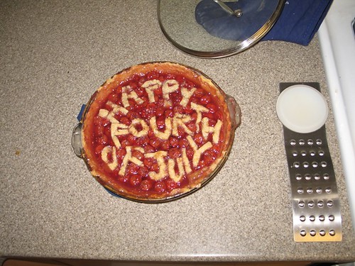
By the way, the only pie I've made myself is cherry:
Cherry Pie for the 4th of July

Now that I know how much work it is, I can understand not wanting to make a different one every month!

Thursday, May 15, 2014

A busy month!

Since I last posted, we have moved to Sonora! Very lovely forested location, deer and turkeys wandering by all the time, but still close to grocery stores and the like. Despite the move I've still managed to keep entering the weekly contests, so I have a few to catch up on.

First, the theme was lilies. I combined actual lilies and fleur-de-lis. The colors I got from the list of prize winning varieties of lilies from Wikipedia, collected on a board here. The background is the same pattern as I used for the bark on my bonsai trees, and the leafy pattern on the fleur-de-lis is the "kelp" pattern I've used for a few things.

Lily and fleur de lis color study

I got 32 votes for this and finished right at the top of the bottom third. There were several entries in this one I really, really liked: a riotous combination of lily-named flowers with other vegetation, one in the style of William Morris, and a bright, stylized take.

Then there was another contest to make a floral design, but in a black-and-white line-art style, such that it could be used like a coloring book page. The idea being, you could use it as colorable wallpaper. I pondered trying to do something inspired by ikebana (Japanese flower arranging) but beyond making a board with some of the stuff I liked best I couldn't get that idea to gel. I just combined my eight favorite flowers: honeysuckle, jasmine, orange blossoms, fuchsia, lavender, California poppies, borage, and snapdragons (Side note: since some people tag bonsai as ikebana, I discovered that you can make some of these into bonsai, which made me hyperventilate a little to be honest)

My favorite blooms

This entry got 47 votes and came in right in the middle. The design I could most see myself using as coloring book wallpaper was this one, and the design I liked most on its own was this more graphic one.

Continuing the plant theme, there was also a contest for terrariums. This was one of those themes I found intimidating, as it's easy to imagine all kinds of amazing, lush illustrations on the topic, but hard to execute them. So I took a very graphic, subdued take. I had fun looking up neat terrariums on Pinterest, though. I based the colors and proportions on this very tiny spice jar terrarium. The textures I used here were the isometric dots and lines I originally made for my school papers and the lattice (all of which can also be seen here), plus the knit I've used quite often.

Moss Terrariums

This entry did not catch on, got 12 votes, and finished in the bottom 10. My favorite was this one.

For the contest closest to Earth Day, the challenge was to make a 1-yard pattern for a reusable tote bag. The bag itself didn't necessarily need to be Earth Day-themed, but I decided to use a couple of my existing designs that are nature themed, and combined them together with this tote pattern that I liked. This uses the "kelp" mentioned above in two color combinations, the "star" pattern in two more, the meerkats I drew for my son, and the map pattern, which is one of my most popular. (I pulled the other fabric colors from the map design.)

Meerkat Tote Kit

My tote did pretty well, getting 132 votes and just squeaking into the top quartile. My favorites were this bright one in modern colors and this more serene, mid-century-ish take.

There was actually another holiday-related cut-and-sew challenge. Another tea towel, but this one with one of "Mom's" recipes on it, in honor of Mother's day. I knew immediately that I would adapt my mother's banana bread recipe (which she got from my paternal grandmother). And for fun I drew it as a diagram instead of writing out the recipe (plus this is really how I think of the recipe in my head). The colors are the same as the last time I combined family lore with a towel. The blue/green background patterns are, yet again, my "kelp" and the "knit" both mentioned previously. The brown texture in the border was one I put together for the "anti-Valentine's" faux-cross-stitch.

Banana Bread Diagram Recipe Towel

I got my hopes up pretty high for this one, as it gained a lot of "likes" through the week - enough to make it my second-most-liked design ever (behind Baby's Book of Computer Science, of course). But even so it ended up with 84 votes, and just above the median. The entry I could most likely see using as an actual kitchen towel was this one, which combined an actual old hand-written recipe card with some textures from hand-me-down cookbooks.

Thursday, October 25, 2012

Three designs at once

So what have I been up to on Spoonflower? Since I last posted, I've had one successful entry and two duds. Well, maybe "dud' is too harsh, but you get the drift.

Most recently, it was the annual "tea towel calendar" contest. My starting point was representing each month by some type of produce that should be in season at that time (In order: potatoes, radishes, asparagus, bananas, artichokes, corn, nectarines, summer squash, apples, pumpkin, leeks, and oranges). The colors are based on the image in this blog post.

 A Year of Fresh Produce - Eat In Season!

I'm not all that happy with how this turned out. The block of color are way too large and the way it looks from a distance is, well, ugly. Especially those big dark potatoes just hanging out there! I should have made them yellow. I think the three green veggies turned out the best. I guess the bananas are decent too. At least I made one improvement over last year's pie-based effort - I remembered to leave enough negative space around the design for a seam allowance!

This came in 113 out of 186 with 79 votes. I loved all of the entries in the top 10. I also liked the overlapping circles, wildflowers, exuberant tea set, and sashiko-inspired calendars. I also noticed someone else did a pie-of-the-month design!

Looking further back, there were two Halloween-related contests. First, a cut & sew pattern to make a zombie plushie. I hate zombies! Even when they're cutesy I just think they're off-putting. But with this week, I reached a complete year of entering every contest, so I wasn't about to give up. I took it in a different direction and decided to show a computer that had been turned into a botnet zombie.

 Zombie Computer Stuffed With Viruses (get 3 viruses on a swatch)

The computer itself is just a fabric box, and you fill it with little stuffed tetrahedron viruses! I hope I have a chance to actually sew this together soon. It came in 53 out of 88 with 74 votes. My favorite entry was this spooky owl (with detachable eyeball!).

Finally, there was a contest to do something "creepy-crawly" that could be used to make a trick-or-treating bag. I love castles, ruins, architectural details - that sort of thing. So I made a haunted castle with frightening things in silhouette in the windows. Originally I was going to make it all spiders but I got bored with that pretty quickly and branched out.

Spider Castle

The medium and dark grays are cool shades, and the light gray is a warm shade, to amp up the eeriness. I got a lot more comments than I usually do, so I had some hope it would do well. Then it turned out the guy who usually puts together the results post was on vacation, so it took four days longer than normal after the contest ended to find out! The suspense! In the end, I came in 23 out of 224 with 158 votes. My favorite entries were the google-eyed squish marks that came in second, and the one in ninth that my husband should definitely not look at because it combines his favorite and least-favorite things - candy corn with spider legs! *shudder*

Monday, November 9, 2015

The yearly calendar

Every year Spoonflower does a contest to put next year's calendar in a fat quarter-sized design, such that it can be used as a tea towel - you can see my previous entries here. This year, I was initially going to go with something generic that people like to have in their kitchens. Uhh, lavender flowers! And let's add fleur-de-lis and go for a French theme. But when I started trying to make the basic layout of all the numbers, it seemed kind of dumb and pointless. Back to the drawing board.

I had been laying it out in a diagonal checkerboard pattern, so I stuck with that. Then I had the thought to fill the background of each of the diamonds I was going to put a month in with just a large initial for the month. But, starting with "J", that seemed like it left too much empty space, so then I did the three-letter abbreviations instead, trying to stack them together like Mayan glyphs.

The Mayan connection reminded me of the ancient Egyptian colors I used before, so I used those. I made a polka dot background - instead of just circles, it's X's, stars, hexagons, and bursts, which you can see better here. I'm actually really happy with how that came out - it's one of the few designs I've made that came out exactly like I envisioned it.

In any case, the calendar came together like so:

Glyph Calendar 2016

It didn't go anywhere in the contest, but two people bought it. My favorite was this one.

Sunday, March 22, 2015

Best recent contests

Bringing the catchup to a close, here are some contest entries that have done quite well (by my standards).

For the theme "calligraphy," which also had to be in black and white, I focused on ligatures - joined-together letters. I thought it would be fun to put them in circles, to focus on the shapes rather than making it look like something you should be reading.

ligature medallions

This got 149 votes and came in 26th out of 205! My favorites were the textured assortment of pens and ink (which won), the friendly speech bubbles, and the bold sampler.

For the yearly tea towel calendar, I did an assortment of ephemera - menus, tickets, etc, each of which had one month's worth of numbers on it.

Calendar of all kinds of paper

The background is the "kitchen table" I created previously. This got 186 votes, almost made it into the top 20% of entries, and I even sold a few. The ones I liked best were the tall ship and the trees.

Finally, near the end of October, there was a contest to do something related to Calaveras, a.k.a. sugar skulls. I pondered what kind of shape or creature to apply that decoration style to, and since there are so many oak trees around here, settled on acorns. Also, the Synergy project has a "haunted" color group, so I used that to tie it into Halloween more specifically.

Spooky Sweet acorns

I had a lot of fun with this one and I'm quite happy with how it came out. It got 42 "likes" (second only to Baby's Book of Computer Science), 198 votes, and came in 29th out of 250. My favorite (other than my own!) was this one.

The most recent contest was a good one for me as well. The theme was "spoons," this being Spoonflower and all. I tried to think of something other than "cutesy layout of spoons in nice colors," since that would be what most people would do. I tried to think of some other theme to apply to spoons - Disney princesses as spoons? The seven deadly sins as spoons? Eventually I settled on putting a piece of advice on each spoon, and calling it "spoon-fed wisdom."

Spoon-fed wisdom

The colors are from this menswear palette. The advice is:

  • Don't drown in a cup of water
  • The single biggest problem in communication is the illusion it has taken place (George Bernard Shaw)
  • Not my circus, not my monkeys
  • It's ok to have an unexpressed thought
  • If you can't explain it to a six year old, you don't understand it yourself (Albert Einstein)
  • Worrying won't stop bad stuff from happening, it just stops you from enjoying the good

This came in 25th, ending up in the 91st percentile - the best relative finish I've had so far! Can't complain about that. My favorite was probably this one, which included a bunch of other kitchen implements.

Monday, July 22, 2019

Next batch of designs

For the "paint by number" contest, I used the paint-by-number roses I made for Maren's quilt, with bolder colors.

Jumbled Roses, Paint-by-numbers style

My favorite was the heron woods.

For "vintage postcards," I did the BACKS of postcards.

Awaiting Your Message

My favorite was the Hawaiian themed cards.

Then we had a theme to do an animal portrait that would fit on a tea towel. I thought it would be funny to do a tribute to the inescapable "Baby Shark" song, but in the style of those really old-fashioned portraits with the baby in a big, lacy white dress. So that was fun! I wanted to add more detail to the frame, to make it look like a carved wood frame, but ran out of time.

Ye Olde Baby Shark (Do Do Do Do Do)

Next the challenge was to do a print that would work for boys' clothing. I adapted the orange doodle design I did of a bunch of Bruce's favorite stuff and did it in color instead.

Joy in a Boy

My favorite was the bugs on stripes.

Lastly, another restricted palette contest where we had to use bronze, peach, and light & dark teal (and optionally black and white). I based my design on this image and added some mysterious symbols.

pocket glyphs

I thought the ginkgo best used these colors.

Of all these entries, the boys' clothing doodle did by far the best!