Wednesday, December 19, 2012

Tags

Last week's contest was to create a pattern you could cut apart and use as gift tags. Incidentally, Spoonflower has branched out - along with fabric, you can also get anything printed out on wallpaper or on vinyl wall decal material (that has a re-adhesive back). So I decided to make a pattern you could cut out of the decal stuff and use as stickers on packages (as Spoonflower themselves suggested in the contest description) - in other words, no seam or hem allowances. However, I still wanted it to look reasonably good on fabric. So the extra challenge I imagined for myself was to have no partial or cut-off labels no matter what size of fabric or sticker I got. So the rectangles I had to operate in were five and fifteen inch squares for the decals, and the eight inch square and 18" by 21" fat quarter for the fabric. (The larger sizes - 30" decal square and full yardage - are naturally covered by the smaller sizes.)

After I divvied it up into reasonably label-sized sub-rectangles within those contraints, I filled in each with a pastel version of the knit pattern I've used a couple times before. Then I used the Dr Who/menswear patterns as if they were cloth-covered buttons on each tag.

Cut & Stick Gift Tags - sweater patches with cloth-covered buttons

My entry came in 122 out of 152 with 36 votes. Out of the more cutesy entries, I liked these (which came in eighth), these animals (which came in first!), and these little houses. For more elegant ones, I liked these and these (which came in ninth).

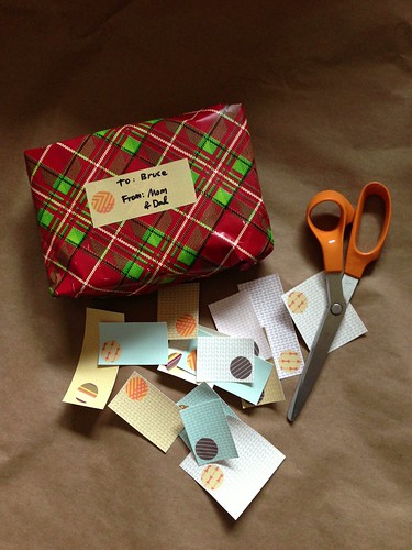
I even got mine printed out in time to use them for wrapping Christmas presents!

Gift tag applied to present

Wednesday, December 12, 2012

That eucalyptus pattern gets around

Back when I created a "family crest" pattern, I created two sub-patterns for it. One was a simple line drawing of eucalyptus leaves. I used it again to create a little more depth in the pomegranate cookie design. I recently had a chance to take it for a spin again.

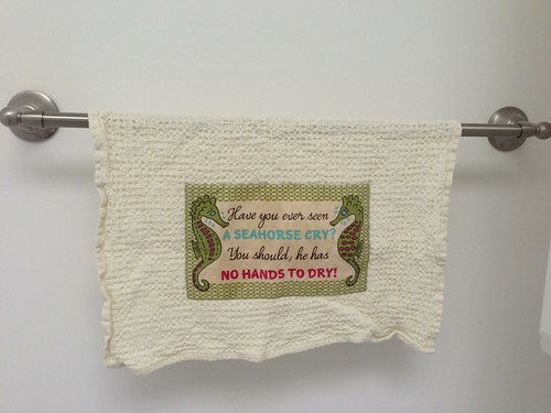
First, some backstory. When I was a kid, every year at Thanksgiving we'd gather with the extended family on my mom's side at an old house on an orange orchard that the family owned but nobody occupied year-round. The bathroom at the back of the house had these strange old (probably decades old) paper hand towels that just hung there yellowing and never got used. They had pictures of sobbing seahorses,with the text "Have you ever seen a seahorse cry? You should, he has no hands to dry!" So very odd.

Once the house finally got sold and its contents were packed up and divided among certain family members (a saga too long to even touch on now), nobody was able to put those aside. Perhaps some are still in a box somewhere; perhaps none exist. I had been wishing for years that I could get my hands on one to scan it and turn it into a real towel. Well, fast-forward to this year, when my brother was gearing up to host Thanksgiving at his house again, and he suggested that I should just draw my own version and make those the new Thanksgiving towels. Challenge accepted!

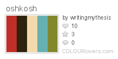
For the text, I found a couple of retro fonts I liked: Roadbrush and Simplesnails. I searched for seventies-inspired colors and decided on these:
oshkosh
Color by COLOURlovers

Next I had fun drawing some distraught seahorses. I framed the whole thing using the rounded lattice previously seen here. Then I thought it still looked a bit plain so I put that trusty eucalyptus pattern very lightly in the background (though rotated 20 degrees, since putting it next to text made the horizontal repeat wayyyyy too obvious).

I decided to make the overall size six inches by nine inches, so that it would be nicely visible when appliqued onto a hand towel but not take up the whole front. Plus that size meant I could fit exactly nine on a fat quarter of cotton-linen (which Spoonflower has wider than the plain standard cotton) like so:

Have you ever seen a seahorse cry? You should; he has no hands to dry!

Then, since I had a streak to maintain, I got the printed fabric on literally the day before we headed out of town for Thanksgiving, and started sewing the towels in the car. The towels themselves are from here.

Seahorse towel

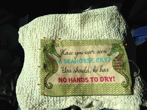
Each patch is just blind-stitched on to the towel. I managed to finish all nine in time, on the drive up and during naptimes at my mother-in-law's house. (The above picture shows me sewing in the car - you can imagine my toddler son directly to the right of this, asleep in his carseat.)  I gave eight to my brother and kept one for myself. I had prewashed the towels and the fabric before we left, so they were ready to put into service as soon as we arrived!

Seahorse towel

It'll be fun to get to use these every year now. They seemed to be a hit with my extended family. I still cherish the idea of someday miraculously finding the original.

Oh yeah, the other pattern in that family crest? That would be the little repeat of handguns. I just got a notice that somebody ordered FIVE YARDS of it...on SILK. As my husband said, that's a heck of a set of pajamas!

Saturday, December 8, 2012

A tee for the sea

This week's contest was to take an existing blank pattern for a t-shirt, which fits on a yard of fabric, and fill it in with an "under the sea" themed design. I somehow missed the fact that it's a shirt for a little girl, not an adult, so I had a much more subdued take than most of the rest of the entries. I based the basic layout on one of my favorite shirts, which has a sort of harness-like colorblocking. For the two areas of color, I used two prints I had already - the seaweed-like background of the jellicle jellyfish, and the rounded lattice I used as part of the zig-zag cheater quilt (which was itself a simplification of this pattern). However, I changed this colors of those patterns slightly. I looked for a set of kelp-inspired colors and liked these:
kelp_forest
Color by COLOURlovers

So that resulted in these two patterns:

Netting lattice


 Lacy Kelp

And thus, it all came together like so:


 Kelp and Netting T-shirt
The original pattern blank was in a PDF. So I imported it, selected out all the whitespace so that I had just the lines, masked out the shapes for my different areas, filled it in, and submitted it. But for some reason the whole rectangle was showing up too small - it wasn't taking up the whole yard. Huh? Then I figured out - I had imported the PDF at 100 DPI instead of 150. ARRRRRRGGG. So I had to redo it entirely! Fortunately I had learned from the first time around so it didn't take all that long.

This came in 78 out of 182 with 107 votes. My favorite entries were this cute sailor-inspired one with a faux placket, one with a graphic jellyfish, and this one with lobsters.

Friday, December 7, 2012

A kernel of truth

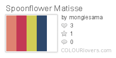
Like the previous contest, this one also had an assigned palette:
 Spoonflower_Matisse
Color by COLOURlovers

The additional requirement was to make it look like something that could be in a Matisse painting. That didn't capture my imagination so much, so I read through Matisse's wikipedia page to see if anything grabbed me. One thing that stuck with me, for whatever reason, was that his father was a grain merchant. Additionally, I've seen a type of grouped floral print in a couple of different places I wanted to try to make a version of - like this or this. So I decided to use different grains instead of differently colored flowers. I also made this my first attempt at a true half-drop repeat instead of a straight repeat.

Tribute to Matisse

So the colors formed up into an unintentional diagonal stripe, but that's ok. For the grains themselves, I looked up eight different grains that are actually major crops in France. I also tried to be less literal with the colors than I usually am (or else I would have just made all the grains yellow with red shadows or something like that). The large white grains are wheat, the small white grains are rye, the pointy blue ones are oats, the large pink ones are barley, and the round red ones are sorghum. The pink squarish ones are corn, the little red ones are sunflower seeds, and the tiny blue ones are sesame seeds.

My entry came in 31 out of 303 with 147 votes. That makes it just the second time I've come in the top ten percent (after the Spider Castle)! I really liked these patterned plusses, these berries, and the cherries that came in tenth. For designs more directly inspired by specific Matisse motifs, I liked these graphic shapes, and the horizontal and vertical stripes of abstract elements. For more conventional florals, these two were my favorites.

Blown Away

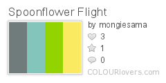
Alas, I have neglected to post a few contests now - time to start catching up. First up, this contest had two aspects. One, you had to use these colors:
Spoonflower_Flight
Color by COLOURlovers

And two, it had to have something to do with birds or flight. I made a first pass at an abstracted, geometric repeat of dandelion puffs.

 Geometric Dandelion Puffs

Then I made the terrible mistake of looking at the Spoonflower site and I accidentally saw some of the designs that had already been entered - such as this amazing dandelion design. As Cathy would say, ACK! So at that point I lost my nerve and gave up trying to improve my poor little effort.

My entry came in 264 out of 323 with 24 votes. That intimidating design ended up, very deservedly, winning. I also liked these bees, birds with foliage, and geometric owls.

Thursday, November 15, 2012

Put this under your glass

This week's contest was to make a fabric that could be cut apart and made into cocktail napkins. The guidelines suggested making 4 1/2" napkins, with 1/4" seam allowances, so the starting fabric squares would be 5". I decided to just make a repeat of 5" squares, instead of making it obvious that you could cut it out into napkins, so that it could look like a patchwork print.

One of the most-viewed designs I've made was the Doctor Who-inspired coordinate. So I decided to add two additional patterns to that set and use them for the napkins, since the colors already have a sort of harvest-y feel.

Doctor Who Menswear Patchwork 5" Squares - Harvest Color Cocktail Napkins

Added to the Time Lord collars, fourth doctor scarf stripes, and blown up tweed and tartan I had last time, are a bowtie stripe (for the eleventh doctor) and a pinstripe (for the tenth). I also finally uploaded all the individual patterns and you can see them together in a collection here.

It came in 84 out of 182 with 75 votes. I really liked these Mary Blair-ish ones, the jewels, the olives, and the quilt patches. All of the top ten are great, but I especially liked the retro ones that came in third.

Thursday, November 8, 2012

ARROW'D!

Last week's contest was for a design that had something to do with arrows. I couldn't come up with anything that was both an appealing design and doable in the time I had, so I went with a simple geometric, which came in 126 out of 221 with 58 votes.

Sandstone Arrows

My favorite entry was the winning one: these swirly arrows. I wish it came in more than just plain black and white. Also good were these Frank Lloyd Wright-ish arrows, nicely-done rainbow-fletched arrows, and waves of gradient colored arrows.

The most recent contest was for a boy's novelty fabric in the theme "Be My Hero."  I knew the most common themes would be superheroes and first responders, so I wanted to do something different. I put positive qualities (courageous, thoughtful, etc) into stripes. Hopefully I didn't misspell anything!

Blessing Pinstripes - Heroic Qualities to Cultivate
They didn't publish the results of this one, other than the top ten, since the winner was decided by Timeless Treasures fabric, who is actually going to produce the design and sell it in stores and all that! So I'm not sure how mine did. My favorite entries were the super shields and the crossed swords.

Sunday, November 4, 2012

Project Runway Season 10 Episode 12

Well, we're now two weeks into the new season of Project Runway All-stars, so I guess I had better get caught up on how the regular Season 10 ended.

Episode 12 brings us down to the final five. Heidi introduces the challenge in her craziest, strappiest minidress yet. They are taken to some ritzy estate turned tourist trap called Oheka Castle, where they learn that this is the makeup challenge. They have to make avant garde looks inspired by both the castle and a randomly-assigned "persona" associated with a makeup palette.  Fabio and Chris get "Enchanted Queen," Sonjia gets "Tempting Seductress," Dmitry gets "Wise Mystic," and Mellisa gets "Artsy Muse." So they are somehow supposed to make cutting edge fashion based on some of the stuffiest cliches ever unearthed from a bad fantasy novel?

Sonjia is in deep trouble from the very start, when they get back to the workroom and she discovers that her main fabric purchase - five yards of gold lamé - somehow did not make it back with them. Fabio and Chris are feeling the competition a bit more than the rest, since they're the only ones who have to compete on the same "persona." Fabio likes Chris' take, but Tim is literally rendered speechless when confronted with Fabio's. This inspires Fabio to break down all the stages of Tim's silence: first the breath in, then the chin on hand, then the crossed hands, then the lean back. Eventually Tim is able to say that he thinks it looks sad and flat, and like a costume. He is also not very positive with Dmitry or Sonjia, saying the former is producing a look with no remarkable drama and the latter is clearly stuck and not working up to her potential.

The second day in the workroom, Fabio has literally turned things around by flipping the jacket he's making upside down. Tim loves it, Sonjia hates it, Mellisa thinks it's her biggest competition. Mellisa is having time management issues, Dmitry says "no!" to Sonjia's look, Chris' is reading very 90's, and the other designers think Dmitry's is too ready-to-wear and too similar to what he's done before. Sonjia and Fabio luck out when their looks fit their models right away.

Sonjia makes a green dress with an illusion back. Heidi loves it and says she'd go on the red carpet with it, but Michael hates it and jeers that it's like an old lady's idea of a backless dress.

Chris sends down a black dress with padded hips. The judges like that part but hate the way it flattens the model's bust and feel the arm feathers push it too far into Goth Victorian costume territory. In all, they feel it was a mediocre execution of a good idea.

Dmitry makes a skirt suit with a separate Vampira collar. The judges love the sleeves but say the collar was too much. Heidi likes the peekaboo slit in the back.

Fabio makes a transparent black dress with a smock-like sleeveless burgundy jacket. The judges are pretty fond of the jacket, and once they hear that it was originally the other way, they make him turn it right-side-up again - and they actually like it even better that way. The dress, however, nobody likes - Heidi says it has no beauty and is not flattering.

Mellisa makes an odd outfit combining a vest, a leather shirt, and a huge, long, high-waisted skirt. Michael loves it - it's interesting, flattering, and handles its colors well. However, Heidi hates it and thinks it's ugly.  Nina says the skirt is too long.

Dmitry wins! Sonjia is out. Who knows what would have happened if she hadn't lost her intended fabric? Next week, we get to see what the final four will make for their finale collections.

Thursday, October 25, 2012

Three designs at once

So what have I been up to on Spoonflower? Since I last posted, I've had one successful entry and two duds. Well, maybe "dud' is too harsh, but you get the drift.

Most recently, it was the annual "tea towel calendar" contest. My starting point was representing each month by some type of produce that should be in season at that time (In order: potatoes, radishes, asparagus, bananas, artichokes, corn, nectarines, summer squash, apples, pumpkin, leeks, and oranges). The colors are based on the image in this blog post.

 A Year of Fresh Produce - Eat In Season!

I'm not all that happy with how this turned out. The block of color are way too large and the way it looks from a distance is, well, ugly. Especially those big dark potatoes just hanging out there! I should have made them yellow. I think the three green veggies turned out the best. I guess the bananas are decent too. At least I made one improvement over last year's pie-based effort - I remembered to leave enough negative space around the design for a seam allowance!

This came in 113 out of 186 with 79 votes. I loved all of the entries in the top 10. I also liked the overlapping circles, wildflowers, exuberant tea set, and sashiko-inspired calendars. I also noticed someone else did a pie-of-the-month design!

Looking further back, there were two Halloween-related contests. First, a cut & sew pattern to make a zombie plushie. I hate zombies! Even when they're cutesy I just think they're off-putting. But with this week, I reached a complete year of entering every contest, so I wasn't about to give up. I took it in a different direction and decided to show a computer that had been turned into a botnet zombie.

 Zombie Computer Stuffed With Viruses (get 3 viruses on a swatch)

The computer itself is just a fabric box, and you fill it with little stuffed tetrahedron viruses! I hope I have a chance to actually sew this together soon. It came in 53 out of 88 with 74 votes. My favorite entry was this spooky owl (with detachable eyeball!).

Finally, there was a contest to do something "creepy-crawly" that could be used to make a trick-or-treating bag. I love castles, ruins, architectural details - that sort of thing. So I made a haunted castle with frightening things in silhouette in the windows. Originally I was going to make it all spiders but I got bored with that pretty quickly and branched out.

Spider Castle

The medium and dark grays are cool shades, and the light gray is a warm shade, to amp up the eeriness. I got a lot more comments than I usually do, so I had some hope it would do well. Then it turned out the guy who usually puts together the results post was on vacation, so it took four days longer than normal after the contest ended to find out! The suspense! In the end, I came in 23 out of 224 with 158 votes. My favorite entries were the google-eyed squish marks that came in second, and the one in ninth that my husband should definitely not look at because it combines his favorite and least-favorite things - candy corn with spider legs! *shudder*

Thursday, October 4, 2012

Embroidering the Eighties

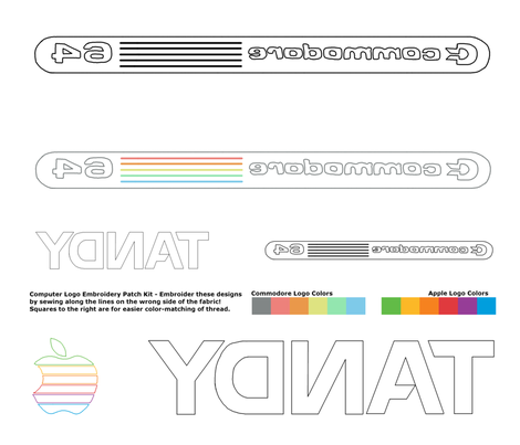
This week's contest was a first - an embroidery pattern. This was a new one on me, but apparently people have been making these on Spoonflower. You print the design reversed, use it as a guide, and - violá! - there's your embroidered design, on the "wrong" side of the fabric. And for this, it had to have something to do with the eighties. I decided to go for famous computer logos of the times, arranged so you could use them as patches.

Eighties Computer Logos - For Embroidered Patches

Mine came in 21 out of 50, with 121 votes. My favorite entries were the homage to Keith Haring that came in second and the Lisa-Frank-esque panels that came in tenth.

Sunday, September 30, 2012

Project Runway Season 10 Episode 11

Episode 11 was another muddled, confusing challenge. The six remaining designers must all make outfits for toddlers, and the winners (there will be a winner for each target gender) will be added to Heidi's new line of baby clothes for Babies R Us. That's simple enough. However, they are actually each assigned a specific toddler, who they meet in a line up of moms and tots. The moms and designers get some time to talk and get some ideas about what outfits the moms like. Dmitry compares this task to making an outfit for a cat, since the kids can't talk. Aren't we all relieved that foot-in-mouth Ven isn't around for this one?

The babies are all between 12 and 18 months old. My son is 17 months right now, so I definitely recognized his behavior in these other babies - switching between walking and crawling, stealing the designers' pens, etc. Chris is initially really happy with his pairing, since he really likes what the little girl is wearing - but quickly regrets it since the mom is very picky and opinionated. She tells him exactly what she wants him to make, notably a three-quarter sleeve white denim jacket (with NO POCKETS!).

Before they go back to the workroom, Tim emits the most ominous chuckle he's ever produced when he tells them they'll have a surprise. The next twist is revealed: they each have one of those newborn simulators they give to high school students, that cries all the time and has to be changed, fed, and rocked. I didn't really get this bit at all. Are they being judged on how well they take care of the baby? It sure didn't seem like it, since it never came up later. We were led to believe they even had to take them back to their apartments at night, but I'm pretty skeptical on that count. As for the supposed goal of this whole exercise - if a grown adult can't think of how to design clothes to make life easy for the parents of toddlers, I can't imagine that having them watch a newborn doll for part of a day would some how enlighten them.

In any case, Fabio takes it very seriously. He talks to his doll very sweetly and is reluctant to put it down and work. The other designers mock him for this, to which I say, sure - but why didn't the rest of you take it further? If it's not part of the judging, why do it at all? Just leave it in the bathroom or something so you can't hear it cry! It's just a doll! Or at least try to come up with a "babysitting" agreement, where one designer watches a few babies at once so the others can work uninterrupted, and then trade off. I can only think that there were rules preventing these sorts of things, or else surely someone would have tried.

Heidi joins Tim for his workroom rounds. The only conversation that really stands out is the one with Chris. He has been busily making the white jacket as requested, but Heidi has a totally different idea for the rest - she wants to see a skirt made out of some textile with dimensional flowers. So, correctly realizing that Heidi's opinion matters and the mom's actually doesn't, he changes direction and does exactly what Heidi asks for.

Heidi then introduces the next twist: they have one more day and also have to make an outfit for the moms. However, as it becomes very clear later, these outfits are actually not being considered in the judging either, since the prize is solely about which toddler outfits will get added to Heidi's line. So again, why did the producers do it? For their second day in the workroom, their dolls are taken to "day care" - and never mentioned again.

At the judging, Heidi is in her weirdest minidress yet - a black sheath with a negative-space Peter Pan collar and double thigh-slits. Crazy! The runway show is very cute, as each mom walks down, either carrying or holding hands with her child. During the critique, they just bring out one mom/baby pair at a time to discuss the clothes.

Chris' mom does not at all like what Chris ended up making - not the white flowery dress for the baby, and not the bright floral dress for her. But both are a clear favorite of the judges, who love that it's a dressy look for both without being matchy. Sonjia has a huge advantage in that the little boy she worked with is such a charmer - he smiles and waves at the judges, and is otherwise unbearably adorable. She made him a little matching blazer and sweatpants, with a bright print onesie underneath.

Dmitry and Fabio both make somewhat retro one-piece body suits for their little boys. Dmitry's has a hood that's a little too pointy, making him look a little like a crayon, as Michael Kors points out. Michael also objects to the hood looking too much like a cape when down, but Nina and Heidi quickly correct him and say the kids like it that way! By the end of the judging, the little crayon is asleep on his mother's shoulder. Fabio makes a little hat that matches his, and the judges like all the details.

Elena makes a little jacket with an interesting pleated collar, and a plain shirt and pants to go with it. The judges don't like that it looks like mixed separates, rather than a specific outfit. Mellisa makes a vest, and a too-short, too-narrow white dress (with exposed zipper!) that rides up.

Nobody mentions the moms' outfits all that much. None of them are terrible, and none of them are really remarkable either - since they don't actually affect the competition.

Unsurprisingly, Chris and Sonjia are the winners! Interestingly, in the actual production outfit, the main color in Chris' has been changed from white to navy.

Elena and Mellisa are in the bottom, and in the end Elena is eliminated.

Thursday, September 27, 2012

Old as dirt

This week's fabric design theme was "earth science." I knew instantly what I wanted to do - dirt! Something I've always been fascinated with is how dirt is made - I know it's partly rock, partly organic matter, but it seems so unlike either. My parents always had a big herb and vegetable garden out in the backyard, and my dad has made compost for many years. All those moist, hot, smelly piles covered with black tarp! Leaves and sticks go in, amazing dirt comes out. I used to help him strain out the big non-decomposed chunks before he spread it around. Also in the backyard was a large segment where my brother and I were allowed to play in the mud. We'd run the hose and make a big puddle, and as the dirt got saturated we'd dig it out and pile it up on the sides. We got some bricks too, and eventually made a whole city with a covered river running through it. I loved to see how the different consistencies of dirt would turn into varying kinds of mud. The layer on top had lots of leaves and other detritus, and below that it got very fine and smooth. Lower down it got sandy, and in some places a little claylike.

Later, in college, I took geology in hopes of learning more about soil formation. Teacher: "we're not going to get into soil formation, because it's pretty complicated." Disappointing, but intriguing! Nowadays, I have Google whenever I want to find out a little about things like this.

For the fabric design, I abstracted out the different stages and processes into stripes. There are two sequences - one is the darker green leaf litter, with worms below it, that turns into clay and then bedrock. The other starts with grass and roots, has ants, and also ends up with bedrock.

Soil Formation Stripes

It came in 63 out of 160 with 153 votes. In a similar "vein" as mine, I liked the geologic strata print (that won) and these core samples. On a more macro scale, I liked these cutesy globe cutaways and magnetospheres. Of the crystal/mineral entries this was my favorite, and out of weather themes I thought this was best. This ocean depth map that came in fourth is neat and has a really large repeat.

Sunday, September 23, 2012

Project Runway Season 10 Episode 10

In Episode 10, the competition is down to seven designers. As the day starts, some of them discuss how Elena is the only one left who hasn't won a challenge. She vows to change her approach from now on - less freaking out, more staying calm and relaxed. Good luck with that!

The challenge is introduced in quite possibly the cheesiest and most embarrassing way yet: they are all taken to Radio City Music Hall where the Rockettes do a routine, at the end of which who should appear but Heidi herself. She even joins in the kicking! Funny, cringe-inducing, unclear what any of it has to do with "fashion." Of course, they will have to make costumes for the Rockettes.

Elena immediately blows up her low-stress pledge by going $150 over budget at Mood, and I feel very sorry for the clerk who has to help her fluster through her fabrics and notions to figure out what to get rid of. Back at the workroom everyone else is just counting the minutes until she goes into another full meltdown, as they listen to her rage about how much she hates the fabric she got.

Happily, this is broken up by Chris, who decides to imitate what Sonjia is wearing - turban, sunglasses, and dark lipstick. Then everyone starts to turn the skeptic's eye on Ven, who keeps stressing that he wants his costume to have clean lines and not "beads and stones all over."

The workday ends early so that they can all go out to dinner! Sometimes I think the producers must take stress-level readings for everybody when they do their camera interviews, and when the group reaches some threshhold they finally let a tiny bit of pressure off like this. Most of them seem to have reached the point of mental exhaustion where their sympathy for each other as fellow human beings going through the same ordeal is starting to override their desire to defeat each other.  At dinner, everybody drinks a bunch and opens up. Elena apologizes to Dmitry for directing so much anger towards him, and Ven explains how, being far younger than the rest of his siblings, he felt isolated as a child, and that's why he's the way he is. As Dmitry says, "it's the wine!"

Elena and Ven are still not doing great on their costumes, though. Elena, upon picking out her fabric, immediately said it looked like stuff for a band uniform, and promptly makes an ultra-blinged out bandleader/cheerleader look. She ends up putting it on herself, and dances and jumps around the workroom. Tim tells her she should just look for a baton when she styles the outfit. He also tries to get Ven to somehow increase the impact of his, since it's just a short dress, and is met with the Ven Wall of Ignorage. Ven thinks the pale blue sparkly netting he has is "loud." That's like saying bell peppers are spicy.

Dmitry uses his childhood/young-adulthood experience as a ballroom dancer to create a dress that, as Chris says, looks a lot like a high school dance team costume. Fabio and Tim get into an extended jam session on the theme of "bitches" and "bitchslapping," inspired by Fabio's frustration with his sequined fabric. Sonjia is struggling with her piles of purple feathers and Mellisa is unhappy with her pile of colorblocked pattern pieces.

Chris is happy with how his is going - the bodice has the NYC skyline on it. The others, especially Sonjia, are quite jealous of his great idea. However, he wishes he had enough illusion with sparkles on it for the sleeves and neckline, instead of just the plain illusion he got. His wish is granted, as Tim says that everybody seems enough in need of help that they all get another $100 and a trip to Mood! Ven, Dmitry, and Fabio decline, since they are happy enough with their fabrics and want more time to keep working.

Mellisa has a few last minute panic-inducing moments. First, the pull of her zipper comes off, without enough time to sew a new zipper in. It's not clear what she ends up doing, but I think her model just gets sewn in the dress. Then once it's on the runway, she realizes that from a distance, the colorblocking reads like a giant numeral 1!

At the top are Chris and Dmitry. At first the judges sound very mixed about Mellisa, but then they finally admit she's in the top three too. Fabio is the one out of seven who ends up exactly in the middle and therefore safe. Sonjia and Elena are in the bottom, as is Ven, though they are clearly less critical of him than the other two.

The judges have only positive comments for Chris - it would look great on thirty-six dancers in a row and smacks of Bob Mackie. They all like Dmitry's except that guest judge Debra Messing thinks it might be too sexy for "the little, little, little ones." Do people take kids that young to Rockettes shows??? And what is sexier about that costume that the others? They really like the graphic qualities of Mellisa's, but think it's too short.

Sonjia's is boxy and too fragile. The judges go into a long riff about how the feathers would fly everywhere and end up calling it a "disco turkey." Ven's has no design and looks like a glam Mother of the Bride dress cut short. Elena's is busy, tacky, and like a Las Vegas cheerleader or circus costume.

Chris is the winner! And Ven, now that his story arc from arrogant to cluelessly cruel to lonely has run its course, is out - prompting a round of "survivor's guilt" from Elena.

Next week, the designers have to make an outfit for a baby, for Heidi Klum's line of baby clothes.

Project Runway Season 10 Episode 9

Episode 9 begins with the men discussing their feelings of dread about unceasing eliminations, and the women cattily agreeing that Dmitry should be eliminated because he's only ever made dresses. This week is the digital fabric challenge, in which the designers have a hour (!) to make a repeating design, and then make it into a look when they get it printed on fabric. This time, in a desperate attempt to recapture the magic when Mondo won this challenge by creating a fabric with a very moving and personal story behind it, the producers add that their looks must be based on their "cultural heritage." This leads into a very cute segment where each designer has either his or her mom or significant other brings them a slideshow of family pictures, I guess to refresh their memories of their heritage. Then they get the evening off to hang out with those family members, so there's time for the printing.

Gunnar bases his design on his personal history of being bullied - it's the most emo print ever, of birds being menaced by skeleton hands. He and Chris bond over bullying stories, and finally bury the hatchet. Chris makes a print based on ladybugs, which have a connection to his grandmother - and he secretly hates Gunnar's print.

Mellisa makes a red vine pattern for the bloodlines of her Polish family, Dmitry makes a red, black, and white geometric design based on traditional Belarusian textiles, and Elena makes a purple-and-yellow scribble that has something to do with her childhood in Ukraine. Fabio also makes scribbles on black, and claims that it shows, uh, genitals. Nobody else can see them, though. Sonjia makes a red, blue, black, and white tribal-ish pattern, and Ven makes very boring dark pink hibiscus flowers.

The high point of the episode is Tim's check-in with the designers. He sees how Ven is using his print - fan-pleating the parts with flowers and cascading them down the front - and says "I see an homage to a menstrual cycle!" Ven is speechless. Tim even calls out to the rest of the room to back him up. This actually makes Ven tear up a little when he recounts it in the interview. I guess if he hadn't already shown himself to be an insensitive boob I might feel bad!

Elena makes a jacket. Fabio makes a vest. They are both safe so sadly we don't get to see how Fabio would explain his print or how the judges would react.

Christopher makes a cocktail dress by covering his print with black organza, because he doesn't like to work with prints. Gunnar makes an Amish band jacket. Ven makes a dress with the same pleating he does over and over - and this was his second dress, since he totally scrapped the one Tim criticized.

Dmitry makes a shirt from his print, which goes with a plain black jacket and skirt, and the jacket has some amazing cutouts to show the print from underneath. Mellisa makes a dress. Sonjia makes pants.

Chris, Gunnar, and Ven are in the bottom. Dmitry, Mellisa, and Sonjia are in the top. The judges like how, even though you can't see much of Dmitry's print, it's still the part of the outfit that makes it special and "phenomenal." They like that Mellisa's dress is very unexpected from her, but feel it needs more edge. Guest judge Mondo like Sonjia's the best - those pants were rather Mondo-like.

They find Chris' to be the most disappointing and wish he had skipped the shrouding layer of organza. Gunnar's is called out to be "not cool, edgy, or modern." But the worst criticism is for Ven - Heidi says it looks like a Hawaiian Airlines hostess outfit, and they finally, finally, finally call him out for doing the pleating he's done over and over and over, and even express amazement that nobody else warned him off of it. In fact, once the designers go back to the waiting room so the judges can deliberate, they summon Tim Gunn to explain how Ven could have come put with the pleating again. So Tim gets to tell the whole hilarious story of the first "maxi pad' dress, since that's the reason he didn't see Ven do the pleats on his eventual look. (And he says he HAS warned Ven about repeating that element so much, in fact - just not for this challenge.) As the judges erupt into belly laughs over the whole thing, you can't help but think this is amazing karmic payback. Ven, a nobody who humiliated his "makeover client" even though there was no reason she had to respect his opinion or design abilities at all, is in turn being utterly humiliated by all of the people whose good opinion he most wants to have right now.

Dmitry is named the winner! For, as he says, NOT A DRESS. Ven and Gunnar are the last two, and this time there is no second (third? fourth?) chance for Gunnar - he is out.

Next week - costumes for the Rockettes? Oh well, at least that's better than costumes for wrestlers.


Friday, September 21, 2012

Clop clop stomp stomp

In "honor" of election season, this week's design had to include donkeys and elephants. I figured the majority of entries would go for patriotic colors, so I wanted to avoid that in hopes of standing out a little more. Also I thought of just doing the foot and hoof prints of the animals instead of the animals themselves. I tried to google for images of such prints to get the spacing of the tracks right, but I couldn't think of the word "hoofprint" for an embarrassingly long time. "What's the word for the marks that a donkey's feet make, darnit?!"

Originally I was going to have the trails just criss-crossing each other randomly. However, I had a hard time getting it to look right as a repeat. Eventually I noticed that my layout sketch looked like a wonky argyle, so I thought, heck, why make it so hard on myself? Who doesn't like an argyle?

It was my husband who had the brilliant idea of having the Constitution be the background. I was trying to come up with something that would add a little depth but still be sort of "ground' colored. Since I had the framework of the argyle, I could use diamond-shaped segments of the document and not try to blend the edges together for the purpose of making a repeat.

Election Year Argyle - elephant and donkey hoofprints

It came out pretty close to how I envisioned it, so I'm pleased in that regard. Also the concept is still cracking me up! It came in 53 out of 103 with 68 votes.

There was another footprint entry, which I liked. For straightforward takes on the contest, I liked these watercolors and this tessellation (which came in second). I also liked this cutesy, more generally USA-themed one (which came in eighth).

Friday, September 14, 2012

Clack clack clack clack DING!

This week's contest was to create a black-and-white repeat having to do with typewriters. My initial thought was to arrange typed characters into some fancy pattern - something like a damask. That quickly morphed into doing something like ASCII art. Then, I thought, why not a simple ASCII rose?

Typed Roses

I like that it looks like it could have been typed directly on the fabric. I tried out a bunch of "typewriter" fonts and settled on this one. It came in 73 out of 169 with 84 votes. I've now made it into the top half of the results for four in a row!

I liked this ikat pattern made from x's; sort of a similar idea to what I was thinking of trying. In the same vein was this plaid. There were quite a few entries of typewriter keys, of which my favorites were these two (the first of which came in fifth). My favorite entry overall was the repeat of ribbon tin labels, which came in second.

Wednesday, September 12, 2012

Project Runway Season 10, Episodes 7 and 8

Due to Labor Day travel, I didn't have a chance to watch either of the previous two episodes until recently, so I have a double update (just in time to be ahead of this week's episode...)

In Episode 7, the remaining women reaffirm their desire to have one of the male contestants eliminated next. Throughout the subsequent challenge, though, all of the female designers struggle and feel like they're out of their comfort zone, whereas all of the men feel confident and feel they are all contenders for the win - especially perennial rivals Chris and Gunnar. Several of the designers comment on this gender divide, and Ven wraps it up with a bizarre generalization: "I feel that generally men are stronger designers, and women are more practical." I'm not even sure what that means, and given that Ven has revealed what a thoughtless person he is, I'm not able to imagine any positive connotation for it either.

The challenge itself is the "Lord and Taylor" challenge - that being the store that supplies all the accessories they have to use for styling their looks. The specific setup is that L-n-T has gotten one designer from each of the previous nine seasons to design a look for them - all either cocktail dresses or evening gowns - and the winning dress from this challenge will get to join those as the tenth dress in the collection. They are all actually going to be produced and sold! This means they can't use any techniques that are too hard to reproduce and they have to choose from specific fabrics already given to them, and it has to be able to be sold in the $200-$300 range. Overall, though, very little time is spent talking about exactly how their designs have to be constrained for this, especially in comparison to the Project Runway All-Stars challenge where they had to do something similar.

All the designers make black cocktail dresses, except for Dmitry, who makes a sparkly greige one, and Christopher, who makes a gown with a light pink t-shirt top (covered with the same shredded technique he has done before). Gunnar's take is covered in sequins, and he is sure he's going to win. Elena worked herself up into several freakouts in the workroom and is sure she's going to be eliminated for her harness-babydoll.

First off, Sonjia, Ven, and Dmitry are safe. Sonjia had some rough moments during construction herself, especially when sewing the dress onto her model at the very last minute, and is over the moon at being safe. Ven and Dmitry both felt they were definite contenders and are miffed.

The judges say that of the remaining, there are actually four in the top and two in the bottom. Fabio, Chris, and Mellisa are in the top. Alicia is in the bottom. Gunnar is shocked to be in the bottom as well, but not nearly as much as Elena is to be in the top!

Christopher is named the winner. As the usual judging continues apace, eventually Gunnar is left as the last on the runway, which would normally mean he's out. But since the competition is still short a competitor (after having two quit and only bringing Raul back), the judges decide everyone gets an E for Effort this time and nobody gets eliminated!

This sets us up for Episode 8, another team challenge. Chris, cheesed that the perfect opportunity to be rid of Gunnar fell apart, gets teamed up with Gunnar. Stuck with them is Sonjia. Dmitry and Elena, who have also had their share of clashes, end up together, with Alicia as the third wheel. That leaves Ven, Fabio, and Melissa on the last team.

First, the teams must make "merchandise" using craft supplies, then go and sell it on the streets to raise funds to buy the fabric and notions for the challenge proper. It's sort of like kids running a lemonade stand, since they don't have to reimburse for the supplies...but ah well. They're allowed to sell anything they can come up with - fashion advice, other services, any accessories or "irresistible things" they can come up with. So they all sell T-shirts they've dyed or painted. Team "VMF" makes $800.48, team "CSG" makes $684.00, and team "DEA" makes exactly $500.00.

Now, to the actual challenge. Each team must make two looks for fall, including outerwear in at least one. The team dynamics play out like something from Goldilocks - Team DEA has too much conflict, Team VMF has too much friendship, and Team CSG is just right. Amazingly, Chris and Gunnar are able to tamp down their claws and work together, and overall all three seem able to speak up and collaborate in such a way as to elevate all their work. Team VMF seems to get along well on the surface, but everybody just kind of does his or her own thing and there's nothing special. Team DEA works out exactly like everyone predicts - Elena does her usual freakouts and all three spend their time jockeying for position and trying to have the most visible surface area displayed on their garments.

To be honest I thought all the clothes were boring. They were all safe, neutral, and as far as I could tell have all been from the same collection, across all the teams. The judges like Team CSG best. As is customary for team challenges, members of the winning team have to name which individual should win, and the other teams have to name who should be eliminated. Chris and Gunnar both pick Gunnar to win, and Sonjia picks herself.

On the non-winning teams, Elena and Dmitry of course rehash their every argument in front of the judges, and pick each other to go. Alicia picks Dmitry. Nobody on Team VMF wants to make a pick, but finally the judges batter them down and Ven and Melissa both pick Fabio. Fabio evades the question by picking Ven, because, as he says, he knows there's no way they'll eliminate him.

In the end, Sonjia is named the winner for her jacket, and Alicia is eliminated for her pants (which were largely covered up by Elena's jacket). Next week, it's the digital print challenge, where we are reminded that one of the few things more ridiculous than creating an outfit in a day is creating a fashion print in an hour.

Thursday, September 6, 2012

Zig-zagging down stairs

The contest this week was to make another one-yard "cheater" print, this time with a zig-zag design of some kind. I started off by browsing "zig zag quilts" on Pinterest and found this one I liked. I decided to use previously created designs as all the subdesigns. So, using the handy-dandy stats I gathered about which of my contest entries were the most popular, I decided to base it around the cake collage repeat, and change the colors of the other designs to go with it.

In fact, I already had that scheme in mind when I was creating the camping design, so it already uses colors sampled from the cake slices. Also included in their original forms are the dancing dinosaurs, family crests, sewing pattern, and Daft Punk cameos. Well, the dinosaurs and the crests didn't do that well in their contests, but they're some of my personal favorites and the colors went well already.

I produced newly colored versions of the Gemini astronauts, pitchers, the ginger (that was also used in Maren's quilt), seadragons, kites, and the programming languages from the baby hats (which were inspired by the ones in the baby book). I also re-used the military uniforms, but redesigned them slightly to be civilian suits so that the colors could be different.

The only design that was really new for this was a new version of the "hand-drawn" design - I wasn't satisfied with how the shapes flowed into each other, so I redrew it. Also for this usage it's just in two shades of green - I didn't add the other scattered colors.

I filled it out with some smaller-scale patterns I've used in a few places: the gingham/check that got used with the pie calendar, hipster piglet, and memory game; and the knit that showed up with the reversible bag and the bells.

So once I had those 16 designs, it was just a matter of pasting them into place.

Zig Zagging Cheater

The overall design is thirty-two inches square. I learned a hard lesson before when I made the reversible bag, which is a yard (36 by 42 inches) - my computer has a hard time handling more than just a couple layers with files that large. It got slower & slower as I was working on it, and ended up freezing entirely - while it was saving. Arrrrg! When I opened it back up, it had lost three or four of the bottom layers.  Alas! Also, that was very late at night on the last night to enter, so I just had to quickly redo it, and of course didn't have time to add any of the additional details I was hoping to.  So anyway, I worked on this design just four "zigs" at a time, and then combined it all into one flat file at the end. No freezes this time!

My entry came in 106 out of 216 with 96 votes. There were a bunch of really neat entries this week. This one really reminds me of Mary Englebreit. For a mostly straightforward take on the idea, I also liked this sea-themed one and this one with vintage graphics. With a little more of a twist, this one has pieced flowers and I really like the combination of prints and solids here. These zig-zag turtles make a nice fabric all on their own, and my favorite entry is this one which combines geometric prints with organic zig-zags. I also really like all of the top ten.

Saturday, September 1, 2012

Paper Squares

This week's contest was for school supplies. I thought of putting a bunch of different papers into a patchwork pattern - lined paper, graph paper, etc. I'm very happy with this design. This is one of the few I've made that came out EXACTLY like I pictured it in my head.

School Paper Patchwork

When creating the Scantron-style answer bubble sheets, I ended up just drawing them by hand. However, I did consider trying to use the official Scantron font. I Googled for it, and found an actual corporate Scantron "style sheet," which pointed me to a font named Interstate. So there you have it, if you should ever want to make something look like a Scantron.

My design came in 58 out of 171 with 139 votes. There were an astonishing number of entries having primarily to do with pencils, my favorite of which was the cross-sections (which came in fifth). I also liked this photo print of crayons.

Friday, August 24, 2012

Project Runway Season 10, Episode 6

This week's episode was to create a look for a woman who had been nominated for a makeover by a friend. These clients also get a hair and makeup makeover for the runway as part of the deal. This meant we got an extended ad for L'Oreal hair products in the middle of the episode when they were all getting ready.

The episode starts with Dmitry wishing for a win, and Sonjia wishing for a male contestant to get eliminated so there would be equal numbers of men & women left. One of these wishes comes true!

I wonder where they find the people for these types of challenges. Who in their right mind would want an outfit from a fledging designer, created in a single day, and you have to be on TV for the whole thing? It's like they think it's going to be some amazing pampering thing, where the designer caters to their every wish, and creates an amazing outfit that makes them feel like a princess. Well, I guess maybe it works out for some of them, but if you've ever seen any of these "real world" challenges you'd be well aware that you can end up being very unhappy if you get the wrong designer.

In this episode, the wrong designer was Ven. And wow was he W-R-O-N-G with a capital W. In previous challenges, he has seemed perhaps arrogant, but at least calm and professional. This challenge brought out the worst in him. He was paired with a woman who is size 14, and spent the entire episode moaning and flailing in the most disgusting manner about how disappointed he was, how it was so unfair, a nightmare, he can't design what he wants, she has no style or fashion, blah blah blah on and on until all I heard coming out of his mouth were mosquito noises. Most of this was just in interviews and to the other designers, but to her face he made insensitive remarks like how he chose black because it was slimming, the belt he chose was just too small so he's waiting for them to bring another one, etc. All the other designers are appalled, the client is in tears, and the friend who nominated her feels terrible. Ven is unmoved. Even Tim's attempt to give him a pep talk to pull his head out from where the sun doesn't shine falls on deaf ears. To the very end Ven maintains he has done nothing wrong, said nothing wrong, nothing is his fault and he has no idea why she's upset. And that he should be safe from elimination no matter what because, in his opinion, he had a harder challenge than anyone else. In other words, the Brobdingnagians have him on speed dial as a handyman, because he's a GIANT TOOL.

On the flip side, Gunnar is also transformed by this challenge - into someone charming, friendly, happy, and successful. He is excited about the challenge from the start gets along great with his client, who is also, like Ven's, a "real woman" and not a runway model size. It's very interesting to see how the same challenge brings out the worst in Ven and the best in Gunnar.

I actually thought all the designs were acceptable this week. I didn't hate any of them, but I thought very few of them had anything special either - most seemed like stuff you'd have no problem buying in a store already.

Alicia gets by far the least amount of screen time - we get just a little snippet where her client says she "wants men to want [her], and women to want to be [her]." We get a few comments from Alicia, Tim, and other designers mentioning she is going out of her comfort zone by making a pink dress. It ends up looking like a sun dress, perhaps a bit too short, and wins her a spot in the safe group.

Melissa makes a black dress (no surprise there) that ends up getting eclipsed by the accompanying scarf, with which the client literally wrestles with the whole way up and down the runway. I wasn't clear on whether the scarf was something she made, or pre-made accessory. Her client clearly loves the dress, but Melissa ends up merely safe.

Chris spends most of his time on a little jacket, but the client takes it off on the runway right away so all the focus is on the gray draped dress. It emphasizes her tiny waist and she looks great. Both of them are really happy with it, but Chris also is safe.

Elena's client asks for lots of color, so she makes a pale peachy shirt with a fluttery hem in front and a black skirt. Hmm. I suppose, technically, those are "colors." Elena is safe.

Sonjia makes a blue draped dress with a knot in the front, very similar to her previous designs. However, it's too short and the proportions are off. She lands in the bottom.

Nathan is paired with an up-and-coming R&B singer who wants something sexy and midriff-baring, but still sophisticated, that she can wear on stage. Like Alicia, Nathan is out of his comfort zone but gives it his best try. He makes a blue prom-like dress with black mesh sleeves. The client really likes it, but the judges do not. This results in some terribly uncomfortable moments when the judges tear it down with the client standing right there, culminating with Heidi saying she looks like a "hoochie mama." (She then has to translate that into British English for guest judge Alice Temperly - "a tart!")

Ven makes a blue shirt and a black skirt with an exposed zipper down the front. I don't think it's really all too terrible or unflattering, objectively speaking, but the client clearly dislikes it and feels uncomfortable, so it's a failure. Ven's objectively terrible behavior does come to light for the judges. He is also in the bottom.

Happily, Gunnar's felicitous collaboration has good results, and he makes a black dress with a lovely ruffled skirt. His client is overjoyed, and he gets into the top.

Dmitry makes a blue dress with geometric seaming that fits his client very well. I think it's a tad too short, but he ends up in the top and the judges like it.

Fabio's client doesn't like to look feminine or show cleavage. He rises to this challenge by creating a dress with a very modest silhouette, but with edgy colorblocking. It's also sleeveless, which the she loves since she "can show off [her] guns." The only issue I have is that the front of the skirt seems stiff. Regardless, it's clearly the best design.

Fabio wins! No qualms there. The elimination comes down to Nathan versus Ven. Mr. Nice Guy versus Raging Piehole. Just based on the garments, I didn't have a strong opinion about who should go. But obviously on the criteria of who I would want to be out, it would be Ven. Alas, it is Nathan. Tim seems even more genuinely sad than usual when ushering him out.

Next week, Ven shows no sign of going back to being more appealing, as he is on tape saying "men are usually stronger designers than women." Nothing follows up aggravating thoughtlessness like insulting generalizations!

Thursday, August 23, 2012

Find a nice flat spot for your tent

This week's contest was for a design having to do with camping. My husband and I bounced a few ideas off each other - merit badges, different types of campfires/tents/etc. But, I do have a love of maps, so I decided to make a campground guide. It was a little time consuming to draw, but lots of fun. I'm quite pleased with how it turned out.

Campground Map

There were several groups of entries containing similar design ideas. I liked this entry which had a similar concept to mine, and came in third. There were also a number like ours, i.e. cutesy illustrations of the overall camping scene, but closer to the action, of which I thought this was the best - and it came in seventh. Also popular were tossed prints of camping implements, and I consider these two the best of that type (the former came in second). My favorites in the marshmallow category were the s'more argyle and the marshmallows on sticks. I also liked this arrangement of camping icons, which stood out as unique. And the best "campers and trailers on the road" design was this one, which came in eighth.

My entry came in 48 out of 162 with 157 votes.

Friday, August 17, 2012

Project Runway Season 10, Episode 5

This week's challenge was to work in two teams (one of six members, one of five) to create a collection of clothes that women could wear in the workplace. The winning outfits get to be in an editorial in the new "Marie Claire at Work." When the team aspect is announced, the editors treat us to a lovely montage of all the designers ranting in their interviews how much they hate team challenges.

As the winner of the previous challenge, Sonjia gets to pick the first other member of her team. Heidi draw's Nathan's name to be the first on the other team. The two teams go back and forth, with the last person added to each team responsible for picking the next.

The two teams end up being, each in picking order: Sonjia, Elena, Mellisa, Dmitry, Alicia, and Raul; and Nathan, Ven, Christopher, Fabio, and Gunnar. There are three notable items in this:

1. Christopher and Raul were apparently good friends. Christopher specifically picked Fabio over Raul since Raul and Ven don't get along, and he wanted to avoid that kind of drama.
2. Raul ended up not getting picked at all. Since he was the very last left at the end, he was assigned to the first team by default.
3. Only one man picked a woman - Dmitry picking Alicia. Only one woman picked a man - Mellisa picking Dmitry. As a result, all the women were on one team.

Raul, facing the humiliation of being eliminated, being brought back and then being one place away from eliminated again, and then getting picked last, is not in the best frame of mind for the start of the challenge and immediately irritates his team by being extremely cranky and defensive.

Gunnar, for no particular reason except for his sparkling personality, is also extremely cranky with his team. He has a number of good points about the direction the more commanding team members are taking the collection - in particular the very 80's color scheme of black, white, purple, magenta, and turquoise. But instead of speaking up, he decides to simmer in resentment and just tell it in the interview.

The volatile Elena begins her stress-induced meltdown early on, when they discover that one of the bags of fabric didn't make it back from fabric shopping. She gets more freaked out and more abusive of her teammates as the challenge goes on. By the end, at the photoshoot, their discussion devolves into screaming and the rest of them end up just walking away from Elena and not talking to her any further.

Team Six mixes up their outfits, which each designer making a couple of pieces - two shirts or two skirts, for example - instead of each making a complete look. They are working entirely in black, grey, and blue - most likely driven by the devoted-to-black duo of Mellisa and Dmitry, reunited from the first team challenge. When Tim comes by, he seems pretty OK with all of it, but not very enthusiastic.

Team Five sticks with the more usual strategy of each designer remaining in charge of his own design. Tim calls their color scheme costumey and matronly, which produces another moment of high-grade smugness from Gunnar. They pare their fabrics down to just black, white, and a printed pink and purple chiffon. It turns out that Elena and Mellisa have a nickname for Christopher, Ven, and Nathan - "the Chiffonzies" - since they use silk chiffon so frequently. Sure, they say, it drapes nicely, but most women wouldn't actually wear it to work.

Team Five:

Team Six:
  • Elena makes two tops, one of which has the same giant shoulders she always does. The other just has patches of a different fabric on the shoulder. The latter is good - the former not so much.
  • Alicia makes two pairs of pants: wide and skinny.
  • Dmitry makes a color blocked black-and-navy sheath dress. It has little cutouts along the back, which Nina claims makes it iffy for work, but Heidi defends. Well, yeah, Heidi - you're a super model!
  • Mellisa makes a blue funnel-neck dress which stands out but would personally drive me totally bananas. I think it looks a little silly but the judges love it.
  • Sonjia makes twe pencil skirts, in blue and gray stripes.
  • Raul makes a black shirt fronted with huge stiff ruffles and a leather tank top. The ruffled one draws the ire of the judges.
At the end of the runway show, it turns out that the teams have exactly equal scores! Once the judges go over their praise and criticism, they amp up the drama by asking each designer who they think should be eliminated. Fabio is first, and he tries to avoid the whole game by picking Ven, since he knows Ven has to be safe. The rest of Team Five picks Gunnar - even Gunnar himself! On Team Six, all the women pick Raul because he's the weakest designer and both the men pick Elena because she's so hard to get along with. Because men are more emotional and women are more analytical. Uh, that's the stereotype, right?

Mellisa wins, Raul is out. He sends himself off by tearing into Elena backstage, telling her he can't stand her at all and urging all the other designers to make sure she gets eliminated as soon as possible. Elena seems to have worn herself out with all her earlier yelling and simply sits in silence, taking the abuse with barely and eyeroll - at least if the editing is to be believed.

Next week, the traditional "make an outfit for a non-model woman" challenge - in which we get to see which designers are the most arrogant and shallow for whining about making clothes for someone above a size 0.


Thursday, August 16, 2012

What game would you play at a craft party...

This week's contest was for another cut and sew pattern, this time for something that could fit on a fat quarter and be sewn together at a "craft party." I browsed through craft projects I've saved on Delicious looking for inspiration, and found this memory game. I decided to do little drawings for each pair, plus have it possible to do groups of four to be able to play Go Fish or Old Maid.

Cut Out & Sew Memory Game Cards

I used a subset of the colors I used for Hipster Piglet and the seadragons, and I even re-used the checked background from Hipster Piglet for the backs of the cards. By putting the cards all flush together like this, and alternating fronts and backs, I think it makes the overall design look nice even if it is a cut-out-and-sew pattern.

This came in 88 out of 107 with 41 votes. My favorite entries were the globe (which came in third), the oven mitts (which came in fourth), the lavender sachets (which came in ninth) and this board game.

Friday, August 10, 2012

Project Runway Season 10, Episode 4

This episode picks up the drama right where the last one left off, with Christopher starting to feel guilty about how much he chastised Andrea at the judging, unaware that she already slunk out of the competition in the middle of the night. So he feels pretty bad when Tim tells them all that she's gone, and proceeds to overcompensate later by offering "helpful" suggestions to another designer - specifically Buffi. Because what do independent-minded creative types like better than unsolicited advice?

This was the Michael Kors challenge, meaning Michael Kors got to deliver the description to them. Before he does that, though, he and Tim give the designers a pep talk since they are all seeming somewhat oppressed by Andrea's exit - not helped by the inevitable onset of physical and mental exhaustion at this point in the competition. Micheal Kors gets to deliver one of those lines he has that seem calculated to get edited into promos - "Fashion's not for sissies!"

Once the designers get back to the workroom, the discussion is of course around Andrea and they all try to work out their feelings on the matter. Right in the middle of that, Kooan suddenly announces that he is leaving the show too! Tim comes in, simply to announce that Raul will return to take Andrea's place, and gets plunged into the middle of this second emotional whirlwind. Many tears are shed, Kooan is gone, Raul is back. I'm not sure why they didn't also bring in Lantie to replace Kooan, but certainly not disappointed! How is that going to work later on, though? Did they have a double-elimination planned that will have to get dropped?

That's basically it for drama. After that sequence of revelations, the designers seem too emotionally wrung out and inwardly focused to push each other's buttons. The actual challenge, by the way, is to make an outfit that can be worn all day by a glamorous woman through all kinds of activities - shopping, work, plane trip, cocktails, etc. So basically something dressy from Travelsmith.

Sonija makes a draped black jersey dress. Chistopher makes a draped black jersey dress with a black shrug. Nathan makes a draped pea soup green jersey dress. Dmitry makes a dark grey jersey dress with some woven strips on the front. Fabio makes a black and white minidress with a black shrug. Mellisa makes a many-layered gray and black jersey ensemble, something like a modern hipster Stevie Nicks would wear.

Ven makes a beige dress with the same starburst pleats he's put on all of his designs. Elena makes a big stiff coat with the same seaming and huge shoulders that she's made for all of her designs. Alicia makes a shirt with a high, weird collar that would drive me insane within 30 seconds, much less a full day, and a curved hem perfectly shaped to reveal your side muffin tops. This is paired with gray pedal pushers. Gunnar makes a busy, busy outfit with a ruched top and tons of layered petals on the skirt, which causes Kors to literally sniff in disdain as it goes down the runway.

Raul makes a disastrous three-piece outfit: a vest with pointed flaps on front large enough to take flight, a crummy shirt, and badly-made pants. The pants! He actually discovered the waist was a full four inches too narrow at the very last minute when putting it on his model. He commenced sewing leather panels into the gaps in the sides. This caused Gunnar to form possibly the most insufferably smug expression ever seen. The styling is terrible too - and I usually can't tell if styling is good or bad to save my life, so you know it had to be exceptionally bad.

Buffi belts a translucent pink sack over a zebra-print dress. Christopher's unwelcome advice was to remake the sack in black instead, which Buffi calmly rejects to his face, and soon after rejects more forcefully out of his sight in the sewing room.  However, he can still hear her, so he leans into the room with his best "devastated" look. Buffi plays it off by basically saying, thanks for giving me that advice that I totally disagreed with, since it strengthens my certainty that I'm being true to myself! Christopher demonstrates his eternal optimism by saying he's not sure if she's lying to his face.

Pink or black, Buffi's look was doomed the moment Kors said it looked like a hairdresser's smock and proceeded to invent a story on why a woman would be wandering around with such a thing belted over her normal clothes. The dress underneath has so many visible sewing issues, the judges immediately assume Buffi only added the smock at the last minute to cover this up. Oh no, she assures them, this was my design from the beginning! Oh dear, they say - that makes it even worse.

Sonija, Christopher, and Dmitry are in the top. Fabio, Raul, and Buffi are in the bottom. Fabio is clearly way ahead of those other two, so no sweat there - the main criticism is that it is too generic and doesn't show his point of view. Christopher gets a little too on-point by describing his look as being for a mother of four who's on the go - but Heidi totally eats it up! His and Sonija's are the definite favorites, with tons of praise from the judges. Dmitry's is a little too safe for them - they would have liked to have seen it in, like, an actual color. Sonija is declared the winner! The editors do everything they can to make us think Raul will be eliminated - again - but Buffi is the one who is out.

Next week, another dreaded team challenge.

Thursday, August 9, 2012

Gemini

This week's contest had the theme "aviation." I've been reading Spacesuit: Fashioning Apollo so I have space on the brain. I wanted to do something with NASA's mission patches, perhaps an assortment of motifs from them, but most of them are awfully busy. However, I liked the one for Gemini 4:

What a cute little astronaut! So I based the design on that. I wanted the light color of the figures to be a little reminiscent of an Aurora Borealis, so it's a gradient that goes back and forth between light green and light purple.

Gemini 4 - First Spacewalk

I had a scare with this one! The contests always close on Tuesday nights, so I got mine submitted not long before I went to bed. I checked Spoonflower during my lunch at work the next day, and found to my horror that I had mistakenly uploaded a version that still had my initial sketch layer still visible. My first thought was that I'd just have to live with it, but then I remembered that sometimes the contest doesn't close until sometime on Wednesday - I had a previous experience, I think with the pomegranate contest, where the website wasn't working for me on the Tuesday evening. I had no choice but to email support and call it a night. In the morning they told me I should be able to upload, and they'd add it to the contest for me. However, I noticed that the contest option was still showing up in the dropdown!  So this time, I checked - and sure enough, this contest was still showing up as available to enter.

The fix would only take a few seconds, but the files (and program) I needed were only on my laptop at home. Arrrrrg! My husband works from home on Wednesday, so I prevailed upon him to boot it up. I actually work on remote access software in my day job, called GoToAssist, which I then got my husband to start up on the laptop.  From there I was able to very quickly fix the file and reupload it, then withdraw and delete the bad one, and enter the fixed one in the contest.  Whew!

This came in 85 out of 202 with 87 votes. My favorite entry was this travel map. I also liked these dashboard instruments. There were many, many hot air balloon entries, of which I liked this one best.