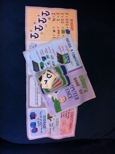
There are directions on how to sew together the Baby's Book of Computer Science on the fabric itself, including diagrams, but I thought I'd put together a post with images showing how I sewed it together. I ended up making a few small changes to my written directions, since I had to write them before getting to actually sew it together and all.
Being an organized sort, I cut out all the pieces and trimmed them down to the marked seam allowance. The gray (or yellow) 1/4" outlines are all supposed to be hidden in the seam.
The first part of the sewing I tackled was to finish all the flaps. I started with the 1/0 flaps for the binary page. Contrary to my printed directions, I decided that they were too small to sew inside out and then flip right side out, so I just folded them together right side out to start with and simply blind-stitched them.
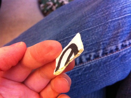
First, I folded in the seam allowance:
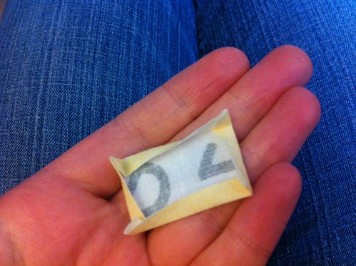
Then folded it in half and started blindstitching from the folded point:
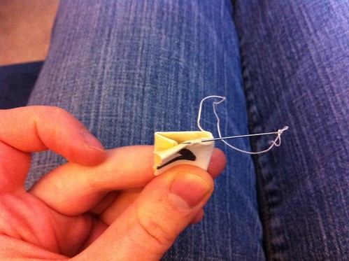
Here's what the finished flap looks like. You don't need to stress about the neatness of the stitching too much since this side gets sewn down to the page.
Once I sewed all four of those flaps that way, I sewed them onto the binary page. Since I wanted them to be equally able to be in the up and down position, I sewed them so they'd default to sticking straight out of the page. Not quite sure if there is a name for the exact stitching I did, but it was pretty much like blindstitching. With each stitch I went all the way through the bottom of the flap and sewed it to the page on alternating sides.
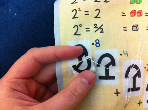
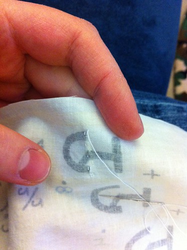
Which looks like this from the back when it's all done:
Next, I worked on the flaps for the page with all the different "Hello World" programs.
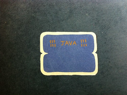
I did try to sew these wrong sides together at first, and then turn them right side out with just an inch or so to go in order to minimize blindstitching, but decided that like the 1/0 flaps these are just too small to make it worth it. So I started out by folding them in half.
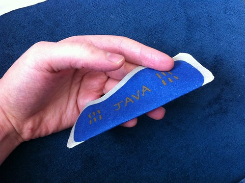
To get the corners to curve nicely, start with just a little reverse tuck.
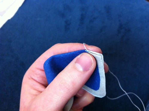
With each stitch, turn it in a little further.
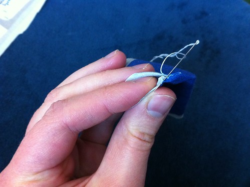
Then just keep turning the seam allowance in and blindstitch all the way around.
Once I sewed all the language flaps together, I sewed them onto the page. Since I wanted these to lie flat by default, I whipstitched them on.
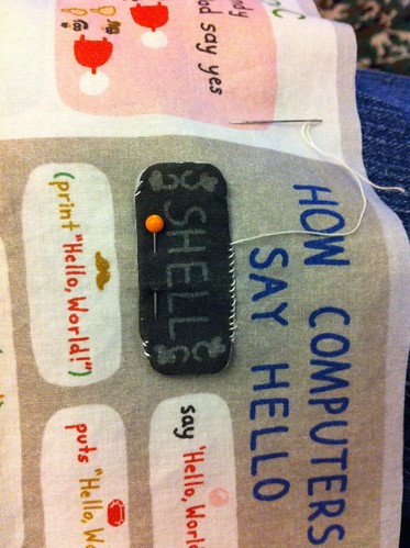
Once all those flaps were in place, I heaved a sigh of relief. Ahhh. If you're following along as you sew one of these yourself, relax! The hardest part is done. Next, I folded the four page segment (that was now thoroughly be-flapped) in half right sides together, and sewed the two middle pages together top and bottom.
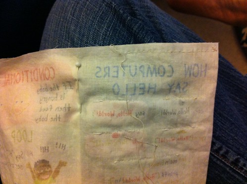
When that was done it looked like this:
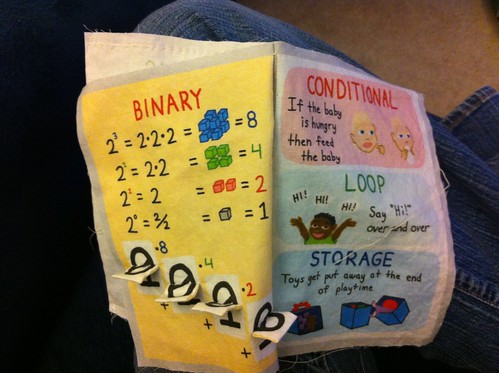
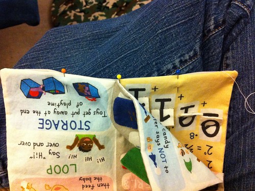
Closing in! Next step was to pin the two-page segment onto the four-page segment, right sides together. I triple-checked that all the pages had "up" in the same direction.
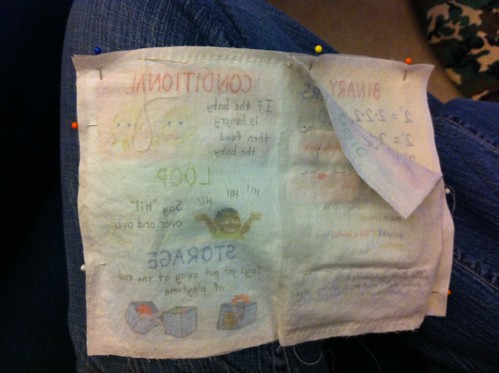
I sewed all around except for a few inches along the bottom, then turned it right side out. I used a skewer to push the corners out to get them as square as possible.
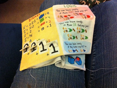
Then it was just a matter of blindstitching together those last few inches.
See this post again for images of the completed book!
I also included a little rectangle on the fabric that can be used to create a little closure for the book (if you add a button, snap, velcro, or the like) but I decided to skip it.
Saturday, December 31, 2011
Friday, December 30, 2011
Visualize Whirled Peas
Previously, sweet potatoes. Now, peas!
These were a big hit right away. Every other food I've introduced to the boy has required a few offerings before he was willing to eat much. With this stuff, he just gobbled it down from the first time. Fine by me! It has a great color and smells great, too.
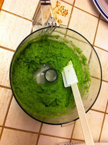
I just boiled a whole bag of frozen peas and creamed them up in the food processor. Like before, I froze individual servings in aluminum foil. This resulted in quite a few servings socked away, so it's a good thing he likes it.
Thursday, December 29, 2011
Lots to catch up on
Whew! Another holiday season survived. This one was particularly special, being my firstborn's first Christmas.
I have lots of stuff to blog about, but the main accomplishment I wanted to mention was that I sewed up two copies of the Baby's Book of Computer Science (fabric page here) in time to give one copy to each set of nephews/nieces! The book was a big hit with both sides of the family, so I'm really glad I was able to finish the sewing in time. I am really proud of this thing.
I'm going to sew another copy for my son now, since being just eight months old he wasn't going to mind if I didn't have it done in time to give it to him strictly on Christmas.
Along with sewing those two books, I also managed to finish the baby blanket I had in progress so that I could give that one, and the other finished one, when we were visiting family for the holidays, even though they weren't actually Christmas presents. The last thing I finished was the pie-of-the-month calendar, which I gave to my mother. In the rush I didn't get a picture of it completed, but all I did was a basic hem around all four edges so it pretty much looks exactly like the picture of the plain fabric.
I'm really pleased with the amount of crafting I've been able to do over the last few months, so here's to keeping it up in 2012!
Thursday, December 15, 2011
Baby's Book of Computer Science
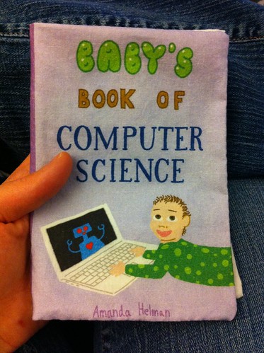
The challenge this week was to create a pattern for a cloth baby book that could fit on a fat quarter. I thought of the old saw, "write what you know," and being a software engineer, decided to try to create a book for babies that goes over some fundamentals of computer science!
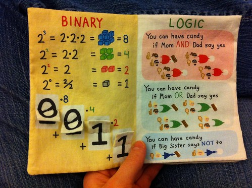
The first page explains binary numbers, first by visually representing the first four powers of two. Then there are flaps that let you construct binary numbers from 0 to 15. The second page demonstrates the three most basic logic operations ("and", "or", and "not"). The inputs are what people say about whether the baby can have candy, and the outputs are whether the baby actually can have candy!
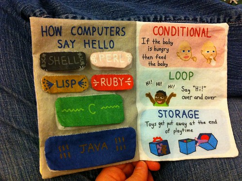
The third page shows the classic "Hello, World" in a number of languages. I had to include Java, since that's the main language I use in my day job. Also mandatory was C, since it's such a fundamental and important language. To round it out I included shell script, Perl, and Ruby. Then I found that I had room for one more program, and decided to include Lisp - since its version was small enough to fit in the remaining space, plus it has a funny name! Each of these "Hello World" programs gets hidden by a little flap with the language name on it. Since the four smallest programs were about the same size, I drew a little symbol above the program to make it easier to match up the flap with the correct program - a pearl and a ruby for Perl and Ruby, obviously, then a nautilus shell for shell scripts. I went a little free-association and used a mustache for Lisp.
The fourth page contains demonstrations of the three characteristics needed to make a language Turing complete - loops, "if" statements, and storage of variables - depicted with situations familiar to babies.
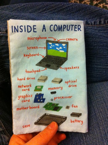
The front cover is a baby using a computer. As anyone who's been around a baby these days knows how interested babies are in computers, smartphones, etc - all the fun stuff adults pay constant attention to. The last thing I finished in this design was actually what was on the screen on the computer on the cover - in the end I decided just to go with a robot. Hard to go wrong with cute robots! Finally, on the back cover I went with the classic "parts of a computer" diagram, a staple of beginner computer science texts. I've always seen that done with a standard desktop computer. However, more & more people are using mostly laptops (or tablets, even) for everyday use, so I went with a laptop. And since I used a macbook on the front, I showed a windows laptop on the back, for maximum cultural diversity. :)
I'm really happy with how this came out! I got a number of enthusiastic comments on this one. I haven't received the printed fabric yet, so I'm waiting with baited breath to get that & be able to sew one of these up for real!
My design came in 21st out of 68, with 210 votes.
Incidentally, see above how I finally figured out how to embed a fabric image that links directly to its page on Spoonflower? I mean, I know I could do that myself manually and all, but I was hoping Spoonflower had a widget that did that for you. As it turns out, they so - but I couldn't find it anywhere. I even emailed tech support and suggested that as a new feature! I must not have described it very well, as the lady who replied just gave me a generic response instead of saying, uh, dude, we have that already... A few days later, lo and behold, I suddenly saw that there was a link below the fabric image on the page that said "Embed" which produced the little embed graphic seen here! As it turns out, that feature had been there all along, but it's only visible on certain pages. It's funny, there are two different ways to get to a fabric page. If you navigate from the main page of your own account, the page URL looks like this: http://www.spoonflower.com/fabric_items/new?design_id=885250, and just below the lower right corner of the fabric image the only action is "Zoom." But if you navigate to the fabric any other way (such as the links on the left hand side from another fabric page) the the URL is just this: http://www.spoonflower.com/fabric/885250, and suddenly you can "Tweet" and "Embed" too! Strange. Well, at least I figured it out eventually, and I'll be able to use that from now on.
Tuesday, December 13, 2011
Homemade baby food
After a month or so of solid food, I've finally managed to make some homemade baby food for my son!
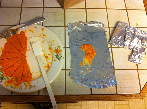
This is simply two sweet potatoes, baked for an hour at 425 degrees, peeled out of the skin, and mashed up thoroughly with a fork. In the picture I'm dividing it up into servings, and wrapping each in foil for freezing.
Previously I'd given him some store bought sweet potato baby food, which he really liked and gobbled up. It took him a few times to come around to this stuff, but today he finally ate nearly his whole serving of it.
The other thing I've made for him is mashed-up banana. That, however, is not nearly so photogenic! I just mash up about a quarter to a third of the banana right before feeding time (and then eat the rest of it myself!). He has taken a long time to warm up to that as well, but when he got some this evening he really scarfed it down.
Thursday, December 8, 2011
Feathers in multiple colors
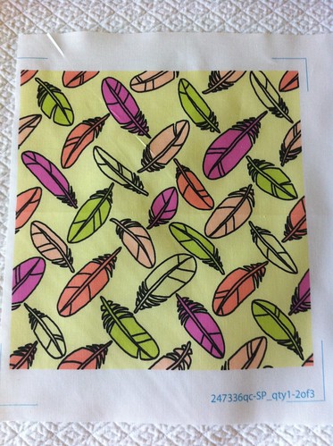
The contest this week: feathers. I decided this time to just go literal and do feathers, simply scattered in a pattern reminiscent of basketweave, but play around with color a bit. My starting point was the website COLOURLovers, which lets people name colors, create color palettes (up to five colors together) and apply them to repeating patterns. They even have an integration with Spoonflower, so you can get designs you create on COLOURLovers printed out by Spoonflower, but I haven't made use of that myself. I have created some palettes & patterns though, and you can see them here. I have used palettes created by others in some of my fabrics before - the cameos and the wrestling mask so far. Anyway, you can also vote for any palettes you like as your favorites, and see which others are favorites. Here are the palettes on the site which have been favorited the most. I found it very interesting how many of those are reminiscent of the infamous teal/orange palette overtaking movies.
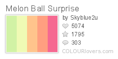
First, I decided to work with this one:
Color by COLOURlovers
When I sketched the flower design initially, I used black outlines and quick ovals of color to decide which feathers would be which colors. I kind of liked the way that looked, so I kept the black outlines in the final design. Once it was done, though, I liked it less - looks a little too 80's. I was tempted to keep tweaking it but in the end just left it as is. I think this color combo might be used better by making the proportions less even - emphasizing some colors and leaving some as just small accents.
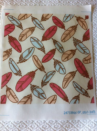
Next, I tried this one:
Color by COLOURlovers
I used the brown for the outlines instead, resulting in this design. I like this better, so this is the one I entered in the contest. I think my design is a bit leaden, though. Not one of my best efforts, since I couldn't think of any twist or inspiration like I usually try to.
There were many, many designs which were a lot like mine - scattered, tossed, and otherwise evenly distributed feathers. It was the first thing that came to mind for me, and evidentally for many others as well! Another big theme was peacock feathers, which I didn't surprise me in the least. My design came in 116 out of 224, with 63 votes.
Wednesday, December 7, 2011
The thrilling story of the Robot baby quilt
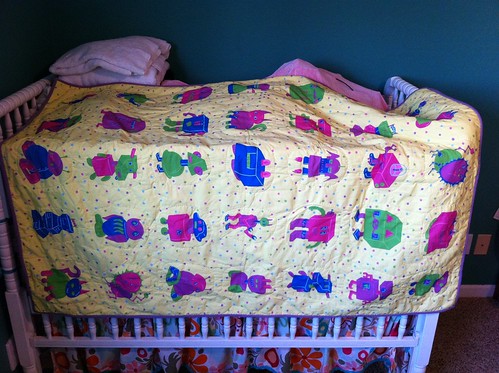
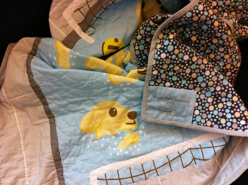
So, I made this quilt for my first nephew. By the time my first niece was around, I had my Spoonflower account and wanted to use that to create the top for a whole-cloth quilt for her. My brother is a giant nerd like I am, and sci-fi figures heavily into our mental space. So, robots!
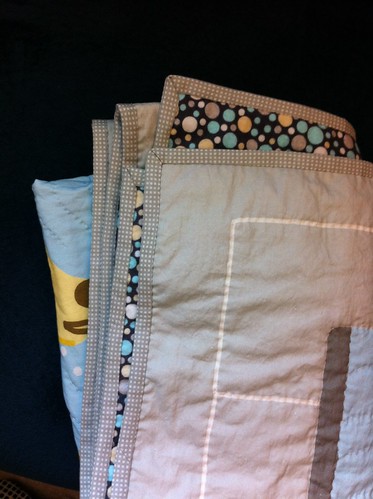
The backing & binding is flannel cut from a bed sheet, like the first one I did.
As you can see, I actually finished & gave this quilt almost three years ago. Amazingly for me, I actually got it done in time for the baby shower, before she was born! But only just barely - and there's a reason why I never got any photos of it until now.
I spent a lot of time getting the design the way I wanted it. I decided doing a grid of five robots by seven robots would produce nicely-sized bots. So I sketched 17 different robots, each of which was colored in twice (one flipped the other direction), plus an 18th robot which was only used once. Can you find the unique robot? Hint - it's a reference to a sci-fi TV show! My brother's favorite show, in fact. Next, I got the robots into the grid - I tried to make sure that duplicate robots didn't end up in the same column or row, and that there were no groupings dominated by a single color. It ended up being like a very colorful form of Sudoku. I suppose it would have been easier if I'd placed the robots first, and then colored, but no matter!
By the time I finished all that, there was no time to wait for a proof from Spoonflower before ordering the final cloth. There are a few tweaks I would have made...but heck, I'm pretty sure if I don't point those things out, nobody else would notice. So I'll say no more.
By the time I had the printed top delivered, and assembled it for quilting, there wasn't much time before the shower. All our family is up in Northern California, so we were going to visit my husband's family for a day or two on the way to the shower. I made sure to make the bias tape for the binding before we left since that's pretty much impossible to make on the road. I was still furiously quilting at the start of the trip. I went with a simple quilting scheme - an oval around each robot. I finished that up at my mother-in-law's house and started on the binding. The day of the baby shower, we left her house to drive to the town where the shower was (two hours away) and I kept sewing the binding in the car. I think I had two sides left where the binding needed to be sewn to the back when we arrived at my mother's house, just an hour or two before we needed to go to my brother's house for the shower!
Next, it got really hilarious. My brother, completely unaware of my frantic efforts to finish sewing, kept calling and asking me to prep things for the shower! I can't remember all of it, but at least one request was to look through our parents' stuff to find some obscure AV cable for the music setup he wanted to use for the shower. I delegated to mom instead, ha ha.
I still had a few inches to sew when we had to leave to make it to my brother's house on time - about 10 minutes away. I grabbed a gift bag, so I could just shove the blanket in and not have to wrap it, and kept sewing in the car. I finished just as we pulled in to their street and shoved it in the bag. That is cutting it close!
It was a hit. I had kept the whole thing a surprise from my brother and sister-in-law, so they were delighted to realize that I had not only sewn the quilt, but drawn the design as well. My brother recognized my drawing style. They later told me that it made a fun playmat as well - my niece would sit on it and poke at the robots.
Since the party was so hectic, and I only had the finished quilt in my possession for about five seconds, I didn't have a chance to get a picture of it. I never managed to remember to get a picture at visits after that either. However, this year at Thanksgiving I finally was able to make some time and grabbed a few quick snaps.
Hopefully I'll have a few more finished quilts to post here soon!
Monday, December 5, 2011
My first Spoonflower sale!
Someone bought my Hanukkah calendar! Pretty exciting. She even messaged me asking if I could make it available for sale a few days before I could. (Spoonflower doesn't let you make a design available for sale unless you purchase at least a swatch of it first to proof it) So as soon as I got the proof of it, I flagged it for sale and viola, she bought it the next day! I got a blistering $1.10 (10%) commission out of it. Woohoo!
I do crafts almost entirely to make gifts for people, which as far as I know are mostly well received. But it's a different kind of feeling to have someone (a stranger!) actually want to buy something of mine on purpose, of their own volition.
Actually, I have made one other "sale" on Spoonflower - when someone bought a swatch of my Christmas ornament pattern. Just a week or two after that happened, they finally changed the policy so that you get the 10% commission for swatches too. Of course!
Friday, December 2, 2011
Kites with kites
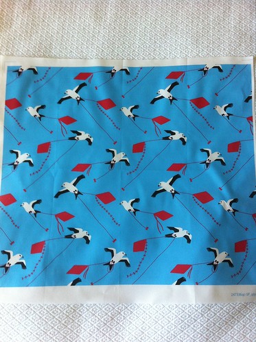
This week's contest theme was kites, with the extra stipulation that it be a small print. Usually they have the contest voting on samples showing a fat quarter of the print, but for the small print contests it's just a eight-by-eight swatch. I struggled awhile to come up with an idea that wasn't simply literally kites, until I remembered that "kite" can also mean a kind of bird! Things really came together when I Googled kites and found the swallow-tailed kite, which has a wonderful silhouette and bold black & white coloring. I decided that the black & white birds against a blue sky with red kites would make a nice combo. I had fun working with such a small palette - no shading or anything like I've done in most of my recent designs.
My design came in 52 out of 153, with 100 votes. There was one other design that had kites (the birds), but not also with kites (the toys!), which I did end up coming out ahead of in the votes.
Thursday, December 1, 2011
Advent style calendar
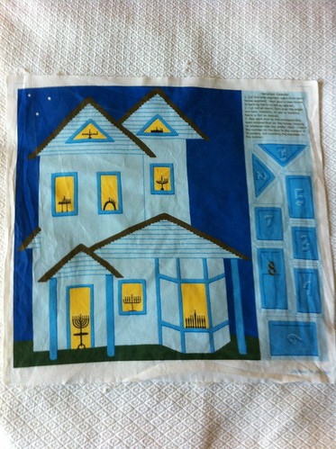
Well, I messed up last week's contest. Plus, the contest ended on Thanksgiving, so I couldn't write about it until now. The goal was design an advent calendar - it didn't necessarily have to count down 25 days until Christmas, but the idea was some kind of counting calendar with things hidden in pockets or behind doors. I originally wanted to do a full advent calendar like the ones my mom made when I was a kid. She made two, which were these wonderful Victorian-style houses made of paper, with pictures behind the doors and windows. Since we celebrated both Hanukkah and Christmas, she would always put pictures for the days of Hanukkah that fell in December. For instance, in one calendar it was simply menorahs with the right number of candles lit, and in the other the pictures told the story of Hanukkah, with little stick figure Maccabees liberating the temple and finding the miraculous oil that lasted eight days. She also put in a picture for the Winter Solstice, which falls on the 21st or 22nd. Since those days change every year, she had to move around all the pictures. The remainder were filled in with more traditional holiday stuff. The first calendar had drawings of different ornaments on each day, with the 25th showing a tree with all of them hung up. The second one showed a snowman with more and more features each day. She said that a hard lesson she learned after making the first calendar was that having all the windows & doors at different sizes each year made it really hard to switch it around! She sometimes had to redraw the pictures if they ended up in a really different window. But then, some years later when she made the second one, she forgot about that in the rush of inspiration - and made all the windows & doors different sizes again. Oops!
So anyway, I do eventually want to make something like that of my own, with pictures for Christmas, Hanukkah, and the Solstice that move around every year, but since I had been spending my limited crafting time finishing this quilt, I had only a few days to work on the advent calendar for the contest, so I quickly decided to be less ambitious. I still stuck with the Victorian-style house though. I realized I could do just Hannukah, and have only eight openings to deal with! So I drew the house, with a menorah in each window, and then coverings for each window & door. It was fun to come up with eight different menorah designs! As I was making it, I was thinking to myself, wow, it's pretty cramped to fit this on a fat quarter with only eight! The openings/pockets for a regular 25-day calendar must have to be pretty tiny! Ah, foreshadowing.
Anyway, I finally managed to wrap it up in the early evening the last day for contest entries. I would have loved to have gotten more detail on the house, but I'm still happy with how it came out. I uploaded the design to Spoonflower, and entered it into the contest. However, I noticed that on the page where they show you how it will look when people are voting, it looked strange - instead of filling the whole rectangle, my design floated in the middle with a huge blank margin all around. So I took a look at the contest page again....and oops, it turns out the idea was to create the calendar on a WHOLE YARD, not a fat quarter! Eeeeeuuurghhhhhhhhh.
I wrestled briefly with the idea of trying to hurriedly adapt it to fit on a yard. Perhaps I could make a version where you could buy either a fat quarter and get just what I'd done so far, or buy a whole yard and get extra decorative bits, like backing, strips to hang it with, etc. Then I decided to just go with what I had. I'm just doing this for fun, after all, no need to stress! I still left it as a contest entry - no reason not to.
After all that, my design came in 28th out of 41, with 111 votes. I'm sure I would have done better if I had done it correctly and filled up a whole yard, but I was the only one to do a Hanukkah calendar, so at least I stood out in a good way in that aspect!
Friday, November 18, 2011
Tea towel calendar
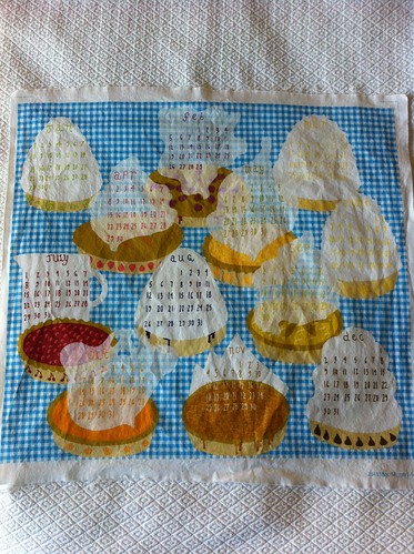
So "tea towels" are thin, mostly decorative cloths that are meant mostly to be hung up in kitchens, as I understand it. Around this time each year, Spoonflower has one of its contests to design a tea towel (to fit on a fat quarter) that has a whole year's calendar on it. I tried to think of what would be an interesting representation of each month of the year. Then I remembered...PIES. My mom makes the most wonderful pies. She always makes a cherry pie, a lemon meringue pie, and a chocolate (custard) pie every year at Christmas, and another cherry pie for my dad's birthday. One time, my dad was suggesting other pies that would go with other special occasions, and then had a sudden flash of inspiration - "What about a pie every month?" Being a kid, I took this joke and treated it as a serious suggestion to be enthusiastically endorsed. Mom, of course, quickly and laughingly shut us down. But the dream remained - the pie of the month club!
I decided to make my calendar design of twelve delicious pies laid out on a table. It was surprisingly hard to come up with twelve distinct pies! Then I had to come up with ways to create lighter backgrounds to put the actual calendar numbers over. Most pies I just heaped up with whipped cream or meringue, or topped with a cloud of steam as if they were fresh from the oven.
Anyway, the pie flavors are:
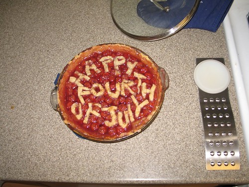
By the way, the only pie I've made myself is cherry:
Now that I know how much work it is, I can understand not wanting to make a different one every month!
I decided to make my calendar design of twelve delicious pies laid out on a table. It was surprisingly hard to come up with twelve distinct pies! Then I had to come up with ways to create lighter backgrounds to put the actual calendar numbers over. Most pies I just heaped up with whipped cream or meringue, or topped with a cloud of steam as if they were fresh from the oven.
Anyway, the pie flavors are:
- January: Key Lime
- February: Boysenberry
- March: Banana Cream
- April: Strawberry Rhubarb
- May: Peach
- June: Lemon Meringue
- July: Cherry
- August: Blueberry Cream
- September: Apple
- October: Pumpkin
- November: Pecan
- December: Chocolate
By the way, the only pie I've made myself is cherry:
Now that I know how much work it is, I can understand not wanting to make a different one every month!
Wednesday, November 16, 2011
Finished!
I finished the quilt for Cord! Even though I still have three more baby blankets to make, I feel like I'm back on track since the rest are for babies still well under a year old.
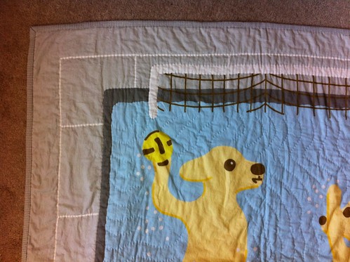
I was debating how much of the outlines around the pool to quilt, and eventually decided I would be happiest if I did all of it. That includes the edge of the water and the pool, the grout lines, and the outline of the main frames of the goals.
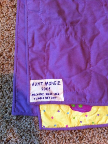
I printed out a tag for the back (including care instructions!) via Spoonflower as well. You can see the backing fabric through it, but I kind of like the effect. The backing fabric is a flannel that I bought from Fabric.com via Amazon. The batting is Quilter's Dream Cotton, in the "request" loft, which is the thinnest.
For previous quilts, I've made the bias tape for the binding myself, but that's something that takes me awhile. I haven't ever had a space where it's easy to lay out those large squares and draw lines on them, plus I just can't seem to get it lined up correctly when sewing the initial cylinder. So in order to help things along, I shopped around for some bias tape on Etsy. I was hoping to find a grey tape with white polka dots, so I was really happy to find this! The seller (Beewise Goods) only had her tapes listed in packages of two yards each, but I needed about five to bind this quilt. So I messaged her, and happily she was able to sell me a package of six continuous yards! The only way it could have been more perfect is if it was double-fold, but it looks great, and most importantly, I was able to finish it!
In the end, it took me just over a month from when I got all of the main components to finishing this up! I'm definitely a faster sewer than I used to be.
Friday, November 11, 2011
Military Fabric Design for Veteran's Day
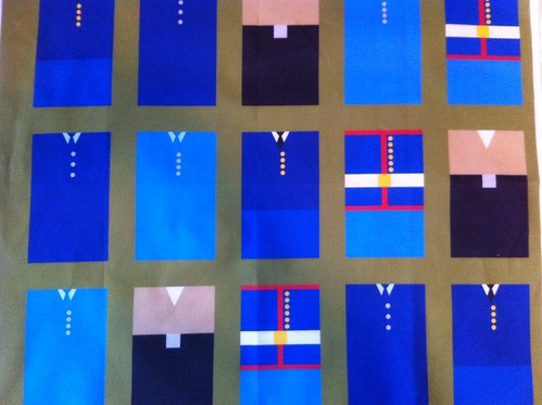
This week's contest was for a military-inspired fabric, since today is Veteran's Day. My idea was to create stylized versions of uniforms - one for each of the five service branches. I made them geometric, almost as if they were pieced quilt patches. I learned that the uniforms of the US military are not really all that "uniform!" There are many different variations and options, especially when you take into account enlisted vs. officer. The Navy was the most challenging, as it seems they're in the middle of a uniform redesign, so it was hard to choose which one would be most recognizable. I also learned there are quite a few different shades of blue across all the uniforms! I tried to make them look more-or-less correct in relation to each other. This was a little extra challenging since they all tend to look lighter on screen than they print.
My design did pretty well - I came in 18th out of 83 with 216 votes!
The uniforms are as follows:
My design did pretty well - I came in 18th out of 83 with 216 votes!
The uniforms are as follows:
- Navy: khaki shirt, black pants, black belt with silver buckle
- Coast Guard: Medium blue jacket, pants, & tie, light blue shirt, four silver buttons
- Air Force: Dark blue jacket, pants, & tie, light blue shirt, three silver buttons
- Army: Dark blue jacket, lighter pants, black tie, four gold buttons
- Marines: Blue jacket with signature red piping and six gold buttons, lighter blue pants, white belt with gold buckle
Thursday, November 3, 2011
Cameo fabric contest
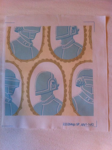
This week's Spoonflower contest was for fabric inspired by cameos. I thought, what would be the least likely subject to portray in a sweet little cameo? Being a huge fan, I had to go with Daft Punk. This is the result! I based the colors on this palette:
Color by COLOURlovers
I wasn't the only one who added a touch of Sci Fi - I was pleased to see a Dr Who entry as well. Oddly, there were a large number of entries with cameos of dogs.
I came in 50 out of 167 with 120 votes. I got a couple nice comments on the fabric page too, so at least a few people liked my take on the idea. This was my best placement in a contest by far, relative to the number of entries!
Friday, October 28, 2011
Scrum Artwork
Yesterday was my first day back at work after six months of maternity leave. In honor of that, I thought I'd post some artwork I created for work awhile back. But, it needs a little bit of an introduction.
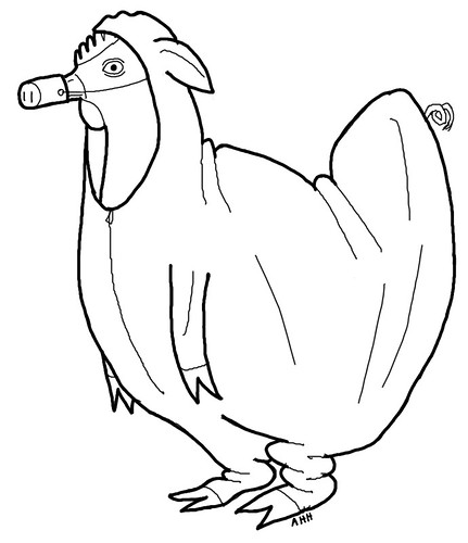
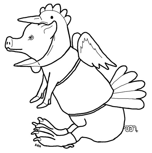
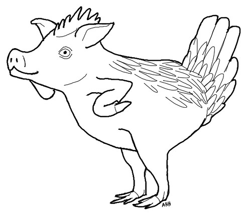
I work as a software engineer, and at the time I created these my department was deep into converting to a "Scrum" style of development. I'm not going to get into all of what that means (google it!) but one of the main tenets of scrum is that the people involved in an effort can be divided into "pigs" and "chickens." Consider this story: a pig and a chicken are starting a breakfast restaurant. The chicken provides the eggs, and the pig provides the bacon. This causes the pig to remark to the chicken, "you're involved in this restaurant, but I'm committed!" Back to the world of software, the idea is that if you are not actually committed to a project, i.e. are merely a chicken, then you should, for the most part, be seen and not heard, particularly at daily status meetings. The analogy allows for a lighthearted way of enforcing the rule - you can remind people butting in unasked for that they are chickens, cluck at them, etc. I halted a rather senior person in full "take charge" swing by exclaiming "aren't you a chicken?!?" and wow, it was quite satisfying.
I forget the exact circumstances, but the project managers at work asked people to create drawings of pigs pretending to be chickens and vice-versa, to serve as metaphors of what not to do. I don't think anyone but me ended up creating any, though. In any case, eventually these got put on the cover of an internal Scrum guide the project managers printed up and put in all of the conference rooms. So I'm a famous artist, at least in my own department!
First off, the chicken pretending to be a pig. This is the most problematic from a Scrum perspective, because it means someone is butting in and trying to control things where they really don't have anything to contribute. To me the best part is the limp little pig front legs flapping empty in front of the chicken.
The pig pretending to be a chicken doesn't actually make as much sense from a scrum perspective (someone trying to slough off responsibility?), but I had to draw it anyway for symmetry.
Most horrifying of all, the mutant pig/chicken combination. Piggen? Chig? Whatever you call it, it looks like it would be pretty tasty! From the scrum point of view, this would be someone with an unclear role, not fully committed yet still necessary for a project.
Thursday, October 27, 2011
Results of ornament contest
This week's Spoonflower design contest was for a Christmas ornament. I've already shown the design I made in a previous post where I showed how I sewed it together. I actually made this design before the previous week's lucha libre mask, and in fact this was the first design I ever made specifically for one of these contests. It came in 69 out of 124 with 112 votes. There were a lot of really cute designs so I'm pretty pleased.
One interesting trend I noticed among the designs was the idea of having more ornaments if you bought more fabric. The design for the contest had to fit on the 8" by 8" swatch size, normally just used for samples. But some designers actually made a design that filled a fat quarter, so that the swatch got you one ornament design, but there was a whole set of designs in the fat quarter. I realized that this was a good commercial strategy, because although designers get a 10% commission if anyone buys your designs, this doesn't apply to swatches. (They even acknowledge this in the blog post.) Very smart if you really want to make money!
And speaking of that, I saw today that one person has bought my Christmas ornament swatch! That's pretty exciting! It's the first time anyone has bought any of my designs (except for myself, of course).
Tuesday, October 25, 2011
Spoonflower colors
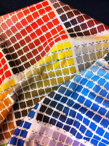
One of the most fraught parts of creating fabric designs for Spoonflower is dealing with color. Of course printed colors never look quite the same as they do on computer screens, but additionally their printer doesn't support the entire RGB spectrum, so "out of gamut" colors will get shifted and can sometimes look quite different. For instance, once a color that appeared light purple on the screen printed nearly magenta. So for designs that are really important to me, i.e. the ones I'm creating for baby quilts, etc, rather than just for the contests, I prefer to proof the colors.
At first, I didn't have a printed copy of the Spoonflower color map, so I just worked with the colors on the computer and hoped for the best. But now that I have the map, I can at least avoid major mishaps. First, I decide on the appearance of the colors I want (sometimes using a formal palette, as I did for the wrestling mask), then examine the map and find the printed colors that, in my opinion, best resemble what I'm shooting for. The swatches are tiny, but I can still fold it up to see how colors look next to each other. This is especially important when using several shades of the same hue, because frequently one shade in the sequence will get shifted a bit and throw the whole combination off.
Up to this point I've always done this before I have the final design finished (or even started, mostly), so in order to get a preview I create a separate "swatch" image using the colors I want.
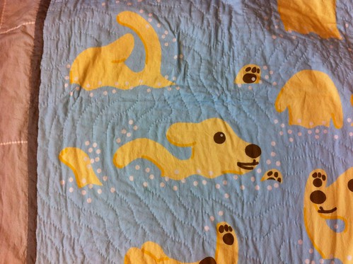
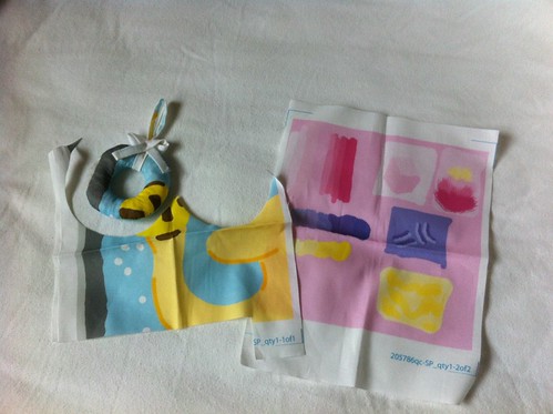
I actually created the first color swatch for the waterpolo puppies some time back (er, when Cord was still a little baby and not a toddler as he is now!), before I had the map printed out. So I printed out a few different combinations of yellows, browns, & blues, to see what would look best. I'm not sure where it is now, but I did use it to chose the colors. When I finished the design, I had added some additional colors (the yellow & maroon in the balls) so I wanted to check the colors one last time before printing out the whole top. So I just printed out a little square of what ended up being the final design, and that's pictured here. However, in addition, I ended up using that color swatch as scrap fabric to create a mockup of the Christmas ornament! I started too late before the contest deadline to print out the final fabric and make sure the pattern was doable, so I created this mockup, which also helped immensely in writing the directions on the pattern itself.
Back to the swatches - for Maren's design, I made the small mistake of adding several colors in a gradient without checking the map. If you look at the purples you might be able to tell that they don't exactly go in a smooth sequence. However, I didn't end up using them all in a row on any design, so I think all the individual designs that use the purples turned out fine.
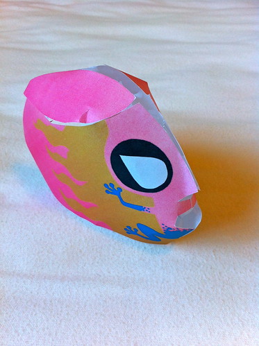
One side effect of this process is that I end up with the opposite problem of the fabric not looking like I want - the design on the screen is actually misleading! In particular, I've found that many blues and reds look much lighter and brighter than how they will print out. The most chilling incident so far was again with the wrestling mask. When printed on fabric, it looks like the red I want. However, on the screen, it looks unfortunately pinkish. Since I created that one with an even shorter time before the deadline than the ornament, I didn't even have time to create a fabric mockup. So I shrank it and printed it out on paper:
As it turns out, our laser printer is running out of red toner, so the red looked even pinker on paper! When my husband saw this model, he looked at it with great suspicion and said, incredulously, "is that...PINK?" However, considering that the top five winning designs included butterflies, flowers, and lace, perhaps I shouldn't have been worried about some feminine subversion!
Monday, October 24, 2011
Continuing quilting
So, I've decided how I'm going to do the rest of the quilting for Maren's quilt. She's a Gemini, so I'm going to quilt a large Gemini symbol on either side of each of the five flags. Here's the first one:
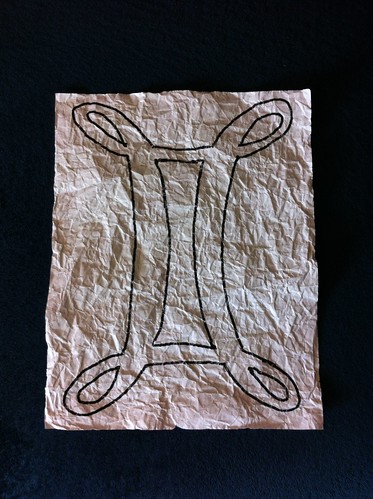
I don't believe in any of that astrology malarkey, but it's a rich vein of symbolism and personalization! I found this script-like version of the symbol, which has a pleasing appearance. So I blew it up to ten inches tall (the same size as the flags) and printed it out. To make it more pliable and fabric-like, I thoroughly crumpled up the paper. I learned that trick in art class in elementary school!
To use it for quilting, I just pin it in place.
With a design this curvy and continuous, there's really no way to avoid having to turn the quilt every which way to maintain the right-to-left sewing direction. But in order to minimize stopping & starting threads, I have a strategy to sew each symbol using just one length.
I start a long thread at one corner, with half on each side of the starting point (that's the stage the photo above is at). With the first half, I sew around one "edge" of the design - going around the outside of the outer loops, and the inside of the rectangular section. For the parts in the interior of the design, I skip under the quilt top.
With the second half, I do the other "edge" - the insides of the outer loops, and the outsides of the rectangular section. Notice I haven't cut out the holes for the insides of the outer loops. I just eyeball those when I sew them, since they're pretty small and easy to line up once the first half is already quilted.
The hardest part of this process is getting the template pinned to the right place, so that it's lined up vertically with the flag and horizontally with the existing quilted symbols.
Subscribe to:
Posts (Atom)