Saturday, December 21, 2013

Winter themes

The latest two contests I have to write about were to be inspired by "ugly Christmas sweaters" and skiing, respectively. For the ugly sweaters, I was inspired by one of my favorite Christmas movies, "Nightmare Before Christmas," and drew sweaters to fit the silhouettes of most of the main characters. I figured that most people would use a traditional red/green/white color scheme so I tried to differentiate myself by using colors from the movie poster - cream and navy. This was also partly pragmatic, as I knew I'd never be able to finish on time if I tried to draw fully-colored sweaters for each person.

And in my bones I feel the warmth that

The representations are:

  • Jack Skellington: allover bows = maximum festivity
  • Sally: cat with hat, since she seems like a cat person
  • Mayor: candy canes to help him stay on the cheerful side of his face
  • Oogie Boogie: ornaments (showy and shiny, like his lair)
  • Dr Finklestein: reindeer, of course - these are more than skeletons though
  • Lock (devil kid): snowflake (a cold day in hell!)
  • Shock (witch kid): shiny hard candy (sugar and spice and nothing nice)
  • Barrel (skeleton kid): penguin (black and white...?)
  • Wolfman: a big Ho Ho Ho (awoooo!)
  • Behemoth: a tree, in honor of the axe embedded in his head
  • Vampire: a tall glass of milk, to have something more seasonally appropriate to drink

This did pretty well in the contest - 111 votes, and 41st place out of 110. My two favorite entries were the hearts and unicorns, and the take on the nutcracker.

For the skiing contest, we were supposed to do it in a "retro" style, and use these colors:   Spoonflower_Skier
Color by COLOURlovers

Plus white. I knew most people would do designs using white or the light blue as a background, so I stayed away from that. I decided to go as retro as possible and was inspired by some of the earliest rock carvings depicting skiiers, like this guy.

Rock carvings of skiers

The background pattern is based on the sashiko-style design I used in the star designs, and the red-and-yellow in the foreground is my good 'ol eucalyptus. This came in 89 out of 120 with 46 votes. My favorites were the mountains and cocktail ingredients.

Saturday, December 7, 2013

Mid-Holiday catchup

Here's what I've been up to for Spoonflower designs!

I made a bonsai-inspired entry for the "fall leaves" contest. I'm pretty happy with how it came out, but it did not resonate with the community and got only five votes (and came in second from last). That stung a bit!

Bonsai Maples in Autumn

I think that perhaps the trees are too close together and so just get read as blobs. Maybe a less dense arrangement, and in a one-way-up orientation, would work better for this. My favorite entry was this exuberant nature assortment, followed by the tessellated oak leaves.

I used a couple of patterns I had on hand - the background is from the isometric graph paper and the leaves use the lattice pattern I've used in a few places before. And speaking of that graph paper set, somebody bought the scantron design on a roll of giftwrap! I bet that's for a present for a teacher. (Someone else also got the snow angel kids as giftwrap - I bet those will be some cute presents.)

And speaking of giftwrap, the next contest was to make a small-scale print, with a mitten theme, to be used as giftwrap. I thought of the way my son adds extra consonants to words - pitcher is "pist-stir," button is "bun-ton" - and mitten became "mint-en." So I drew mint leaves in the shapes of mittens.

mint-ens

I used these colors:
wintergreen
Color by COLOURlovers

I'm very satisfied with how this came out. I ordered a roll of it on giftwrap to use for the presents I'm giving this year! It got 31 votes and came in the bottom quarter of the contest. My favorite entries, any of which I would happily use as giftwrap, were these: one, two, three, four.

And most recently, the contest was for a design that fit on a yard of fabric that you could hang up as a festive decoration (in lieu of an actual Christmas tree, perhaps). My husband suggested a tree grown into the shape of a menorah, with Christmas-tree-type lights as the candle flames. I didn't have time to do a fully rendered take on that idea, but I at least suggested it in a minimal way.

Golden Vine Menorah Hanging

The idea here is that you hang up the bottom portion, and cut out the individual lights and put them up in the usual Hanukkah way. The background dots are the same as I used for (again) the graph paper and the firefly molecules. The branch/vine texture in the menorah is based on the howling spirits/haunted ghosts pattern, just with all the features filled in and the bodies joined together.  It came in the bottom third, with 51 votes. So the design I threw together in about two hours at the last minute, got more votes than the previous two - which I had put quite a bit of work into - combined! Isn't that the way.

The best straight-up traditional all-out Christmas tree entry was this Victorian one. I also really liked this stylized geometric one. The ones I liked that had more of a twist were the pressed flowers, New Zealand Christmas, Japanese crest, and Indian block print. And the best one that had an interactive element like mine was this "Twelve Days of Christmas" tree.

Thursday, November 14, 2013

Profiles in noir

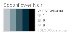
This week's theme was a little darker than normal - "film noir." Plus we had to use these colors (plus white):

Spoonflower_Noir
Color by COLOURlovers

I haven't seen much film noir - in fact, my main exposure to the genre has really been through the Guy Noir spoofs on Prairie Home Companion. So I started as I so often do by reading the Wikipedia entry on film noir, and was intrigued to be reminded that Blade Runner is considered to be in the genre.

From there, I was inspired by the Voigt-Kampff test questions. I was going to have a sequence of heads in silhouette, with an image or icon related to the questions inside each head. It started looking sillier than I wanted though, so I went with just the heads.

Who is hiding the secret?

This came in 73 out of 213, with 74 votes. To me, the entry that best literally represented film noir was this one (which indeed won). And the one that best conveyed a more general vibe of menace was this dahlia/razor combination. My favorite entry that had the flavor but could still be used for something more light-hearted was this assortment of keys. And the best pun was the hard-boiled eggs.

Friday, November 8, 2013

The annual tea towel contest

It's that time of year again - when Spoonflower does a design contest for a tea towel with the upcoming year's calendar. I updated my 2012 pie calendar for 2014, but didn't bother for my lackluster produce entry for 2013, though I do intend to rework that at some point.

This year I debated a couple more elaborate ideas, but finally decided to do something fairly straightforward - stylized moons, with the full moons marked. The background image is a smaller version of my constellations design, and the calendar text itself is simply copied from the pie calendar.

Also, people who buy these and actually intend to use them as tea towels prefer to get them on the cotton-linen canvas, which is wider than the basic cotton by a full foot. Usually the contests are always for the regular fat quarter size (18" by 21") but this year they set it to the cotton-lined size (18" by 27") so that we could make designs that took up the full space (without having them cut off from the contest view). Some of us still opted to make the main design fit in the conventional fat quarter area so that someone could still buy just that. I turned my extra six inches into bookmarks!

2014 Full Moon Tea Towel Calendar - with bonus bookmarks

This came in 178 out of 195 with only 20 votes, though I did get one message from somebody saying they want to buy it. Tons of great entries this time! I would have an enormous stack of towels if I bought all the ones I love. I wasn't the only person to focus on the cycles of the moon. There are always a few that emphasize the changing seasons. For less common motifs, I liked the LA cityscape and the string instruments. For cutesy, I loved the kawaii icons, the fairytale mushroom cottage, and the graphic sea creatures. Some animal-themed entries at the top of my list were the songbirds and the cats. And for plant-based designs, I liked the preserved apples and the colorful modern floral, and my favorite overall was composed of pressed flowers.

Thursday, October 31, 2013

All Hallow's Eve

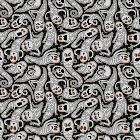
This week's theme, in honor of Halloween, was Ghosts. I decided right away that I would use the "wailing souls" pattern I made for the Cthulhu pillow as the base of the design. And to freshen it up for this contest, I reworked it with more detail, using the "haunted" colors from the Synergy group.

Haunts, Ghasts, and Poltergeists

It was fun drawing little skeletons into the wiggly shapes I had already made. I'm pretty pleased with how it came out. It came in 66 out of 276, with 103 votes. My favorite was this paisley interpretation. I also really liked the bats and these toothy ghosts swooping among trees.

Thursday, October 24, 2013

What is your quest? To find candy!

This week's contest, ahead of Halloween, was to create a kit for a costume that fits on a yard of fabric. It took me a long time to come up with a compelling idea - what possible costume could I come up with that isn't already available commercially? And if someone is crafty enough to want to sew together a costume, why would they buy one of these on Spoonflower, why wouldn't they just sew one from a pattern?

Having a toddler, I definitely wanted to make a toddler-sized costume. I ran through some of the classic costume ideas of yore - vampire, ghost, cowboy, knight. That last one led me to the idea of heraldry on a shield, and that occurred to me as a fun way of personalization. I could provide the pieces for a plain shield and tabard, and a bunch of different symbols to cut out and put on the shield.

Knight tabard and shield for toddler boy/girl, customizable heraldry, no sewing!

There are a couple of other interesting touches I hoped would add appeal. The tabard is mainly yellow, to be as high visibility as possible. Also, I included pieces to make a neck facing for the tabard, but you can actually make the whole thing without any sewing at all - just cut everything out with pinking shears! And finally, I put all the symbols in the lower left, so if anyone just wants to play with those and not the whole costume, they can get them on a fat quarter (or most of them on the 15" square decal). So I'm quite pleased with how it all came together.

This came in 23 out of 47, with 200 votes - a moderate placement, but within the top ten of most votes of any of my entries. My favorite other costumes were the raven hood and matryoshka doll. I also really liked the feather cape/mask that won.

Saturday, October 19, 2013

Project Runway Season 12 Finale Part 2

Now that they've finally pared the field down to four designers, it's time for them to wrap up the final challenge and get to the runway show. (Though in the recap of last week's elimination I noticed a detail I missed before - Justin had 3D printed himself the bowtie he wore on the runway! Awesome!) There's one more trip to Mood to buy easy-care fabrics for the Tide "washable garment" challenge. They will have to swap out one of their ten planned looks to include it.

Dom makes an interesting observation - since she and Bradon didn't have to present three looks to the judges, they haven't gotten any feedback on what they have. Justin and Alexandria, however, can choose to address any criticism. As everyone soldiers on finishing up their collections, we get the first of two L'Oreal product placement segments, as they get the hair consultation. Justin, having gotten negative feedback on the giant mushroom hairdos, comes up with a less crazy iteration of the idea.

And just to continue my apparently all-Justin post, he helps Dom get her heavy unconventional materials dress up on a form. She calls the dress "a nightmare," to which Justin replies "a beautiful nightmare!" "What are you Beyonce?" "Yes!"

Tim comes by to check in on their collections. The editors didn't include any advice, if any, he gave to Bradon, but he has lots of little nitpicks for Dom. He also advises Justin on the length of a dress, and informs Alexandria that Nina thought her t-shirts were "dumb," and that if she doesn't at least appear to have listened to that feedback, the judges will find a way to retaliate. Real talk!

The next day, the last one in the workroom, we get the second product placement segment, since it's time for the makeup consultation. Bradon is running back and forth and back and forth, fraying first Alexandria's nerves and finally everyone's. As the day drags on everyone picks up the pace, and Dom loses her bag of zippers and has to beg one off Alexandria.

The day of the show, the designers make the traditional pre-dawn trip over to the tent to see everything before anyone else arrives. After a few star-eyed moments of contemplation, they all fall to work and start getting their models dressed. Justin takes an early lead in last-minute drama, when one of his models turns out to have broken an ankle, and he has to fit her look on an alternate with a different body type. Then Alexandria surges ahead by harassing the hair and makeup folks with constant tweaks and "being neurotic about every detail," as Dom puts it. Then, in a perfect "Checkov's gun" moment from the editors, Bradon warns all his models and everyone else around to please move their "tea and muffins" away from his garments, less any stains result. So I'm sure no viewer was surprised when, thirty seconds later, he was sponging coffee off of charmeuse. Agh!

And then, finally, we get to the runway. Justin's collection is very much the black, white, and gray tailored style we saw in his three-look preview. His washable look is a pants and vest outfit that strikes me as looking like a civilian outfit from Star Trek: The Next Generation (in a good way).  Dom's collection has a ton of prints, of course, with lots of purple. It looked like the judges were laughing at the visible rear end of her model in her metal finale dress, but in the judging later we hear only praise, so it must have been more joyful and less derisive than it appeared to me.

Alexandria starts her collection off with her unconventional look, the phone book dress that her sewing camp kids helped make. The rest are her variety of neutral separates. Bradon's, on the other hand, is very floral and shiny and full of occasion dressing.

The judges have plenty of praise for Justin - it has ease but still femininity, the 3D-printed accessories are cool and give it cohesion - but Nina thinks there is not enough wow. Bradon's has plenty of wow, but is too disjointed. They like Dom's, except that Zac isn't fond of the swimsuit she sent out. They like that Alexandria started out with the shock of the paper dress, and think the styling is good.

Next, they ask each designer why they should win. Justin, continuing his run as the star of the episode, notes that since he hasn't won a challenge yet, this would be the one to win! Dom feels in her soul that this is her time, Bradon knows this is his new direction after retiring from dancing, and Alexandria has sacrificed so much and worked so hard that she's sure it's her turn.

The judges first eliminate Bradon, then Justin. Then, alas for hardworking Alexandria, Dom is named the winner (as widely predicted). I definitely agree with that decision - her clothes had the best combination of unique point of view plus immediate visible appeal.

Next week - we get the reunion special, back right up to the premiere of the next season of All Stars!

Thursday, October 17, 2013

Today is a good day to pie

I didn't post about last week's contest, as I didn't have an entry - alas, it was only open to thirteen- to nineteen-year-olds. This week, the theme was pie. Pie is such a staple of the kitchen-crafts design world that, despite having a deep personal appreciation for pie, I struggled to come up with any possible fresh take on the subject. I was sure (and was proved right) that there would be plenty of lovely representations of assortments of pies. I went down the path of deconstruction, and thought about doing something with a recipe, or just the ingredients. A step further down that path, and I went with the plants that the ingredients are harvested from. And as far as picking which flavor of pie, since there's a synergy theme of "apple," that was easy enough.

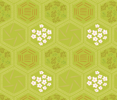
So the design contains the flowers of apples, sugarcane, nutmeg, and cinnamon, plus sheaves of wheat. Also, the outlines of the hexagons are done in a wavy shape that's supposed to resemble mammary cells, to represent milk.

I aspire to pie-ness (blossoms of apple, sugar, cinnamon, nutmeg, and wheat)

This came in 109 out of 236, with 47 votes. Along with the designs I linked above, I also liked the simple blueberry pie lattice, stargazy, and fruit tarts. For the obvious puns, there were some "pi" entries, but none I liked all that much - though there are some in the synergy group, like this; and of course pie charts.

Saturday, October 12, 2013

Project Runway Season 12 Finale Part 1

In preparation for the final show, the final five designers are dispatched home and given six weeks to create ten looks for a Spring runway. One of the ten looks must use "unconventional materials," which seems to have been the theme of the season. Dom and Bradon will definitely get to show what they make, but Alexandria, Helen, and Justin are still on probation - though the judges have been deliberately vague about whether two or only one of them will get to be in the finals.

In any case, we get to have the "Tim Gunn home visits" partway through the six week period. With Dom, he is treated to a patio brunch in Philadelphia, and he urges her to go for the knit substrate for her Blade Runner retro futurism custom prints. Bradon, in LA, was inspired by crocuses pushing through the snow, and Tim gets to go to the beach with his dog. Cute! A bit further north, and even cuter, Alexandria takes Tim to the "Camp Couture" sewing room she runs for kids, where they've made caricature dolls of most of the Season 12 cast! For her collection, she's going for a neo-punk, modern nomad feel, and has already made around 30 pieces.

Helen, in New Jersey, has keyed in on capes and a print based on her boyfriend's iris as ways to convey her theme of "clairvoyance." And finally, after a meal in a very bright and busy dining room with Justin's family, we get to see how Justin is making use of a 3D printer for his looks. He is inspired by his own journey of being deaf for 18 years, and then adjusting to his cochlear implant.

Once the six weeks are up, everyone is summoned back to the workroom. They all suddenly turn into the world's least-subtle rubberneckers as they all try to peek at each other's clothes coming out of the garment bags while concealing as much of their own as they can. Finally Dom breaks the ice by running over to see Helen's. They all seem to like Justin's and think Helen is being overconfident. Bradon thinks that Alexandria's bounty of separates is in fact not an advantage - that too much choice is going to mess her up.

We get a confusing and jarring little interlude when a PR person for Tide (the detergent) comes in and tells them that the final challenge for the finalists will be to create one more look that is actually machine washable. So more on that next episode, I guess. The finalists will be chosen in the usual manner - the three probationary designers will pick three looks to show the judges.

When Tim comes back to check on this effort, he is shot mostly from his right side, as he had an unfortunate accident in the subway and has a busted lip and four stitches in his forehead. Yowch! He advises Alexandria to not put a bra top under one of her sheer looks, as it would mess up the proportions. Justin gets lots of little tips about construction and pressing details. Similarly for Helen - she's been focusing on the whole collection instead of her three chosen looks, so she's also behind on finishing touches. He also doesn't like a loincloth shape she has in some of her skirts, which she is reluctant to remove since she put a lot of work into it.

Alexandria considers this a sign that Helen doesn't have enough critical distance from her own designs, and still has a student mentality. For her part, Helen thinks that Alexandria's collection just looks raggedly and is not seasonally appropriate for Spring. Tim gets choked up as he leaves. Dom ends up helping Helen with some bias tape finishes, and Bradon helps Justin get his model laced into his unconventional materials look - a gown covered all over with little plastic test tubes.

Other than that test tube dress (which I would love to know what it sounds like being worn), Justin also sends out an all-white look of pants, shirt, and jacket, and a black dress splattered with white paint - and some unfortunately mushroomy bowl-cut hairstyles on the models. Alexandria sends out three looks of her mix of separates, but rather overpowering punky, feathery styling. Helen sends out a short navy blue dress with an oddly suspended handkerchief hem, a red cape dress, and a dress with a self cape in that eye print. Her styling mistake is chokers - made from each model's own hair.

Zac characterizes Justin's three looks as "chic" (the white), "too much" (the dress) and "wow" (the test tube gown). The judges like the 3D printed neck pieces as well. Heidi wants all of Alexandria's clothes, but Nina thinks the lack of color may make it "not show-worthy." Helen's is praised as "minimal yet feminine," but Heidi notes that the models look sad. They ask the girl in the blue dress if she can move her arms, and in response she flails around (only from the elbows down) in the funniest moment of the episode.

It's pretty clear from the judging that Helen is not going to make it. Indeed, she is out, and the other two are in.

Saturday, October 5, 2013

Project Runway Season 12 Episode 12

Project Runway is down to the final five, and this week's challenge is to be the last elimination before the final shows at Fashion Week. Heidi compares this to a "sausage dangling right in front of your nose - or is it a carrot?" So the editors spend all episode throwing out possible leads as to who is going to fall short fail by overreaching (Justin has never won a challenge!) or by lack of urgency (Bradon doesn't sketch before the trip to Mood!) or by collapsing under stress (Alexandria makes a tearful call home!)

The challenge this time is to be inspired by butterflies, for which they get to spend a little time in a butterfly house to observe many species of them together. We are treated to an adorable shot of Justin watching a butterfly, unaware another one is perched on his hat.  It's also another product placement challenge - this time, the makeup one, so we get plenty of screentime of the consulting makeup artists painting the models' faces and nails. And on top of butterflies and makeup, their looks should be avant-garde. Since it's the last time they have to use their prepaid cards, the designers all go wild at Mood and spend around $1000 apiece on many, many different expensive fabrics.

Most of the first working day is spent in making black velvet piping (by Justin) and white silk "noodles" (by Bradon). When Tim visits, he urges Dom to not be timid in her print combinations, Alexandria to leave the extra flaps along the side seam unfinished, and Justin to use a less inexpensive fabric. He likes where Bradon is going, but doesn't get the noodles. As Bradon tries different noodle placements out, however, Tim starts believing in it. Helen's look, however, Tim is having none of. Helen has her usual crying breakdown, resulting in an awesome pep talk from Tim - he literally stands in front of her, clapping, yelling "Come to! Right now! Rally! Rally!" Dom also has to continue to try to buoy her along, as does Helen's own model.

The next day, they come to the workroom to find all of the losing looks from each previous challenge lined up. It turns out they'll get one more day to work, but have to make a second look - a transformation of one of these losers. It's a completely separate challenge though - it doesn't have to "go" with the avant-garde look, nor does it need to fulfill the constraints of the original challenge (like being for a "modern Southern woman" or whatever). From what I saw, they don't get another trip to Mood, but it also looks like - and if they mentioned this explicitly I missed it - they also get any leftover fabric that was bought by the eliminated designer for that look.

Anyhow, Dom chooses to redo Jeremy's red blazer and print dress from the Belk challenge, since the colors are good. Alexandria is tackling Miranda's red plaid pants from the shoe episode, since she really wants to remake those pants. Bradon takes a risk by taking on Sue's "unconventional materials" placemat dress. Helen selects Kate's gown from the last challenge. And finally, in a teary moment, Justin picks his own look, for which he would have been eliminated in the glamping challenge had Tim Gunn not used his save.

Work continues, and then we got the inevitable long montage of makeup sequences, so I blacked out a little bit. On to the runway!

Dom's avant-garde look, inspired by the cross-breeding of the captive butterflies, mixes multiple exuberant prints in a full-skirted jacket over a jumpsuit. Helen doesn't feel so great about her orange gown with diagonal rows of raw-edged chiffon. Alexandria's is like a messier goth version of that. Justin's outfit has an A-line black jacket over his white dress shaped with waves and swooshes of piping all over. Bradon's all-white look is also swooshy all over, with the addition of the "noodles" accenting the movement.

For the reinvention looks, Dom changed the blazer into a vest, the dress into a top, and added a black skirt. Alexandria made the plaid pants fit like a glove, with leather accents, and provided a new top and painted vest. Helen turned the dress into essentially the same cut as she did last time - super high-waisted skirt, cutoff shirt. Justin makes his foamy failure into a very serviceable cocktail dress. Bradon reimagines his chosen garment in the same silhouette, but (faux?) leather instead of placemats, with the placemats contained to just a half-peplum.

The judges respond well to both of Justin's looks. Nina crows that his avant-garde is his best work all season. Similarly for Dom's output - and they're even more blown away when the model takes the coat off, and reveals the jumpsuit underneath. Bradon also gets praise overall, especially for the fact that his avant-garde look is interesting from all angles.

The reaction is more mixed for the other two. For Helen, Heidi likes the gown but not the reworked look, but the rest of the judges feel the opposite. The orange gown is compared to "a carrot in a grater." They don't have much to say about Alexandria's gown, but they feel that though her new plaid pants are "smoking hot," the styling pushes the overall look too far into "punk costume" territory. Zac says that neither of her looks were transporting.

Now we get the inevitable lineup where they ask each designer which other two designers they think should go to fashion week. Justin and Helen both pick Bradon and Dom. Dom picks Helen and Justin. Bradon and Alexandria pick Justin and Dom. So everyone picked Dom and nobody picked Alexandria - a fact Nina points to when deliberating who to eliminate, even though Heidi is trying to save her.

Bradon is named the winner! Dom is also through to the finals. That leaves the last three. The judges end up with a hung jury - EVERYONE will go though, nobody is eliminated today, all five get to create collections, and only just before the final runway show (and another challenge) will they decide for really-real.

Thursday, October 3, 2013

Constellation confirmation

This week's design theme was "constellations," so I reused the "star" colors and pattern from last week but in a different way and a different scale. Each star actually contains a gradient between two of the light colors (gray, white, yellow, blue, lavender), in groups of five or six stars each. I'm really looking forward to seeing how this one looks printed out.

Shimmering colors and shapes in your peripheral vision

This came in exactly 100th out of 211 with 89 votes. There were many, many takes on straightforward maps of the night sky which ranged from abstract to representational to somewhere in between. Diamonds (as in twinkle, twinkle) came up in a few, and I liked this one best (a fellow Synergy/Star entry to boot!). My favorite entry overall was the whales - think how neat that'd be as pajamas. Also unique were the QR codes - each one actually points to an astronomy website.

Friday, September 27, 2013

Project Runway Season 12 Episode 11

As this week's episode kicks off, Alexander is still feeling thrown off by the blowout with Ken last time, and Kate is sick of being in second place. This time it's the HP challenge, meaning they get to design a fabric. There's an extra twist this time, in that they will each be paired with a young innovator, who will serve as muses for their looks. Both the winning designer AND the paired innovator will get an HP technology suite as the prize.

Helen gets to pick first, and pairs up with the paint/print artist. Kate chooses the 17-year-old computer scientist, who is working on way to encourage more women to enter the field. Justin will be inspired by the charity-involved Miss USA 2012. Bradon picks the BMX rider, Alexander the pastry chef, and Alexandria the magazine editor. That leaves Dom with the president of Kiva, the microfinance organization.

Then they all get to actually meet their innovator muses and discuss their work. Helen really hits it off with the artist, as he seems to remind her of her fine-artist parents. They work together on a piece, based on a photo of her, that she gets to keep. Alexander actually has to decorate the cake with the pastry chef - and then take it back to the workroom with him! He's not feeling very inspired by the process.

Since it takes time to print up the fabric, the producers always have to come up with some way of filling the gap. This time, they've simply set it up so that their innovator interviews take up the first part of the day, then they design the fabric, so it gets printed up overnight and they sew the next day.

Kate designs a white-on-blue print composed of flowers and lines. She keeps saying that the print is like "binary code" but based on the design she seems to be confused with "bar code." Alexander takes the chocolate strands on his cake as inspiration and makes squares full of rayed chocolate streaks. Dom is drawn to the indigenous prints created by some of the women who received Kiva loans, plus the global interconnectedness of the whole thing, and makes giant black and pink chevrons. Bradon evokes the BMX activity through NYC with an abstract black and electric blue plaid. Alexandria continues the "abstract menswear" trend with a pale, scribbly windowpane. Justin is inspired by Miss USA's love of her work to make a ghostly, smoky print with hidden sign language "love" signs. Helen does a print of stars on white.

At this point I noticed that Kate had gotten a lot of screen time already in the episode. Not a good sign at this point in the season.

The next morning, they get to work on garments. Helen is struggling mightly and annoying everyone with constant requests for help. Dom urges her to just get something done so that Tim can give her guidance instead.

Tim's visit is, as usual, intercut with clips of the designers making comments of their own in the interview booth. We learn that Dom doesn't understand Bradon's, Bradon doesn't understand Kate's, Helen doesn't understand Alexander's, and Justin doesn't understand Alexandria's. Tim professes himself perplexed by Bradon's, who then decides to ditch the long skirt he was planning. Alexander has put a giant white cross on the front of his dress, which Tim pegs as clerical - but Alexander (last name Pope) won't be dissuaded. Bradon comments that "[his] last name is McDonald, and you don't see me making dresses out of french fries."

Helen is still struggling mightly. She's afraid to even cut into her custom fabric. Dom is doing her best to pep her up. Alexander and Alexandria kvetch in the break room about how Helen's process always seems to involve peppering everyone else with constant requests for help, reassurance, hand-holding, etc. Alexandria describes as Helen's "usual fit." Once she actually makes something, and gets it on her model, she starts feeling much better about it. Meanwhile, Kate is having fit issues, of a different kind, getting her dress on her model. But finally everybody gets a look out the door.

Bradon makes a bomber-style jacket from his semi-plaid, over a stretchy tube dress. Justin makes a fairly blah, gothy-even-though-it's-white, gown. Kate makes a busy, flippy dress, in which the print is entirely shrouded by a transparent white layer. Alexander's can only be described as a chocolate nun, or perhaps when you see the revealing back as something that Willy Wonka's arm candy (hah!) would wear to a red-carpet event. Dom's graphic dress is really cool looking. Alexandria's outfit is strange and messy, with a weirdly hanging wrap skirt and raw-edged leather vest. Helen's minimal look is composed of a short top and a very high-waisted skirt.

Since we're down to seven contestants, only one person will be in the safe middle - and that's Alexandria. Then the judges tease that one OR MORE of the rest will be out. I suppose we do have Tim's save to make up for...

The judges adore Dom's dress. Since Dom is known for working with print, they feel this was her challenge, and she lived up the expectations. Even the styling was good. The details of the print placement are great, and it's global without being too costumey. Zac Posen says he would wear it if he were a woman - of course, not that he couldn't wear it as a man, but I guess he's no Marc Jacobs.

Bradon's gets lots of love too. It's cool, the dress is very sexy yet versatile, it's an updated classic. Zac thinks it's his best work all season. Helen is also in the top. her decision to make it two pieces was a good one, and the combo of the figured print on white with ivory solid fabric gives it an interesting vintage versus modern feel. The shoulder is interesting, and it could be "1930's pinup" or "star-spangled hipster."

That leaves Justin, Alexander, and Kate in the bottom. Justin's is good from the waist up, but the bottom is drab, depressed, and not modern. Alexander's is neither sweet nor sexy, and is serious when it should have been light. Heidi thinks the white lines look like masking tape left on by accident. Kate tries to talk up the whole "digital dots of information" of her design but the judges are just giving her looks like (-_-). The shrouding layer makes it look like she fell into a kleenex box, and the look is just not about the print any more.

Backstage during deliberations, Kate is already freaking out because she's sure she will be eliminated - especially since they said they might "auf" more than one.

Dom is named the winner! So Kiva will get the additional technology suite. Bradon and Helen are safe. Alexander is out, Justin is in, and poor Kate has to be in suspense the longest. Alas, she is indeed out as well. Many tears are shed, and she says it hurts even more the second time. So close and yet so far!

Next week, it's the final elimination challenge that will decide who gets to show at fashion week.

Thursday, September 26, 2013

This fabric is made for walking

This week's design challenge was in concert with a shoe company called Milk + Honey, to make a small-scale geometric print that could be used on shoes. Milk + Honey are picking from among the top ten vote-getters to actually put on shoes they'll produce.

For the geometric layout, I really like sashiko designs, and was originally going to go with the classic interlocking circles pattern you see everywhere, but then I noticed that even the example shoe in the contest announcement used it. I used a variation instead, where the circles are replaced by octagons, and it looks like this.

Since the middle segments look like stars, I decided to try using the Synergy group "star" palette, which are not normally colors I'd gravitate towards, but figured it would be a fun exercise if nothing else. I tried to make it look a little bit crystalline, like the prismatic effect you get through cut glass.

Silky Stars

This came in 279 out of a whopping 495 entries, with 70 votes. Boy howdy did it take a long time to get through the voting! There were indeed several entries that used the interlocking circles - my favorites were the poppy-colored and aqua gradient versions. Gems were also a big theme: in bubbly circles of all sizes (came in fifth), serene graphics, exuberant wireframes, and emerald dots. Many people tried to work in as many colors as possible, in circle segments (came in sixth), lozenges (came in ninth) and pixels. Other designs I really liked were this wiggly zig-zag, folksy patchwork, linen-textured motifs, Death-Star-like windows, and blackwork. The entry I'd probably most like on a pair of shoes were the buckyballs, or possibly the sequins.

Wednesday, September 25, 2013

Project Runway Season 12 Episode 10

This week's challenge is the dreaded "real woman" (i.e. not the figure of a professional clothes-hanger) episode. The eight possibly naive souls this time are in fact "Project Runway Superfans" who get to come, tour the set, and get complete makeovers. They are so incredibly happy that I start to seriously dread whatever bad treatment they may get at the hands of the over-stressed designers. But my fears turned out to be unfounded - the designers reserve the bad treatment solely for each other.

Since they're down to just four men, Alexander and Bradon have to troop over and move in with Ken and Justin. When they arrive (at eleven at night, exhausted from the day's work), Ken is camped out right inside the door, ironing a pair of denim shorts (??? isn't the point of jeans that you DON'T NEED TO IRON THEM???) wearing some kind of skin-treatment domino mask, and stone-facedly ignores Alexander's attempts to get in the door. For Alexander's part, he tries to be jokey about it at first, but then he loses his patience and simply pushes his way in, deliberately knocking the iron on the ground. So of course it turns into Ken screaming in rage, with Megan, the poor "talent coordinator," trying to get him to take deep breaths and calm down, and him having none of it. In the morning everybody has to sit in the lounge together and talk it out, led by Tim Gunn, and they eventually agree to put it behind themselves, though Alexander, Bradon, and Justin remain quite rattled. Ken will also remain in a room of his own, with the other three rooming together.

On to the challenge. They get two days for this one, instead of the usual one, which is a very smart move - hopefully this ratchets down the stress level a little, making the designers more pleasant to be around for the superfans, plus the added time gives them the best possible chance of sending everyone out on the runway with a finished garment.

The designers are assigned to the superfans randomly. Helen feels like everyone is jealous of who she got - the tall, thin, Jamie, who has the most dated style and very unflattering hair. Jackpot! This lady is ripe for the classic movie makeover montage - take off the glasses, smooth out the hair and bam!

At the other end of the spectrum is Jennifer, a very pretty and put-together blond assigned to Bradon. She doesn't need a makeover, per se, but wants a look with more edge.

The superfans actually get to go to Mood with the designers. The curly-haired Susie, accompanying Ken, falls in love with a nubbly chartreuse fabric, which he loathes but feels he has no choice but to use. Once they all get back and the designers get to work, the superfans go off for the massive L'Oreal product placement segment, I mean hair makeovers.

At Tim's workroom checkin, he tells Justin to watch the length of his dress, Alexander to watch the bust of his suit, Ken to watch the fit, and Dom to watch the print. As the time ticks away, Alexander has the most alterations to complete. We get to see the superfans lined up backstage right before the runway, getting their final "walk and pose" instructions. Jennifer is so excited she is in tears and has to repair her running mascara. Susie wants vodka.

Kate, for the most mature superfan Altagracia, makes a fluttery tunic top and leggings. Dom, working with red-haired Jane-Sarah, makes a pretty safe print dress and an interesting A-line jacket. They are both safe, and relieved to be so. Both are happy to have made looks that their clients liked.

Alexander, Ken, and Alexandria end up in the bottom. Alexander didn't have enough time to finish the suit he made for Andrea (who has just switched careers blue collar to white collar) and it shows. But even if it were finished, Zac Posen doesn't like the colorblocking or the cut, and says the shape is like an Oompa-Loompa. He also has unkind words for the interview outfit Alexandria made for Art student Stephanie. For her part, Stephanie likes the jacket, but not the rest. Zac thinks the jacket is sad, and that the wide waistband on the skirt makes it "maternity librarian." Susie actually completely loves the green sheath dress that Ken made, but the judges dislike it. The placing of the leather piecework is unflattering to the figure and it doesn't have any "fashion".

Justin nails the challenge with a lovely black dress for the tall Tristan. He also places her signature down the front as lovely abstract-seeming white embroidery, a beautiful touch that goes over well with the judges. Helen follows through on Jamie's perfect makeover potential with a navy red-carpet-ready gown. Bradon's black dress and vest with beaded and patent leather trims definitely delivers the edge requested by Jennifer, but the judges are a bit more divided - the vest can take it from workwear to evening, but the shiny leather looks cheap.

Helen wins! I though Justin made the most personal garment, but I can see how it would be hard to vote against the overall effect of Jamie's huge makeover. Even though Alexander is sure it's the end for him, it is in fact Ken who is eliminated. So, I guess the producers don't have to keep paying for an extra room for him after all.  Ken is at peace with his exit at this point, and feels like it was actually a boost of confidence for him and his barely-budding career to have made it to this point.

Next week - it's the digital textile design challenge!

Thursday, September 19, 2013

Time to come inside, it's getting dark

This week's challenge was in coordination with Adobe, who have just come out with their own color palette website, called Kuler. We had to create a color combo there and then use it to make our fabric design. The colors I chose are here. Personally I still far prefer Colourlovers, which is much more full-featured.

In any case, then I had to decide what to draw, and riffed on the "adobe" name. I thought of a village of little adobe dwellings, and the colors made me think of light shining through windows at night.

Pueblo at dusk

This came in 87 out of 122 with 79 votes. My favorite entries were the fish, the succulents, and this airy floral.

Tuesday, September 17, 2013

Let's just create an account on every website

So, I created a tumblr for myself but haven't totally resolved what kinds of things I want to be posting on it, so I haven't been posting anything lately. There are certain categories of posts (cool artwork, interesting scenic photos) that I had been posting as a way of being able to go back and look through them for inspiration later. So that started sounding more and more like Pinterest instead. So, what the hey, I started one of those too.

It's also really great for saving Spoonflower designs. You can "Favorite" designs on the website, but Pinterest allows you to scroll through everything you've saved on one page. So I have some boards there where I'm listing out all the ones I would most like to buy to make into things. I already have more pinned than I could every possibly use in my lifetime, so that's pretty great.

Monday, September 16, 2013

A little side project

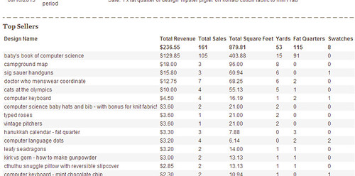
So I've continued to make a small trickle of sales of my designs (mostly Baby's Book of Computer Science). On the Spoonflower account pages, they show you a chronological list of all your sales. I was curious how some of the other designs stacked up, and started brainstorming how I could scrape all the data off the page and into, say, a spreadsheet. Then it occurred to me that, since I've been doing more front-end Javascript development in my day job, perhaps I could write it as a browser plugin and just add whatever statistics I wanted directly to the page itself! And the added bonus of doing it that was is that I could share it with other people.

So I took a couple of hours and did just that. I managed to get it working in Chrome and Firefox. (For reference, plugin development is MUCH easier and more clearly documented for Chrome.) Here's a screenshot of what it looks like in place:


  example table

The plugin (and installation instructions) are here. I was very nervous about having others try it out, since I could only test it with my own data, and there could easily be other types of sales that would break my code. I offered it to the Synergy group though, and so far a couple of people have tried it out and said it works. Exciting!

Saturday, September 14, 2013

Project Runway Season 12 Episode 9

Jeremy starts us off this week by doing his own recap of the previous day's events - Karen is out because "she f***ed up the challenge." Ken says that he's being very careful what he says to who at this point in the competition, and that his guard is up. He's not the only one - the designers are told that they will get to have a nice brunch out, and everyone is immediately suspicious, wondering what the catch will be.

They do indeed get to have a fancy brunch, out at a restaurant patio reserved just for them, punctuated by a little gloating from Helen over her New Balance win and a little secretive eye-rolling in response. Everyone is tense, waiting for the other shoe to drop. So when Tim Gunn finally appears it's a relief. But fortunately the twist isn't too brutal - the brunch is simply to put them in the right frame of mind for the challenge, which is to make an outfit (day or evening) for a modern Southern woman.  This is because it's the challenge for Belk, which is supplying the accessory wall this season, and who's slogan is "Modern. Southern. Style." Also, the winning look will actually get produced by Belk.

Ken and Dom are immediately perceived have an advantage, both having family backgrounds in the South. They, in fact, know exactly what modern Southern women are wearing at this very moment. At Mood, everyone goes for very colorful fabrics, and then in a repeat of the Miranda/Alexander plaid pants collision, Bradon and Alexander both get very similar large-scale plaids, not seeing the coincidence until too late. Alexandria also ends up with plaid. Really? Plaid? Somehow plaid doesn't say "Southern" to me at all but I must be missing something. Dom and Ken also seem to agree that plaid is definitely not a "thing" in the South, leading to a running joke throughout the episode that whenever on of the plaids is mentioned, we get a quick shot of one of them looking skeptical, irritated, or bemused. They did one of those "live polls" during the show, and in fact the majority of viewers agreed that they did not see plaid as something a modern Southern woman would wear.

At Tim's visit, we find out that Bradon's plaid is a very close match for Tim's tie. Tim also warns Justin that combining dark colors with his lovely coral fabric just push it into cheap orange Halloween territory. And then he just straight out tells Alexandria that hers is hideous. She ditches some complicated patchwork she had started for the skirt and starts over using the plaid alone.

We get a little interlude with Ken. He's feeling "not quite homesick," but misses his family. He has a conversation with his mother where it becomes apparent that they're both aware he has an anger issue. "Has that other side come out yet?" she asks. "A little." And in one of those moments where the editors enjoy themselves far too much, we get a montage of the times Ken has yelled at, sworn at, or attempted to silence the others.

Heading into the runway, everyone is really happy with their looks except Alexandria. So we know already at least two folks are in for a rude shock.

Ken's dress looks like a long version of Marilyn Monroe's iconic gown, but in purple, and somehow the proportions around the torso look awkward. Helen's lace-over-yellow gown looks very nicely made but doesn't seem modern to me. Justin's flippy coral dress with interesting draped elements is probably my favorite. Alexander's plaid dress strikes me as a tamer take on Vivienne Westwood. Alexandria's plaid dress has a weird shape and has some kind of odd structure around the hips. Bradon has pieced his plaid in a way that is interesting for the textile, but I think makes the dress too unevenly flexible - it drapes nicely in some parts and is too stuff in others. Dom's evening gown is long and colorblocked, and looks pretty nice but slightly too twee. Jeremy's print dress is alright, but the red jacket makes it look far too old. On the other end of the spectrum, I think Kate's exuberant confection reads too young.

Helen, Justin, and Alexandria are safe. Helen is peeved, as she feels that she was bumped out of the top just because hers would be too expensive to mass-produce.

Now, I have to say, at no point in this episode did I get any real understanding of what was meant by "modern Southern woman." The judges seemed to have gravitated towards "modern country woman" in my opinion. They were definitely not sold on Ken's and Dom's, who both made what they claimed were the kinds of things that the actual modern Southern women, which they know in real life, would really wear. So those two were in the bottom, as was Jeremy.

Jeremy's is not modern or sexy. Zac hates the jacket, Nina hates the print, and guest judge Stacey Keibler hates the length of the skirt. As for Dom's, Heidi says it's not fashion forward, Nina thinks the colors are reminiscent of hospital scrubs, and it's too safe and pageanty. Heidi also calls Ken's safe, as well as unflattering, and she doesn't understand where anyone would wear it. Zac finds it uninteresting and calls it a purple nightgown. Ken is visibly fuming more and more, and finally Heidi remarks that he looks like he wants to roll his eyes into his head. Ken, probably recognizing that if he says anything he's going to completely lose it again, chooses to remain silent and we get some awkward moments of staring.

Praise for Bradon's and Alexander's plaid dresses are universal. We gets lots of shots of Ken and Dom giving hairy eyeballs, since they can't imagine the modern Southern women of their acquaintance wearing plaid (Dom even compares Bradon's to a tablecloth). As for Kate's, the judges all like it except for Heidi who thinks the high-waisted poofy skirt looks too much like a baby bump.

Bradon is named the winner! And then we get the twist. Based on how the judges are acting, Helen thinks they might just eliminate all of the bottom three, but it's more interesting than that. The judges feel none of them "got" the challenge, so they each get one more hour, one other designer as an assistant, and any remaining fabric in the workroom to produce another garment.

Dom chooses Helen, and makes a completely new dress out of the black and white print she was initially going to use for her long skirt but then passed on.

Jeremy chooses Alexander, and they also start completely over, making a tank dress out of two different light-colored fabrics.

Ken chooses Kate, and they rework his purple dress. They chop off the skirt and make it nearly a mini, then drape the extra fabric around the neck and down one arm.

The judges adore Dom's new effort. Heidi wants to buy it right then, Zac loves the print, and the guest judge from Belk admires how it has interest both from the front and the back. They agree that Ken's is a 100% improvement, and is sexier and cooler. However, Heidi thinks it's now TOO short, and the top looks forced. They're even more lukewarm on Jeremy's - it's pretty and more fun, they like the prints, but it's the least interesting of the three.

Nina takes a stab at keeping Jeremy around instead of Ken, since he has a better attitude, but nothing can save him - he's out. Ken stays for another day. Dom not only stays, but her design will ALSO be produced by Belk!

Next time - looks like it's the "real woman" challenge, this time with Project Runway "superfans." Judging from how those usually go, I really hope they all have thick skin and a willingness to look ridiculous. And speaking of thick skin, or a lack thereof, it also appears there will be some kind of blow up between Ken and Alexander in their apartment.

Thursday, September 12, 2013

Sleepy, wiggly creatures

This week's contest was dinosaurs! I have been thinking about trying to make a design for a lovey blanket for my son, so making some uber-cute dinos seemed like a good possibility. Then, looking through the Synergy palettes, the "Serenity" group seemed to fit both "calm and sleepy" and "dinosaurs."

Then it was just a matter of drawing a bunch of sleeping dinosaurs - I decided to go for non-species-specific heads and anthropomorphic bodies. It was fun to think back to all the funny little poses my son would make when he was a tiny baby. Then, I filled in all the little onesies with all the "small" patterns I have on hand from other designs.

Dozing Dinos

I really want to make a cheater print as well, using all the little sub-patterns in use here. I'm pretty pleased with how this one came out - it's very close to the vision I had in mind. It did quite poorly in the contest though - a mere 19 votes. Insert sad trumpet noise here. No matter, this will be another one like the adder, where all I can say is, well, I liked it!

Novelty prints for kids certainly dominated the entries. Indeed, it's hard to think of any other kind of fabric you could make based on the dinosaur theme. My favorites were this damask that went more towards the girly side (and came in second), and these colorful dinos all standing atop one another that would be considered more of a boys' fabric. Moving into less cartoony territory, I thought this mix of doodles and bright pixelated textures was a really fresh combination. Then there were two plesiosaur designs that I really liked - this almost Edward Gorey one with lacy textures, and a more graphic take with a plaid underlay that was my favorite entry.

Saturday, September 7, 2013

Project Runway Season 12 Episode 8

This week's episode opens with Tim, dressed as a ref, waking everybody up at oh-dark-thirty by blowing a whistle in their rooms and tossing them a duffel bag of athletic wear. Ah, of course, the t-shirts all say "HK for NB" - this must be the challenge where they have to make a look for Heidi Klum's activewear collection for New Balance. Both workout ready and fashionable, fits in with the existing collection, the winner's design will actually get produced as part of the line, etc etc.

But first, a little humiliation, I mean fun, for the designers. They get paired up to run an obstacle course: three-legged race, then a tire run (before which they have to untie their legs), wheelbarrow race, and then a search for a flag in a pile of random cloths. The winning pair will get to pick from the available fabric first, and get an extra hour of working time for the challenge.

Bradon and Helen had an early lead, but they forgot the wheelbarrow portion and just ran to the flag pile, so they had to go back and redo it. That gave Dom and Justin enough time to take the lead and win! Strangely they still made everyone else finish the course and root through to find the flag, even though there was nothing to be gained from any further places. Alexander and Jeremy were the very last, and still had to keep sheepishly tossing the fabric around until they found the last flag.

Then, each designer gets to pick a total of ten yards of fabric from the varieties available from Heidi's collection. There was never a mention of the quantities being limited, or anyone not getting the ones they wanted, so I'm not clear on what the advantage of being able to pick first was. Back in the workroom, they are each given an outfit from the existing collection so they can see how the style looks (though they are not allowed to cut them up and use them in their garments).

The big dustup of the episode occurs when Helen goes out in the hallway to ask Tim whether they can use the existing garments to help them make patterns - so that nobody else can hear. He says yes and she returns to the workroom, and smugly declines to tell anyone what she asked. Which seems a little silly since wouldn't anyone glancing over easily be able to see her doing so once she gets started? The other designers are annoyed, since they say she always comes around and asks for advice. But instead of calmly calling her out on this hypocrisy, they fume in mostly silence, until Ken finally "tsks" enough that Helen rolls her eyes and says "well fine, if you're going to be CHILDISH about it, what I asked was..." But OH NO Ken can't possibly bear such a CRUSHING insult and starts yelling at her, which escalates until he's just shouting "shut the f*** up" at her over and over. When he finally makes a vague threat of "going over there" Helen again ducks out and tells Tim what's going on and that she feels unsafe now. In general I would consider that the right move, but she did it in a very self-conscious way that grated at me. She seemed like she was relishing her role as the "victim" here far more than she should have, had she actually felt afraid that Ken was going to escalate further to physical attacks.

Fortunately, Ken takes a break at this point, talks to some people back home on the phone, and calms down a little. Tim also talks him down a little further, until he can go and calmly apologize to Helen. Helen doesn't do any better accepting this apology than she did with Sandro's, but at least that's the end of it. Yet more examples of how sleep deprivation and intense pressure to perform can make people into the worst versions of themselves.

Heidi joins Tim for his workroom visit. They urge Helen to make sure her as-yet unstarted jacket is a wow piece, and Alexander to make his trim narrower. Justin is adorably nervous and blushing around Heidi, who makes fun of Jeremy for having gotten sunburned at the obstacle course. Tim is concerned about Alexandria making drop-crotch pants (again) but Heidi likes them, unlike Karen's outfit, which Heidi loathes - it is impossible, crazy, Martian, nobody would want it. So Karen has to completely start over. Ken also starts over after Heidi compares his to a scuba suit.

The funniest moment of the episode comes at the model fitting, when the seam at the crotch of Helen's pants pops open on the model, who quips, "I don't think this was the kind of wow piece Heidi wanted!" Karen's model is second guessing her second attempt as fast as she can - should it be this baggy? sure you don't want to make shorts? and grimacing mightily all during the fitting. Karen convinces herself that there are other outfits worse than hers.

On the runway, it was hard to believe that this was filmed in the summer, as everyone except Justin made full- or capri-length leggings. Nearly everyone used the same vernacular for workout gear - black and grey for the most part, with angled accents in neon colors. So I'll just list the differentiating factors.


  • Kate: A-line sweater with a zipper in the back that can make it more form-fitting
  • Bradon: got the most flattering lines down the legs
  • Alexandria: drop-crotch pants, slashed detail on shirt
  • Helen: black mesh jacket with drawstring waist
  • Dom: Tron-like red accents and matching hat
  • Justin: shorts!!! Looked like something on the cover of Women's Health, though the bra top was too busy
  • Ken: too-long purple tank, model looked like she wanted to kill someone
  • Jeremy: mixed purple and green accents
  • Karen: the loosest fit - banded capris and awkward sweatshirt
  • Alexander: made his leggings with no seams on the outsides of the legs!
Bradon, Dom, Justin, and Jeremy are in the middle. Dom is irritated to not get any feedback, and Jeremy is relieved, as is Bradon who think that Michael Kors, back for this challenge, looks ready to spew his trademark one-liners.

The judges aren't completely unanimous on which are best. Heidi doesn't like Kate's back zipper, but the others do, and they like it even more up close. Heidi and Zac like Alexander's, but Nina and Kors don't - Nina says the piecing make the model's butt look too big, and Kors finds it unmemorable. Up close they like it less, as the mismatches in the graphic piecing are more apparent. Zac calls out Alexandria for using drop-crotch pants again, which Heidi defends because she likes them. Nina hates them and considers them impossible to be active in. Kors hates the, uh, "suggestive" placement of the pockets on the front and deems it creepy. They all like at least parts of Helen's look, and they all love the jacket, especially Nina. She's about ready to run up on the runway and steal it for herself that second.

Ken tries to play up the functional elements in his (long top to avoid cameltoe, black around collar & armholes to camoflauge sweat) but the judges like it less the more they look. It doesn't have enough fashion, the top is so long it just looks like Tina Turner's dress rode up, and the complicated straps in back just make it look like the model is wearing seven bras. Karen's is also disliked by all, including the model wearing it. It's not athletic and it is badly sewn.


Helen is named the winner, and Karen is out. Next week, the teaser makes it look like they all do so badly on the challenge that they're all given a re-do. Looking forward to that one!

Thursday, September 5, 2013

Potstickers

This week's theme was Dim Sum, and additionally had a required palette:

Spoonflower_Dim_Sum
Color by COLOURlovers

I immediately thought of potstickers, since those were always required in my family when we got Chinese food. Their curved shape made me think of the classic ogee, so here's how it all came together:

Potsticker Ogee

This came in 81 out of 144 with 89 votes. There was another entry that did almost the same layout, but with the more spherical style of dumplings. Bowls were a popular theme, and I really liked these plain graphic ones (which came in fifth) and these pretty patterned ones (which won) - and, very smartly, that designer is also offering those patterns as their own separate designs. There were also many scattered prints of varieties of dim sum, such as these very cute ones and these teeny-tiny beauties. Tablescapes were also well represented, my favorite of which were these smiling steam baskets. A subset of those were the straight overhead layouts, from which I liked this streamlined graphic version and this more detailed, textured pattern. Some less literal takes I liked were the dumpling-clutching dragon and Chinese menu text. Edging out further from the realm of the representational, I also admired the sesame seeds (a great blender print!) and the highly textured circles and swirls.

Friday, August 30, 2013

Project Runway Season 12 Episode 7

At the start of the episode, everyone seems happy to have Justin continuing on, as they reflect over morning coffee. Kate points out that this is the seventh challenge, which is when she was eliminated last time. Alexandria, basking in her immunity, hopes it's a really hard challenge this time.

The challenge turns out to be designing an outfit around a pair of shoes. But of course they have to try to make the assignment of the shoes interesting. They get to go to the Marie Claire offices, where they have a giant shoe "library." The producers try to make it look like they can choose from anything off all the shelves in this giant closet, but it becomes clear they only have eleven pairs in one little area that they have to choose from (obviously so it's easier to have all the possible sizes available to fit their models).

And then, because it can't be too easy, the designers each get a buzzer and have to answer a fashion trivia question before they can pick a pair. Alexandria gets to choose first, though, without having to answer. Ken is worried that he's at a disadvantage, being self-educated, but he's fast on the buzzer and gets the first question right. Dom and Miranda struggle the most, with Miranda being the absolute last - so she just gets the last pair of shoes without ever answering a question right. Ken and Jeremy have many chuckles over neither of those ladies knowing that Coco Chanel was the one who introduced the term "little black dress."

At Mood, both Miranda and Alexander end up going for red plaid. Neither of them declines this game of fashion chicken, though, so red plaid it is. They both make it into pants, causing much heartache and sideways glances, but neither wavers so two very similar pairs of red plaid pants go down the runway.

But before that, Tim's workroom visit. Miranda declines to take any of his advice, as she feels like following his suggestions instead of her own instinct is what has landed her at the bottom before. Tim warns Justin and Karen about making theirs too matchy-matchy with the shoes, and Ken and Helen about being too dated/matronly. Karen think's Alexandria's is "weaksauce" but really wants Helen's. Bradon thinks a casual outfit would go better with his shoes, but for some reason only wants to send something dressy down the runway. Tim asks him where someone wearing his look would go - a complete stumper. So he has to rethink.

Ken tries a little psychological warfare by pretending to be concerned to Miranda that the judges might object to the places where her plaid doesn't match up. He objects to any designers that are still being helpful to each other (like Jeremy) and thinks it's time to "bring out the knives and play the game as it was meant to be played." Maybe he's getting confused with the Hunger Games?

Jeremy is very confident about his look. Bradon is struggling with his and is feeling very homesick, and the others think his look makes his 19-year-old model look far older than that. Alexander has to sew his model into his skinny plaid pants, but still calls Miranda's look an "ugly mess." Ken says Miranda's model, after the outfit and styling are in place, looks like Amy Winehouse "after she OD'd." Then we get a little montage of all the last minute "hurry hurry sew sew tuck tuck augh" things going on.

On the runway:
  • Ken
    • Shoes: lace-up stilettos
    • Outfit: a black dress, made of a highly textured fabric, that has a big peplum but a raglan sleeve construction makes it look a bit too much like luxe workout gear to me
  • Alexander
    • Shoes: Beigie peep-toe platforms
    • Outfit: the slim-fit red plaid pants look pretty good, but the big pleats on the white shirt seem a bit awkward and forced
  • Miranda
    • Shoes: red loafers with gold details
    • Outfit: her red plaid pants and higher-waisted than Alexander's and pleated, with a belly shirt and jacket that look remarkably similar to the ones she made for the bow tie challenge.
  • Dom
    • Shoes: multicolored creepers
    • Outfit: an all-over pieced and quilted dress in the same colors as the creepers. Sailor Moon as a motocross driver. Her model seemed weirdly uncomfortable and tentative on the runway.
  • Justin
    • Shoes: platforms with tile-like print
    • Outfit: All black, so the details are hard to see. Pants with some volume at the hips, black corset top, and a leather shrug. Kind of looks like an anime villain - perhaps Dom's would be the protagonist.
  • Alexandria
    • Shoes: thigh-high gladiator boots, which appeared to be too short for the model's legs and too small for her feet
    • Outfit: little black toga dress with lace insets.
  • Karen
    • Shoes: beige and yellow pumps with wide crossing straps over the ankle
    • Outfit: A bland colorless jacket over a colorblocked yellow and black dress
  • Bradon
    • Shoes: gold-beaded flats (my favorite of the shoes)
    • Outfit: Circle skirt over halter top with a wavy pleated treatment.
  • Kate
    • Shoes: surreal, sculptural red and yellow shoes that appear to coil around the feet
    • Outfit: high waisted pants with thigh-high slits up the fronts, with a too-tight shirt with too many busy details
  • Jeremy
    • Shoes: Over the knee black boots with chain detail. Are these in style right now??? They look very dated to me - I don't even know how a normal person in the present time would pair them with clothes.
    • Outfit: a very, very, VERY 80's giant white sweater with faux cable knit applique over a gold lame camisole and a black miniskirt
  • Helen
    • Shoes: black booties with studded toes
    • Outfit: A boring black sheath dress with a cape
Kate, Karen, Dom, Justin, and Alexander are safe. Kate gets to remark for the second episode in a row that they're now officially in the top ten. And speaking of things that get repeated, let me just say I'm getting incredibly sick of the auto-tuned Yoplait commercial they've been playing at nearly every commercial break, every episode. I hear "I WANNA MEET THE COW THAT MADE THIS!" in my sleep.

In the top: The Heidi and Nina love Alexandria's and appreciate that she chose such a dramatic shoe. It's cool, editorial, and the soft, whimsical dress plays off the hard shoes. Zac, however, is not wowed. The judges are unanimous about Helen's, though - everything from the fit to the styling is great, though they agree the cape is the crucial element, not the dress. I was distracted during the discussion of Ken's, because it looked like his model was shivering whenever they did a close-up. They like the fact that the top is covered up to balance out all the leg, and think it's nicely done and rich-looking. 

In the bottom, they immediately call out Jeremy's as being a bang-on homage to Pretty Woman, which he denies. It's not pretty or modern, and verges on trampy. For Miranda's, Zac likes the nerdiness but thinks it didn't go far enough, Nina thinks it's Christmas all the way, and Heidi just says it isn't cool. Bradon's swing dancer is too old school, overworked, and frumpy. It's a bad bridesmaid's dress! 

Helen is the winner! Exhausted, wrung-out Miranda is out. She lasted longer than I thought she would, but it seems like she didn't have much left to give the competition. At least she left on something she actually liked.

Next time - Tim dressed as a referee, three-legged races, and a visit from Heidi in the workroom!

Papers for pencils

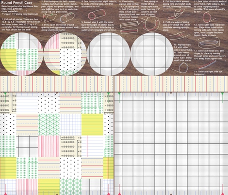
This week's contest was to make a cut-and-sew pattern, fitting on a fat quarter, that could be made into a pencil case. I decided to base mine on the design I made for last year's back-to-school theme - the paper patchwork. The pattern is based on the one by Sew Mama Sew, here. I thought it would be fun to put a school-desk-like wood background behind the instructions.

Paper Patchwork Case

This came in 47 out of 81 with 96 votes. Most entries did a fairly plan rectangular shape, my favorites of which were this very colorful one and this mellow mail-themed roll-up case. As for cases that had more representational shapes, I liked the cartoony cat (which won) and the calmer chickadee roll.

Sunday, August 25, 2013

Project Runway Season 12 Episode 6

As the episode begins, Ken is still fuming that Alexandria would dare imply that she had to be careful in speaking to him, lest he should become angry. Mm-hm. When they get to the runway, Tim is wearing a camo suit to introduce the next activity. First, we learn that Jeremy can't tell the difference between hunting and military camo, and then we learn that they will all get to go "glamping" over night! As it happens, there really is no trick (as I kept expecting) - they get to hang out at a lovely campsite night next to a stream, relax in hammocks, go rafting and ziplining, have a lovely catered picnic dinner, and sleep on cushy cots in canvas tents. The only stressful part was that they only got 30 minutes to pack. Well, Ken hates being outdoors so he hates the whole experience, but he manages to warm up to it by the end.

It's very nice of the producers to give them this break. In previous seasons, they've brought in loved ones for a day for a similar purpose, but that sometimes seems to backfire - some of the designers collapse under the pressure once the challenge resumes. It's almost as if it gives them a bit too much of a break and reminds them what life is like outside of the insane crucible of sleep-deprived reality TV contestants and omnipresent cameras. So this is an interesting tweak - they are still only around each other, but get a day off from competing. It does seem to have been more uniformly refreshing rather than emotionally crushing.

Justin in particular has a great time "glamping." He explains that his hearing impairment make it essentially impossible to work and communicate at the same time, so he hasn't been able to get to know everyone else until now. There's a very cute scene of him teaching everyone else swear words in sign language.

Interlude over - the actual challenge is to make a high-end fashion look, something editorial. They can use the glamping experience as inspiration, but they don't have to. Their suggested Mood budget is $300.

Justin buys a bunch of glue gun cartridges and proceeds to make it into lace - Tim approves of what he sees so far. Bradon has been "painting" with thread to create his own textile, irritating the other designers with how much constant noise he's making in the sewing room, and unfortunately Tim thinks it looks like a kid's drawing. Dun dun dun! Tim is also very skeptical of the drop-crotch pants Dom is working on. Her model says that pants like that are used as underwear in her culture - a reassuring notion, to be sure! Tim thinks Karen's dress may be too boring and urges her to go for the ombre dye effect she'd been contemplating. Bradon and his model joke that it looks like a nightgown. Everybody really likes Helen's moth-inspired dress.

Overall, at the end of Tim's visit, he's actually very pleased with how things are going in the workroom and thinks it seems like one of their best overall efforts so far.

As we get through the model fitting and the final rush before the runway, the editors unleash a wave of snark from the interview rooms. Jeremy in particular, riding high from having immunity, is enjoying endulging in name calling and compares Alexander's leather train to an "oil slick" and Kate's poufy concoction to "a pregnant fairy in a shiny harness." Ken jokes to Jeremy that he wants to buy the immunity off of him! (And if he did, I'm sure they'd do it with those pre-paid cards they've been using all season!) He's also shown being great pals with Justin, and compliments Miranda's work so far ("is that Miranda or Christian Dior???") which makes me start wondering if the editors are doing a little "reputation repair" to make us feel bad if Ken gets eliminated.

Alexandria is behind where she wants to be and Ken thinks she should go home. Helen thinks the judges will hate Justin's lace and she hates the silhouette of the top of Ken's dress. Poor Bradon is getting stuck on his draping, is running around frantically, then has terrible static cling issues with the dress. But in the end they all manage to get something walking down the runway.

Karen sends out a beige red carpet dress that seems verrrrry "safe." Bradon's dress is loud and kind of wacky, but I could actually picture in an editorial...in a teen magazine. Miranda's dark petaled dress is my favorite this time, though also a bit on the safe side. Ken has made a sheath dress using several colors of the same heathery print, with a very heavy blob of folded fabric on the top. Alexandria's outfit is a denim jacket with a dramatic back and those dreaded drop-crotch pants - the styling does a good job of selling it, though, and I could picture it in an editorial settig. Alexander's long, dark, tree-printed dress seems like too literal a take on their inspiration. Justin's is very messy, and he acknowledges that he took a risk. Dom's watery print dress would be better if the collar had just one color instead of two. Karen's buckle-top ombre maxi dress and Kate's poofy "fairy in a shiny harness" dress both seem like things that could be in an editorial but would never be worn by a person out in real life. Jeremy's slinky dress, made of fabric on which he painted a love letter to his husband, seems a bit too much like lingerie.

Dom, Bradon, Kate, Helen, and Miranda are all safe - and they realize that means they've made it into the top ten!

The jugdes hate Karen's - it's trashy and looks like a duvet or muumuu. She had her model wear it with cowboy style boots, making it look like she can't decide between the beach or the rodeo. They don't like the Easter-egg yellow or the figure-hiding shape. Ken's prompts Nina to shout B! O! R! I! N! G! and they loath the weird heavy wad of fabric he put on the bodice. He claims it was inspired by layers of exposed sediment near the stream, and the swept back hair was supposed to evoke Mother Nature, but Zac Posen says it looks like a frog queen. (Cue a huge smirk from Alexandria.) Justin's doesn't fare much better. Heidi compares it to a cheap Halloween costume and Zac says the lace gives the effect that the model is "foaming from the hips." Nina takes this even further and mirthfully utters the deadly phrase "FOAMING VAGINA." But then they do try to find some nice things to sac - Zac likes the color and Nina likes the varying layers of transparency in the skirt. Backstage, Karen and Justin are reduced to tears over their critiques.

At the top, the judges melt for Jeremy's sweet love letter dress. It's chic, personal, emotional, and breathtaking. When they get to see it up close they love it even more, for the details like the buttons up the side and the tulle around the sleeves and neckline. They also like similar details on Alexander's dress, and the great fit (achieved with a zipper, not sewn on the model!). Zac is not wowed, however. As for Alexandria's, he's also in the "no drop crotch pants!" camp, but she's managed to sell them to him. Nina indicates that her outfit would definitely be a good fit for an editorial.

Alexandria is named the winner! And despite all the screen time he got, Ken is safe. In fact, Justin is out. Bah! Backstage, everyone is upset and crying when this happens. I can't remember ever seeing any group so universally affected by the elimination. And then, Tim comes in...and announces he's using his save! So nobody will leave this week. Of course now everyone is crying even more.

Next week looks like shoes, shoes, and more shoes.