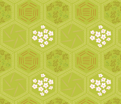
I didn't post about last week's contest, as I didn't have an entry - alas, it was only open to thirteen- to nineteen-year-olds. This week, the theme was pie. Pie is such a staple of the kitchen-crafts design world that, despite having a
deep personal appreciation for pie, I struggled to come up with any possible fresh take on the subject. I was sure (and was proved right) that there would be plenty of
lovely representations of
assortments of pies. I went down the path of deconstruction, and thought about doing something with a recipe, or just the ingredients. A step further down that path, and I went with the plants that the ingredients are harvested from. And as far as picking which flavor of pie, since there's a synergy theme of "apple," that was easy enough.
So the design contains the flowers of apples, sugarcane, nutmeg, and cinnamon, plus sheaves of wheat. Also, the outlines of the hexagons are done in a wavy shape that's supposed to resemble mammary cells, to represent milk.

This came in 109 out of 236, with 47 votes. Along with the designs I linked above, I also liked the
simple blueberry pie lattice,
stargazy, and
fruit tarts. For the obvious puns, there were some "pi" entries, but none I liked all that much - though there are some in the synergy group, like
this; and of course
pie charts.

No comments:
Post a Comment