Project Runway's tenth season just started! They keep congratulating themselves on their "tenth anniversary" despite the fact those ten seasons took place over just eight years.
The big story far has been Gunnar Deatherage, the person with quite possibly the highest ratio of badassness in name to badassness in person in the entire country - as in, approaching a divide-by-zero error. He was eliminated at the very beginning of last season, so he gets another chance this time. He then completely blows any goodwill from this circumstance by acting like a spoiled, entitled brat and engaging in a pointless, random feud with doppelganger Christopher, who promptly wins the first challenge, thus earning immunity from elimination for the second. In the second episode Gunnar puts on a fake, sticky-sweet act and goes around praising all the designers except Christopher, and talks non-stop about what he would be doing instead if he had won immunity.
Racing Gunnar to the bottom of the appealing personality list is Lantie, who not openly admits to wanting to work with only pretty people and being overly defensive in the face of criticism, but seems to be proud of both. Fortunately she's eliminated in the second episode.
On the opposite side of the spectrum is Nathan, who has a heartwarming quote about his father. Apparently he never understood his son's interest in fashion, until he saw the first season of Project Runway - "this really is a real thing! An actual industry!" - and so Nathan credits the show with restoring his relationship with his father.
In the first challenge, the designers have brought one outfit from home and must make a second to go with it. Beatrice, despite being the favorite of Project Runway All-Stars champion (and beloved-of-fans) Mondo, is eliminated based on two very blah outfits. Christopher wins with a pair of ruffled dresses. Lantie narrowly escapes elimination despite getting called out for making the same dress for each of her models (and herself!).
The second challenge is to use materials bought at the fancy candy store run by Ralph Lauren's daughter, who then gets to be the guest judge. The selection of the top three and bottom three were especially baffling here. Andrea's ridiculous Victorian candy clerk costume was safe, somehow appealing more the to judges than Elena's retread of her previous design and Buffi's lumpy, slumpy pink confection - mediocre as they both were. Lantie is eliminated for her crazy grade school craft project dress, and even though I despise Lantie I still think it was better than Andrea's!
Severus Snapes', I mean Dmitry's, beaded-looking dress was also unaccountably in the middle rather than the top. It was certainly better than Sonjia's top-heavy dress with unflattering flappy peplums that the judges somehow put in the top three. Ven picks up the win with his pastel stained-window-esque crushed candy decoration.
The judges also continue their consistent history of inconsistency, by knocking Melissa's all-black entry for "taking the joy out of candy." Uh, shouldn't that be considered creative? The challenge was just to make things out of candy, not to embody the Spirit of Candy. Fabio wins the Shock & Awe award for making Tim Gunn swear when he agrees - "it's a glue the $#!+ out of it moment!"
Next week, the show continues the tour of the usual challenge types by forcing the designers to work in pairs. DUN DUN DUN. Who wants to bet the producers will make them "randomly" pair Gunnar and Christopher?
Monday, July 30, 2012
Friday, July 27, 2012
Summarizing Contests
Check out the "Spoonflower Contests" link at the top right of the page! Or if you're just reading this on a feed, it's here as well. I put together a spreadsheet of all the data on the contests I've entered. Cells highlighted in green show the ones where I did better than others, and the dark green especially well.
Thursday, July 26, 2012
Cocktail Dress
The latest Spoonflower contest was in conjunction with a nearby theater company, to create a print they could use to make a mid-century cocktail dress for a play. It wasn't clear whether the play actually was being set in the fifties or sixties, or if they just wanted a retro look. I looked at some mid-century dresses for inspiration, and found this skirt with a houndstooth/plaid weave I really liked. Then I found this set of colors:

Color by COLOURlovers
And pulled it all together with some additional circular colorblocking.

My design came in 220 out of 367, with 60 votes. My favorite entry was this jeweled design. The designs I would most like on a dress for myself were this leafy one and these cubes with springs of flowers. There were a number of traditional tossed floral designs, the best of which I thought were these, these, and these. Also good was this peacock/paisley meld (which came in second), these jester-like ovals (which came in ninth), and the tongue-in-cheek pills.
Color by COLOURlovers
And pulled it all together with some additional circular colorblocking.
My design came in 220 out of 367, with 60 votes. My favorite entry was this jeweled design. The designs I would most like on a dress for myself were this leafy one and these cubes with springs of flowers. There were a number of traditional tossed floral designs, the best of which I thought were these, these, and these. Also good was this peacock/paisley meld (which came in second), these jester-like ovals (which came in ninth), and the tongue-in-cheek pills.
Wednesday, July 25, 2012
A couple of cakes
Here, finally, is the last of the backlog of Spoonflower contests I have to catch up with before going back to merely once a week. This contest was another more specific one - we had to make designs involving cake (or cupcakes) out of collaged paper, with only the minimum of digital manipulation needed to get it into a repeat. I decided to make plain cake slices, and thought it would be fun to make them out of pictures from catalogs! I gathered up Pottery Barn, Williams-Sonoma, and Garnet Hill, then cut out all the areas I could find that had large-enough, interesting textures. Then I paired them up and decided which ones would be "icing" and which would be the actual "cake." In lieu of scanning them in, I enlisted my husband - who has been honing his photography skills by taking tons of amazingly cute pictures of our son - to photograph them. Then it was just a matter of getting them all arranged in a repeat so that the light/dark values were evenly distributed.

My entry came in 20 out of 143, with 239 votes. Definitely one of my best results!
My favorite entry by far was this one, which came in second. It reminds me of a set of illustrations I saw years and years ago in Sesame Street Magazine. It was a cut-out game, of memory or go-fish or something, where all the sets were little cakes. Instead of drawings of cakes though, they were photographs of little clay cakes. They were all two or three layers, in all different colors, with fancy piped borders and decorations and flowers. I loved the three-dimensional look of all those perfect little cakes. This fabric is simpler, but has a similar charm. I'm trying to think what it would be good to make into - maybe placemats.
Tuesday, July 24, 2012
Pomegranate Cookies
Pomegranates! Everybody make a pomegranate fabric! OK. I was inspired by the animal cookie design in the extinct animal contest and decided to make my design of pomegranate cookies. I thought about how one might make pomegranate cookies, and made up a little narrative. Someone with older children getting bored during Summer vacation might try to come up with things for them to do. I imagined such a person would have them bake cookies, but challenge them to come up with other things the traditional cookie cutters could represent. So ball ornament shapes have been iced as pomegranates, and bell shapes have been iced as pomegranate flowers. The kids also mixed up custom colors for the icing. I think they did a pretty swell job!

My design came in 259 out of 290, with 20 votes. I'm pretty happy with how the repeat came out here - I kept rotating it as I worked on the layout, which helps avoid too much directionality. (Of course, then I added the shine all facing the same way, so technically it's still one-directional!) I also tried to add a little depth to the background. Layered over the check (which is reused from the background of the hipster piglet) is the eucalyptus leaf pattern I created for the family crest.
Of the more realistic designs, my favorites were this very lush design that I would love to make into a tablecloth (and came in seventh), and this warm tonal. The more graphic ones I liked were this pomegranate/lime combo, a watercolor of whole pomegranates and one of just the seeds, one reminiscent of batik, and this one that looks like a pomegranate vine.
Monday, July 23, 2012
A Clever Title about Stars and Stripes
The Spoonflower contest closest to the Fourth of July was themed "Stars & Stripes." My first vague idea was to represent "Betsy Ross' sewing kit" - as if she looked down, saw red stitches on white linen, with needles scattered on top in the shape of stars, and that became her inspiration for the American flag. In the end, I decided to make the stitches yellow instead, to try to stand out from what would undoubtedly be a preponderance of red, white and blue designs.

My entry came in 242 out of 328, with 31 votes. Of the red/white/blue designs, my favorites were the jets that came in fourth, and the overlapping circles that came in eighth. I liked a couple of the designs that referenced stars in the sky - this one that is Matrix-esque, and this peaceful night sky. Also good were these cute wrapped stars and vending machines.
My entry came in 242 out of 328, with 31 votes. Of the red/white/blue designs, my favorites were the jets that came in fourth, and the overlapping circles that came in eighth. I liked a couple of the designs that referenced stars in the sky - this one that is Matrix-esque, and this peaceful night sky. Also good were these cute wrapped stars and vending machines.
Friday, July 20, 2012
Dancing Dinosaurs
For the Spoonflower contest to make a design involving an extinct animal, I went with a dinosaur even though I knew there would be many, many other dinosaur entries. I wanted to make it a fabric for kids, but tried to think of a way to balance it so it could be either a girl or a boy fabric. How? T-rex doing ballet.

T-rex's poses are all based on photographs of Nijinsky. This came in 142 out of 226 with 54 votes, though as I looked at the voting page I saw that apparently I failed to vote for it myself. Whoops! My other favorite dinosaur design was just tracks, and my favorite of the many dodo entries was this one. Also good were these very pretty proto-starfish, and the animal crackers.
T-rex's poses are all based on photographs of Nijinsky. This came in 142 out of 226 with 54 votes, though as I looked at the voting page I saw that apparently I failed to vote for it myself. Whoops! My other favorite dinosaur design was just tracks, and my favorite of the many dodo entries was this one. Also good were these very pretty proto-starfish, and the animal crackers.
Thursday, July 19, 2012
One color + one color = two designs
In this contest, Spoonflower required us to use only a specific shade of green and a specific shade of purple, and optionally white, to create a geometric design. There were a ton of really great entries! I'll just say right off the bat that mine came in a blistering 371 out of 375, with eleven votes. Ha ha, BURN! Definitely sets a new low from my previous worst.
I made a design of tesselating plusses:

And then layered in white a stylized circuit design for a full adder, arranged again into tessellated plusses. This represents the logic needed to add two one-digit binary numbers (i.e. it computes 0+0, 0+1, 1+0, or 1+1).

This was fun to make - I enjoyed working out exactly how to place all the logic gates to get them evenly arranged in the plus shape.
I really like this semi-paisley that came in third, and the sketchy triangles in fourth. Also fond of these tangram animals, even though the designer had some issue getting the green color to show up right. And for plainer geometrics, my favorites were these circles and squares, triangles, and polyhedra.
I made a design of tesselating plusses:
And then layered in white a stylized circuit design for a full adder, arranged again into tessellated plusses. This represents the logic needed to add two one-digit binary numbers (i.e. it computes 0+0, 0+1, 1+0, or 1+1).
This was fun to make - I enjoyed working out exactly how to place all the logic gates to get them evenly arranged in the plus shape.
I really like this semi-paisley that came in third, and the sketchy triangles in fourth. Also fond of these tangram animals, even though the designer had some issue getting the green color to show up right. And for plainer geometrics, my favorites were these circles and squares, triangles, and polyhedra.
Wednesday, July 18, 2012
Crest with Zest
A very interesting recent Spoonflower contest was to create your own family crest. I decided right away that I wanted to make mine more like a Japanese style crest (aka "kamon") rather than a European heraldic shield type. I first became aware of kamons when I was a kid, and we had a drawing program on one of our computers that came with a ton of vector clip art, arranged into pages. One of the pages was all different kamon. I had no idea what they were at the time, but I really liked their graphic qualities and "collection-ness." Years later I became familiar with the quilting work of Kumiko Sudo, who made a whole book of patterns turning kamon into patchwork and applique designs, called "Circles of The East : Quilt Designs from Ancient Japanese Family Crests ." I love this book! I also read Susan Briscoe's blog, a quilter in the UK who does similar kind of work - I haven't gotten her book
 yet but I want to.
Back to my design - I wanted to incorporate computers, guns, and something about the area where we live (Goleta/Santa Barbara). For the computer aspect, I made the circuit diagram symbol for a transistor in the kamon style, and made that the overall design. I decided to make the foreground & background each composed of their own repeat, in a semi-cheater style.
![]()
I also uploaded each design separately, so you can see the repeat more clearly. The background is eucalyptus leaves, in reference to all the eucalyptus trees that grow in this area.

The foreground is a repeat of little guns (Sig Sauers to be more specific).

My design came in 54 out of 86, with 55 votes. My favorite entry is this cute, minimalist one. I also like this more ornate design that came in second place. This Zelda-inspired entry is pretty great, and I was pleased that this very punny one came in ninth.
Back to my design - I wanted to incorporate computers, guns, and something about the area where we live (Goleta/Santa Barbara). For the computer aspect, I made the circuit diagram symbol for a transistor in the kamon style, and made that the overall design. I decided to make the foreground & background each composed of their own repeat, in a semi-cheater style.
I also uploaded each design separately, so you can see the repeat more clearly. The background is eucalyptus leaves, in reference to all the eucalyptus trees that grow in this area.
The foreground is a repeat of little guns (Sig Sauers to be more specific).
My design came in 54 out of 86, with 55 votes. My favorite entry is this cute, minimalist one. I also like this more ornate design that came in second place. This Zelda-inspired entry is pretty great, and I was pleased that this very punny one came in ninth.
Monday, July 16, 2012
Vroom vroom!
There has already been a design contest for bicycles, for which I fudged a little and created an entry with motorcycles instead. Well, now there is a contest actually for motorcycles. What now? I decided my lightcycle motif was perfectly good, so instead of the regular striped arrangement I did before I went for a tossed print. I also decided to use the same colors as the "Isabel's Robots" design I made before. I had a hard time deciding on the background, though. I ended up going with the flat black since that was the most "Tron-like.'

I wanted to add some other subtle design or texture to the background, but I also was resistant to adding another color, since the only other one already in use in the collection is the light yellow. I think any use of that in the background would be too disruptive to reading the foreground figures.
My entry came in 97 out of 119, with 28 votes. I also liked this other lightcycle entry, and these eight-bit motorcycles. I think this entry would be great as a skirt. Well, I don't really wear skirts often, so maybe a tunic-y shirt.
Sunday, July 15, 2012
Draw what you know
After the previous, more specific challenge, the next one was back to wide-open. The idea was simply "hand-drawn," with a minimum of digital manipulation. I didn't want to hassle with actually drawing something and scanning it in, so I just used SketchBook Pro again to make it look fairly hand-drawn.
This design is based on what I can see sitting here on my couch. There are some overlapping segments of a baby gate which form a rounded grid, and the colors are based on the back yard behind me (tall hedges, stone retaining wall, some flowers).

The shapes didn't come out exactly like I wanted - the points of the leaf shapes don't quite line up right to balance the negative & positive space. I lost sight of that when I was trying to get the overall repeat to look right. I decided to leave it, since I would have had to redo almost the whole thing to fix it. A lesson for future designs!
There were a couple of different polyhedron/crystal entries I liked: a purple one, another of jewels, and one of salt. I also really liked these raindrops.
My entry came in 160 out of 500, with 95 votes.
This design is based on what I can see sitting here on my couch. There are some overlapping segments of a baby gate which form a rounded grid, and the colors are based on the back yard behind me (tall hedges, stone retaining wall, some flowers).
The shapes didn't come out exactly like I wanted - the points of the leaf shapes don't quite line up right to balance the negative & positive space. I lost sight of that when I was trying to get the overall repeat to look right. I decided to leave it, since I would have had to redo almost the whole thing to fix it. A lesson for future designs!
There were a couple of different polyhedron/crystal entries I liked: a purple one, another of jewels, and one of salt. I also really liked these raindrops.
My entry came in 160 out of 500, with 95 votes.
Saturday, July 14, 2012
Oh, a "Jug!"
It's interesting how the Spoonflower contests vary in specificity. The last one was just "watercolor," which implies actually not a whole lot about what the resulting design will look like. This next one was much more constrained: we had to use a set group of colors, and the design had to be kitchen-related. We were given the exact RGB values for the colors, which were brown, beige, yellow, and red (and optionally white).
My first thought was to do sets of matching pitchers and bowls, but I found so many interesting shapes of vintage pitchers (on Etsy and plain old Google image search) that I stuck with just that.

Many of the other entries were in a similar vein - representational, single-orientation prints of collections of objects. My favorites of this type were the mugs, egg cups, appliances, and tea kettles. Other than that I liked this one, which has representational stuff and abstract motifs arranged in stripes.
My design came in 79 out of 281, with 133 votes.
Postscript: The title of this blog post is from an incident that I think about nearly every time I hear the word "pitcher." When I was a young teen my family went to the UK. At one restaurant, my father asked the waiter for a pitcher of water and we got an incredibly blank stare in response. My father then mimed the act of pouring a glass of water, and the waiter said, "Oh! A JOOOOG!"
My first thought was to do sets of matching pitchers and bowls, but I found so many interesting shapes of vintage pitchers (on Etsy and plain old Google image search) that I stuck with just that.
Many of the other entries were in a similar vein - representational, single-orientation prints of collections of objects. My favorites of this type were the mugs, egg cups, appliances, and tea kettles. Other than that I liked this one, which has representational stuff and abstract motifs arranged in stripes.
My design came in 79 out of 281, with 133 votes.
Postscript: The title of this blog post is from an incident that I think about nearly every time I hear the word "pitcher." When I was a young teen my family went to the UK. At one restaurant, my father asked the waiter for a pitcher of water and we got an incredibly blank stare in response. My father then mimed the act of pouring a glass of water, and the waiter said, "Oh! A JOOOOG!"
Friday, July 13, 2012
Doubled up
There was actually a second contest that closed on the very same day as the non-owl animal contest, with a much harder theme. Spoonflower announced they were teaming up with Robert Kaufman fabrics, and doing a mega contest, where the designs had to look at least partially like watercolor paintings, with two rounds. The top eight vote-getters of the first round would get a few weeks to create full collections around their first entry, and the winner of that round would get a contract with Kaufman to be a professional fabric designer.
They actually announced this one first, and then two weeks before it closed, posted about the animal one closing on the same day. Whaaaa? I thought it had to be a mistake at first, but alas, it was true. This was especially irksome for me, because I was going to be traveling for the week leading up to the last day of these two contests.
Since I hadn't made much progress on my watercolor entry, I figured I would just finish my animal entry first and then go back if I had any time. Hipster Piglet actually came together pretty quickly, so I got a little bit done before the trip started.
Of course, 'watercolor' is just an appearance, and doesn't give any suggestion for actual subject matter. I tried to think of something that was really 'me'. When I was little, I wanted to be a Ballerina Plumber - fixing plumbing by day, dancing on the stage at night. I drew a couple of the little B.P.s and some plumbing for the background, all in SketchBook Pro so I could make them look like pencil drawings.
Once we were back, I had one evening to finish up. I followed this tutorial to make the color look a little more like watercolor paint. The end result is still far short of what I was wishing to make, but a decent first attempt.

Definitely one I want to take another stab at! Not sure if I would necessarily make it a watercolor design again, but it's a concept I want to develop. One of the weakest parts is the color - I tend to be far too literal and representational with colors, so I need to do some thinking on how to come up with a scheme for this that is more cheerful and bright, but still allows for the ballet & plumbing elements to come across clearly.
I also uploaded a version with just the background, which I think makes an interesting blender print on its own.

Alas, but unsurprisingly, my design didn't make it into the second round. They didn't show the voting results so I don't know the extent of how poorly it did, ha ha!
My favorite entry was this one, which also didn't make it into the finals. Of the final entries, none particularly grabbed me. I thought all of them were good, but nothing seemed like anything super-special that's beyond what you see in conventional fabric collections.
They actually announced this one first, and then two weeks before it closed, posted about the animal one closing on the same day. Whaaaa? I thought it had to be a mistake at first, but alas, it was true. This was especially irksome for me, because I was going to be traveling for the week leading up to the last day of these two contests.
Since I hadn't made much progress on my watercolor entry, I figured I would just finish my animal entry first and then go back if I had any time. Hipster Piglet actually came together pretty quickly, so I got a little bit done before the trip started.
Of course, 'watercolor' is just an appearance, and doesn't give any suggestion for actual subject matter. I tried to think of something that was really 'me'. When I was little, I wanted to be a Ballerina Plumber - fixing plumbing by day, dancing on the stage at night. I drew a couple of the little B.P.s and some plumbing for the background, all in SketchBook Pro so I could make them look like pencil drawings.
Once we were back, I had one evening to finish up. I followed this tutorial to make the color look a little more like watercolor paint. The end result is still far short of what I was wishing to make, but a decent first attempt.
Definitely one I want to take another stab at! Not sure if I would necessarily make it a watercolor design again, but it's a concept I want to develop. One of the weakest parts is the color - I tend to be far too literal and representational with colors, so I need to do some thinking on how to come up with a scheme for this that is more cheerful and bright, but still allows for the ballet & plumbing elements to come across clearly.
I also uploaded a version with just the background, which I think makes an interesting blender print on its own.
Alas, but unsurprisingly, my design didn't make it into the second round. They didn't show the voting results so I don't know the extent of how poorly it did, ha ha!
My favorite entry was this one, which also didn't make it into the finals. Of the final entries, none particularly grabbed me. I thought all of them were good, but nothing seemed like anything super-special that's beyond what you see in conventional fabric collections.
Thursday, July 12, 2012
The pitter-patter of little feet; the incessant poking of little toes
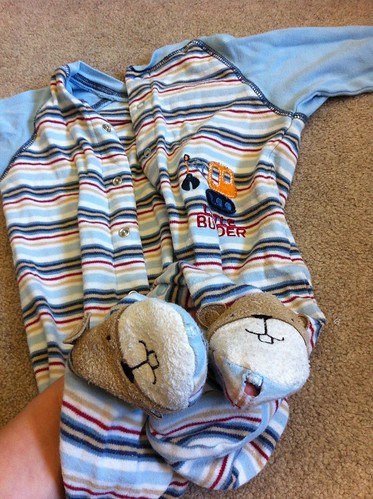
As well as replacing our old mattress last weekend, I tackled another bittersweet project - packing up a batch of clothes my son has outgrown, for my nephew, who is a year younger. This is only the second time I've had to do that, since it seems like most of his growth since he was six months old has been just to make his limbs longer. I've been seeing him in some of those little shirts and footies for months and months now, and they're only just now too small, so it caused some pangs to give them up! But hopefully at least a few items will find use again for his cute little cousin.
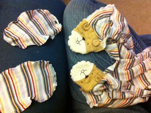
To that end, I tried to do some repairs on one of my favorite little footies. He wore it so much that the feet developed holes at the toes.
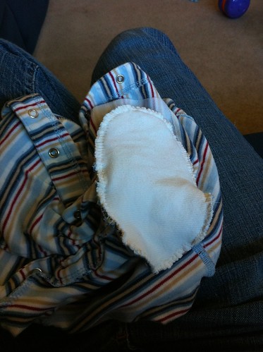
First I took the foot bottoms off as carefully as I could.
I have no way of replacing that fabric, so in order to get a nice knit, I grabbed an old onesie that got a bad stain on the back. It has a pleasing waffle-weave texture.
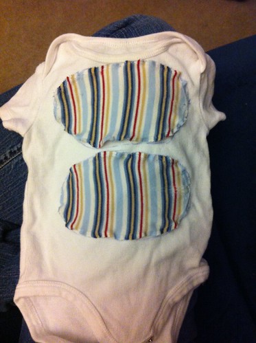
There was enough room on the onesie around the seams & stains to get a double layer on the feet. Also I decided to incorporate the embroidery that had been on the front.
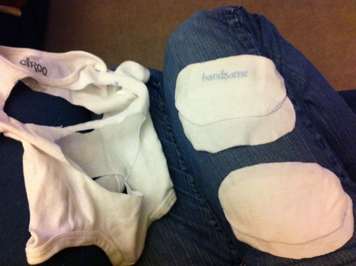
Then it was just a matter of pinning the new feet in place...
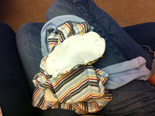
...and sewing them in place. To try to replicate the performance of serging with handsewing, I both straight-stitched AND whip-stitched all the way around.
Right-sides out again, here are the 'handsome' new feet!
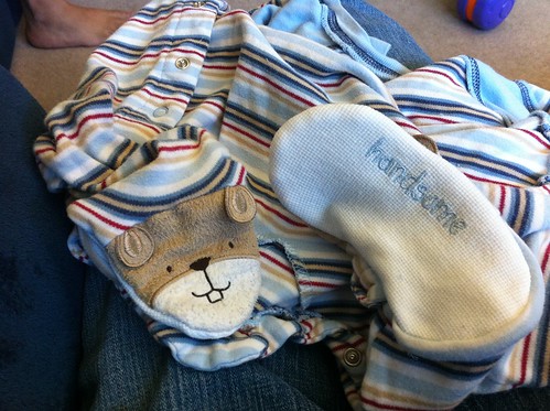
So these are on their way to my nephew now, with all the rest.
To that end, I tried to do some repairs on one of my favorite little footies. He wore it so much that the feet developed holes at the toes.
First I took the foot bottoms off as carefully as I could.
I have no way of replacing that fabric, so in order to get a nice knit, I grabbed an old onesie that got a bad stain on the back. It has a pleasing waffle-weave texture.
There was enough room on the onesie around the seams & stains to get a double layer on the feet. Also I decided to incorporate the embroidery that had been on the front.
Then it was just a matter of pinning the new feet in place...
...and sewing them in place. To try to replicate the performance of serging with handsewing, I both straight-stitched AND whip-stitched all the way around.
Right-sides out again, here are the 'handsome' new feet!
So these are on their way to my nephew now, with all the rest.
Wednesday, July 11, 2012
The ebb & flow of life, as demonstrated by mattresses
In the summer before my last year of college, nine years ago now, I was an intern at the company where I now work full time as a software engineer. My then-fiancee and I were living in Isla Vista, where most UCSB students live. The internship actually paid pretty well, so I had some extra dough after expenses and whatnot. (My parents smartly left me to entirely support myself over that summer.) We decided to go for a big-ticket item - we replaced our crappy futon with a Real Mattress and Real Box Spring. We got just the most basic metal frame possible as a bed. It was soooooo nice! We did eventually get a real, grown-up bed, once we later moved to a real, grown-up apartment - but kept the mattress.
I spent the next nine years trying to remember to flip it regularly. I did pretty well for a while there by doing it on the first weekend of every month, with odd-numbered months requiring a rotation and even-numbered months an end-over-end flip. (I turned this into a name as a mnemonic: r(otate)+odd and fl(ip)+even became "Rod Fleeven".) However, after we bought a house two years ago, with a master bedroom with a ceiling fan thus requiring a lot more care be taken while flipping, this tapered off significantly.
I'm sure I don't need to describe how slumped and saggy a mattress gets after nine years. We had two nice little depressions on each side. It was time to go.
So now, across the hall from our sleeping toddler, sits our brand-new mattress. We bought it from a man who can only be described as a "mattress nerd." He & his family own & run a store in Santa Barbara that sells mattresses (and apparently they also construct them). It was amazing! He knew everything about the composition of mattresses, when certain mattress technologies came about or became unpopular - a regular font of information. So with his expert advice, and a lot of awkwardly lying on mattresses in public, we got a natural latex foam mattress. It's supposed to be a balance between a traditional inner-spring mattress and a memory-foam mattress, very breathable, and even eco-friendly.
Best of all, they took away our old mattress & box spring away when they delivered the new one. It was a little sad to see it hauled away, thinking of how proud I was to buy it back then. The new one could, in theory, last for 20 years. In 20 years our son will probably be in college, perhaps reaching the point where he's starting to get tired of his crappy futon and thinking about getting a real, grown-up bed. Hopefully he can find a mattress nerd too.
Wednesday, July 4, 2012
Subscribe to:
Posts (Atom)