Thursday, February 13, 2014

Happy Valentine's Day!

Yes, I know it's not until tomorrow, but not only did my husband and I already exchanged our presents, the Valentine's-associated contest at Spoonflower ended today. Actually, the theme of the contest was Anti-Valentine's Day, and in addition had to be faux cross stitch.

I spotted some early entries, before I started mine, which were pretty impressive: one that fully embraced the cross stitch format, and one that brought candy hearts into the mix - and both exhibiting exhilarating levels of unromantic snark. So I decided to take a different strategy. Rather than say something negative about the usual sentiments of the holiday, I wanted to say something positive about something that was the opposite any those sentiments. I looked around for quotes about being by yourself, and at various vintage samplers (you should be able to pick out my reference material from here). And for the colors, I decided that the Synergy "serenity" colors, which I had previously used for my newborn dinos, would be a good fit both for the material on its own, and as a further contrast from traditional Valentine's pinks. So assembled into a panel and put in a simple repeat, it came together like this:

Companionable Solitude Motto

But then I started thinking about how you might actually use this fabric, and decided to make a format where you could actually use (almost) everything in a standard fat quarter. That size actually makes a good fit for a 16" square (as we learned with the Spring Cheater contest), so I decided to go for something that you could make into a front for a 16" throw pillow.

Companionable Solitude FQ Panel

I'm very happy with how this came out. I even took the time to turn some of the elements into their own repeats - and I could happily add more, given time. I got a respectable 117 votes, and just squeaked in to the top third in the rankings.

Thursday, February 6, 2014

Papercut

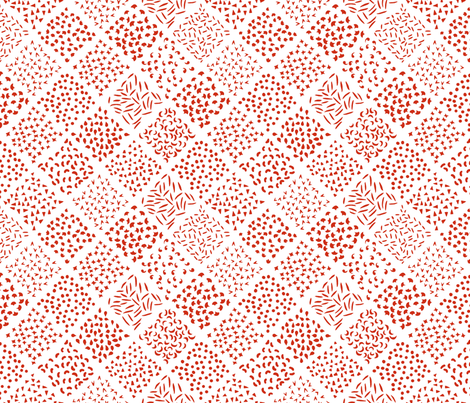
This week's contest was one of those that requires a format, instead of themed content. In honor of the Chinese new year, we were asked to make red and white designs that looked like Chinese paper cutting. I decided to take a sly approach to it and made an arrangement of shapes that looked like the leftover snippets.

Papercut Leavings

I got quite a few nice comments appreciative of the humor, but it obviously has more of a niche appeal when there were so many ACTUAL nice paper cut-style designs.. It got 56 votes and came in 133 out of 218, so just a hair better than last week. My favorite entries were the garden birds, stylized zodiac animals, patterned hexagons, and teapots. I also really liked the guitar-shaped dragon panel. And for a more usable general fabric, the simple clouds are a nice idea.

Sunday, February 2, 2014

Little houses, all in a row

The theme this week was the "Great Barrier Reef." I found it rather intimidating, since I could picture right off all these amazing, hyper-colorful underwater seascape prints, brimming with dozens of different life forms. I decided to focus on just the coral part of things - and doing it in a cutesey, anthropomorphic style. My take was to draw a little village of coral polyps, each in its own little "house" of calcified excretions. I looked around for color inspiration and found this:

Coral_in_the_sea
Color by COLOURlovers

I originally wanted it to be a little more organic - not so geometric of a layout, and each house is slightly different - but that was giving me fits so I stuck with one "style" of house in a regular hex layout. It's hard to see at this scale, but each little roof has a thatch texture and the walls have a brick texture.

Happy Calcareous Village of Coral Polyps

This came in 148 out of 228, with 49 votes. There actually weren't any fabrics that went as all-out as I had imagined (how much easier it is to imagine those kinds of illustrations than bring them to life!), but this one in graphic style one probably got the closest. I also liked this one in an indigo/gold color scheme, and this assortment of corals and sea plants. For more subtle entries, I liked the brain coral texture, tonal sea plants, and super-simplified fish.

Monday, January 27, 2014

Ahead and behind

First, the "behind" - I have two contest entries to blog about.

First, we had to do a cheater print (previous cheater contests have been themed with zig-zag and robots), this time including something floral and being seasonally apt for Spring. And also using these nine colors (plus white):
Cheater_Spring_Warm
Color by COLOURlovers

Cheater_Spring_Cool
Color by COLOURlovers

I searched around for florally-suggestive traditional quilt blocks and liked "Thistle Bloom." That design requires five different fabrics. As a twist, though, this is a square block and the contest entries get shown on a 21" by 18" fat quarter, so I tried to come up with a way to have it work as a full FQ or if you just wanted a square block. My solution was to make the block a fairly standard 16", then add a 1" seam allowance all around, then add 1.5" sashing to each side to fill it out. So with a different design for the allowance, that brought it to six sub-designs.

I considered drawing six new floral repeats, but got a little light-headed at the thought, so instead I just took some of my existing designs that have gotten the most amount of positive attention and recolored them. I even managed to upload them all as their own repeats, so you can see them all here.

The easiest, just involving swapping the colors, were the seadragons, the basic stitching, and the baby praying mantises. I also took the "wailing spirits" and redrew their faces so they were happy and laughing instead. I had previously turned the campground patten into an abstract texture, so I used that one again as well. And finally, I took just the Rothko egg from the painters' eggs and put that in a small repeat.

So the end result:

Spring Thistle

I ended up using only the cool colors, plus the light yellow and pink from the warm. I thought it would give a more serene look, but I think it was a mistake as it simply looked washed out compared to all the other designs that featured the red, in particular. It came in a bit below the 50th percentile, with 60 votes. My favorite entries were the ones based on millefiore and Baltimore-style applique. For plainer types of patchwork cheaters, I really liked the 3" squares, hexagons, and cathedral windows.

As to the "ahead" part of the post title - I had managed to get ahead of the contests by the time I was working on this cheater, so I even made a few more coordinating designs. I put just the 16" patch in a repeat without the extra filler:

Spring Thistle Yardage

And I also made some plain quarter-inch checks using various combinations of the same colors I used in the other fabrics, and combined them all to make a nine-patch cheater print:

Spring Ninepatch Cheater


Part of this burst of coordination was also procrastination, because I was lacking inspiration for the next challenge, which was "magic" (as in Houdini, not Harry Potter). I had an idea of a scatter print of white-gloved hands in poses suggesting sleight-of-hand, but hands are some of the most challenging things to draw, so I kept putting it off. But, finally, I loaded up a video of Penn and Teller demonstrating their principles of magic and did my best on a representative sequence. It was at that point I decided to just put the hands in orderly rows, so that you could "read" them in order like a little illustration of the technique.

I decided to use the Synergy "movie" palette, which is a bit of a stretch theme-wise - still entertainment, I guess? I plan on also doing a version with hands clapping, so perhaps that can bridge the gap. I entered this version in the contest:

Sleight of Hand

And I also did a version with a gray background. My entry came in 34 out of 119, with 105 - a pretty good showing! My favorite entry was the playing cards.

Sunday, January 12, 2014

Resolutions at 150 DPI

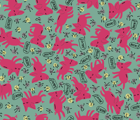
Since it's still right at the beginning of the year, the contest that finished last week was to make something that portrayed a new year's resolution - which had to contain at least some hand-written text. Since "saving money" is one of the most popular resolutions that people make each year, I went in that direction. My husband gave me the idea of having coins marching into piggybanks. Thinking of piggybanks reminded me of this previous pig-based design, which since it has pink tones, plus silver and gold for the coins, seemed to hit the mark perfectly. (I have used these same colors for a few other designs as well).

Galloping Piggybanks! Dancing Coins! Saving Money!

This came in 63 out of 109, with 54 votes. Lots of people did assortments of resolutions, rather than focusing on one. My two favorites were like one - one more graphic, based on tags, and the other very painterly, based on flowers and leaves.

Saturday, January 4, 2014

Hat shaped like an hourglass

We had a break for a week from Spoonflower contests, but now that the holidays are over they've posted the results of the last one and we're back to normal. The goal this time was to create a pattern for a party hat that would fit on a fat quarter. There was a bit of griping about this on the forums - that's not much room, such as for a basic cone party hat, and it'd be very hard to make it a standalone kit due to the need to reinforce the fabric for any structure. And plus it was due right before the holidays (December 17th) - all adding up to there only being 23 entries. I got 101 votes and came in 14th.

I riffed on the basic cone shape of the traditional party hat by doubling it and turning it into an hourglass - thematically appropriate to a New Year's Eve party. The idea is that you flip it over at midnight, so it goes from looking like a nearly-empty to nearly-full hourglass.


I have no idea how well this would actually work when cut out and put together. I have a feeling the whole thing would need to be heavily reinforced with cardstock and/or pipecleaners to stay up at all. I hope to get around to trying it, though!

I used CC-licensed photos for the textures - the glitter is from here and the wood here.

Something I didn't think of, that was a good tactic for this challenge, was to do crown-style headbands. My favorite was the set of dessert crowns.

Saturday, December 21, 2013

Winter themes

The latest two contests I have to write about were to be inspired by "ugly Christmas sweaters" and skiing, respectively. For the ugly sweaters, I was inspired by one of my favorite Christmas movies, "Nightmare Before Christmas," and drew sweaters to fit the silhouettes of most of the main characters. I figured that most people would use a traditional red/green/white color scheme so I tried to differentiate myself by using colors from the movie poster - cream and navy. This was also partly pragmatic, as I knew I'd never be able to finish on time if I tried to draw fully-colored sweaters for each person.

And in my bones I feel the warmth that

The representations are:

  • Jack Skellington: allover bows = maximum festivity
  • Sally: cat with hat, since she seems like a cat person
  • Mayor: candy canes to help him stay on the cheerful side of his face
  • Oogie Boogie: ornaments (showy and shiny, like his lair)
  • Dr Finklestein: reindeer, of course - these are more than skeletons though
  • Lock (devil kid): snowflake (a cold day in hell!)
  • Shock (witch kid): shiny hard candy (sugar and spice and nothing nice)
  • Barrel (skeleton kid): penguin (black and white...?)
  • Wolfman: a big Ho Ho Ho (awoooo!)
  • Behemoth: a tree, in honor of the axe embedded in his head
  • Vampire: a tall glass of milk, to have something more seasonally appropriate to drink

This did pretty well in the contest - 111 votes, and 41st place out of 110. My two favorite entries were the hearts and unicorns, and the take on the nutcracker.

For the skiing contest, we were supposed to do it in a "retro" style, and use these colors:   Spoonflower_Skier
Color by COLOURlovers

Plus white. I knew most people would do designs using white or the light blue as a background, so I stayed away from that. I decided to go as retro as possible and was inspired by some of the earliest rock carvings depicting skiiers, like this guy.

Rock carvings of skiers

The background pattern is based on the sashiko-style design I used in the star designs, and the red-and-yellow in the foreground is my good 'ol eucalyptus. This came in 89 out of 120 with 46 votes. My favorites were the mountains and cocktail ingredients.