Saturday, April 28, 2012

Contest Catchup - Again

Oh yeah, didn't I used to post here? Sheesh, four weeks goes by like nothing! Well, let's see if I can at least squeeze one post into April and get back on track.

Alrighty, starting with the oldest contest: the theme was to create a pattern for a bag that fit on a yard, that had all the directions to allow you to cut it out & sew it together. (Like the previous contests for the baby book, advent calendar, wrestling mask, and Christmas ornament.)  I decided to make something for kids, like a tote for toys.  I looked for free bag patterns online, and found this one that I liked.  Since it was reversible, I thought of maybe doing a more "boy" side and a more "girl" side, and that evolved into doing an Easter side and a Halloween side. You could use the same bag for trick-or-treating and egg hunting.

Reversible Halloween Troll & Easter Bunny Bag

I had higher ambitions for this one, but alas ran out of time.  Plus the large size of this file made GIMP crash, and I ended up losing some progress the very night it was due.  Arg!  So, I would've like to add more detail, and perhaps made the Halloween troll side look not so much like a generic green Satan.  Ah well, another for the "remake someday" pile. Then, what hung me up was that I wanted to sew the bag together before doing this post. Well, I've had the printed fabric awhile, but no chance to sew yet.  Soon!

This came in 42 out of 76, with 152 votes. My favorite entry was the one that came in first place.

Next up, the theme was books. I discussed this one with the husband, since both of us have probably spent more time reading books than not, and the first idea we came up with was to make personifications of books - like a hardback of "The Firm" dressed as a lawyer and whatnot. But again I had time issues and just couldn't make the book people look like I pictured them in my head.  Then one evening near the deadline, I came up with the idea of creating library cards for libraries in fictional cities from books. Since I had made this fabric based on the Cluny library in Sacramento already, I decided to use some of the same colors in this one so they'd go together.

Library Cards of Literary Cities

The cards are for libraries in the Emerald City (Oz), Krondor (from Raymond E. Feist's Riftwar series), Camelot, Newford (from the urban fantasy by Charles de Lint), Metropolis (the Superman version), Fort Weyr (from the Anne McCaffrey Dragonrider books), Rivendell (Tolkien), Atlantis, and a Hogwarts extension in Hogsmeade.

This came in 75 out of 143, with 120 votes. The one I liked the best came in 2nd.

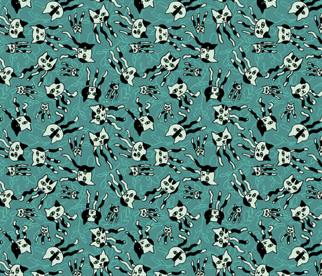
Then, a contest for sewing-themed fabric. The only way it could be more meta is if we made fabric-themed fabric. First I thought of doing a mock sampler in progress, showing how to do various embroidery stitches.  That turned into a thought of making a trompe l'oeil quilted pattern, so the fabric would look puckered and 3D.  Finally I kept it simple and just did a design depicting a running stitch in progress.  First I colored it in just in grayscale, to get an idea of how I'd apply actual colors, but I ended up liking it on its own.  Then, I decided to try it with the two palettes I used for the feather fabrics.  I went back and forth on which one to use, and eventually decided to go with the more muted version rather than the brighter one.

Calm Running Stitch

It came in 13th place with 417 votes! This was out of 111 entries.  That's definitely the best I've ever done in one of these contests.  I'm pretty pleased.  Woohoo!  My favorite was this one, which came in 23rd - I'm stunned I came in ahead of it.  I also really like the one that came in 3rd.

Finally, there was another cut & sew contest - for a hat.  In this one, happily, I came very close to meeting my ambitious goals for the design.  I went the obvious route of a baby hat, but since we had a whole yard to work with I figured I could fit more than one hat.  Also, I wanted to try the technique of making an "extra" part of the design that you get if you buy the larger fabrics - specifically, if you get the knit instead of the basic woven cotton, the yardage is a whopping 14" wider!  So I searched around for patterns until I couldn't squeeze any more in.  I found a reversible bucket hat and a reversible hat with earflaps.  For the "bonus" 14" segment, I went with a little topknot beanie (since that for sure would be in the knit). And in the space leftover I put a bib.  Then, to be extra clever, I arranged the bucket hat pattern so that if you buy just a plain fat quarter, you get one side of the hat - so you can make it as it is, or use another fabric to make it reversible. No idea if anyone will end up buying any of it, but it was a fun challenge nonetheless.

Next, how to color it in? Well, a number of people have actually bought my computer science baby book, so I decided to stick with that theme. I created a few patterns based on the book, and then some more general computery ones - a computer keyboard and a iPhone checkerboard.  I'm going to upload each of those as its own fabric as well.

Computer Science Baby Hats and Bib - with bonus for knit fabric!
(Update - the preview changed at some point to show only the FQ part of the design, so here's a photo of the whole thing printed):
(Update 2 - looks like the preview is working correctly again...)
Cut out & sew pattern fabric for Computer Science-themed baby hats & bibs

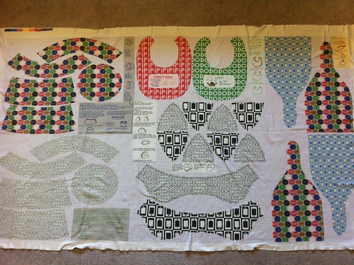
It came in 28 out of 42, with 133 votes. I have the printed version of this sitting next to the bag fabric too - can't wait to try sewing them all together!

Friday, March 30, 2012

Fabric from Photos

The contest this week was a little different. We had to use photos provided by the "Textile Center" in Minnesota as the basis for our designs. I took a little from each photo and put all the motifs together into a stripe:

Urban Sightings Stripes

The judging was actually in two rounds. Folks from the Textile Center narrowed the field from the original 236 entries into their top 45, and then the Spoonflower community got to vote on those to choose the winner as usual. I was pretty pleased to have made it into the initial cut to 45. My design came in 27th out of those. (For some reason they didn't publish the vote counts this week.)

Friday, March 23, 2012

Catching up with contests

I'm behind in posting about the most recent Spoonflower contests! First, the theme was toile - you know, that old-fashioned, elaborately detailed type of pattern featuring shepherds picknicking and what not. An upholstery/wallpaper sort of thing. Plus, it was supposed to be inspired by the towns where we live, with a little explanation of how it related to the town's history in the fabric description. Toile is not really my favorite, so this really felt like a homework assignment. I grappled with some way of making a "history of Goleta" (or even "history of Sacramento" since that's where I grew up) toile, and finally decided to discard the theme. If I could make a toile-type design based on anything I want, what would it be?

The first thing I hit upon was legos - what if I did all the traditional bucolic toile scenarios, but rendered with lego figures & lego greenery and so forth? I had to give that up as being way too much work, but that's something I still want to try at some point. Next I thought, well, I may have spent the most amount of my physical existence in Sacramento and Goleta, but where have I spent my mental existence? For many years, that would be doodling. So I pretended I was in a lecture again and arranged some of the types of things I doodled constantly in school in a toile-ish layout.

Toile of the Land of Doodling

The main thing I would want to change about this is to move it closer together - there's too much blank space between the repeats. But overall I'm pretty satisfied, given that I'm not the hugest fan of toiles anyway. It came in 60 out of 81 with 45 votes.

Next up, the contest was to create a cheater print involving robots. Ah ha! That was easy, given that I created a robot print for a whole cloth quilt for my niece already. So not exaaaaaactly a cheater print but pretty close. So I decided to take the same colors and robots and rearrange them. I wanted to make it look more like a fake pieced design (as cheaters usually are) so I also made several coordinating prints. The overall design came together like so:

Isabel

It came in 116 out of 132 with 40 votes. I will admit to hoping it would do a little better, especially since there were very few other girl-specific designs entered. My favorite entry was this one.

You can see all the coordinating designs here. The darker blue print is "Isabel" in Morse code, and the lighter blue print is postage stamps, in honor of her grandfather (my father) being a philatelist. The pink print is logic gates (AND, OR, and NOT), and the purple print is LEDs!

The last contest, that ended yesterday, was actually only open to Spoonflower staff. They had to make larger projects involving printed fabric. My favorite entries were the hankies and the black & white quilt that formed a QR code of the Spoonflower URL.

Thursday, March 1, 2012

Cycles

This week's contest was supposed to be for bicycles, using only three colors. I decided to run with it a bit and do a design with the lightcycles from Tron. Having done a tangentially Tron-related fabric previously in the form of the Daft Punk cameos, I decided to use the same colors as that design. This is what I came up with:
Light Cycles

I also decided to make a teeny version of the print:

Light Cycles - Small

But the larger repeat is what I entered in the contest. It came in 169 out of 199, with 41 votes.

Wednesday, February 29, 2012

Jellicle Jellyfish

The latest design challenge was for jellyfish, doubling up the salt water theme after last week's sea creatures small print. My first thought was to do something with comb jellies, but I couldn't come up with a compelling way to convey the color - iridescence on black? Hmmm. I figured there would be multiple entries going for the jelly (as in jam) pun, so I skipped that. I pondered what other directions I could go, and remembered the word "Jellicle!" Not being one to skip a chance to work cats into something, here's what I came up with:

Jellicle Jellies

Black and white can be a little harsh and hard to use in fabric, so I went with black and shades of turquoise. I used the angled calligraphy style brush instead of just the standard round computer brush to give it a little more life. I'm really happy with how the repeat came out - it doesn't catch the eye much at all.

I also uploaded the background as its own separate, coordinating design:

Jellicle Seaweed

My entry came in 137 out of 226 with 63 votes. And I was right about the "jelly" fish. My favorite was the one that won.

Sunday, February 19, 2012

Seadragons

The contest this week was for a ditsy print, involving some form of sea creature. My parents were in town visiting when I started working on it, so I asked my mom for suggestions on what her favorite creatures were (minus jellyfish, since they had already announced that next week's design should involve jellyfish!). She threw out a few suggestions and I decided to go with leafy seadragons - those really ornate seahorses with lots of appendages to help them blend with kelp.

For the colors, I browsed around on ColourLovers and found this palette I liked:
Where_did_we_go
Color by COLOURlovers

Here's the design I made:

Leafy Seadragons

I'm pretty happy with the repeat - there's a fairly good variety of orientations and so not too many long lines for the eye to try to follow. There were actually two other entries using seadragons - this one and this one. Mine came in 102 out of 214 with 120 votes. The winning fabric has a really neat use of color to suggest iridescence! My favorite entry was this one, which suggests a coral reef.

Thursday, February 9, 2012

Art Deco

This week's contest was for an Art Deco design that only uses four colors. First, I browsed around on ColourLovers for Art Deco-inspired palettes, and decided to go with this one (minus the black):
One_Year_Abroad
Color by COLOURlovers

As for the design, there is a park a few blocks from the house where I grew up, which has all kinds of neat stuff - a duck pond, a playground, and a community center which has a pool and a library among other things. We used to go there every weekend to check books out of the library. I remember at one point, I think when I was a young teenager, they did some restoration work on some Art Deco molding on the outside of that building. I can't quite remember what it looked like, and I couldn't find a picture of it online, but I could at least find pictures of the front of the building. It has some interesting concrete shades over the windows, so I adapted the shape of that front panel of windows into this design.

Windows in Sacramento

It came in 233 out of 275, with 40 votes.