Friday, March 29, 2019

Feathers

For the "feathers" contest, I made a design of Stellar's Jay feathers. Such a nice color scheme! Such cute mohawks! I used this as the inspiration for the layout.

Stellar

I got a thrill because Spoonflower used this design in their weekly email, in the section linking to the current contest:

I really liked the "pillow fight" entry and the chickens. My design actually did pretty well this week - I made it into the top 100! (79th place in fact)

Saturday, March 23, 2019

Happy Third Day of Spring

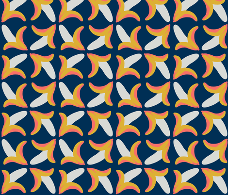
First to catch up, the theme of "affirmations." Well, mine wasn't exactly an affirmation, but a motivational quote that has always stuck with me:

show up and get to work

For the layout, I was inspired by this cuneiform inscription. Mine doesn't have nearly as nice a use of negative space, but I did what I could. I also did a version in yellow with gears in the background but ultimately decided simpler was better for the contest.

show up and get to work

My favorite entry was "today I fly."

For the "Bohemian Paradise" contest (another one of those very loose, "you'll know it when you see it" kind of themes) I tried to make something reminiscent of the folk embroidery such as on this shirt (also inspired by this).

Breezy Boho Embroidery

The entry I thought personally captured the spirit best was this one.

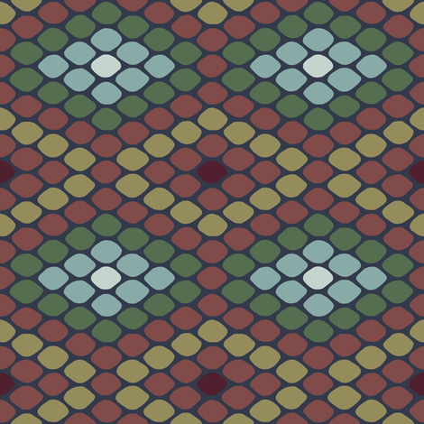
Next up, "moody florals." I did poppies and orchids combined. This is one of those designs where I really liked it as I made it, and then once I uploaded the final design I disliked it instead. Ah well. (The colors are from this cake.)

Poppies and Orchids

My favorite entry was the roses, which for some reason I really want to make into a shirtdress.

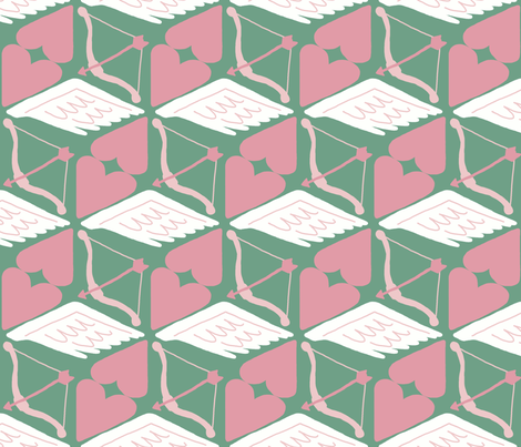
And finally, for the theme of "maximalism" (which most people interpreted as "busy!"), it fell in one of those weeks where I had almost no time so I slapped together something super quick in one of my favorite color schemes:

maximal! maximal! MAXIMAL!

My favorites were the halftone squares and this psychedelic abstract.

Out of all these, the "affirmation" one did the best by far - it actually made it into the top half of entries.

Saturday, February 23, 2019

Pysanky

So for the pysanky contest, my struggle was how to do something different. I knew that most of the entries would be depictions of traditionally-decorated eggs, either scattered, in a grid, or scalloped - or, just the traditional decorations themselves unrolled. What could I do that wouldn't just be an iteration of one of those?

Well, in the same vein as the papercut contest where I depicted the leftovers of doing a papercut, I decided to show the eggs BEFORE they got decorated. I made a lovely little gradient of eggshell colors, inspired by this.

blank canvas

This obviously had no chance of doing particularly well in the contest, but it may work well enough as an interesting - but not TOO interesting - pattern to get some sales. For instance, one of the designs I sell the most of (so perhaps half a dozen per year) is this one based on ye old primary school lined paper. The highly detailed, super-saturated novelty prints do well in contests, but I think they can be tricky to actually use. Most of the overall best sellers are actually quite simple - chevrons, arrows, and crosses, or very limited color usage. It's a little counter-intuitive, as you'd think people would get those kinds of prints more cheaply from regular fabric, rather than paying the premium for print-on-demand.

Sunday, February 17, 2019

Bananas and Bricks

We had another limited palette contest, this time with these colors:


The middle coral color is the 2019 color of the year, hence the theme. I wanted to do something a little silly so I drew bananas - a funny word on its own, plus Bruce is kind of obsessed with the word. (Not the first time I've included bananas because of him). The layout is inspired by this classic pattern.

behold the banana

So of course the "keystone" color is the one I used the least of! My favorite entry was the pencils.

Then, there was kind of a weird theme of "Desert Modernism." What this really meant was that a foundation in Phoenix, Arizona that preserves Mid-Century Modernism specifically, and specifically around Phoenix, was looking for a design to use on throw pillows at an event. Ooookay. I took inspiration from one of the houses they feature on their site, the David Wright house (designed by Frank Lloyd Wright for his son).

decorative bricks under baking sky

My favorites were these two - I do love me an isometric landscape!

Saturday, February 2, 2019

Two different retro styles

For the Moon Landing design (another collaboration with Princess Awesome) I re-used the moon landing design I already made for "the sixties," but with different colors.

Blazing Stars Moon Landing

It actually did a little better this time. My favorite entry was this one.

Then, the theme was rockabilly. I wanted to do a cheater print combining some of the fabrics/motifs the style is known for - stripes, dots, checks, plaids, bandanas, denim, skulls, and cherries. I remembered that I had already done a cheater print of entirely denim before, so I reused that but added some of the other prints in.

Rockabilly Cheater Hexie Quilt

I only had time to do a few of the other prints. It would probably look a little nicer if I worked in some other designs - some burgundy bandana print and some red and black plaid, say. My favorite was the tattoo print.


Friday, January 18, 2019

Animal print

For the animal print contest, I did a pattern very loosely based on snakeskin:

Snake Scales

My favorite entries were the fingerprints and turtle shells.

Thursday, January 10, 2019

Valentine's Day, a month early

This week's contest was the V-day theme. Nothing more specific this year - just "be my valentine." I wanted to do something with cupids. I fell back on one of my favorite patterns - the good ol' cube optical illusion tessellation. (such as this or this or this).

Cube-pid

And so I called it "Cube-pid!" Ha!

My favorites were the Mary Blair-esque animals and the matches.