Saturday, January 4, 2014

Hat shaped like an hourglass

We had a break for a week from Spoonflower contests, but now that the holidays are over they've posted the results of the last one and we're back to normal. The goal this time was to create a pattern for a party hat that would fit on a fat quarter. There was a bit of griping about this on the forums - that's not much room, such as for a basic cone party hat, and it'd be very hard to make it a standalone kit due to the need to reinforce the fabric for any structure. And plus it was due right before the holidays (December 17th) - all adding up to there only being 23 entries. I got 101 votes and came in 14th.

I riffed on the basic cone shape of the traditional party hat by doubling it and turning it into an hourglass - thematically appropriate to a New Year's Eve party. The idea is that you flip it over at midnight, so it goes from looking like a nearly-empty to nearly-full hourglass.


I have no idea how well this would actually work when cut out and put together. I have a feeling the whole thing would need to be heavily reinforced with cardstock and/or pipecleaners to stay up at all. I hope to get around to trying it, though!

I used CC-licensed photos for the textures - the glitter is from here and the wood here.

Something I didn't think of, that was a good tactic for this challenge, was to do crown-style headbands. My favorite was the set of dessert crowns.

Saturday, December 21, 2013

Winter themes

The latest two contests I have to write about were to be inspired by "ugly Christmas sweaters" and skiing, respectively. For the ugly sweaters, I was inspired by one of my favorite Christmas movies, "Nightmare Before Christmas," and drew sweaters to fit the silhouettes of most of the main characters. I figured that most people would use a traditional red/green/white color scheme so I tried to differentiate myself by using colors from the movie poster - cream and navy. This was also partly pragmatic, as I knew I'd never be able to finish on time if I tried to draw fully-colored sweaters for each person.

And in my bones I feel the warmth that

The representations are:

  • Jack Skellington: allover bows = maximum festivity
  • Sally: cat with hat, since she seems like a cat person
  • Mayor: candy canes to help him stay on the cheerful side of his face
  • Oogie Boogie: ornaments (showy and shiny, like his lair)
  • Dr Finklestein: reindeer, of course - these are more than skeletons though
  • Lock (devil kid): snowflake (a cold day in hell!)
  • Shock (witch kid): shiny hard candy (sugar and spice and nothing nice)
  • Barrel (skeleton kid): penguin (black and white...?)
  • Wolfman: a big Ho Ho Ho (awoooo!)
  • Behemoth: a tree, in honor of the axe embedded in his head
  • Vampire: a tall glass of milk, to have something more seasonally appropriate to drink

This did pretty well in the contest - 111 votes, and 41st place out of 110. My two favorite entries were the hearts and unicorns, and the take on the nutcracker.

For the skiing contest, we were supposed to do it in a "retro" style, and use these colors:   Spoonflower_Skier
Color by COLOURlovers

Plus white. I knew most people would do designs using white or the light blue as a background, so I stayed away from that. I decided to go as retro as possible and was inspired by some of the earliest rock carvings depicting skiiers, like this guy.

Rock carvings of skiers

The background pattern is based on the sashiko-style design I used in the star designs, and the red-and-yellow in the foreground is my good 'ol eucalyptus. This came in 89 out of 120 with 46 votes. My favorites were the mountains and cocktail ingredients.

Saturday, December 7, 2013

Mid-Holiday catchup

Here's what I've been up to for Spoonflower designs!

I made a bonsai-inspired entry for the "fall leaves" contest. I'm pretty happy with how it came out, but it did not resonate with the community and got only five votes (and came in second from last). That stung a bit!

Bonsai Maples in Autumn

I think that perhaps the trees are too close together and so just get read as blobs. Maybe a less dense arrangement, and in a one-way-up orientation, would work better for this. My favorite entry was this exuberant nature assortment, followed by the tessellated oak leaves.

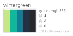
I used a couple of patterns I had on hand - the background is from the isometric graph paper and the leaves use the lattice pattern I've used in a few places before. And speaking of that graph paper set, somebody bought the scantron design on a roll of giftwrap! I bet that's for a present for a teacher. (Someone else also got the snow angel kids as giftwrap - I bet those will be some cute presents.)

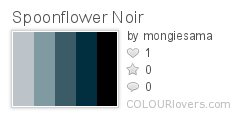
And speaking of giftwrap, the next contest was to make a small-scale print, with a mitten theme, to be used as giftwrap. I thought of the way my son adds extra consonants to words - pitcher is "pist-stir," button is "bun-ton" - and mitten became "mint-en." So I drew mint leaves in the shapes of mittens.

mint-ens

I used these colors:
wintergreen
Color by COLOURlovers

I'm very satisfied with how this came out. I ordered a roll of it on giftwrap to use for the presents I'm giving this year! It got 31 votes and came in the bottom quarter of the contest. My favorite entries, any of which I would happily use as giftwrap, were these: one, two, three, four.

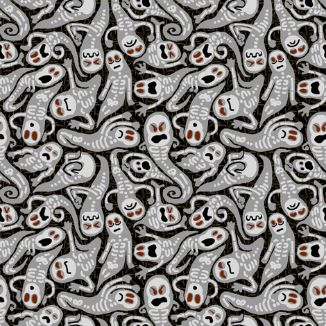
And most recently, the contest was for a design that fit on a yard of fabric that you could hang up as a festive decoration (in lieu of an actual Christmas tree, perhaps). My husband suggested a tree grown into the shape of a menorah, with Christmas-tree-type lights as the candle flames. I didn't have time to do a fully rendered take on that idea, but I at least suggested it in a minimal way.

Golden Vine Menorah Hanging

The idea here is that you hang up the bottom portion, and cut out the individual lights and put them up in the usual Hanukkah way. The background dots are the same as I used for (again) the graph paper and the firefly molecules. The branch/vine texture in the menorah is based on the howling spirits/haunted ghosts pattern, just with all the features filled in and the bodies joined together.  It came in the bottom third, with 51 votes. So the design I threw together in about two hours at the last minute, got more votes than the previous two - which I had put quite a bit of work into - combined! Isn't that the way.

The best straight-up traditional all-out Christmas tree entry was this Victorian one. I also really liked this stylized geometric one. The ones I liked that had more of a twist were the pressed flowers, New Zealand Christmas, Japanese crest, and Indian block print. And the best one that had an interactive element like mine was this "Twelve Days of Christmas" tree.

Thursday, November 14, 2013

Profiles in noir

This week's theme was a little darker than normal - "film noir." Plus we had to use these colors (plus white):

Spoonflower_Noir
Color by COLOURlovers

I haven't seen much film noir - in fact, my main exposure to the genre has really been through the Guy Noir spoofs on Prairie Home Companion. So I started as I so often do by reading the Wikipedia entry on film noir, and was intrigued to be reminded that Blade Runner is considered to be in the genre.

From there, I was inspired by the Voigt-Kampff test questions. I was going to have a sequence of heads in silhouette, with an image or icon related to the questions inside each head. It started looking sillier than I wanted though, so I went with just the heads.

Who is hiding the secret?

This came in 73 out of 213, with 74 votes. To me, the entry that best literally represented film noir was this one (which indeed won). And the one that best conveyed a more general vibe of menace was this dahlia/razor combination. My favorite entry that had the flavor but could still be used for something more light-hearted was this assortment of keys. And the best pun was the hard-boiled eggs.

Friday, November 8, 2013

The annual tea towel contest

It's that time of year again - when Spoonflower does a design contest for a tea towel with the upcoming year's calendar. I updated my 2012 pie calendar for 2014, but didn't bother for my lackluster produce entry for 2013, though I do intend to rework that at some point.

This year I debated a couple more elaborate ideas, but finally decided to do something fairly straightforward - stylized moons, with the full moons marked. The background image is a smaller version of my constellations design, and the calendar text itself is simply copied from the pie calendar.

Also, people who buy these and actually intend to use them as tea towels prefer to get them on the cotton-linen canvas, which is wider than the basic cotton by a full foot. Usually the contests are always for the regular fat quarter size (18" by 21") but this year they set it to the cotton-lined size (18" by 27") so that we could make designs that took up the full space (without having them cut off from the contest view). Some of us still opted to make the main design fit in the conventional fat quarter area so that someone could still buy just that. I turned my extra six inches into bookmarks!

2014 Full Moon Tea Towel Calendar - with bonus bookmarks

This came in 178 out of 195 with only 20 votes, though I did get one message from somebody saying they want to buy it. Tons of great entries this time! I would have an enormous stack of towels if I bought all the ones I love. I wasn't the only person to focus on the cycles of the moon. There are always a few that emphasize the changing seasons. For less common motifs, I liked the LA cityscape and the string instruments. For cutesy, I loved the kawaii icons, the fairytale mushroom cottage, and the graphic sea creatures. Some animal-themed entries at the top of my list were the songbirds and the cats. And for plant-based designs, I liked the preserved apples and the colorful modern floral, and my favorite overall was composed of pressed flowers.

Thursday, October 31, 2013

All Hallow's Eve

This week's theme, in honor of Halloween, was Ghosts. I decided right away that I would use the "wailing souls" pattern I made for the Cthulhu pillow as the base of the design. And to freshen it up for this contest, I reworked it with more detail, using the "haunted" colors from the Synergy group.

Haunts, Ghasts, and Poltergeists

It was fun drawing little skeletons into the wiggly shapes I had already made. I'm pretty pleased with how it came out. It came in 66 out of 276, with 103 votes. My favorite was this paisley interpretation. I also really liked the bats and these toothy ghosts swooping among trees.

Thursday, October 24, 2013

What is your quest? To find candy!

This week's contest, ahead of Halloween, was to create a kit for a costume that fits on a yard of fabric. It took me a long time to come up with a compelling idea - what possible costume could I come up with that isn't already available commercially? And if someone is crafty enough to want to sew together a costume, why would they buy one of these on Spoonflower, why wouldn't they just sew one from a pattern?

Having a toddler, I definitely wanted to make a toddler-sized costume. I ran through some of the classic costume ideas of yore - vampire, ghost, cowboy, knight. That last one led me to the idea of heraldry on a shield, and that occurred to me as a fun way of personalization. I could provide the pieces for a plain shield and tabard, and a bunch of different symbols to cut out and put on the shield.

Knight tabard and shield for toddler boy/girl, customizable heraldry, no sewing!

There are a couple of other interesting touches I hoped would add appeal. The tabard is mainly yellow, to be as high visibility as possible. Also, I included pieces to make a neck facing for the tabard, but you can actually make the whole thing without any sewing at all - just cut everything out with pinking shears! And finally, I put all the symbols in the lower left, so if anyone just wants to play with those and not the whole costume, they can get them on a fat quarter (or most of them on the 15" square decal). So I'm quite pleased with how it all came together.

This came in 23 out of 47, with 200 votes - a moderate placement, but within the top ten of most votes of any of my entries. My favorite other costumes were the raven hood and matryoshka doll. I also really liked the feather cape/mask that won.