The judging was actually in two rounds. Folks from the Textile Center narrowed the field from the original 236 entries into their top 45, and then the Spoonflower community got to vote on those to choose the winner as usual. I was pretty pleased to have made it into the initial cut to 45. My design came in 27th out of those. (For some reason they didn't publish the vote counts this week.)
Friday, March 30, 2012
Fabric from Photos
The contest this week was a little different. We had to use photos provided by the "Textile Center" in Minnesota as the basis for our designs. I took a little from each photo and put all the motifs together into a stripe:

The judging was actually in two rounds. Folks from the Textile Center narrowed the field from the original 236 entries into their top 45, and then the Spoonflower community got to vote on those to choose the winner as usual. I was pretty pleased to have made it into the initial cut to 45. My design came in 27th out of those. (For some reason they didn't publish the vote counts this week.)
Friday, March 23, 2012
Catching up with contests
I'm behind in posting about the most recent Spoonflower contests! First, the theme was toile - you know, that old-fashioned, elaborately detailed type of pattern featuring shepherds picknicking and what not. An upholstery/wallpaper sort of thing. Plus, it was supposed to be inspired by the towns where we live, with a little explanation of how it related to the town's history in the fabric description. Toile is not really my favorite, so this really felt like a homework assignment. I grappled with some way of making a "history of Goleta" (or even "history of Sacramento" since that's where I grew up) toile, and finally decided to discard the theme. If I could make a toile-type design based on anything I want, what would it be?
The first thing I hit upon was legos - what if I did all the traditional bucolic toile scenarios, but rendered with lego figures & lego greenery and so forth? I had to give that up as being way too much work, but that's something I still want to try at some point. Next I thought, well, I may have spent the most amount of my physical existence in Sacramento and Goleta, but where have I spent my mental existence? For many years, that would be doodling. So I pretended I was in a lecture again and arranged some of the types of things I doodled constantly in school in a toile-ish layout.

The main thing I would want to change about this is to move it closer together - there's too much blank space between the repeats. But overall I'm pretty satisfied, given that I'm not the hugest fan of toiles anyway. It came in 60 out of 81 with 45 votes.
Next up, the contest was to create a cheater print involving robots. Ah ha! That was easy, given that I created a robot print for a whole cloth quilt for my niece already. So not exaaaaaactly a cheater print but pretty close. So I decided to take the same colors and robots and rearrange them. I wanted to make it look more like a fake pieced design (as cheaters usually are) so I also made several coordinating prints. The overall design came together like so:

It came in 116 out of 132 with 40 votes. I will admit to hoping it would do a little better, especially since there were very few other girl-specific designs entered. My favorite entry was this one.
You can see all the coordinating designs here. The darker blue print is "Isabel" in Morse code, and the lighter blue print is postage stamps, in honor of her grandfather (my father) being a philatelist. The pink print is logic gates (AND, OR, and NOT), and the purple print is LEDs!
The last contest, that ended yesterday, was actually only open to Spoonflower staff. They had to make larger projects involving printed fabric. My favorite entries were the hankies and the black & white quilt that formed a QR code of the Spoonflower URL.
The first thing I hit upon was legos - what if I did all the traditional bucolic toile scenarios, but rendered with lego figures & lego greenery and so forth? I had to give that up as being way too much work, but that's something I still want to try at some point. Next I thought, well, I may have spent the most amount of my physical existence in Sacramento and Goleta, but where have I spent my mental existence? For many years, that would be doodling. So I pretended I was in a lecture again and arranged some of the types of things I doodled constantly in school in a toile-ish layout.
The main thing I would want to change about this is to move it closer together - there's too much blank space between the repeats. But overall I'm pretty satisfied, given that I'm not the hugest fan of toiles anyway. It came in 60 out of 81 with 45 votes.
Next up, the contest was to create a cheater print involving robots. Ah ha! That was easy, given that I created a robot print for a whole cloth quilt for my niece already. So not exaaaaaactly a cheater print but pretty close. So I decided to take the same colors and robots and rearrange them. I wanted to make it look more like a fake pieced design (as cheaters usually are) so I also made several coordinating prints. The overall design came together like so:
It came in 116 out of 132 with 40 votes. I will admit to hoping it would do a little better, especially since there were very few other girl-specific designs entered. My favorite entry was this one.
You can see all the coordinating designs here. The darker blue print is "Isabel" in Morse code, and the lighter blue print is postage stamps, in honor of her grandfather (my father) being a philatelist. The pink print is logic gates (AND, OR, and NOT), and the purple print is LEDs!
The last contest, that ended yesterday, was actually only open to Spoonflower staff. They had to make larger projects involving printed fabric. My favorite entries were the hankies and the black & white quilt that formed a QR code of the Spoonflower URL.
Thursday, March 1, 2012
Cycles
This week's contest was supposed to be for bicycles, using only three colors. I decided to run with it a bit and do a design with the lightcycles from Tron. Having done a tangentially Tron-related fabric previously in the form of the Daft Punk cameos, I decided to use the same colors as that design. This is what I came up with:

I also decided to make a teeny version of the print:

But the larger repeat is what I entered in the contest. It came in 169 out of 199, with 41 votes.
I also decided to make a teeny version of the print:
But the larger repeat is what I entered in the contest. It came in 169 out of 199, with 41 votes.
Wednesday, February 29, 2012
Jellicle Jellyfish
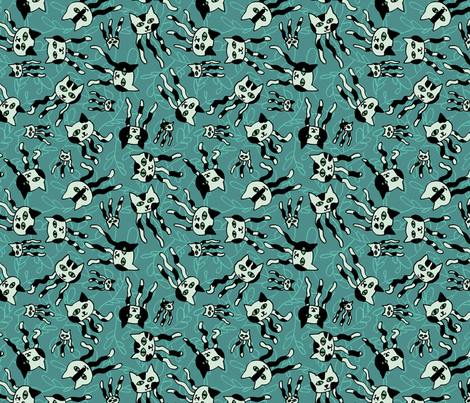
The latest design challenge was for jellyfish, doubling up the salt water theme after last week's sea creatures small print. My first thought was to do something with comb jellies, but I couldn't come up with a compelling way to convey the color - iridescence on black? Hmmm. I figured there would be multiple entries going for the jelly (as in jam) pun, so I skipped that. I pondered what other directions I could go, and remembered the word "Jellicle!" Not being one to skip a chance to work cats into something, here's what I came up with:

Black and white can be a little harsh and hard to use in fabric, so I went with black and shades of turquoise. I used the angled calligraphy style brush instead of just the standard round computer brush to give it a little more life. I'm really happy with how the repeat came out - it doesn't catch the eye much at all.
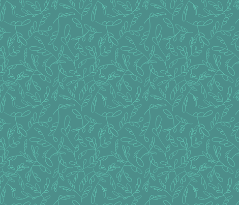
I also uploaded the background as its own separate, coordinating design:

My entry came in 137 out of 226 with 63 votes. And I was right about the "jelly" fish. My favorite was the one that won.
Black and white can be a little harsh and hard to use in fabric, so I went with black and shades of turquoise. I used the angled calligraphy style brush instead of just the standard round computer brush to give it a little more life. I'm really happy with how the repeat came out - it doesn't catch the eye much at all.
I also uploaded the background as its own separate, coordinating design:
My entry came in 137 out of 226 with 63 votes. And I was right about the "jelly" fish. My favorite was the one that won.
Sunday, February 19, 2012
Seadragons
The contest this week was for a ditsy print, involving some form of sea creature. My parents were in town visiting when I started working on it, so I asked my mom for suggestions on what her favorite creatures were (minus jellyfish, since they had already announced that next week's design should involve jellyfish!). She threw out a few suggestions and I decided to go with leafy seadragons - those really ornate seahorses with lots of appendages to help them blend with kelp.
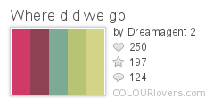
For the colors, I browsed around on ColourLovers and found this palette I liked:

Color by COLOURlovers
Here's the design I made:

I'm pretty happy with the repeat - there's a fairly good variety of orientations and so not too many long lines for the eye to try to follow. There were actually two other entries using seadragons - this one and this one. Mine came in 102 out of 214 with 120 votes. The winning fabric has a really neat use of color to suggest iridescence! My favorite entry was this one, which suggests a coral reef.
For the colors, I browsed around on ColourLovers and found this palette I liked:

Color by COLOURlovers
Here's the design I made:
I'm pretty happy with the repeat - there's a fairly good variety of orientations and so not too many long lines for the eye to try to follow. There were actually two other entries using seadragons - this one and this one. Mine came in 102 out of 214 with 120 votes. The winning fabric has a really neat use of color to suggest iridescence! My favorite entry was this one, which suggests a coral reef.
Thursday, February 9, 2012
Art Deco
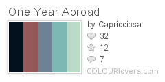
This week's contest was for an Art Deco design that only uses four colors. First, I browsed around on ColourLovers for Art Deco-inspired palettes, and decided to go with this one (minus the black):

Color by COLOURlovers
As for the design, there is a park a few blocks from the house where I grew up, which has all kinds of neat stuff - a duck pond, a playground, and a community center which has a pool and a library among other things. We used to go there every weekend to check books out of the library. I remember at one point, I think when I was a young teenager, they did some restoration work on some Art Deco molding on the outside of that building. I can't quite remember what it looked like, and I couldn't find a picture of it online, but I could at least find pictures of the front of the building. It has some interesting concrete shades over the windows, so I adapted the shape of that front panel of windows into this design.

It came in 233 out of 275, with 40 votes.

Color by COLOURlovers
As for the design, there is a park a few blocks from the house where I grew up, which has all kinds of neat stuff - a duck pond, a playground, and a community center which has a pool and a library among other things. We used to go there every weekend to check books out of the library. I remember at one point, I think when I was a young teenager, they did some restoration work on some Art Deco molding on the outside of that building. I can't quite remember what it looked like, and I couldn't find a picture of it online, but I could at least find pictures of the front of the building. It has some interesting concrete shades over the windows, so I adapted the shape of that front panel of windows into this design.
It came in 233 out of 275, with 40 votes.
Sunday, February 5, 2012
Street Art
This week's contest was for a design that had to do with graffiti or "street art." I'm usually more inspired by somewhat punny twists, so I decided to take "street art" in a different direction. First, I came up with the thought of creating a street map, where all the little roads and markers and things came together to form a recognizable work of art, like the scene on the Sistine Chapel ceiling where Yahweh is pointing the spark of life at Adam. I had some slight misgivings about doing yet another overhead landscape design (just like my last two entries). I started off looking at said fresco, and started planning out in my mind how I would transform the outlines into a map. The next step would have to be sketching out a simplified version of the forms.
As I pictured in my head how I would draw semi-stick figures, a different inspiration came to me in a flash! I could create that image, as well as a bunch of other well-known paintings, in the style of traffic signs! Ah ha! I hit all the mainstays - see if you can name them all!

A note about scale. I like to work small, but since most of the contests are for designs on a fat quarter (18" x 21"), shown at the size above, small prints don't come off so well. But something I noticed other Spoonflower designers have done is to post the same design at different scales. So I decided to give that a try. I put the size above in the contest, and then reduced it to the size below, which is the actual scale I would like were I to use this in a quilt or something.

There a few tricks like that I've seen other designers use - like I had contemplated for my too-small Hanukkah calendar, if there are contests for specific-sized designs (rather than straight repeats), some will create designs one size larger that have bonus elements. For instance, if you "up-size" from buying a 8"-by-8" swatch with a single ornament pattern on it, and get a fat quarter, then you actually get several different ornaments. Or, if you get a fat quarter sized calendar on the more expensive fabric (which is wider), then you get a couple of coasters next to the calendar. These upgrades, completely non-coincidentally, provide more money to the designer! An even more time-consuming way to nudge people to buy more of your designs is to make the contest entries part of a coordinating collection of at least three or four different designs. I definitely don't have the time to create that many every week, but it's still an interesting idea to keep in mind.
Back to the design at hand - here are all the paintings I included:
I'm pretty happy with how it came out. If I were to keep working on it, I would rotate around the individual paintings to various angles so that it could be used as a multi-directional tossed print. I have a tendency to treat my designs as regular drawings so they end up with a very obvious right side up. I tried to overcome this in things like the candy design, but then I realized I had still put the shiny reflections on the same sides of all the candies. I might also have tried to unify the palette across all the paintings a bit more. It's a funny and striking design, IMO, but it's really not very pretty. I mean, I can't imagine someone actually using this in a quilt or for a pillowcase or something. Maybe a dress for Ms. Frizzle! It came in 84 out of 158, with 62 votes.
As I pictured in my head how I would draw semi-stick figures, a different inspiration came to me in a flash! I could create that image, as well as a bunch of other well-known paintings, in the style of traffic signs! Ah ha! I hit all the mainstays - see if you can name them all!
A note about scale. I like to work small, but since most of the contests are for designs on a fat quarter (18" x 21"), shown at the size above, small prints don't come off so well. But something I noticed other Spoonflower designers have done is to post the same design at different scales. So I decided to give that a try. I put the size above in the contest, and then reduced it to the size below, which is the actual scale I would like were I to use this in a quilt or something.
There a few tricks like that I've seen other designers use - like I had contemplated for my too-small Hanukkah calendar, if there are contests for specific-sized designs (rather than straight repeats), some will create designs one size larger that have bonus elements. For instance, if you "up-size" from buying a 8"-by-8" swatch with a single ornament pattern on it, and get a fat quarter, then you actually get several different ornaments. Or, if you get a fat quarter sized calendar on the more expensive fabric (which is wider), then you get a couple of coasters next to the calendar. These upgrades, completely non-coincidentally, provide more money to the designer! An even more time-consuming way to nudge people to buy more of your designs is to make the contest entries part of a coordinating collection of at least three or four different designs. I definitely don't have the time to create that many every week, but it's still an interesting idea to keep in mind.
Back to the design at hand - here are all the paintings I included:
- Composition II in Red, Blue, and Yellow by Piet Mondrian
- The Great Wave Off Kanagawa by Katsushika Hokusai
- Orange and Yellow by Mark Rothko
- The Mona Lisa by Leonardo da Vinci
- The Kiss by Gustav Klimt
- The Persistence of Memory by Salvador Dali
- The Scream by Edvard Munch
- Water-Lily Pond by Claude Monet
- The Creation of Adam by Michelangelo
- The Son of Man by Rene Magritte
- Starry Night by Vincent van Gogh
- The Birth of Venus by Sandro Botticelli
- Girl with a Pearl Earring by Johannes Vermeer
I'm pretty happy with how it came out. If I were to keep working on it, I would rotate around the individual paintings to various angles so that it could be used as a multi-directional tossed print. I have a tendency to treat my designs as regular drawings so they end up with a very obvious right side up. I tried to overcome this in things like the candy design, but then I realized I had still put the shiny reflections on the same sides of all the candies. I might also have tried to unify the palette across all the paintings a bit more. It's a funny and striking design, IMO, but it's really not very pretty. I mean, I can't imagine someone actually using this in a quilt or for a pillowcase or something. Maybe a dress for Ms. Frizzle! It came in 84 out of 158, with 62 votes.
Subscribe to:
Posts (Atom)