Saturday, February 23, 2019

Pysanky

So for the pysanky contest, my struggle was how to do something different. I knew that most of the entries would be depictions of traditionally-decorated eggs, either scattered, in a grid, or scalloped - or, just the traditional decorations themselves unrolled. What could I do that wouldn't just be an iteration of one of those?

Well, in the same vein as the papercut contest where I depicted the leftovers of doing a papercut, I decided to show the eggs BEFORE they got decorated. I made a lovely little gradient of eggshell colors, inspired by this.

blank canvas

This obviously had no chance of doing particularly well in the contest, but it may work well enough as an interesting - but not TOO interesting - pattern to get some sales. For instance, one of the designs I sell the most of (so perhaps half a dozen per year) is this one based on ye old primary school lined paper. The highly detailed, super-saturated novelty prints do well in contests, but I think they can be tricky to actually use. Most of the overall best sellers are actually quite simple - chevrons, arrows, and crosses, or very limited color usage. It's a little counter-intuitive, as you'd think people would get those kinds of prints more cheaply from regular fabric, rather than paying the premium for print-on-demand.
Sunday, February 17, 2019

Bananas and Bricks

We had another limited palette contest, this time with these colors:


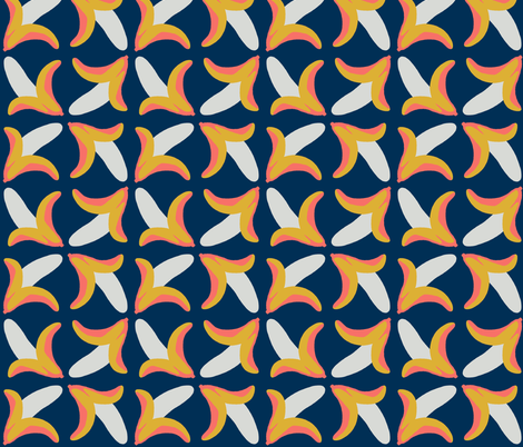
The middle coral color is the 2019 color of the year, hence the theme. I wanted to do something a little silly so I drew bananas - a funny word on its own, plus Bruce is kind of obsessed with the word. (Not the first time I've included bananas because of him). The layout is inspired by this classic pattern.

behold the banana

So of course the "keystone" color is the one I used the least of! My favorite entry was the pencils.

Then, there was kind of a weird theme of "Desert Modernism." What this really meant was that a foundation in Phoenix, Arizona that preserves Mid-Century Modernism specifically, and specifically around Phoenix, was looking for a design to use on throw pillows at an event. Ooookay. I took inspiration from one of the houses they feature on their site, the David Wright house (designed by Frank Lloyd Wright for his son).

decorative bricks under baking sky

My favorites were these two - I do love me an isometric landscape!

Saturday, February 2, 2019

Two different retro styles

For the Moon Landing design (another collaboration with Princess Awesome) I re-used the moon landing design I already made for "the sixties," but with different colors.

Blazing Stars Moon Landing

It actually did a little better this time. My favorite entry was this one.

Then, the theme was rockabilly. I wanted to do a cheater print combining some of the fabrics/motifs the style is known for - stripes, dots, checks, plaids, bandanas, denim, skulls, and cherries. I remembered that I had already done a cheater print of entirely denim before, so I reused that but added some of the other prints in.

Rockabilly Cheater Hexie Quilt

I only had time to do a few of the other prints. It would probably look a little nicer if I worked in some other designs - some burgundy bandana print and some red and black plaid, say. My favorite was the tattoo print.