To that end, they actually showed all the entries on tablecloth mockups - similarly to the large-scale Art Deco contest that was shown on bedspreads. I'm sure that generating cross-traffic to Roostery is part of the goal here. So, I'll be interested to see how the whole party plan aspect works out. (I would guess they will use the winning print in a limited manner - like as napkins or placemats - rather than full-out as the tablecloth)
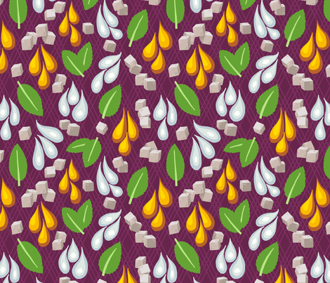
I took the mint julep as my inspiration, and broke it down to its four raw ingredients - bourbon, water, sugar, and mint. The background stripe is actually from one of my rejected Art Deco designs. I tried to go for a chintz-like style for that extra dash of Southern-ness.

It did not do well (bottom third). The entry that, in my mind, most fit in with Black Twine's "look" was this white and navy take on jockey silks, though I was also very fond of this more colorful and larger-scale design.
No comments:
Post a Comment