Here's what I've been up to for Spoonflower designs!
I made a bonsai-inspired entry for the "fall leaves" contest. I'm pretty happy with how it came out, but it did not resonate with the community and got only five votes (and came in second from last). That stung a bit!

I think that perhaps the trees are too close together and so just get read as blobs. Maybe a less dense arrangement, and in a one-way-up orientation, would work better for this. My favorite entry was this
exuberant nature assortment, followed by the t
essellated oak leaves.
I used a couple of patterns I had on hand - the background is from the
isometric graph paper and the leaves use the lattice pattern I've used in
a few places before. And speaking of that graph paper set, somebody bought the
scantron design on a roll of giftwrap! I bet that's for a present for a teacher. (Someone else also got the
snow angel kids as giftwrap - I bet those will be some cute presents.)
And speaking of giftwrap, the next contest was to make a small-scale print, with a mitten theme, to be used as giftwrap. I thought of the way my son adds extra consonants to words - pitcher is "pist-stir," button is "bun-ton" - and mitten became "mint-en." So I drew mint leaves in the shapes of mittens.

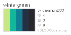
I used these colors:
 Color by COLOURlovers
I'm very satisfied with how this came out. I ordered a roll of it on giftwrap to use for the presents I'm giving this year! It got 31 votes and came in the bottom quarter of the contest. My favorite entries, any of which I would happily use as giftwrap, were these:
one,
two,
three,
four.
And most recently, the contest was for a design that fit on a yard of fabric that you could hang up as a festive decoration (in lieu of an actual Christmas tree, perhaps). My husband suggested a tree grown into the shape of a menorah, with Christmas-tree-type lights as the candle flames. I didn't have time to do a fully rendered take on that idea, but I at least suggested it in a minimal way.

The idea here is that you hang up the bottom portion, and cut out the individual lights and put them up in the usual Hanukkah way. The background dots are the same as I used for (again) the graph paper and the
firefly molecules. The branch/vine texture in the menorah is based on the
howling spirits/
haunted ghosts pattern, just with all the features filled in and the bodies joined together. It came in the bottom third, with 51 votes. So the design I threw together in about two hours at the last minute, got more votes than the previous two - which I had put quite a bit of work into - combined! Isn't that the way.
The best straight-up traditional all-out Christmas tree entry was this
Victorian one. I also really liked this
stylized geometric one. The ones I liked that had more of a twist were the
pressed flowers,
New Zealand Christmas, Japanese crest, and
Indian block print. And the best one that had an interactive element like mine was this
"Twelve Days of Christmas" tree.


