This week's contest was for a design that had to do with graffiti or "street art." I'm usually more inspired by somewhat punny twists, so I decided to take "street art" in a different direction. First, I came up with the thought of creating a street map, where all the little roads and markers and things came together to form a recognizable work of art, like the scene on the Sistine Chapel ceiling where Yahweh is pointing the spark of life at Adam. I had some slight misgivings about doing yet another overhead landscape design (just like
my last two entries). I started off looking at said fresco, and started planning out in my mind how I would transform the outlines into a map. The next step would have to be sketching out a simplified version of the forms.
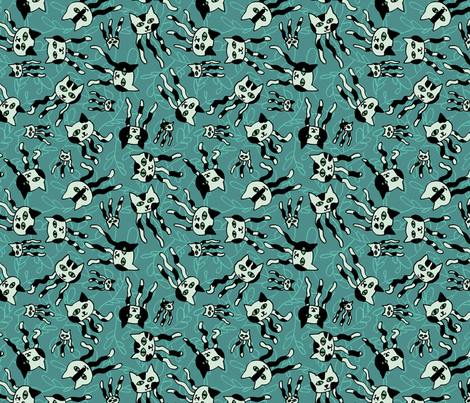
As I pictured in my head how I would draw semi-stick figures, a different inspiration came to me in a flash! I could create that image, as well as a bunch of other well-known paintings, in the style of traffic signs! Ah ha! I hit all the mainstays - see if you can name them all!

A note about scale. I like to work small, but since most of the contests are for designs on a fat quarter (18" x 21"), shown at the size above, small prints don't come off so well. But something I noticed other Spoonflower designers have done is to post the same design at different scales. So I decided to give that a try. I put the size above in the contest, and then reduced it to the size below, which is the actual scale I would like were I to use this in a quilt or something.

There a few tricks like that I've seen other designers use - like I had contemplated for my too-small
Hanukkah calendar, if there are contests for specific-sized designs (rather than straight repeats), some will create designs one size larger that have bonus elements. For instance, if you "up-size" from buying a 8"-by-8" swatch with a
single ornament pattern on it, and get a fat quarter, then you actually get several different ornaments. Or, if you get a
fat quarter sized calendar on the more expensive fabric (which is wider), then you get a couple of coasters next to the calendar. These upgrades, completely non-coincidentally, provide more money to the designer! An even more time-consuming way to nudge people to buy more of your designs is to make the contest entries part of a coordinating collection of at least three or four different designs. I definitely don't have the time to create that many every week, but it's still an interesting idea to keep in mind.
Back to the design at hand - here are all the paintings I included:
The background is supposed to be reminiscent of the perforated square metal poles some traffic signs are mounted on.
I'm pretty happy with how it came out. If I were to keep working on it, I would rotate around the individual paintings to various angles so that it could be used as a multi-directional tossed print. I have a tendency to treat my designs as regular drawings so they end up with a very obvious right side up. I tried to overcome this in things like the
candy design, but then I realized I had still put the shiny reflections on the same sides of all the candies. I might also have tried to unify the palette across all the paintings a bit more. It's a funny and striking design, IMO, but it's really not very pretty. I mean, I can't imagine someone actually using this in a quilt or for a pillowcase or something. Maybe a dress for Ms. Frizzle! It came in
84 out of 158, with 62 votes.