Friday, March 18, 2016

A different contest format

Spoonflower has ended the weekly design challenges and will be doing them monthly instead. For March, the format is quite strange: the first fifteen days of the month, we get a daily prompt (the "Daily Spoonchallenge"), for which we can create a full-fledged design, or a sketch, or whatever. Then, on the 16th, they'll pick one of those prompts to become the actual contest theme - and entries are due on the 18th. So, not very friendly to those of us who have limited time to work on designs!

I did my best to keep up with the prompts. Here are the designs I came up with:
  • Day 1: Pencil Drawing
I went with the simplest thing I could think of I use a pencil for (though I used Sketchbook Pro to digitally replicate the look of pencil): writing the alphabet.
Pencil Alphabet
  • Day 2: Watercolor
Thinking that these themes are all going to be mediums rather than subject matter, I figured I'll stick with the theme I started: typography. I messed around in Sketchbook Pro to find the brush that most resembled water color and drew a couple different symbols. I decided I liked the "@" the best and applied a watercolor texture.
watercolor strudel symbols
  • Day 3: Abstract
I went the literal route here and adapted the Chinese symbols for "abstract" into an abstract design.
abstract - citrus
  • Day 4: Block Prints
Once again, I faked the look of the prompt format on my computer. Having done "@", I figured I'd do the darling of the typographical world: the ampersand. For colors, I looked for "trendy palettes" and decided to use this one.
linocut ampersands - ochre on slate
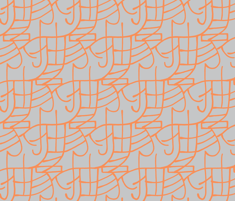
  • Day 5: Pen and Ink
I have terrible handwriting and am no kind of calligrapher. So I didn't want to continue using lettering, exactly, so I thought of other things to draw that are still kind of writing. Maritime flags! (Which I have used before) But what should I spell out? Just drawing each flag in the alphabet is a little boring. I looked at pangrams and chose to spell "Glib jocks quiz nymph to vex dwarf".
pen and ink maritime pangram
  • Day 6: Geometric
Some type elements are very geometric - like the plus sign! Scattered plus signs are actually pretty trendy, as are chevrons, so I combined them. Plus I used one of the "trendy palettes" used by one of the design groups. So this resulted in a kind of Frankenstein's monster of trendiness.
Plus Chevrons
  • Day 7: Vector
I was unexcited at trying out a vector-drawing program just for the sake of the challenge, so I ended up combining this with Day 12 below, by using only the basic vector tools: rectangle and circle selectors, with flood fills.
  • Day 8: Photographic
Flickr has a collection of copyright-free photographs from various institutions, so I browsed around that until I found this gallery of fish from the Smithsonian. My husband had the idea of framing stuff in rectangles to look like polaroids. I took crops of the most interestingly-patterned parts of the fishes and put them together. (No typographical association with this one!)
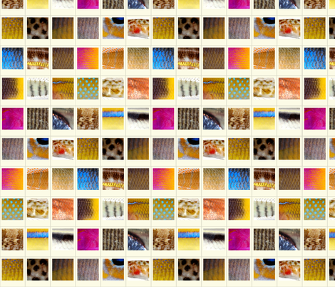
Fish Polaroids
  • Day 9: Free Software
Well, I use GIMP to draw almost everything anyway, so I didn't bother doing anything specific for this.
  • Day 10: Steampunk
I wanted to do something with cuneiform, so I drew some using antique square nails instead of the usual wedge shapes in clay. I feel like it's still in the same spirit as "steampunk," but outside of the same old gears that usually means.
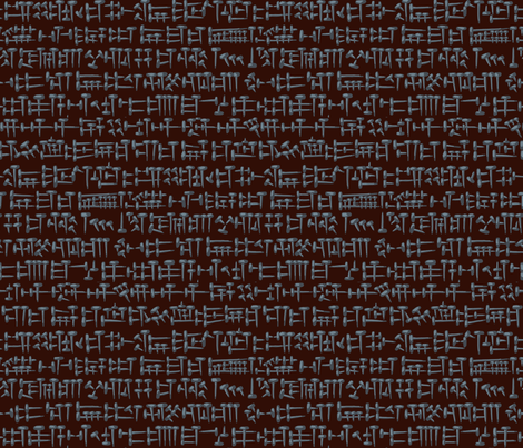
Antique nail cuneifom
  • Day 11: Dyed
Really? A theme of "hand-dying" for a single day? I'm not sure who can just go come up with the time and materials to try dying something in one day with no notice - not people with a full-time job, a toddler, and an infant, I guess! So, as with the other themes involving a specific medium, I just mimicked it digitally. Thinking about various forms of writing, I was considering Braille, which reminded me of the way some shibori-style dying makes motifs out of lots of little squares. Instead of Braille I ended up arranging such squares into a cross-stitch type design (taken from this book, which I've used before). I used the colors from this example.
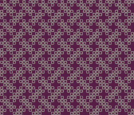
Faux-Shibori Basketweave
  • Day 12: Typographical
So of course, after having adopted typography as an unofficial theme, it comes up as one of the official ones! I was browsing interesting typographical examples and liked this one. So I tried to think of what text I could compose in a circle...how about just the word "circle?" Might as well do square and triangle at the same time! I used the other of the trendy palettes from what I used in Day 7.
calico_spring_warm 300
  • Day 13: Kawaii
I considered a bunch of different things to render "kawaii," but at this point I was five designs behind so it couldn't be that elaborate. (I spent way too much time drawing all that cuneiform!) I saw a picture of a heron in my Feedly feed, which made me think of what bird would be interesting - but not too hard to make cute. So I went with the obvious and illustrated "The Ugly Duckling."
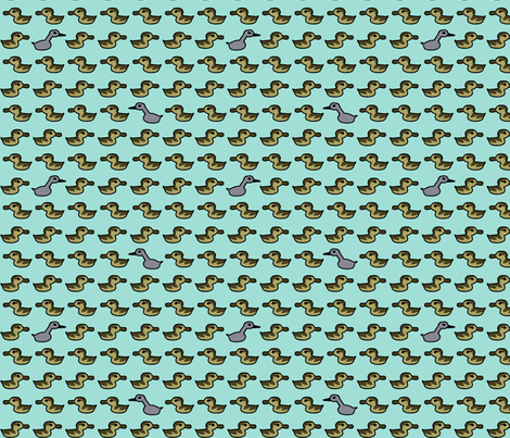
ugly duckling or misplaced cygnet?
  • Day 14: Found Objects
I went back to the copyright-free commons I used for the fish photos and browsed around until I had a variety of interesting images saved. Then I combined them into a simple grid. I think this would make a pretty cool wrapping paper.
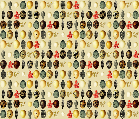
 wunderkammer
  • Day 15: Designer's Choice
 On the final day, they just suggested that we pick one of the previous themes and use it again. So I didn't do anything for this one either.

Saturday, March 12, 2016

Love/air/etc

For contest coinciding with the week of Valentine's day, we had to do something regarding romance plus weather - e.g. "Love is in the air." I decided to do something representing the atmosphere as a whole. So, I went with representations of N2 and O2 molecules, which make up 78% and 21% of the atmosphere respectively. The black outlines here are for nitrogen, and the gray is for oxygen (I approximated the ratio in my design).

Un

The outer shapes of the molecules can also be read as infinity signs. The white hearts represent the electrons - you can see O2's double bond and N2's triple bond.

I titled the design "Un'aura amorosa" as this is the title of one of my favorite Mozart arias, which means "A Loving Breath," and seemed thematically appropriate. (Perhaps though I should have done the ratio of gasses in an exhalation and added CO2 as well...)

There were a lot of good entries in this one. These rainbows and these flowers are two prints that I want to make into clothes and send back in time to my six-year-old self. My favorite overall was this more geometric take. Mine wasn't popular and came in quite near the bottom.


Saturday, February 20, 2016

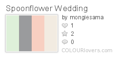
Wedding Pastels

This week's contest required a restricted palette:

Spoonflower_Wedding
Color by COLOURlovers

Also including black and white if we wished. And we could make it wedding themed if we liked. I went very slightly wedding-themed by using ampersands. (Y'know, joining two things together...)

Wedding ampersands

I was thinking of doing a bunch of different ampersands, but eventually decided it looked nicer with just the one over and over. I arranged the colors to make a semi-plaid. This entry maintained the pattern I've been in - twenty-something likes, several dozen votes, ending in the bottom half. My favorites were the roses, the fruit, and the gems.


Sunday, February 14, 2016

Animal pals

For the theme "interspecies friendship," I had about an hour to pull something together. Originally, I was going to do a representation of the Norse myth that there's a squirrel that runs up and down the world tree, bringing gossip back and forth between the dragon at the bottom and the eagle at the top. When I was looking up the names of these animals, I found out that in the legend, the eagle actually has a hawk on top of his head! This struck me as funny so I went with just that pair.

Hawk and eagle at the top of the world

My favorite was the super-cutesy sheep + bird. My design made no impact in the competition and remained in the bottom third. I'm pretty happy with how it came out, though.

Thursday, February 11, 2016

Eighties Hair

For the theme "eighties hair," I went for the classic decade avoidance strategy and changed centuries. Yes, I did 1880's hair instead of 1980's.

Hairstyles of the 1880s

As is usual, this came in about in the middle - but for the first time this year, it actually squeaked just into the top half! There were very few designs in this one I liked at all, but I thought the most appealing were the hair bows.

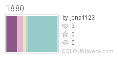
Edited to add: I gathered up this board of hairstyle inspiration, and used (some of) these colors:
1880
Color by COLOURlovers

Wednesday, February 10, 2016

Year of the Monkey

Recently, the contest theme was monkeys, since this is the year of the monkey in the Chinese zodiac. I went with just the Chinese symbol for monkey, using the colors, white, gold, and blue, which are supposedly auspicious for the year of the monkey.

Monkey ideogram - blue/white on gold

The colors are actually the same as the ones from the state fair ribbons. I looked up several different versions of the character to try to come up with a rendering somewhat like what would be used in a chop,

I had so much fun with this, I tried making versions for all twelve animal ideograms of the zodiac, continuing to use the recommended zodiacal colors as documented on wikipedia. You can see them all here.

My entry came in right smack dab in the middle of results. My favorite was this landscape of frolicking monkeys.

Tuesday, February 9, 2016

Spin spin whoosh smack

For the theme "pinata," I went with some traditional star-shaped pinatas, arranged into a pattern based on this tiling. The colors are the synergy "mad" set, previously used here.

candy madness

This actually seemed like it was going to perform better than I expected - twenty-six likes! However, it got barely more votes than that, and came in about two-thirds down the result list. My favorite entry was the crepe paper fringe repeat.

Sunday, January 17, 2016

Rock and Roll

For the theme of rock and roll music, I wanted to avoid referencing any specific artist, so I depicted the drum notation for a "back beat," one of the key rhythms that distinguishes rock music. (Inspired by the Wikipedia definition of hard rock).

Back beat

The background texture is based on the kuba cloth ish design I did for the jazz contest, and the colors are from the Sgt Pepper album (i.e. the shiny psychedelic band outfits of the four Beatles - ok, so I did end up referencing a specific artist).

My favorites were the 45 rpm inserts (there were several designs of those, but those gold ones were the best) and the palm frond guitar picks.

Saturday, January 16, 2016

Windows

For the theme of "windows," I adapted two common quilt piecing designs with window names - cathedral windows and attic windows. I used the "bedtime" colors previously seen here. I combined all that together like so:

cathedral windows in attic windows

I think this would make a pretty good cheater print. Funnily enough, this got exactly the same number of votes (49) and favorites (14) as last week's Auld Lang Syne design. This contest had almost twice as many entries, but I retained essentially the same relative placement (in the bottom half). My favorite entry was this one.

Saturday, January 2, 2016

Design for the new year

This week's theme was "New Year's traditions" - either what you do during the celebration or immediately at the beginning of the year. I decided to do a typographical design using the lyrics of "Auld Lang Syne."

I picked these colors, so the design came out like this:

singing in the new year

This was another challenge were I felt like very few of the entries were visually appealing. This one I liked the look of most. Mine didn't quite make it into the top half of entries.