Yes, I know it's not until tomorrow, but not only did my husband and I already exchanged our presents, the Valentine's-associated contest at Spoonflower ended today. Actually, the theme of the contest was Anti-Valentine's Day, and in addition had to be faux cross stitch.
I spotted some early entries, before I started mine, which were pretty impressive: one that fully embraced the cross stitch format, and one that brought candy hearts into the mix - and both exhibiting exhilarating levels of unromantic snark. So I decided to take a different strategy. Rather than say something negative about the usual sentiments of the holiday, I wanted to say something positive about something that was the opposite any those sentiments. I looked around for quotes about being by yourself, and at various vintage samplers (you should be able to pick out my reference material from here). And for the colors, I decided that the Synergy "serenity" colors, which I had previously used for my newborn dinos, would be a good fit both for the material on its own, and as a further contrast from traditional Valentine's pinks. So assembled into a panel and put in a simple repeat, it came together like this:
But then I started thinking about how you might actually use this fabric, and decided to make a format where you could actually use (almost) everything in a standard fat quarter. That size actually makes a good fit for a 16" square (as we learned with the Spring Cheater contest), so I decided to go for something that you could make into a front for a 16" throw pillow.
I'm very happy with how this came out. I even took the time to turn some of the elements into their own repeats - and I could happily add more, given time. I got a respectable 117 votes, and just squeaked in to the top third in the rankings.
Thursday, February 13, 2014
Thursday, February 6, 2014
Papercut
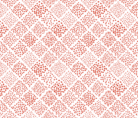
This week's contest was one of those that requires a format, instead of themed content. In honor of the Chinese new year, we were asked to make red and white designs that looked like Chinese paper cutting. I decided to take a sly approach to it and made an arrangement of shapes that looked like the leftover snippets.
I got quite a few nice comments appreciative of the humor, but it obviously has more of a niche appeal when there were so many ACTUAL nice paper cut-style designs.. It got 56 votes and came in 133 out of 218, so just a hair better than last week. My favorite entries were the garden birds, stylized zodiac animals, patterned hexagons, and teapots. I also really liked the guitar-shaped dragon panel. And for a more usable general fabric, the simple clouds are a nice idea.
Sunday, February 2, 2014
Little houses, all in a row
The theme this week was the "Great Barrier Reef." I found it rather intimidating, since I could picture right off all these amazing, hyper-colorful underwater seascape prints, brimming with dozens of different life forms. I decided to focus on just the coral part of things - and doing it in a cutesey, anthropomorphic style. My take was to draw a little village of coral polyps, each in its own little "house" of calcified excretions. I looked around for color inspiration and found this:
Color by COLOURlovers
I originally wanted it to be a little more organic - not so geometric of a layout, and each house is slightly different - but that was giving me fits so I stuck with one "style" of house in a regular hex layout. It's hard to see at this scale, but each little roof has a thatch texture and the walls have a brick texture.
This came in 148 out of 228, with 49 votes. There actually weren't any fabrics that went as all-out as I had imagined (how much easier it is to imagine those kinds of illustrations than bring them to life!), but this one in graphic style one probably got the closest. I also liked this one in an indigo/gold color scheme, and this assortment of corals and sea plants. For more subtle entries, I liked the brain coral texture, tonal sea plants, and super-simplified fish.
Subscribe to:
Posts (Atom)