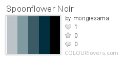
This week's theme was a little darker than normal - "film noir." Plus we had to use these colors (plus white):
Color by COLOURlovers
I haven't seen much film noir - in fact, my main exposure to the genre has really been through the Guy Noir spoofs on Prairie Home Companion. So I started as I so often do by reading the Wikipedia entry on film noir, and was intrigued to be reminded that Blade Runner is considered to be in the genre.
From there, I was inspired by the Voigt-Kampff test questions. I was going to have a sequence of heads in silhouette, with an image or icon related to the questions inside each head. It started looking sillier than I wanted though, so I went with just the heads.
This came in 73 out of 213, with 74 votes. To me, the entry that best literally represented film noir was this one (which indeed won). And the one that best conveyed a more general vibe of menace was this dahlia/razor combination. My favorite entry that had the flavor but could still be used for something more light-hearted was this assortment of keys. And the best pun was the hard-boiled eggs.
Thursday, November 14, 2013
Friday, November 8, 2013
The annual tea towel contest
It's that time of year again - when Spoonflower does a design contest for a tea towel with the upcoming year's calendar. I updated my 2012 pie calendar for 2014, but didn't bother for my lackluster produce entry for 2013, though I do intend to rework that at some point.
This year I debated a couple more elaborate ideas, but finally decided to do something fairly straightforward - stylized moons, with the full moons marked. The background image is a smaller version of my constellations design, and the calendar text itself is simply copied from the pie calendar.
Also, people who buy these and actually intend to use them as tea towels prefer to get them on the cotton-linen canvas, which is wider than the basic cotton by a full foot. Usually the contests are always for the regular fat quarter size (18" by 21") but this year they set it to the cotton-lined size (18" by 27") so that we could make designs that took up the full space (without having them cut off from the contest view). Some of us still opted to make the main design fit in the conventional fat quarter area so that someone could still buy just that. I turned my extra six inches into bookmarks!
This came in 178 out of 195 with only 20 votes, though I did get one message from somebody saying they want to buy it. Tons of great entries this time! I would have an enormous stack of towels if I bought all the ones I love. I wasn't the only person to focus on the cycles of the moon. There are always a few that emphasize the changing seasons. For less common motifs, I liked the LA cityscape and the string instruments. For cutesy, I loved the kawaii icons, the fairytale mushroom cottage, and the graphic sea creatures. Some animal-themed entries at the top of my list were the songbirds and the cats. And for plant-based designs, I liked the preserved apples and the colorful modern floral, and my favorite overall was composed of pressed flowers.
Subscribe to:
Posts (Atom)