Sunday, December 16, 2018

November-December catchup

OK, a few designs to catch up on!

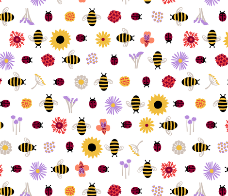
For the "gender-neutral nursery wallpaper" contest, I went with the good ol' alphabet.


I actually wanted this to be a much larger repeat. I drew it such that the repeat would be four feet wide. However, I forgot that with wallpaper the max width of repeats is only two feet. (You can do extremely large repeats vertically though) So I had to make it half the size, darn it. The entry I'd be most likely to ever use was the pufferfish.

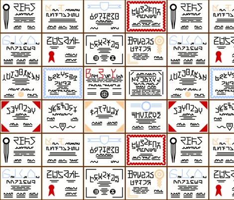
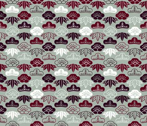
The next contest was Chinoiserie. I used a variety of CC-licensed icons and used colors reminiscent of Chinese vases. (I wanted to stay away from the classic blue-on-white since I knew the majority of entries would use that) And then, in a strike of utter brilliance, I forgot to actually enter it in the contest!

Chinese Icons

Oh well. My favorite was the koi fish.

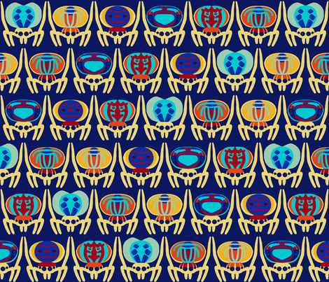
Next! Something inspired by Fair Isle-style knitting. I wanted to do something that isn't normally on a Fair Isle sweater so I did poison dart frogs.

Knit Poison Dart Frogs

My favorite was the dragons.

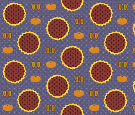
For the "holidays around the world" I represented the celebration my mom made up for the winter solstice - chocolate pie, mixed nuts in the shell (of which I showed just pecans, my favorite) and mandarin oranges. I only had a very small window of time to work on it so I'm not all that proud of it.

On the solstice we eat pie, oranges, and pecans

My favorite was the little vintage-style snowy village.

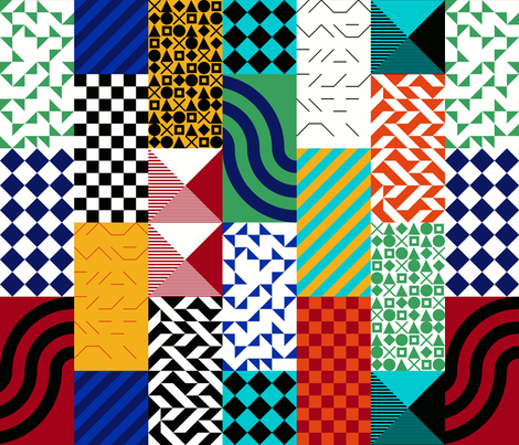
Them, we had another wallpaper contest - for "large-scale black and white." I was able to correct my error of last time and kept the two-foot width in mind. I was inspired by this photo and came up with this:


The ones I liked the best were the monsters, the geometric clovers, these planets, and the columns.

For the sloth theme, I took a basic scallop shape and made it sloth faces:

Serene Smiling Scalloped Sloths

My favorite entry was this one.

And there we go! Happy Holidays!


Monday, October 29, 2018

Easy mode: beanbags!

Since I already had beanbags on the brain, for this week's cut and sew project, I did mini beanbags - i.e. rectangles! Doesn't get much easier than that. And of course you could fill them with dried lavender instead to make sachets. Or potpourri or what have you.

Super Cheery Sachets

This didn't get anywhere in the voting. My favorite was the plush VHS!

Thursday, October 18, 2018

Pull the blanket over your head and ignore it

For this week's contest, we had to use these colors:

I thought the theme was also "cozy," but now I don't see that on the contest description anywhere so apparently I imagined it! I tried to make it look like people curled up, completely enveloped in blankets.

all wrapped up

This did REALLY badly in the contest. (Hence the post title! Whoo!) My favorites were the forest floor items and the bananas.

Monday, October 15, 2018

Halloween Cornhole Beanbags

Bruce's second grade class is doing a cornhole booth for the school fair. Some other parents made and painted the board, and my husband got some black and orange beanbags. He suggested stenciling something on them to enhance the theme. Challenge accepted!

I decided to try out freezer paper stencils. Since the beanbags wouldn't be possible to keep flat while painting that seemed like an easier way to go.

I considered doing a different picture on each beanbag but decided to make it a little easier. After a little discussion with the spouse, I decided to go for skulls on the black ones and bats on the orange ones. I used this skull and this bat.

Once I had the freezer paper and fabric paint on hand, it was just a matter of finding the right moment when I could try to paint eight beanbags without having too many little fingers nearby. Fortunately James actually took a nap on a weekend, so I struck!

First step was to print out eight copies of each image (since I wanted to paint both sides of each beanbag) on the freezer paper, then cut out the shapes. It took me probably 20 sheets of freezer paper to get this right, because I kept putting them in the printer upside down! You wouldn't think I'd be able to make that same mistake so many times...but you'd be wrong.

Then, I got to use my little craft iron for the first time to stick the paper on. Had some trouble keeping it hot enough, though. It seemed like it would cool off after a few minutes of operating, and I had to turn it off and back on to get it back to maximum.
Next was paint! I used a metallic black for the bats. Two of the skulls were in flat white, and two in metallic white. I had to do two coats for the skulls to get it nice and light over the black fabric.
Here they all are drying off! Once they were dried, it was time to flip 'em and repeat for the other side. And then, I got to peel off all the stencils.
I also added little red dots for the bats' eyes. And ta-da! Complete!
Not perfect, but I'm pretty pleased considering it's the first time I've tried that particular technique. 

Thursday, October 4, 2018

A Month of Tea Towels

Whoops, got behind on posting contest results again. This is the time of year that Spoonflower does tea towels. So we need to design for a 18 by 27 inch rectangle (the size of the cotton/linen fat quarter). This year they actually have it set up to display in the contest on a fully-rendered towel, which is nice - since it's a 90 degree rotation from how the fabric normally displays, making it an awkward choice.

First, there's always a calendar challenge. I put each month into a single column and added color-coding for the seasons, also noting the equinoxes, solstices, and phases of the moon.

2019 At a Glance

Here it is in the towel preview - you can see how much hem allowance you have to leave around the edge of the design.


My favorite calendar was the one with the envelopes.

For the "retro bar cart" towel, I went with a plain repeating design rather than tailoring something for the towel shape.

Carbonation/Intoxication

I don't drink, am not into drinking culture at all, and am even not particularly into the fifties/sixties type of retro they mean for this contest. So it was a bit tricky to get a toehold! I made this board and found some few elements that called to me. (You can probably spot my color inspiration there too!) I was trying to give the sensation of a carbonated liquid fizzing.

My favorite was this one that takes advantage of how the towel could be folded in half to hang it up.

Next, the theme was to do a visual pun. I used one my son told me off of a Gogurt: what kind of shoe do ninjas wear? Sneakers! I had very little time to work on this one, so I went with big and cartoony:


My favorite was the thematically appropriate Wetness Protection Program.

Next, the theme was just Animals. I had even less time for this one, so I reused the elements I made for a whale/bat design.  This is a life-size Blue Whale eye and the entire body of a Bumblebee Bat - the largest and smallest mammals.


My favorites were these swans and the bee/bear.


And finally! The recipe tea towel. I put eight of my favorites (including old family favorites from my mom and grandma) in a grid, leaving a space in the middle for someone to add their OWN recipe.


My favorite was the diagrammatic representation of a jam recipe.


Friday, September 7, 2018

Victorian

On the heels of twenties, fifties, and sixties, the final "era" challenge was "Victorian." Which is pretty broad. Anything that happened, or any pattern that would have possibly been used, for the whole time period. To put it in perspective, imagine it were shifted 100 years later - so you could use anything from 1937 to 2001 as inspiration. You could make basically anything fit! (Spoonflower did specify that we couldn't use any public domain imagery - i.e. you couldn't just goink a pattern or collage images from an online archive - but that's pretty hard to enforce)

I was thinking of doing silhouettes of how women's fashion changed during that time, because it's a little funny - leg-o-mutton sleeves and bustles each came into fashion TWICE - but I didn't have enough time for that much detail. I went right to the source of the name and made a design based on the crown Queen Victoria wore for her coronation.

Queen Victoria

This went nowhere in the voting. There were of course a lot of William Morris type designs, of which this strawberry one was my favorite. I also liked this red floral.

Friday, August 31, 2018

Sixties

So after Fifties last week, we have Sixties this week. I went with another scientific milestone - this time, the moon landing! And I tried to do it in a somewhat "psychedelic" style - like Peter Max or Pucci. I had quite a bit of fun and I'm pretty happy with how it turned out!

Psychedelic Moon Landing

This came in my usual spot of right in the middle. My favorite design overall was the peacocks, but I thought the one that was the best combination of good AND Sixties was this one.

Saturday, August 25, 2018

Fifties

Coming right after twenties, this week's theme was the fifties. I looked at the scientific breakthroughs of the decade (which I had also done for the twenties but didn't find anything that leant itself to an illustration) and decided to go with the rollout of the Polio vaccine in 1954. So, a nice little repeat of syringes.

1954 - Polio Vaccine

 This ended up right in the middle of the pack as usual. My favorite was this scatter of mod-style elements.

Sunday, August 19, 2018

Twenties

This week's theme was the 1920s. (Yes, even though we just had an Art Deco contest.) I have previously done a 20's fashion design for the tennis contest. I started with some famous slang terms from the twenties: "the bee's knees" and "the cat's pajamas." Hence, bees, and pajama-clad cats, doing the Charleston:

Cat

I had a lot of fun drawing fancy twenties-style pajamas. This came in right in the middle of the pack, as usual. My favorite was the colorful high-rises.


Saturday, August 11, 2018

Two food contests

There were two contests in a row with food-related themes. First, a contest with a LOT of modifiers:
  • It was for a company that does iPad coloring books, so it was to be in black and white linework only
  • Plus the top designs could be featured in the coloring app, which does NOT do repeating designs, so our entries were supposed to be (or easily formatted to) 2200 by 3300. (as you can imagine, most people ignored that in order to make something more appealing as a repeat, since there's probably a bigger potential return on investment for yardage/wrapping paper)
  • And the actual theme was "food frenzy."
My inspiration was actually really simple. When I noted down the contest themes, I summarized it as "Food Coloring." So hey, how about those cute little bottles of literally food coloring?

Coloring food? Food coloring!

I even took a few reference photos of food coloring in our kitchen (without spilling it everywhere!), like a responsible artist. I'm really happy with how this came out. It almost made it into the top third of the contest! My favorite entry was the doodled fruits.

The next one was simply "tacos and burritos." I did polka dots (using the colors of traditional Mexical folk embroidery) with empty taco shells.

Imagine the tasty tacos

This ended up right in the middle of the pack. My favorite was the one that ultimately won.


Thursday, July 26, 2018

Circles? Triangles?

This week's theme was "Circles are the new triangles," which, apparently starting from a viewpoint that triangles were (recently?) the tip-top of design, means that now circles are ultra-popular. Which was kind of a weird way of telling us to make a circle-featuring design.

I based mine on equations associated with circles, and then put them on hands, as if for cheating on a geometry test:

Sweaty Palm Cheat Sheet

This did not do well. I did have fun trying to make the writing look like a few different handwritings. My favorites were the marbles and these slightly-doodly dots.

Saturday, July 21, 2018

Diplomas

For the "medical professions" challenge, I did a bunch of diplomas and certificates, in honor of all those years of medical/nursing/pharmacy/etc school. I drew made-up shapes instead of letters, to give the impression of text without having to actually come up with fake schools and whatnot. (And, to work cross-language, no translation needed!)

So Many Years of School

I'm pretty pleased with how it came out! Regardless, it got nowhere in the contest. My favorites where these pills and bandaids.

Saturday, July 14, 2018

A punt

I got intimidated by the "emerald forest" theme (which they specified to be forest-themed, and use at least some shade of something you could reasonably call emerald green) because I wasn't able to make a big, detailed forest illustration look the way I pictured it in my head. So, inspired by my younger son's love of pinecones, I just made a repeat of pinecones (specifically, those from coastal redwoods) in various shades of green. Not my best effort, but at least something.

Jewels of the forest floor

It didn't go anywhere in the contest. My favorites were the sorrel, this array of leaves & berries, and this dreamy illustration.

Thursday, July 5, 2018

"Princess Awesome" gives second chances

This week's contest was a sponsored one in concert with "Princess Awesome," which makes clothes for girls that includes some areas outside of the girly norm (dinosaurs, science, fire engines, etc). I've gotten my niece one of their dresses before. So the idea was to make a fabric they could use - something you would want to use for a girl's clothing, but not completely traditionally "girly."

Well, as it happened, I had a (nearly) complete idea ready to go for this. For the "ballet" theme a few years ago, I made a new version of my "ballerina plumbers," but unfortunately failed to submit it in time for the contest.  (TLDR on why I keep doing "ballerina plumber:" it was my desired profession when I was about six; plumber by day and ballerina by night.)

Sooooo, I tweaked my previous design a little - I boosted the pink (and tweaked some of the other colors) for a better contrast, and redid the pipes in the background so they are nicely curved. Thanks, me of three years ago!

Ballerina Plumbers (My Dream Job at Age 6)

This came in pretty much smack-dab in the middle of the pack for the contest, which is not too shabby considering how much of a "niche" idea it is.

My favorites were the ones about beetleschess, fishing, pirates, and outer space.


Friday, June 29, 2018

Four wheels

For the "four wheels" contest, most of the suggestions in the theme were for vehicles, so I went with inline skates.

Inline Skates Zooming

I used the "summertime" colors from the set of shared palettes created by the "synergy" group I'm part of. I'm not 100% on how it came out - I just couldn't get it to look the way I pictured in my head. In any case, at least I made it out of the bottom third of entries! My favorite was the "rolling robots."

Thursday, June 21, 2018

Bauhaus

This week's contest was for a Bauhaus-style design. I really like the work of Anni Albers and Gunta Stölzl, so I tried to do a little patchwork inspired by some of their work.

bauhaus inspired patchwork

This did pretty well, and it got into the top quarter of the contest again.

Sunday, June 17, 2018

Cubed Manatees

For the ocean animals design challenge, I drew manatees:

Calming Manatee

I tried to arrange them in the classic cube optical illusion. This actually did pretty well - I got into the top quarter of entries!

My favorites were the kraken spirals and cartoony fishes.

Thursday, June 7, 2018

Dancing spiders

For the "land animals" challenge, I drew peacock spiders. If you haven't seen these before, they're known for lifting up their colorful hindbodies and doing a little dance.

peacock spiders

This almost made it into the top third.  My favorite was this very impressionistic take on African animals.

Monday, June 4, 2018

Three types of wings

For the "animals by air" challenge, I did a bunch of drawings of my favorite flying animals:

Favorite Flyers

Swans, barn owls, hummingbirds, ravens, Stellar's jays, fruit bats, bumblebee bats, butterflies, ladybugs, honey bees, and wood bees. This actually made it all the way to the middle third of entries.

My favorites were the geometric owls, the china-pattern swallows, and the birds and butterflies carrying letters.

Friday, May 25, 2018

Winter in May

This week's theme was "Elegant Holiday", and the description clarified that it was to be for patterns you could imagine decorating a winter party. Say, on napkins or a throw pillow. Also, we were given a set of colors to use - two shades of burgundy and a grey (plus we were allowed to use black and white). There was quite a bit of complaining about these colors - it's a hard set to use. There's not a lot of contrast between the two burgundies, nor between the darker one and black.

I latched on to the "winter" part of things and made a design based on the "Three Friends of Winter" - pine, plum, and bamboo, so named because they don't wither in cold.

Sho Chiku Bai (Three Friends of Winter)

I'm really proud of how this came out - didn't have much effect on the contest though, as I still came in my usual 2/3 of the way down the list. My favorite was this floral.


Thursday, May 17, 2018

Two designs

First up - the "cycling" challenge. Inspired by my older son recently getting his first bike, I did a design based on taking your first bike ride, with wobbly lines in the background.

first ever bike ride

Then, the theme was "Marrakesh." I mashed together a few different things - the Majorelle Gardens, the famous picturesque cones of spices, and the way Marrakesh is written in Tifinagh script.

Rhapsody in Majorelle Blue

Both of these did quite poorly in their contests. Oh well! My favorites were the bicycle chain chevron and the tile-inspired stars.

Monday, May 7, 2018

(No longer) endangered species

For this week's challenge theme of "endangered species," I didn't want to depress myself too much, so I chose a species that WAS endangered but has since been removed from the list: the American crocodile.

American Alligator

This came in the bottom 25% of entries, with 25 votes. My favorite was the jungle design by Christine Witte, but I love all of her stuff.

Saturday, April 28, 2018

Geology

This week's contest was for "geology." I knew lots of people would be doing designs with crystals and/or gems, so I stayed away from that area. They've had an "earth science" contest before, in which I did soil formation. (Wow how times have changed! Back in 2012 there were only 160 entries in this whole contest...now it's rare for them to be below 500)

I love cross-section diagrams so I did a bunch of those - like what you'd see in a text book showing different types of volcanoes, faults, erosion, and other random geological features.

geological diagrams

This actually did fairly well - in the top 200! My favorite was this nice assortment of pebbles.

Tuesday, April 24, 2018

Gardening

This week's theme was the extremely broad "gardening." I based mine around beneficial insects, specifically bees and ladybugs. I populated the rest of the design with stylized flowers that are supposed to attract one or the other: asters, butterfly bush, fennel, lantana, sunflowers, sweet alyssum, alstroemeria, butterfly weed, chives, cosmos, marigolds, and statice.

Good Friends For Your Garden

I actually made it well into the top half of the contest, which is pretty good considering how heavily tilted the entries were toward florals. I really liked this other design inspired by flowers for bees, these veggies, the little potted plants, and the mossy one.


Thursday, April 12, 2018

What is a "Modern Farmhouse" anyway

The theme this week was "Modern Farmhouse" - as in, the popular design style, most prominently seen on the HGTV show "Fixer Upper." Kind of a hard concept to put in a fabric design, as it's more about textures (barn wood, tile, sheet metal, etc). I browsed around Pinterest, where there are a whole bunch of "Modern Farmhouse Paint Colors" with names like "Intelligent Gray." So I made up my own array of tasteful neutrals, but with unpleasant and ridiculous names.

I swear they all look alike to me, honey...

At first I was afraid I would run out of names, but once I started I just kept coming up with more and more.

THEN, after I entered it in the contest, it got disqualified for not being "on topic!" Ha! Well, I emailed them right back, explained my perspective, and got it re-instated. Not that it mattered because it still only ended up in the bottom quarter of entries.

My favorite design was this one, and the one I thought best fit the theme was this one.

Friday, April 6, 2018

Fuel for grilling

This week's theme was "summer cookout." I tried to compose a plaid out of a few of the different types of fuel you can use for grills - propane tanks, charcoal briquettes, and wood pellets.

gimme fuel, gimme fire...

This did extremely poorly in the contest! Can't win em all. My favorite was this one, which made it into the top ten.

Thursday, March 29, 2018

Overcoming Orange

My six-year-old's favorite color was red for quite awhile, but he recently switched it to orange. I used to absolutely loathe orange but I'm starting to turn around on it. This week's design theme was to make a monochrome design, so I thought using orange would make it an interesting challenge (and also help my entry stand out, as it would likely not be used as much as other colors).  I made a bunch of doodles of some of his favorite stuff:
  • Dogs
  • Elephants
  • Dodos
  • Batteries
  • Screws
  • Hammers
  • Tires
  • Interlocking blocks - not legos of course because that would be a trademark violation! ;)
  • Pizza
  • Bacon
  • Bananas
  • Pickles
  • Spaghetti and meatballs
  • Stars
  • Planets
  • Lightning bolts
  • Snowflakes
  • Water droplets
  • Hearts
  • Music notes

That which brings joy

It was a lot of fun to draw! My favorite was this botanical scatter design (which ended up getting second place). This was an enormous contest with over 700 entries, and I ended up just in the top half.

Thursday, March 22, 2018

Horse races and decorating for them

This week's contest was a little strange. The theme was "Off to the Horse Races" (i.e. Kentucky Derby), and the parter was Black Twine, a party planning service. The idea was to make a print that could be used as a tablecloth at a derby-themed party. This doesn't seem like a great match to me, as Black Twine's aesthetic is more about combining textures and a few colors on solid neutral backgrounds - their apparent use of print is quite limited. Mostly stripes, dots, single-color abstracts, a little plaid, and I spotted maybe one paisley. The kinds of full-color, lushly-illustrated, very busy "feature" prints that generally win Spoonflower contests do NOT fit in with the kind of stuff they have posted. But, the first place winner is going to be featured in a Black Twine "party blueprint."

To that end, they actually showed all the entries on tablecloth mockups - similarly to the large-scale Art Deco contest that was shown on bedspreads. I'm sure that generating cross-traffic to Roostery is part of the goal here. So, I'll be interested to see how the whole party plan aspect works out. (I would guess they will use the winning print in a limited manner - like as napkins or placemats - rather than full-out as the tablecloth)

I took the mint julep as my inspiration, and broke it down to its four raw ingredients - bourbon, water, sugar, and mint. The background stripe is actually from one of my rejected Art Deco designs. I tried to go for a chintz-like style for that extra dash of Southern-ness.

Deconstructed Mint Julep Chintz


It did not do well (bottom third). The entry that, in my mind, most fit in with Black Twine's "look" was this white and navy take on jockey silks, though I was also very fond of this more colorful and larger-scale design.


Thursday, March 15, 2018

IWD

This week's contest was tied into International Women's Day. I just did a little assortment of symbols for women. For colors, I noted that they were associating the shade of purple that Pantone chose as color of the year with the day, so I started there and then used one of these sets of colors.

Symbols for Women

And then, it occurred to me how easy it would be to make the corresponding opposite design, so I did:

Counterpart

It ended up in the bottom half of entries. My favorites were these two.