Thursday, March 29, 2018

Overcoming Orange

My six-year-old's favorite color was red for quite awhile, but he recently switched it to orange. I used to absolutely loathe orange but I'm starting to turn around on it. This week's design theme was to make a monochrome design, so I thought using orange would make it an interesting challenge (and also help my entry stand out, as it would likely not be used as much as other colors).  I made a bunch of doodles of some of his favorite stuff:
  • Dogs
  • Elephants
  • Dodos
  • Batteries
  • Screws
  • Hammers
  • Tires
  • Interlocking blocks - not legos of course because that would be a trademark violation! ;)
  • Pizza
  • Bacon
  • Bananas
  • Pickles
  • Spaghetti and meatballs
  • Stars
  • Planets
  • Lightning bolts
  • Snowflakes
  • Water droplets
  • Hearts
  • Music notes

That which brings joy

It was a lot of fun to draw! My favorite was this botanical scatter design (which ended up getting second place). This was an enormous contest with over 700 entries, and I ended up just in the top half.

Thursday, March 22, 2018

Horse races and decorating for them

This week's contest was a little strange. The theme was "Off to the Horse Races" (i.e. Kentucky Derby), and the parter was Black Twine, a party planning service. The idea was to make a print that could be used as a tablecloth at a derby-themed party. This doesn't seem like a great match to me, as Black Twine's aesthetic is more about combining textures and a few colors on solid neutral backgrounds - their apparent use of print is quite limited. Mostly stripes, dots, single-color abstracts, a little plaid, and I spotted maybe one paisley. The kinds of full-color, lushly-illustrated, very busy "feature" prints that generally win Spoonflower contests do NOT fit in with the kind of stuff they have posted. But, the first place winner is going to be featured in a Black Twine "party blueprint."

To that end, they actually showed all the entries on tablecloth mockups - similarly to the large-scale Art Deco contest that was shown on bedspreads. I'm sure that generating cross-traffic to Roostery is part of the goal here. So, I'll be interested to see how the whole party plan aspect works out. (I would guess they will use the winning print in a limited manner - like as napkins or placemats - rather than full-out as the tablecloth)

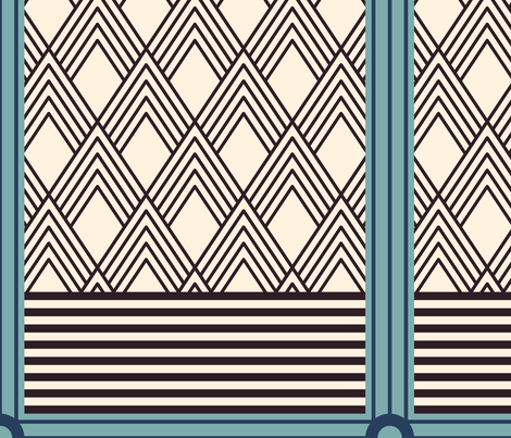
I took the mint julep as my inspiration, and broke it down to its four raw ingredients - bourbon, water, sugar, and mint. The background stripe is actually from one of my rejected Art Deco designs. I tried to go for a chintz-like style for that extra dash of Southern-ness.

Deconstructed Mint Julep Chintz


It did not do well (bottom third). The entry that, in my mind, most fit in with Black Twine's "look" was this 
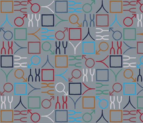
white and navy take on jockey silks, though I was also very fond of this 
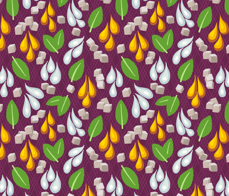
more colorful and larger-scale design.


Thursday, March 15, 2018

IWD

This week's contest was tied into International Women's Day. I just did a little assortment of symbols for women. For colors, I noted that they were associating the shade of purple that Pantone chose as color of the year with the day, so I started there and then used one of these sets of colors.

Symbols for Women

And then, it occurred to me how easy it would be to make the corresponding opposite design, so I did:

Counterpart

It ended up in the bottom half of entries. My favorites were these two.


Thursday, March 8, 2018

Art Deco

This week's contest was to do an Art Deco-style design, but one that looks good on a large scale. They displayed all the entries mocked up on a bedspread (since you can do that with any Spoonflower design on Roostery now) instead of just the usual flat view of the repeat.  I originally did a big patchwork of a bunch of different Art Deco patterns, but it was too busy, too small, and, well, ugly. So I picked the one patch I liked the best and quadrupled its size:

Art Deco Composition

Here's what it looks like in the mockup:


This was one of the best results I've had in a contest. I came in 45th place, which put me in the top 10% since there were over 500 entries.  My favorite was the lacy one, which actually ended up winning first place.


Thursday, March 1, 2018

The tortoise and the hare

This week's theme was to do a riff on the old fable of the tortoise and the hare. Kind of a "meh" theme in my opinion. I thought it would be funny to take it in a darker direction, so I depicted the aftermath of an escalating feud - the hare is wearing tortoiseshell glasses and the tortoise has a lucky rabbit's foot!

Tortoiseshell Glasses and Lucky Feet

I couldn't come up with a better way of combining the illustrations than just alternating in a checkerboard. I was much more interested in perfecting NEXT week's design, so I called this one "good enough" and moved on rather than agonizing over it. I knew it wouldn't do well and indeed, it came in very, VERY nearly dead last!

There's probably some kind of metaphor I could make here about continuing to plug away methodically, vs dashing off and being distracted and therefore getting a disappointing result...but I'll leave it there. Heh.

Out of the horde of hares-jumping-over-tortoises-and-green-rolling-landscapes designs, I liked these two the best.