Saturday, April 28, 2018

Geology

This week's contest was for "geology." I knew lots of people would be doing designs with crystals and/or gems, so I stayed away from that area. They've had an "earth science" contest before, in which I did soil formation. (Wow how times have changed! Back in 2012 there were only 160 entries in this whole contest...now it's rare for them to be below 500)

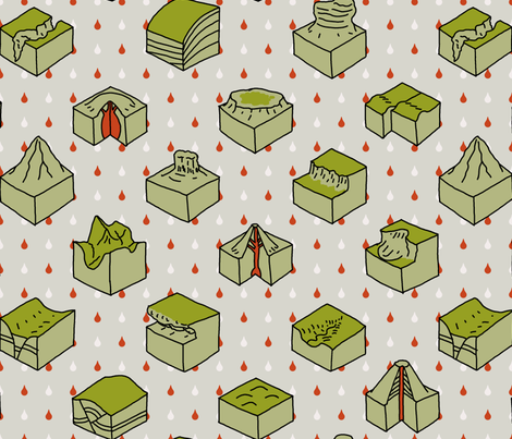
I love cross-section diagrams so I did a bunch of those - like what you'd see in a text book showing different types of volcanoes, faults, erosion, and other random geological features.

geological diagrams

This actually did fairly well - in the top 200! My favorite was this nice assortment of pebbles.

Tuesday, April 24, 2018

Gardening

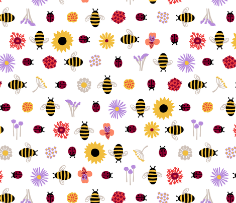
This week's theme was the extremely broad "gardening." I based mine around beneficial insects, specifically bees and ladybugs. I populated the rest of the design with stylized flowers that are supposed to attract one or the other: asters, butterfly bush, fennel, lantana, sunflowers, sweet alyssum, alstroemeria, butterfly weed, chives, cosmos, marigolds, and statice.

Good Friends For Your Garden

I actually made it well into the top half of the contest, which is pretty good considering how heavily tilted the entries were toward florals. I really liked this other design inspired by flowers for bees, these veggies, the little potted plants, and the mossy one.


Thursday, April 12, 2018

What is a "Modern Farmhouse" anyway

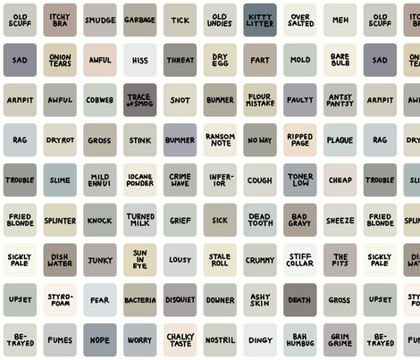
The theme this week was "Modern Farmhouse" - as in, the popular design style, most prominently seen on the HGTV show "Fixer Upper." Kind of a hard concept to put in a fabric design, as it's more about textures (barn wood, tile, sheet metal, etc). I browsed around Pinterest, where there are a whole bunch of "Modern Farmhouse Paint Colors" with names like "Intelligent Gray." So I made up my own array of tasteful neutrals, but with unpleasant and ridiculous names.

I swear they all look alike to me, honey...

At first I was afraid I would run out of names, but once I started I just kept coming up with more and more.

THEN, after I entered it in the contest, it got disqualified for not being "on topic!" Ha! Well, I emailed them right back, explained my perspective, and got it re-instated. Not that it mattered because it still only ended up in the bottom quarter of entries.

My favorite design was this one, and the one I thought best fit the theme was this one.

Friday, April 6, 2018

Fuel for grilling

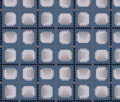
This week's theme was "summer cookout." I tried to compose a plaid out of a few of the different types of fuel you can use for grills - propane tanks, charcoal briquettes, and wood pellets.

gimme fuel, gimme fire...

This did extremely poorly in the contest! Can't win em all. My favorite was this one, which made it into the top ten.

Thursday, March 29, 2018

Overcoming Orange

My six-year-old's favorite color was red for quite awhile, but he recently switched it to orange. I used to absolutely loathe orange but I'm starting to turn around on it. This week's design theme was to make a monochrome design, so I thought using orange would make it an interesting challenge (and also help my entry stand out, as it would likely not be used as much as other colors).  I made a bunch of doodles of some of his favorite stuff:
  • Dogs
  • Elephants
  • Dodos
  • Batteries
  • Screws
  • Hammers
  • Tires
  • Interlocking blocks - not legos of course because that would be a trademark violation! ;)
  • Pizza
  • Bacon
  • Bananas
  • Pickles
  • Spaghetti and meatballs
  • Stars
  • Planets
  • Lightning bolts
  • Snowflakes
  • Water droplets
  • Hearts
  • Music notes

That which brings joy

It was a lot of fun to draw! My favorite was this botanical scatter design (which ended up getting second place). This was an enormous contest with over 700 entries, and I ended up just in the top half.

Thursday, March 22, 2018

Horse races and decorating for them

This week's contest was a little strange. The theme was "Off to the Horse Races" (i.e. Kentucky Derby), and the parter was Black Twine, a party planning service. The idea was to make a print that could be used as a tablecloth at a derby-themed party. This doesn't seem like a great match to me, as Black Twine's aesthetic is more about combining textures and a few colors on solid neutral backgrounds - their apparent use of print is quite limited. Mostly stripes, dots, single-color abstracts, a little plaid, and I spotted maybe one paisley. The kinds of full-color, lushly-illustrated, very busy "feature" prints that generally win Spoonflower contests do NOT fit in with the kind of stuff they have posted. But, the first place winner is going to be featured in a Black Twine "party blueprint."

To that end, they actually showed all the entries on tablecloth mockups - similarly to the large-scale Art Deco contest that was shown on bedspreads. I'm sure that generating cross-traffic to Roostery is part of the goal here. So, I'll be interested to see how the whole party plan aspect works out. (I would guess they will use the winning print in a limited manner - like as napkins or placemats - rather than full-out as the tablecloth)

I took the mint julep as my inspiration, and broke it down to its four raw ingredients - bourbon, water, sugar, and mint. The background stripe is actually from one of my rejected Art Deco designs. I tried to go for a chintz-like style for that extra dash of Southern-ness.
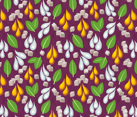
Deconstructed Mint Julep Chintz


It did not do well (bottom third). The entry that, in my mind, most fit in with Black Twine's "look" was this white and navy take on jockey silks, though I was also very fond of this more colorful and larger-scale design.


Thursday, March 15, 2018

IWD

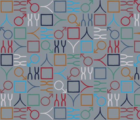
This week's contest was tied into International Women's Day. I just did a little assortment of symbols for women. For colors, I noted that they were associating the shade of purple that Pantone chose as color of the year with the day, so I started there and then used one of these sets of colors.

Symbols for Women

And then, it occurred to me how easy it would be to make the corresponding opposite design, so I did:

Counterpart

It ended up in the bottom half of entries. My favorites were these two.