Tuesday, May 28, 2019

🎶Guess who got a Cricut 🎶

My combined birthday/Mother's Day present from Zack and the boys is a Cricut! I haven't had a chance to do too much with it yet but I did a few small things to try it out.

I did a few of the free included projects they have online - a beetle greeting card and some page-corner bookmarks.


Then I used some of the free elements and composed them myself to make little banners for each of the kids. (You can see that James crinkled his a bit before I could get a picture!)


Monday, May 27, 2019

The 2018 Bags

Here were last summer's (2018) bags for the kids for the family Redwoods trip - I just realized I never posted them!


It's time for me to start pondering the design for this year, as the trip is just a few months out now. (Here are the bags from 2017, 2016, 2015, and 2014).

Sunday, May 26, 2019

Almost June

Here's the designs I've made lately!

For the "April Showers" theme, I made a design in the style of a "tilted square" patchwork, with clouds and giant drops.
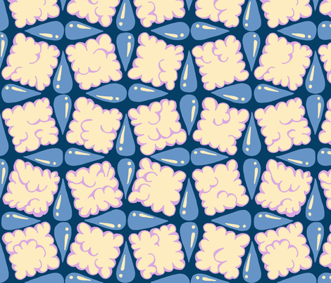
storm clouds and soaking rain

My favorite was the rainbow raindrops.

for "eucalyptus," I was just going to use the eucalyptus design I made already, but as it turns out it was pretty small so I ended up having to redraw it. So I also added some pods to it.

eucalyptus

I'm really happy with this one - maybe one of my favorites I've created for a contest. (Still didn't do any better than usual, ha ha!) My favorite was this one that combined different types of eucalyptus.

Speaking of trying to predict what people will vote for, there were also contests for "shibori" and "abstract minimalism." Here are my respective entries:

Faux-Shibori Basketweave - Mulberry

Imi Knoebel Tribute

In my opinion, the shibori one is way more pretty AND useful. But the abstract rectangle one did way better in the contest! The first ended up very near the bottom, and the second did quite well (almost in the top 100). Insert shrug emoji here!

I think the common perception of shibori is that it's always indigo dye. (Probably 97% of the entries were blue.) I specifically chose something to look like a traditional mulburry dye instead so as to not be one of the zillions of blue entries. I'm sure that ended up hurting me! You can see an example of the kind of elaborate shibori dye I had in mind on this page (the red kimono). Also I had made this base shibori pattern for an earlier challenge.

The abstract rectangle one is an homage to this artwork specifically.

My favorites for these themes were the simple shibori squares and the triangles.

Then, there was a contest to make a playmat, to fit on a yard of fabric. I made a solar system playmat. With more time I would love to add more details - like Voyager, the Mars rovers, etc.

Solar System Playmat

My favorites were the circuit components and the nest.

For small-scale Summer-themed prints, I made one based on the shield-like badges you often see on bottles of suncreen.
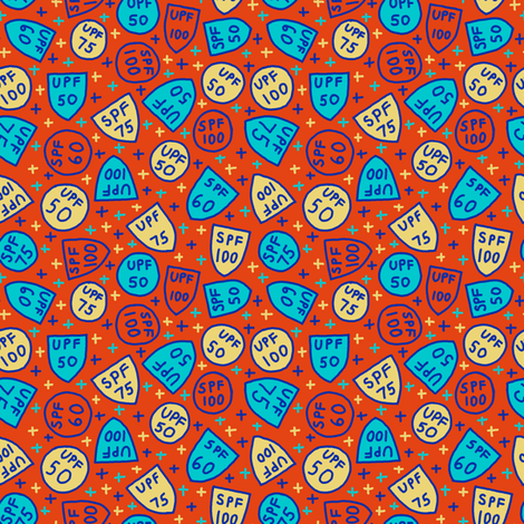
sunscreen badges

My favorite was the fruits.


Thursday, April 11, 2019

Pollen

For the "pollinators" challenge, I skipped the actual pollinators and just drew pollen. I made it similar to the "grains" design I did for the Matisse challenge.

pollen grains

My favorite entries were the clover and the bees and lemons.

Thursday, April 4, 2019

Nautical Flags

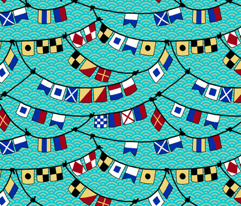
For the nautical-themed contest, I based it around the classic flag alphabet, which I have used before. This one spells out a classic quote: "a smooth sea never made a skillful sailor."

Flags and Ropes


My favorite entries were the sardines and the knots.

Friday, March 29, 2019

Feathers

For the "feathers" contest, I made a design of Stellar's Jay feathers. Such a nice color scheme! Such cute mohawks! I used this as the inspiration for the layout.

Stellar

I got a thrill because Spoonflower used this design in their weekly email, in the section linking to the current contest:

I really liked the "pillow fight" entry and the chickens. My design actually did pretty well this week - I made it into the top 100! (79th place in fact)

Saturday, March 23, 2019

Happy Third Day of Spring

First to catch up, the theme of "affirmations." Well, mine wasn't exactly an affirmation, but a motivational quote that has always stuck with me:

show up and get to work

For the layout, I was inspired by this cuneiform inscription. Mine doesn't have nearly as nice a use of negative space, but I did what I could. I also did a version in yellow with gears in the background but ultimately decided simpler was better for the contest.

show up and get to work

My favorite entry was "today I fly."

For the "Bohemian Paradise" contest (another one of those very loose, "you'll know it when you see it" kind of themes) I tried to make something reminiscent of the folk embroidery such as on this shirt (also inspired by this).

Breezy Boho Embroidery

The entry I thought personally captured the spirit best was this one.

Next up, "moody florals." I did poppies and orchids combined. This is one of those designs where I really liked it as I made it, and then once I uploaded the final design I disliked it instead. Ah well. (The colors are from this cake.)

Poppies and Orchids

My favorite entry was the roses, which for some reason I really want to make into a shirtdress.

And finally, for the theme of "maximalism" (which most people interpreted as "busy!"), it fell in one of those weeks where I had almost no time so I slapped together something super quick in one of my favorite color schemes:

maximal! maximal! MAXIMAL!

My favorites were the halftone squares and this psychedelic abstract.

Out of all these, the "affirmation" one did the best by far - it actually made it into the top half of entries.