The most recently finished contest was for something to do with beetles. Of course I immediately thought of doing something punny with Volkswagons or The Beatles (or both at once), but decided instead on Egyptian scarabs. One of the other synergy designers is working on a set of colors matching those used by ancient Egyptians, of which I selected a subset. It was fun doodling a whole variety of variations on standard scarab carvings.

This got 133 votes and came in 55th out of 288. My favorite was this one (which won).
Further back in time, the theme was surfing, and we had to use these colors (plus white):
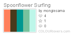
Color by COLOURlovers
I went with a pretty straightforward combination of surfboards and hibiscus.
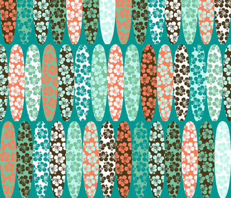
This got 104 votes and came in 31st place out of 169. My favorite entry also featured hibiscus.
Finally, we got a theme of tennis. Not a topic I find particularly interesting. Thinking back on tennis historically, it reminded me of going to Hearst Castle, where one of the stories the tour guides like to tell you is how Hearst always wanted his guests to be active - illustrated with old film of his glamorous guests heading off to the tennis court. So, how about some twenties-style tennis clothes? I used the same colors as my art deco and library cards designs.

This got 136 votes and came in 23rd! That's my highest placement in quite a while. My favorite was this graphic repeat of tennis balls.